
The Macro Compass
131 episodes — Page 1 of 3
Run It Cold Now, Run It Hot Later
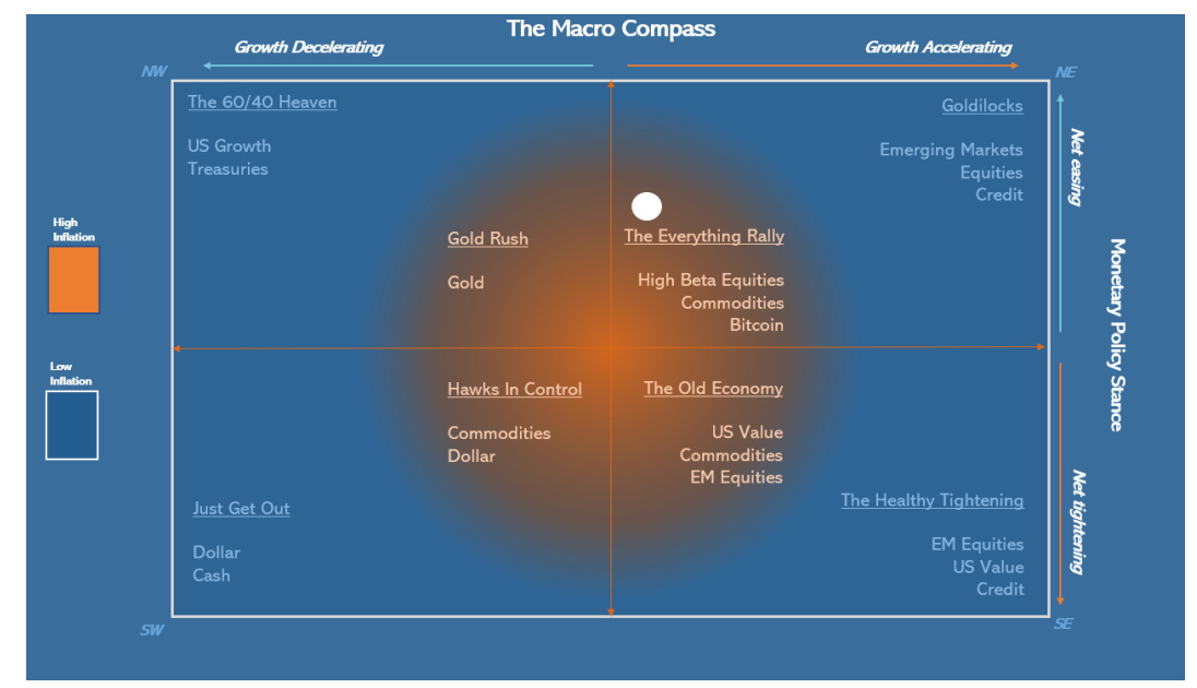
Hi everyone - this is Alf.I hope you’re having a great day.My macro models have been suggesting a bi-modal framework to approach markets for the near future: Run It Cold Now (growth My Run It Cold Now theory has been increasingly vindicated by labor market data, and markets are often busy trading what’s in front of them rather than looking through a potential reacceleration in 2026.This is why it’s vital to figure out:1. How early/late do we sit within the ‘’Run It Cold Now’’ period;2. How much has the market priced in by now;3. Consequently: is it still worth getting engaged in Run It Cold trades, or shall we look at Run It Hot Later ideas already?As a reminder, my macro models suggest tariffs will act as a fiscal tightening mechanism until year-end.By early 2026, the OBBB fiscal impulse will offset and Trump’s new initiatives alongside lowered Fed Funds and private money creation should propel a Run It Hot Later period.First, some evidence that US labor demand is really weak: extrapolating benchmark revisions from April 2025 onwards, the US has been consistently shedding jobs!To get a broader perspective on the labor market we can rely on unrevised data which incorporates demand and supply for labor: for example, unemployment rate and its important subcomponents.The chart below shows the number of long-term (27+ weeks) unemployed Americans as a percentage of the total labor force. At 1.14%, this number is already as high as in 2002 or summer 2008 – in both cases, a recession was already visibly hitting America:Why is US labor demand so weak?Due to tariffs, the US is going through a slowdown of its primary fiscal impulse: the 2025 primary fiscal deficit sits almost 20 bps below last year and markedly below the 2023 pace.Tariffs are effectively acting as a tax on US companies and consumers:This seems to be confirmed by ‘’the best economist Druckenmiller knows’‘: the internals of the stock market.The chart below shows (in white) the ratio between an index of the 5 largest US payroll processors companies and the equal-weight SPX, plotted against 2-year Treasury yields (in green).If there are no new jobs, the largest payroll processors companies in the US will suffer - and indeed, their stocks are trading very weak.This is an example of how the internals of the stock market suggest the US labor market is very weak, and that the Fed will be soon called to ease more:The US economy is ‘‘running cold’’ now, yet stock markets are roaring and risk sentiment remains very aggressive - why?The private sector money printer is going BRRRR, led by AI.The chart below shows the big-tech announced capex spending as a % of their EBITDA – it’s already over 65% on average, exceeding the AT&T spending of 1998. To keep up this pace next year, companies will have to resort to debt-funded AI capex:AI Capex mechanically adds to US GDP even before we get to talk about the ROI.But the biggest issue with AI Capex is that it doesn’t really add jobs for the median American for now, and hence we are left with two economies: a hot AI-related economy, and a broader labor market struggling under the fiscal tightening induced by tariffs.The stock market is not the economy, and the gigantic AI capex effort coupled with large global fiscal stimulus programs continues to support risk sentiment.Our global real-economy money printing index is very strong.We tracked the YTD pace of inflation-adjusted $ money creation around the world, and this year we have scored an impressive 5.77% increase in real-economy money printing around the world.This comes after 3 weak years led by the gigantic Chinese housing deleveraging, and the YTD pace in 2025 is in line with the ‘’concerted global growth’’ pace of 2017.The global pace and acceleration is quite robust, and its mainly driven by China which has restated its credit engines after 2-3 years of robust housing deleveraging.Despite being crippled by tariffs (e.g. a large tax), US money creation is accelerating led by the AI-related debt-funded capex spending on data centers.And money printing is only set to accelerate going forward.From a fiscal standpoint, we are 100% sure that from early 2026 we will see:- Germany adding to money creation via a large increase in primary spending;- The US OBBB kicking in with its fiscal stimulus offsetting tariffs money destruction;- Korea, Sweden, and many other countries kickstarting deficit spending programsWe might be looking into a scenario where the Fed cuts rates but global money printing accelerates.If we dust off my TMC Quadrant Asset Allocation Model, that puts us in the top-right quadrant:In short, historically the best asset allocation for such an environment involves selling IOUs and paper assets, and buying tangible risk assets.Basically:* Sell USDs and bonds, * Buy stocks and assets linked to nominal growthThe most painful outcome for institutional investors would be an equity rotation towards EM/Value + a commodity rally.These are very underowned asset class
May The Odds Be Ever In Your Favor
Hi everyone - this is Alf. I hope you're having a great day.‘’I compile statistics on my traders. My best trader makes money only 63 percent of the time. Most traders make money only in the 50 to 55 percent range. That means you’re going to be wrong a lot. If that’s the case, you better be sure your losses are as small as they can be, and that your winners are bigger.’’ – Steve Cohen.This is a hard truth to accept for many macro investors: we will be right only about 50-55% of the times.If your win rate is much higher than this, I suggest you extend the sample of trades you are analyzing or assess whether you are not trading macro but rather just selling optionality – short vol/option strategies have win rates as high as 90%+, but they wipe you out completely when you are wrong.In the last 10 years, I scored a 52% long-term win rate on my directional macro trades. Once I realized that and given that the year-end P&L formula can be written as follows:I knew I’d better make sure the size of my losses doesn’t get out of control.This can be achieved in two ways: sizing trades correctly and designing a system that lets your winners run. We are going to talk about my approach to both angles in a second, but first another important remark.To step up the win rate on macro trades from 50% to say 55% over a long period of time, you need to gain some edge over other macro investors.What could that be?- A data-driven approach with superior macro models- The ability to assess the gigantic amount of cross-asset market signals via quantitative tools- A particular edge in a niche market that you have learnt to navigate well over time- Be less stupid than othersMacro models help a lot, but my ‘’don’t be stupid checklist’’ adds value too:Points 1-3 keep my emotions in check and ground me to a more rational assessment of the trade.Points 4-6 are about implementation.A warning: short carry trades (and long options) are expensive to hold over time if nothing happens.A reminder: in very choppy markets, you can get quickly stopped out with linear trades even if your thesis proves to be correct – consider whether the market regime favors linear or option implementations.Don’t be stupid: check whether the trade you are about to add is not just another expression of a trade you already have on – I have seen people blow up as the 10 trades they were running were just…the same trade.But it’s point 7 that sticks out: sizing and risk management define most of your P&L at year-end.Here is how I approach them through a practical example. Say you think that the S&P500 will keep marching higher over the next month: how many SPYs do you buy?You could be in the right or left 50% of that distribution: when you pull the trigger, you don’t know that. And because you don’t know that, you want to standardize your ex-ante sizing.One effective way to standardize the sizing of each tactical trade so that they don’t excessively weigh on your year-end P&L is to do volatility-adjusted sizing: let’s go through the SPY example.You could be in the right or left 50% of that distribution: when you pull the trigger, you don’t know that. And because you don’t know that, you want to standardize your ex-ante sizing.One effective way to standardize the sizing of each tactical trade so that they don’t excessively weigh on your year-end P&L is to do volatility-adjusted sizing: let’s go through the SPY example.Let’s set our stop at 1.5 standard deviations, and our defined time horizon in this example will be 1 month. For the SPY, using a 5-year lookback the typical 1.5x monthly negative sigma event would be a -7.6% decline.You can play around with the lookback period if you want more history and/or assign different weight to more recent periods if you think today’s vol regime is more relevant (grey boxes).If returns are normally distributed, we will be stopped out 6.7% of the times in our defined time horizon. But as returns often follow other distributions, it’s good practice to check the actual empirical probability of being stopped out against the theoretical 6.7% probability (orange boxes).Finally, define what’s the fixed % of AuM you are willing to lose on any given macro trade.A fictitious $1 million trading account willing to lose max $20k per trade which is bullish on SPY with a 1- month horizon would buy 571 SPY shares at $437 and be stopped out at $402 (-7.6% = 1.5x sigma event) hence losing $20k (= 2% of AuM).Congratulations, you just applied volatility-adjusted position sizing!What are the advantages of this approach?1) You remain agnostic to ‘’volatility luck’’: if you size all positions the same, being right/wrong on the most volatile assets will make/break your P&L at year-end and that’s all about luck. Don’t gamble.2) You remain agnostic to your ‘’conviction’’ level: the truth is that ex-ante you don’t know when you’ll be in the right or wrong 50%, so why would you over or under size a trade based on your ex-ante conviction levels? You shouldn’t.3) T
Plumbing Risks Ahead
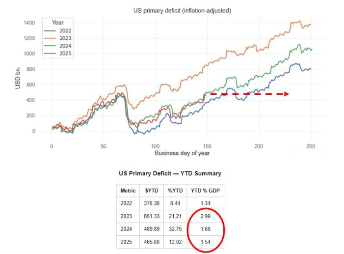
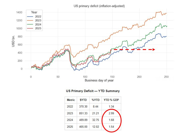
Hi everyone - this is Alf. I hope you're having a great day.The US economy and markets might face a double negative whammy over the next 2 months: a large reduction of the fiscal impulse and the aggressive rebuild of the Treasury General Account (TGA).A slowdown in real-economy money creation (primary deficits) could result in an economic slowdown, which will coincide with a drainage of bank reserves (TGA buildup) from markets.Our US primary deficit tracker stands at 1.54% of GDP as per last week, already lagging behind the 2024 pace and way behind the 2023 staggering pace.Tariffs came in at almost $30bn in July, and were this pace to continue we’d effectively face an additional $150bn of fiscal drag until the end of the year.That alone means the US primary deficit might shrink by 15% from $1 trillion in 2024 to $850 billion in 2025:As a reminder, primary deficit spending = money being injected in the real economy.Literally, we are talking about money printing.As step 1 the US government spends money (e.g. cuts taxes) which increases the bank account of households which receive an injection of net worth – they pay less taxes, hence their bank accounts are fatter. Bank deposits grow at commercial banks, which as a result see their reserves at the Fed grow too.Step 2 describes the bond issuance pattern: the US government issues bonds to ‘’fund’’ deficits, and banks swap reserves for bonds at auctions.This slide comes from my Monetary Mechanics course, in which I cover all the plumbing topics and variations you can ever imagine – take a look here if interested:So the private sector will receive a smaller injection of wealth from the US government going forward.Money creation will still happen, but at a reduced pace – but how should we think about the TGA rebuild?When the government wants to rebuild its Treasury General Account, it issues bonds but not for the purpose of ‘’financing’’ money creation – rather simply to rebuild its coffers at the Fed (TGA).As you can see from the T-Accounts at page 2, a TGA rebuild ends up with a reduction in bank reserves (steps 2 and 3) and no creation of money for the private sector.TGA rebuilds are not uncommon, but as we sit at $421 billion now and the Treasury targets $850 billion by the end of September, the $400bn+ increase in 8 weeks would be one of the most aggressive TGA rebuilds over the last 10 years:Bank reserves are currently sitting at $3.3 trillion, and given the ongoing QT and large TGA rebuild they could drop below $3 trillion soon. That would be the equivalent of less than 10% of nominal GDP:The last time we experimented with bank reserves below 10% of nominal GDP was in 2018-2019, and this eventually led to pressures in the repo market in September 2019.This excellent speech from Waller encapsulates how the Fed thinks about an adequate level of reserves.A scarce level of bank reserves means US banks would be more reticent to engage in the repo market (lend reserves against Treasury collateral) and more conservative in their risk-taking.As Waller stated in his speech: ‘’I think of ample reserves as the threshold below which banks would need to scramble to find safe, liquid funding, something that would drive up the federal funds rate and money market interest rates across the economy.’’Also, the Fed can’t really do much to slow down the bank reserves destruction from the TGA rebuild.Quantitative Tightening is running at $40bn/month, but $35 billion of QT is linked to mortgage-backed securities (MBS) which the Fed wants to get rid off from its balance sheet.And the Reverse Repo (RRP) facility is only at $80 billion, so there is little left to drain there as an offset to the TGA rebuild.If the Treasury really goes for a such a fast TGA rebuild alongside with the reduced fiscal impulse coming from tariffs, the US economy could face a soft patch right when bank reserves fall towards scarce levels leaving banks more reticent to provide repo funding and to oil the leveraged financial system.This potential plumbing issue alongside the net fiscal drag leaves me defensive on US economic growth prospects for the next 2-3 months at least.This was it for today. Be nimble, and remain hungry for macro.I This is a public episode. If you would like to discuss this with other subscribers or get access to bonus episodes, visit themacrocompass.substack.com
Policymaking Protest Assets (PPAs)
Amidst all the noise, markets haven’t had time to digest 5 key macro news:1) Elon Musk announces formation of ‘’America Party’’2) Speaker Mike Johnson: "We're gonna have a second reconciliation package in the fall, and a third in the spring of next year..."3) President Trump: ‘’ “Stock markets are now at all-time high -- we’re going to maintain it, believe me.”4) Bessent: We could appoint new Fed chair in January, nominating in October5) OMB Director Vought sends official letter to Powell saying ''Chairman Jerome Powell has grossly mismanaged the Fed''Musk’s America Party might as well cost the Republicans both the Senate and House in the 2026 mid-terms. That’s a big political risk for Trump.The response from the Trump administration is very clear - run the economy hot. More fiscal stimulus with reconciliation bills on the table again, and dovish pressure on the Fed.The interference with the Fed independence is increasing by the day, with clear attempts to find ''cause'' to fire Powell (e.g. ''gross misconduct'' mentioned by Vought).If you run the economy hot with inflation already above target and force a dovish reaction function at the Fed, our asset allocation model moves towards the ''Everything Rally'' Quadrant:Historically, the best asset mix for this scenario is to get rid of USDs and underweight long-end bonds and buy:1) Assets denominated in USD that produce inflation-proof cash flows;2) PPAs: Policymaking Protest AssetsWhy do these assets perform well in such a macro environment?Trump's plan with tariffs, fiscal and lower front-end real rates means that real growth remains ok as the tariff passthrough hits consumer spending, but rounds of fiscal stimulus preserve real purchasing power for consumer and capex for companies. It holds fine.Nominal growth is instead more robust in the 4-5% area as inflation remains sticky due to tariffs and fiscal. And you make sure that real yields remain compressed.Basically: you run it hot.In such an environment, specific stock markets composed of companies with strong pricing power (e.g. tech) fare very well as it happened in 2003-2006 and 2013-2019 ''Run It Hot'' experiments. But the two prior experiments were run with inflation at or below target, no tariffs, no attacks on the Fed independence, and no hostile policymaking against the rest of the world.Today, I believe a mix of such investments and PPAs (Policymaking Protest Assets) would work better.PPAs are assets denominated in USD that represent a release valve against unorthodox policy mix such as forcing real rates too low vis-à-vis the level of nominal GDP, manipulating long-end yields via reducing issuance or encouraging banks to buy (SLR reform), or incentivizing foreign countries to diversify away from USD investments.Gold and metals in general are the longest-standing PPAs, and needless to say Bitcoin is also a valid contender for PPA properties:The questions we should all be asking ourselves are:A) How long the USD am I in my portfolio? (Probably too much)B) Do I have enough assets producing inflation-proof cash flows? (Probably not)C) Do I have enough PPAs in my portfolio? Gold, metals, Bitcoin? (Probably not)If you enjoyed this piece, please share it with a friend you know will enjoy it too.For questions/remarks/grandma pizza recipes, feel free to drop me an email at [email protected] humble in markets,Alf This is a public episode. If you would like to discuss this with other subscribers or get access to bonus episodes, visit themacrocompass.substack.com
Null Komma Null
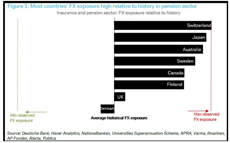
Hi everyone - this is Alf.I hope you're having a great day.Alongside with running my hedge fund, I work as a consultant and external advisor for some of the largest pension funds, asset managers, banks and funds in the world.Arrangements are flexible: from access to my institutional research + daily access to me all the way to monthly or quarterly calls and sitting through your investment committees.If you think I could add value to your firm, simply reach out at:[email protected] state your name, company, and how you think I could help.And now, to today's macro research piece.Let’s start this macro piece with a little game.Below you find two tables representing 3 consecutive prints of core CPI in the US including its subcomponents: core goods and core services (with a separate mention for ‘’supercore’’ CPI).Without using Bloomberg or Google, are you able to tell which 3-month core CPI streak belongs to the pre-pandemic period and which one to today?I wasn’t, and some of the hedge fund PMs I asked the same question ended up making a mistake.In both cases, core CPI MoM prints were averaging 0.15-0.20 which is broadly in line with the annual 2% inflation target and the subcomponents painted a picture of 0% goods inflation with core and super-core responsible for the quite muted inflationary pressures.The answer: section 2 covers the Jun-Aug 2019 period, and section 1 shows Core CPI for Mar-May 2025.I think we should take some time to reflect on this.In early 2019, Powell pivoted dovish with a clear speech highlighting the tightening cycle was over and the Fed was all about accommodating financial conditions.Core inflation averaged 0.2% MoM in summer (higher than today), unemployment rate was 3.7% (lower than today, and stable), and the Fed moved on to cut rates from 2.25% to 1.50% in Q3 2019.Fast forward to today: the last 3 core inflation prints averaged 0.14% MoM with weaker services inflation, unemployment rate is steadily climbing up at 4.24%, and Fed Funds sit 200 bps above summer 2019.The Fed might soon capitulate dovish.Also, amidst this tariff noise it’s helpful to take a step back and remember core goods only represent ~20% of the core CPI basket.The real action lies in services and housing (dis)inflation.The guys at WisdomTree developed a real-time core inflation metric that uses actual housing inflation rather than the lagging shelter CPI metric:Core CPI using real-time shelter inflation (blue) has been around 2% for 18 months already, but the lagging nature of shelter CPI (grey) pushed official core CPI higher limiting the ability for the Fed to cut.The lagged disinflation in housing seems set to continue, which means the official core CPI measure might keep declining based on official shelter inflation dropping (it’s 35-40% of the core CPI basket: it matters).Notice how using real-time shelter inflation works both ways.The red circle highlights the mid-2021 period when the housing market was ultra hot but shelter inflation didn’t yet show up in the official core CPI – which tricked the Fed into mistakenly delaying the hiking cycle.The opposite has happened in 2024, but the last 3 core CPI prints are now decisively dovish.It’s time to follow the Fed very closely to grasp when the dovish turn might come.The title of this piece is ‘’null komma null’’, a German expression which means 0.0 and we can say the excess inflation today compared to pre-pandemic periods is actually null komma null.But there is another ‘’null komma null’’ which is crucial for markets and asset allocation.A close friend, mentor and hedge fund PM recently had a chat with a German pension fund manager and asked him how much additional USD hedging they have done given the correlation break between EURUSD and risk assets.‘’Null komma null’’. Nothing, no additional hedging has been done.Basically, pension funds and insurance companies remain very long (and hurting) the US Dollar:The reason is very simple: FX hedging costs are still high, and pension funds/insurance companies have return targets to meet.Picture this: the standard return requirement for a pension fund is 6.5/7.0%, and if you are in Switzerland or Japan hedging your USDCHF and USDJPY exposure for the next 12 month costs 3.5-4.0%.That’s quite a hefty negative carry to pay, and this deters pension funds managers from hedging.But.In a scenario where:* The Fed turns dovish and starts delivering cuts* USD hedging costs start to drop* The USD depreciates further, reminding foreign pension funds of their losing long USD positionWe could see a fast acceleration in USD hedging demand from foreign whales around the world.Such hedging activity would compound USD weakness very rapidly.If such an outcome unravels, the market implications are pretty straightforward.Short the denominator, long the numerator.The US Dollar remains the denominator of most financial assets out there, and the combo of a dovish Fed turn + Trump policies + hedging activity would definitely ‘’wea
On The US Downgrade
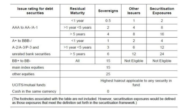
Hi everyone - this is Alf.I hope you're having a great day.On Friday, the credit agency Moody’s downgraded the US rating by one notch to Aa1 (equivalent to AA+).By now, you’ve probably read tens of opinion pieces arguing this is the beginning of the end, and that there will be dire consequences for the US Treasury market.In this piece, you’re going to read a more sober and data-driven approach to this downgrade.The first thing to understand is why Moody’s downgraded the US: ‘’ Successive U.S. administrations and Congress have failed to agree on measures to reverse the trend of large annual fiscal deficits and growing interest cost’’.The mainstream take here is that this makes sense because the US will never be able to repay its debt and because interest costs have now exceeded $1 trillion per year.Once you understand the monetary system, both these assertions don’t make any sense:Any government doing deficit spending and issuing bonds in its own currency (like the US) is not walking into an abyss of doom – it’s just choosing to stimulate the economy by printing money for the private sector.It doesn’t have to repay anything – if it tries that via budget surpluses it will cause the opposite effect and end up hurting the private sector (via higher taxes).The process of fiscal deficits creating money for the private sector is explained in the T-Account chart.Step 1 is the government blowing a hole in its balance sheet to print money for the private sector (aka deficits), which adds net worth for households and corporates which see their net bank deposits increase. These deposits end up at banks, which in turn also see their assets (reserves) increase.Banks will then swap these reserves for bonds at auctions where the US governments funds its deficits via issuing bonds and primary dealers (banks) plus foreign investors show up to buy bonds – step 2.Ok fine, ‘’US debt levels are too high now’’ is a groundless worry touted by rating agencies and mainstream commentators but surely paying $1+ trillion in interest costs must be a scary proposition?Not really: for every $ the US pays for interest on debt, there is an investor making $ on risk-free interest rates she is collecting by owning Treasury bonds.Repeating this concept is useful to demystify the monetary system: yes, government debt and US interest payments are rising but it’s not like the US needs to ‘’choose’’ between spending on interest and spending money for healthcare – the government balance sheet doesn’t work like ours.The real limitation to uncontrolled deficit spending is inflation and scarcity of resources (2021-2022 prime example) and not some budget constraints typical of a household.Ok, but how does the Fitch downgrade affect investors and market participants?The key point is that US Treasuries are now rated AA+ instead of AAA.US Treasuries are the most widely used form of collateral in the world due to their high rating, liquidity, deep repo market and solid democratic foundations/rule of law.Does the downgrade affect that?Commercial banks are huge buyers of Treasuries: they use them as regulatory liquid assets (HQLA), as collateral and also sometimes as an asset to hedge interest rate risk on their liabilities.The Basel regulatory framework introduced 10 years ago has 0% capital requirements for government bonds rated between AAA and AA- for its standardized approach: the downgrade to AA+ wouldn’t make any difference. Most banks actually choose an internal-rating based (IRB) approach based on internal models and in that case most jurisdictions apply an exception for any investment-grade rated domestic government bond which automatically assigns them a 0% risk weight.Bottom line: for banks this downgrade makes no difference at all.Treasuries are also widely used as collateral in repo transactions: for instance, pension funds and insurance companies lend their unsecured cash parked at a bank against collateral to upgrade the safety of their ‘’cash’’ deposits in a so-called reverse repo transaction.A secured loan with UST as collateral (e.g. reverse repo) is safer than parking cash unsecured at a bank.Does a downgrade affect the collateral status of US Treasuries?The table above shows the Basel committee recommended haircuts for repo transactions.As you can see, bonds rated between AAA and AA- fall in the same bucket (little haircut required).The Moody’s downgrade doesn’t affect the role of US Treasuries in the financial plumbing world: banks still face 0% risk-weights when buying Treasuries, and the role of US bonds as the main collateral underlying the global repo market remains intact.People will now try to compare the short-term bond market reaction to 2011, the last time when US Treasuries received a surprise and significant rating downgrade. Yet, the comparison makes no sense.Remember that 10-year government bond yields can be decomposed as:The downgrade can only directly impact the third component – term premium, which measures the compensa
How The Whales Could Dump More US Dollars
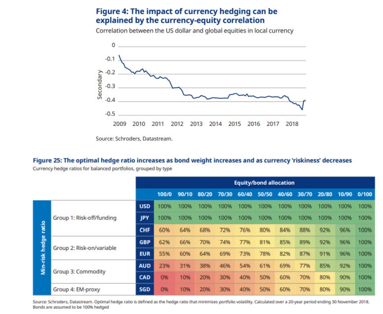
Hear, hear: the US Dollar is going down. Investors love to attach an ex-post narrative to any price action, and this time the blame was on Trump’s erratic policies, the reduced attractiveness of US assets, and ‘’China dumping’’. Two of these actually make sense (you can easily guess which ones).But there is a much bigger catalyst for the USD to sell-off more: FX hedging flows from proper ‘’whales’’. These whales control $30 trillion (!) in USD-denominated assets, of which 13 trillion in equities and the remaining portion in fixed income instruments. You may know these whales by their common names: GPIF, Norges Fund, CPPIB, APG, SuperAnnuation… Foreign pension funds, insurance companies and asset managers are the true whales that could dump more US Dollars in an attempt to correct their sizeable and secular ‘’under-hedging’’ of USD risk:In this article I will try to explain why these FX hedging flows (sell USD) could be triggered, quantify how big these flows could be, and assess which countries and currencies could represent the bulk of it. The analytical process requires us to identify how big their USD asset pool is (in % of their domestic economy) and how much under-hedged they are. But first – why do foreign whales actually ‘’under-hedge’’ their USD risk exposure?Imagine you are the CPPIB – Canada’s biggest pension fund with $500bn+ in AuM.You have to generate a consistent return of ~6-7% to be able to service your liabilities (future pensions), which means you’ll invest in a portfolio of stocks, bonds, real estate and alternatives. Your liabilities are in CAD (as you’ll pay pensions to Canadians) but your assets can’t only be CAD-denominated because to satisfy your investment needs you’ll need to look into the US stock markets, $- denominated hedge funds, Treasuries etc. But by investing in USD-denominated assets, you are also implicitly getting exposure to USDCAD risk. So – how much USD risk should you hedge? Or namely, how much USDCAD should you sell as a hedge? The study above from Schroeders details the industry-standard approach: the top chart looks at the correlation between USDxxx (e.g. USDCAD) and your investment asset class (e.g. equities). Recently, the USD has ‘’always’’ rallied when stocks sold-off as the world scrambled towards the safety of US assets backed by sound policymaking (= USD smile), and therefore being ‘’under-hedged’’ was great. On top of it, given a currency like CAD (table below) is commodity/risk-on cyclical, during equity sell-offs having an active ‘’long’’ USDCAD exposure through under-hedging worked even better – and so the suggested USDCAD FX hedge ratio for a 60/40 portfolio is 40%.But what happens when the USD does not rally (!) during risk-off environments, exactly as we are witnessing recently?In that case, being under-hedged (= actively long USD) becomes painful as it compounds negatively alongside equities (and perhaps also bonds) losing value.And that’s when these foreign whales would be forced to hedge, and kickstart a substantial USD firesale process.Let’s dig into the data and find out:A) How big these USD selling flows could beB) Which currencies would be involved the most and whyThe full macro research piece is available to the TMC institutional tier subscribers - a subscription costs several thousands of dollars per year.But you don’t have to pay that - if you act now.As we are getting a large influx of institutional demand for The Macro Compass research, we might be soon closing to subscriptions at retail-friendly prices.This is why today I am telling you: go for it today.The first 20 Substack TMC readers who will use the code USD20 for our All-Round tier will get 20% OFF the (already retail-friendly) subscription price.You’ll end up paying only EUR 999/year.That’s only ~19 EUR/week to read my institutional-grade research every week.The offer is valid only for TODAY!Use the link below. Be amongst the 20 who get in: This is a public episode. If you would like to discuss this with other subscribers or get access to bonus episodes, visit themacrocompass.substack.com
The Macro Unicorn
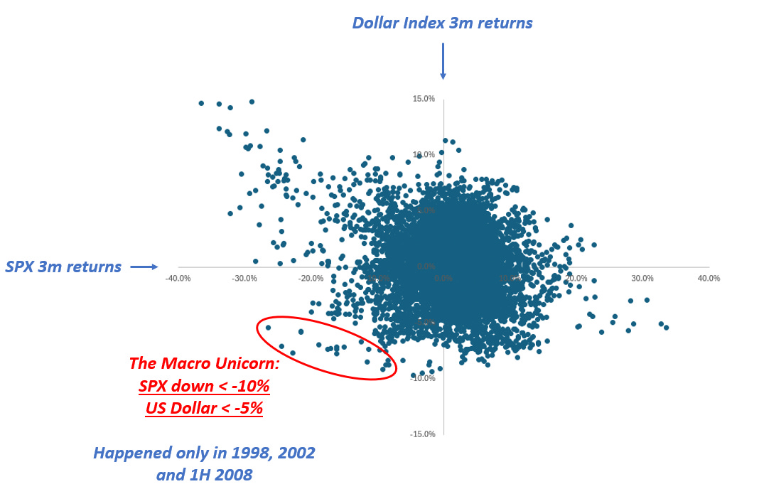
Hi everyone - this is Alf. I hope you're having a great day.‘’There are decades where nothing happens; and there are weeks where decades happen’’ – Vladimir Lenin.Markets were sleepwalking into April 2nd before we had a decent sell-off in US stock markets on Friday.But the size of the YTD sell-off (a mere 5%) masks a very interesting pattern happening below the surface.For the first time since the first half of 2008, we are observing a rare macro pattern – almost a unicorn.The S&P 500 and the US Dollar are going down at the same time:The chart at page 1 shows the 3-month rolling returns for the US Dollar Index (DXY) and the S&P 500.Historically, large SPX drawdown (left part of the scatter) tend to see the USD rallying heavily: the most convex USD appreciation (upper side of scatter) tends to coincide with bad equity drawdowns.This also implies that the upper-left quadrant (SPX down a lot, USD up a lot) experiences the most elongated tail of all the quadrants.The ‘’Macro Unicorn’’ bottom-left quadrant with SPX drawdowns happening alongside a weak USD is not very populated. It’s crucial to remember the last Macro Unicorn dot goes back to July 2008.Why was it so hard for the USD to weaken while the S&P 500 was going down?This is because of three reasons:1) After 2008, the Eurodollar system blew up in size and never looked back;2) The US aggressively swallowed global trade surpluses, and in exchange became the epicenter of all global financial flows into Treasuries and US stock markets;3) Policymakers applied growth-friendly disinflationary policies and politicians postured towards defending Pax Americana on the geopolitical frontWith such a combination of factors, the USD tends to appreciate during risk-off events.A portion of the 12+ trillion dollars of USD debt issued by foreign entities has to be refinanced in any given year, and a risk-off environment which threatens to slow down global trade means all foreign entities rush to buy USDs to service their debt.Foreign investors buy Treasuries because the Fed has your back and it will cut rates if financial conditions materially worsen – cross-border buying of US Treasuries strengthens the USD as money flows in the US.The same foreign investors are reluctant to wind down their US equity exposures because Fed cuts will ultimately restore confidence.Net-net, the USD goes up in risk-off events.The only periods when the USD weakened alongside the SPX were 1998, 2002 and H1 2008.These are all periods where US bubbles ended up deflating rapidly: think of the Dot Com bubble burst in 2001 or the US housing market crash of H1 2008 – before it turned into a global financial crisis.These episodes all have one thing in common: a US idiosyncratic crisis.And today, US policymakers seem to be doing all they can to generate one.On the macro front, the US administration is injecting a large amount of uncertainty.The ‘’no-visibility’’ approach from Trump on tariffs brings big unpredictability – and it’s also nearly impossible for US companies to plan capital expenditures and hiring given there is no visibility on tariffs.To that business uncertainty, you need to sum up the leaked White House memo to the Washington Post (here) which aligns with the recent Musk interview highlighting a 25-35% cut to the federal workforce to achieve budget savings close to $1 trillion/year by the end of May.Former Linkedin Chief Economist Guy Berger looks at a variety of high-frequency leading job market indicators, and I respect him as a non-biased non-alarmist economist.He just produced the chart you see below:Quoting him: ‘’The diffusion index of future headcount plans is now worse than it was immediately prior to the election. Additionally, and concerningly, that pessimism about the future is also affecting the present: the diffusion index of recent employment actions is trailing a year earlier by more than pre-election.’’And this is before the Trump administration starts slashing ~800k federal employees.To add to the potential ‘’Macro Unicorn’’ move which stems from a US idiosyncratic crisis, we are witnessing the very first signs of the unwind of the gigantic long US equity position held by foreign investors.As shown by my friend Brent Donnelly, it is very rare to experience a month when the DAX is up while the SPX down – and we just experienced it:If you take a step back, you realize that foreign investors have accumulated a gigantic amount of US securities since 2010. Trade surpluses came with a USD surplus for countries like Germany or Norway, which then recycled these excess USDs back into US Treasuries and US stock markets.Canadian and Swiss investors own US securities to the tune of 100%+ of their GDP:What if some of these foreign whales decide to reduce their exposure to US assets?It would make sense given the new US geopolitical stance, the non-supportive policy mix (non-proactive Fed and tighter fiscal stance), business uncertainty from tariffs and still elevated valuations.And wha
Here Are My Top Macro Ideas
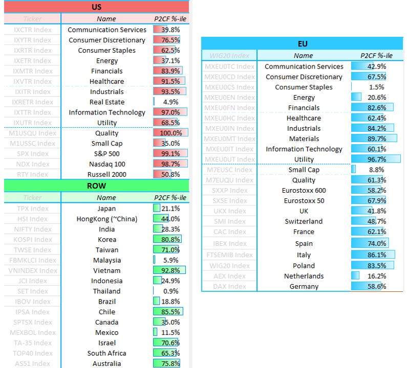
Hi everybody, Alf here - welcome back to The Macro Compass!Before we go into today’s piece, a short announcement.I advise several institutional investors on a bespoke basis.Clients include Canadian pension funds, one of the biggest tech companies around, and top 3 multimanager hedge funds in the world.Services go from sitting on the investment committee as an independent advisor, to constructing specific macro portfolios/hedging programs and consulting on a day-to-day basis (i.e. act as their independent macro analyst).Are you are interested in my macro advisory services?Please shoot an email with your request at: [email protected] warning: it’s not cheap, and it’s only for institutional investors.Now, to the piece.The first 5 weeks of the year have seen international equities outperforming the S&P 500: European and Chinese stocks have rallied harder than US stock indexes, and certain emerging markets like Chile or Poland are doing even better. My main thesis for the first half of the year remains to be positioned with an ‘’International Risk Parity’’ portfolio: long US bonds, and long stocks around the world.Let’s take a look at why.The chart above shows that the US growth exceptionalism might be over. The Aggregate Income Growth series is a great proxy for nominal growth in real time: it includes private sector job creation, workweek hours, and wage growth – effectively reflecting the growth rate of nominal income US workers are bringing home. Today, it sits at 4.5% which is exactly the average level it recorded in 2014-2019.These are the Goldilocks growth conditions and controlled inflation that international stocks enjoy.Let’s now perform a data-driven analysis of what asset classes perform best during this prevailing macro conditions, and specifically when:* Core inflation is in the 1.75-2.25% range;* Real growth is in the ~1.50-2.50% range.Here is what we found:On a risk-adjusted basis, bonds do well - especially the long-end.Stocks perform well too, with international stocks performing slightly better than US stocks: in our sample, European stocks pop up very often with CEE countries (higher beta like Romania or Hungary) leading the table.To do well, international stocks need a combination of: * Goldilocks growth conditions (no US exceptionalism); * (On the way to be) controlled inflation and predictable Central Banks; * Reasonable valuations and a new narrative replacing the existing stale one.Which brings us to the other required conditions: friendly developments in inflation coupled with a reasonable Central Bank, cheap valuations and a new narrative prevailing. What are the best countries to look at today? Let’s have a quick look at valuations:The table above shows the forward P/E ratio for various international equity markets, and the most right column shows the 10-year percentile of valuations. Broader European equities are still reasonably valued (Stoxx 600 more than Stoxx 50 which tends to give more focus to large cap German and French companies), but the standout country remains Poland. Outside Europe, several countries in Asia and LatAm show cheap valuations.Price-to-earnings ratios alone are not enough as a metric for valuations, and to broaden up the valuation assessment I like to look at Free Cash Flow Yield too.FCF yield is the ratio between free cash flows and enterprise value, and you can think of it a measure of the amount of net cash genetated by the company and literally available to stock investors divided by the enterprise value.The table below shows the 10-year percentile of FCF yield for different US and EU sectors, and different stock indexes around the world - the lowest the percentile, the cheaper the valuation:If you consider valuations, policymaking and narratives my shortlist for international equity markets includes:* Developed markets: Europe, Japan, and Canada* Emerging markets: China and MexicoEurope, Canada and Mexico were ‘‘priced to die’’ under the tariff threat, but as time goes by without much being done there investors are slowly realizing that inflation is under control and Central Banks are acting dovish. That supports stock markets.In Japan, valuations are still broadly attractive because investors are growing nervous on how hawkish the BoJ will be - yet nominal growth is doing great (~5%+) and Ueda already verbally intervened to put a cap on bond yields. Strong nominal growth and a cap on excessive tightening will benefit Japanese stocks.Despite the big rally, Chinese stocks are still reasonably priced - the PBOC remains ready to ease, some fiscal spending is happening, and investors are largely underallocated.In short: our analysis suggests that an ‘‘International Risk Parity’’ portfolio built with long US bonds and long international equity markets will perform well in H1 2025.Thanks for reading!If you enjoyed this piece, please share it with a friend:Before you go, don’t forget this.I advise several institutional investors on a bespoke basis.Cli
Bond Market Rally Next?
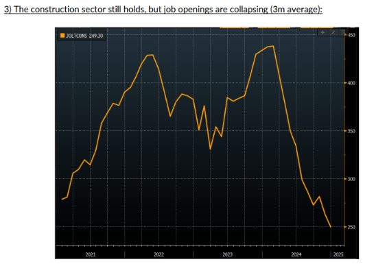
Hi everyone, Alf here - welcome back to The Macro Compass!And now, to the piece.Our main macro thesis for the first half of 2025 is that another disinflationary wave will hit the US.We expect core PCE to annualize at or below 2% in H1 2025.Our Leading Inflation Indicator suggests we might be due for one last wave of disinflation in the first half of 2025:To add some substance, this Leading Inflation Indicator is built using the 7 most statistically significant forward looking indicators for core US inflation.The most recent dip is mostly attributable to leading indicators of shelter inflation, which represents 30%+ of the core US inflation baskets.As you know, official shelter inflation tends to incorporate on-the-ground rent growth with a delay due to its methodology and series like the Zillow Rent Index have been used to predict where shelter inflation will go.The CoreLogic single family rent index is one of the best predictor of shelter inflation, and it just printed at the lowest level in 14 years:Some weakness in the housing market is starting to emerge - as evidenced by other leading indicators as well.One of the main reasons why the housing market held up so well despite high mortgage rates was the gigantic backlog to work through.During the pandemic, the demand for housing was super hot but supply bottlenecks and labor shortages lengthened the housing construction cycle - and this led to large backlogs which kept the housing market afloat.Big US homebuilders like D.R. Horton are now reporting their backlogs have returned to 2019 levels, so this tailwind seems exhausted:Additionally, yesterday's JOLTS report shows that the job openings for the construction sector are shrinking fast (see chart below).The construction sector is key to the US business cycle, and cyclical weakening there has always been an early signal of a broader softening in US growth conditions.Just to be clear: construction workers aren't getting laid off yet.But it seems that the conditions are in place for a slowdown in the housing sector, which also leads to disinflation through the rent of shelter component:Incoming data on inflation, growth and the housing market suggest a disinflationary slowdown in growth could be ahead of us. In that case, the Fed could quickly switch to a quarterly pace of cuts and reassert the Fed Put. This ‘’proactive risk management’’ dovish stance would ease financial conditions = stocks and bonds rally:Looking at the relative valuations across stocks and bond markets, the best risk/reward lies in fixed income.At the moment, this is what the market is pricing the Fed to do over the next 2 years:The Fed is priced to be on hold in March, deliver maybe 2 cuts in total this year, and pretty much stop there.The terminal rate is priced around 3.90% - and that’s where the Fed cutting cycle stops.Given the odds of Fed hikes are relatively small as long as Powell remains Fed Chair until May 2026, bonds offer an interesting risk/reward if my disinflationary thesis proves correct.This was it for today, thanks for reading.If you enjoyed the piece, please share it with a friend: This is a public episode. If you would like to discuss this with other subscribers or get access to bonus episodes, visit themacrocompass.substack.com
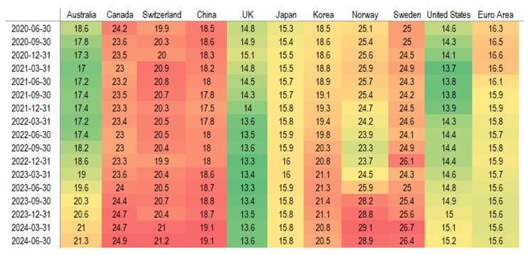
How To Prepare For Tariff Day
Next week will be crucial for markets as Trump is set to announce (or disappointingly not announce) tariffs.In this piece I will highlight the rationale behind my base case scenario and its impact on markets.Before we do that, I want to share something with you.I am offering a FREE trial to my institutional macro research service!The service includes:* Multiple macro research pieces per week;* Timely coverage of important events and market implications;* Direct access to meIf you are a HNW private investor, a family office or an institutional investor feel free to request a free trial using the link below:FREE Trial to Alf's Institutional Macro ResearchAnd now, back to the article.1. Recent economic data provides Trump with cover to go big on tariffsThe biggest risk Trump runs with tariffs is a bond market insurrection: if investors perceive inflation as too high, tariffs can generate an injection of risk premium that launches bond yields to the moon.In turn this would tighten financial conditions, slow down the economy, hamper Trump’s plans to reduce borrowing costs for the US, and just make him quite unpopular (people hate inflation spikes).Luckily for him, the recently released inflation report suggests core PCE is trending at 2.3% - not bad:Additionally, the latest job market report was encouraging and the control group of retail sales is running at 5.4% - around 2018 levels, when the pre-pandemic economy was considered strong. The economic momentum and a 2.3% trend in core PCE inflation provide Trump cover to go big on tariffs.2. To increase his negotiating power, Trump can target vulnerable economiesAs the Fed hiked rates, all other Central Banks around the world merely followed the same strategy. The big issue here is that not all economies were equipped to handle such an abrupt increase in rates.After the GFC, the US economy has deleveraged its private sector – private debt to GDP is down in the US. The US private sector also borrows mostly on fixed rate for long tenors (think about 30-year mortgages). The US also issues bonds in the global reserve currency, so bond vigilantes are unlikely to go after the US.But what if another economy had high private sector debt, or upcoming refinancings, or floating rate mortgages and corporate borrowing which makes the passthrough of rate hikes fast and furious?In that case, the economy will prove quite vulnerable to a prolonged hiking cycle.The BIS just updated their private sector Debt Service Ratio (DSR) for H2 2024 – this snapshot allows us to verify in which countries households and corporates are under pressure from a prolonged hiking cycle.Red or green colors refer to how much the DSR is above or below its long-term average in that country:Notice how Canada and China are under increasing pressure.And it would make sense for Trump to go after them – negotiating with a weak counterpart is always better. But identifying vulnerable economies is not only about the Debt Service Ratio – politics also matters.For example, Germany is very unlevered as an economy: the German DNA prevents (for now) any proper deficit spending, and the private sector is also relatively conservative on how much it leverages.As a consequence, the DSR doesn’t really pick up – yet the German economy is vulnerable.Its business model of cheap energy imports and outsourcing production and manufacturing has been challenged by the pandemic, and China has made huge progress as a competitor for car exports. The German economy has taken a major hit, and people aren’t happy.New elections are planned for February, and negotiating with a country in political turmoil is always better. From a game theory perspective Trump could decide to focus on China, Canada and Germany.3. A tariff strategy to raise the most amount of money, and take the smallest amount of risksEven if Trump wants to target the most vulnerable economies, he must be careful.Let’s take a look at the countries the US imports the most from, and in which categories of imports:The car, pharma, oil and household/tech goods industries are by far the largest import sectors for the US. And Mexico, China, Canada and Germany the top 4 countries that exports the most volume to the US.If Trump’s intention is to raise the most amount of money through tariffs on the most vulnerable economies, basic logic imposes equally heavy tariffs on all these 4 countries above.But there is a risk in going huge against China from the get-go. While it’s very unlikely that Canada and Europe will protect their currencies, China could decide to do it.And if we get 25%+ tariffs on China from the get-go but the CNY doesn’t weaken, US consumers will feel it. Higher import prices on Chinese goods without an offsetting move up in USDCNY = US consumers will take the hit out of Chinese tariffs, and not China.Here, game theory would hence suggest Canada and Europe are the prime candidates for heavy tariffs.Conclusions and market implicationsGiven that:1) Soft inflation and
What To Buy For A Macro Portfolio In 2025
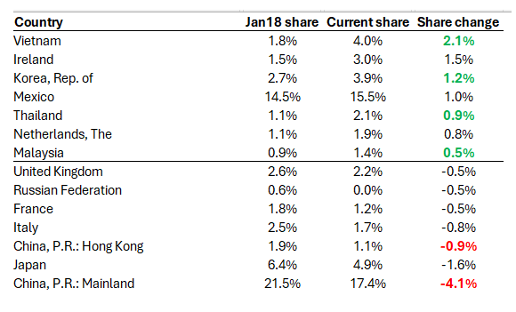
Good morning, this is Alf - welcome back to The Macro Compass!I wish you a fantastic year ahead: follow your passions, keep learning, and don’t drink cappuccino after 11am.In this macro piece, we will cover the biggest market mover for H1 2025: tariffs.We will also investigate what’s the most attractive asset class today.But before we start, here is a present for you to kickstart this new year.Early next week, I’ll publish my top 3 macro trade ideas for 2025.If you want to:* Read my macro research multiple times per week;* Have access to my long-term macro ETF portfolio;* Receive all my tactical trade ideas (including next week’s)You can now sign up to the premium TMC tier for 30% OFF.For the first 30 users, 30% OFF. First come, first serve.Discount Code ‘‘HNY’’. Use the link below:Now, to the piece.What if tariffs end up being non-inflationary and negative for growth?And what if Trump focuses on short-term painful policies first in H1, to then deliver tax cuts in H2?Consensus isn’t ready for this.Let’s disentangle the thought process behind the concept of ‘’disinflationary tariffs’’.This paper from the new Council of Economic Advisor (CEA) Chair Steve Miran covers it – I’ll summarize.The main idea is very simple.In his previous term, the Trump administration increased the effective tariff rate on Chinese imports by 18%.During the same time span, the US Dollar appreciated by 14% against the Chinese currency.It basically means the after-tariff price in USD to import Chinese goods was almost unchanged.As long as the USD appreciates, US consumers aren’t going to feel much inflationary pain from tariffs:Yet we also know that tariffs are negative for business sentiment, investment, and growth.Even if tariffs are phased in gradually as a negotiation tactic, the message will be clear: if you want to export your stuff in the US, you need to re-think your business model or cut your profits.Additionally, it’s well documented that a super strong US Dollar acts as a drag for earnings growth in the US:US companies generate about 60% of their revenues outside the US, and a strong USD doesn’t help there.The charts above prove that was indeed the case in 1996-2001 and 2021-2023: a relentless USD appreciation (orange line down) slowly but surely weakened earnings growth (blue) for US companies.Under the assumption that countries hit by US tariffs will accept a currency devaluation without a fight, there are reasons to believe that tariffs can be non-inflationary and negative for growth.But can we safely assume China isn’t going to push back?Why would China not try to stabilize their currency and export some inflation and pain in the US?Let’s try to think this out as if we were Chinese policymakers.We have three options:1) Accept the hit: let the CNY weaken2) Fight back: protect the CNY by selling down USD FX reserves, and hit back the US3) Play the long gameI believe China will opt for 3: play the long game. And here is what I mean.Chinese policymakers don’t face elections, but the Trump administration does – US midterms in 2026.Rather than going for the extremes (1 or 2), China could decide to apply a long-term strategy that relies on two pillars.A) Allow a steady CNY deval, and plug the hole with fiscal stimulus where neededAs China can afford to play the long-game from a political standpoint, they could opt for a middle ground between a full CNY devaluation and a strenuous defense of their currency by selling USD reserves.B) Keep using ‘’middlemen’’ to dodge tariffsWe had some fun testing this hypothesis: can we show that China used ‘’friendly neighbors’’ to re-route their goods into the US as a way to circumvent tariffs?Since the first round of Trump tariffs went live in 2018, China (and Hong Kong) now import a volume of goods in the US which is 5% lower than the pre-tariff era.But at the same time, Vietnam + Korea + Thailand + Malaysia have all increased their trade flow with the US.Coincidence?Or China trying to dodge some tariffs by re-routing their goods exports to the US through ‘’middlemen’’?Consensus is strongly positioned for tariffs to be:* A big macro event* Negative only for the rest of the world (US growth exceptionalism to continue)* Adding to inflation uncertainty in the USI think there is space for consensus to be caught offside on all the above.I could foresee a world where Trump phases in tariffs, China dodges most of them through middlemen countries, the anticipated inflation volatility doesn’t realize, but growth slows down because business investments are hit by uncertainty.Given today’s pricing, the most attractive asset class in this scenario would be bonds.Our models show that the option-implied probability for the Fed to hike (!) over the next 12 months is priced at 40%. That’s quite high, and it show the extent of hawkish pricing people pushed into the front-end of bond markets.And not only that: the curve has bear steepened, and term premium has been injected in the long end too.With Fed Funds
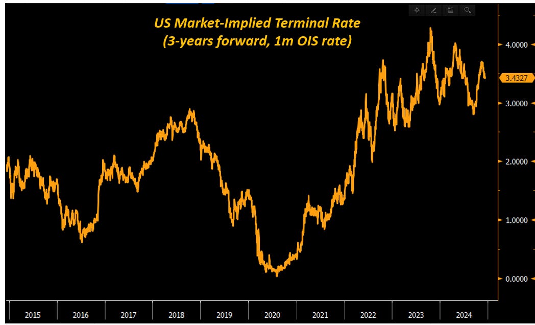
A Fresh Look At Bond Markets
Looking back at the 2015-2021 period when I traded bond markets at a large bank, it was quite boring.Rates were mostly stuck around 0% at the front-end, and to make money you had to find small dislocations and monetize them with leverage hoping volatility would remain low forever.Today, the story is different: bond markets are truly exciting.So let’s have a fresh look at them.Before we do that though - an important announcement.My macro hedge fund Palinuro Capital is going live in January.This is a dream coming true for me.Do you want to be updated about the performance and progress of my hedge fund?Fill in the form below and I will include you in the distribution list:I expect the Fed to cut rates again in December.Why?See the chart below:Even after the recent Fed cuts, today’s Fed Funds (orange) are still markedly above the underlying trend of core PCE inflation (blue).The Fed is a simple animal: their dream is to have a stable labor market with predictable inflation.And today, the main risk they see isn’t an inflation pick-up.Instead, risk management forces them to protect the US economy against a deterioration in the job market.Running a real Fed Fund rate (bottom chart, black) at +2% for several quarters on end is an exercise which was last performed in 2007.I don’t think the Fed sees major benefits in running such a tight policy.Hence, I believe they will cut rates by 25 bps in December.But here is an argument for them to feel confident the US doesn’t need a major cutting cycle in 2025:This chart looks at the US private sector (orange) and government (blue) debt to GDP since the 1990s.It’s an incredibly important chart to approach US bond markets today.The US went through two clear macro phases before today.In phase 1 (before GFC), the US government refused to lever up: government debt as a % of GDP was at or below 60% and deficits were seen as a bad thing.As the private sector didn’t receive any stimulus from government deficits and it grappled with declining demographics and productivity, it used leverage to achieve higher growth.In phase 1, the US private sector was forced to lever up aggressively.Until in 2008 excessive private debt and loose credit standards led to the Great Financial Crisis.This kickstarted phase 2 of the long US macro cycle – the post GFC period.Between 2009 and 2012 the US government printed money (read: deficits) to stabilize the US economy.This allowed the US private sector to de-leverage: private sector debt as a % of GDP fell below 150%.But this fiscal profligacy didn’t last for long: between 2014 and 2019 the US primary deficit as a % of GDP was less than -2% on average – mildly supportive for the private sector, but nothing special.So we sat there in this limbo of acceptable GDP growth, but as neither the US government nor the private sector levered up aggressively we lived through a ‘’meh’’ US growth cycle.Finally, C-19 hit and the game might have changed for good (phase 3).Since 2020, US deficits have exploded and this has allowed the US private sector to de-leverage.US private debt as a % of GDP is now the lowest since 2003 (!).So: why does this matter for bond markets?Because in a world with less private sector leverage, ceteris paribus interest rates can be a bit higher.When there are less mortgages and corporate loans to refinance vis-à-vis higher nominal wages and earnings, the equilibrium interest rates at which the economy can function should be higher.The flipside is obviously that an increasing load of government debt will have to be refinanced at higher rates.In the US case though, that’s more manageable than for other countries due to the reserve currency status.This is why the market feels quite strongly about terminal rates being well above 3% this time.As per today, markets expect Fed Funds to still be at 3.50% in 3 years from now.The most important implication for investors is this.If the Fed embraces this new narrative, we are looking at few (if any) cuts left in 2025.This is because if neutral rates are considered to be higher, the Fed doesn’t need to cut rates much more to achieve a neutral policy stance.With euphoric expectations about earnings growth, nosebleed valuations and a less friendly Fed overly bullish investors might be disappointed in early 2025.This was it for today. I hope you enjoyed this macro piece.Please share it with a friend:And also, don’t forget.Do you want to be updated about the performance and progress of my hedge fund?Fill in the form below and I will include you in the distribution list:Have a fantastic day ahead,Alf This is a public episode. If you would like to discuss this with other subscribers or get access to bonus episodes, visit themacrocompass.substack.com
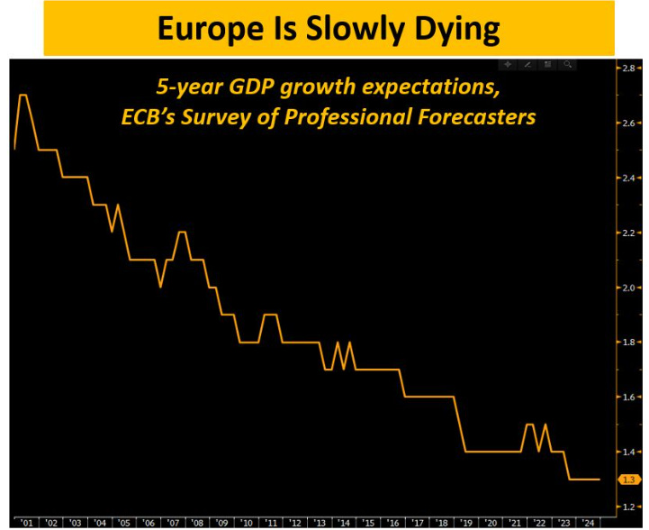
Macro Clouds On The Horizon
The key macro event of 2024 is approaching: US elections are around the corner.Next week I will release a deep research piece on US elections, which will be centered around the key questions looming large.How to trade different scenarios?What happens to markets if Trump secures a Red Sweep? And what asset classes to prefer if instead Kamala wins?This special election piece will be ONLY available to my private distribution list.Sign up for FREE here:Macro clouds remain on the horizon.Wherever you look at, you see unsustainable economic models: we are either relying on debt-fueled growth (US), trying to squeeze exhausted growth models (China), or succumbing to a slow and painful death (Europe).Today, let’s take a step back and talk about the business models that Europe and the US are pursuing.Let’s unpack them together, and understand what lies ahead and how to prepare portfolios accordingly.Europe is slowly dying.To prove my point, here is one of the most depressing chart you'll see today:The chart above shows an uncomfortable truth for Europe.ECB's Professional Forecasters now expect 5-year GDP growth in Europe to come in at only 1.3% - the lowest level ever.Prior to the Great Financial Crisis, this number used to be consistently above 2.0% in real terms.So while we are talking about the ''Roaring 20s'' for the US, and while we are watching countries like India perform particularly well we are left to answer some tough questions in Europe.Why is growth so low, and expected to remain so sluggish?1️⃣ An imperfect European infrastructure, and no improvement in sight: we run a ''union'' under one monetary policy, different fiscal policies, and without a banking or capital markets union.2️⃣ Poor productivity, and no structural reforms: while touted the whole time, European politicians are really not busy with reforms to structurally improve productivity. Over the last 20+ years, European productivity growth has been a meagre ~1% per year.The US is becoming increasingly more productive at a much faster pace:3️⃣ Bad demographics, and worsening;Low birth rates imply that Europe will see its labor force shrink by 25% (!) over the next 20-30 years:Not only that - it’s also a matter of putting people to work in the first place.In Italy, women labor force participation rate is not even at 60%.4️⃣ No appetite for true innovation, and instead an insatiable appetite for more and more regulationEurope is slowly dying.Yet markets are still in La-La Land.This week, the ECB cut interest rates once again but nominal rates remain still too high versus the underlying trend in inflation.As the chart below shows, Europe instead needs interest rates below (!) the level of inflation to have a monetary policy loose enough to stimulate at least some growth:The chart below is another way to picture this inconsistent bond market pricing.The long-run equilibrium nominal rate represents the nominal interest rate that allows an economy to operate smoothly and deliver its potential growth rate while inflation hovers around 2%.Think of it like the interest rate which ‘‘balances’’ the economy.Prior to the pandemic, the average pricing for the long-run equilibrium nominal rate in Europe was +0.5%.Today, it’s over +2.0%.What has changed in Europe so that the economy can structurally handle higher interest rates way better than before the pandemic?In my opinion: nothing.If anything, things look a bit worse now:Patient Europe is dying.Better make sure your portfolio is prepared for it.Let’s chat about the US economic model now.Here are some staggering statistics about the US economy - since mid-2020: 1) US nominal GDP has grown by ~7 trillion 2) US total debt has grown by ~8.5 trillion Debt-fueled economy, debt-fueled growth:Look at this excellent chart from E.J. Antoni. It shows how US nominal growth (blue) has increased less than the increase in federal government debt (red). If you add in private sector debt, the red bar crosses the 8 trillion mark.Should we worry about this debt-fueled growth model?Look: our monetary system is centered around debt/credit creation to sustain economic growth. There is nothing inherently bad about that, but the key is to use new debt to fund productive investments and reforms. We got worse and worse at that:As the chart above shows, for every new $ of debt we end up creating way less than a new $ of GDP growth! So: yes, the US economy has done incredibly well since 2020. But more than organic growth, this is once again debt-fueled growth.Whoever wins the US Presidential Elections, you can rest assured there will be more and more debt creation to try and fuel US economic growth.Can this model continue to thrive?I’ll cover this in next week’s flagship US election research piece.You can only access it registering at the link below.It’s FREE.Don’t miss it - register at the link below:This was it for today.I am counting on you to share the article with friends and colleagues so we can make The Macro Compass newslette
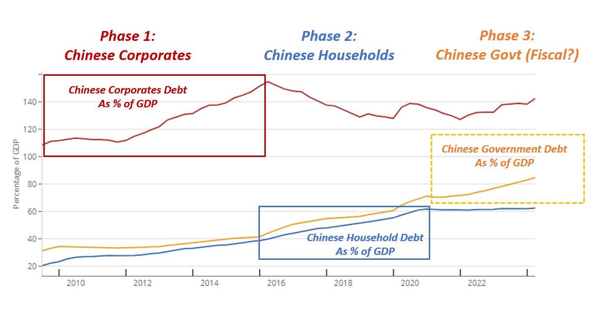
The Big Chinese Bazooka
The Chinese real estate market is de-leveraging very hard. Economists estimate Chinese households have suffered $10+ trillion of wealth losses as a result. There is now a strong urge to stop the bleeding amongst Chinese policymakers.Last week, China unleashed a ‘‘stimulus bazooka’’.But what were the measures all about?And will they be effective to fix the Chinese economy?Chinese policymakers announced the following package: A) More interest rate cuts B) The Chinese version of the ''Fed put'' C) Vague wording about fiscal stimulusInterest rate cuts and the ''backstop'' facility are propping the Chinese stock market to the moon. Yet they are very unlikely to work in a balance sheet recession. In the 90s, Japan cut rates aggressively and that wasn't the solution to the problem:Cutting rates won’t encourage households or corporates to leverage: corporates were tapped out in 2016 already, and households have just been burnt with excess debt so we shouldn’t count on them.Lowering interest rates in combination with the new ‘‘PBOC Put’’ can instead help reinstate animal spirits.Chinese authorities set up a BTFP-like facility which allows you to pledge collateral (cash, bonds etc) and get funding to go and buy Chinese stonks.Yet, this is unlikely to solve the structural malaise affecting the Chinese economy.Fiscal is the only real fix, and here is why. There have been 3 key phases of Chinese leverage: 1) Corporates (red) 2) Households (blue) 3) And now fiscal is the only solution (orange) 10 years after entering the WTO in 2001 and once the demographics dividends were exhausted, China embarked in massive leverage to sustain their growth targets. Phase 1 saw Chinese corporates (red) tap up leverage aggressively (2010-2016). Once corporates’ appetite for debt was exhausted, Xi Jinping tapped Chinese households (phase 2). This led to the creation of a massive real estate bubble which China is trying to deflate now. The only agent left to pick up the slack is the Chinese government – fiscal deficits are key here (phase 3?).So while the ''bazooka'' has been excellent at restoring market confidence, there is only one real fix for the Chinese economy here. It's a large, large fiscal stimulus package.Will China actually implement it?Reuters ran a piece discussing a $284 bn fiscal package.This would be very much unlikely to sort things out.Size matters here: consumers and corporates have been hit by a $10 trillion de-leveraging in the housing sector, and so the fiscal stimulus needs to be large and targeted to make the difference for the Chinese economy.While we keep monitoring any concrete announcement on fiscal stimulus from China, it’s worth remembering how Chinese policymakers love a ‘‘counter-cyclical’’ Bazooka:China loves to stimulate (for real) when the global economy is weak. This way, they can get the best ROI on their money creation and go buy cheap foreign asset/strengthen their trade position/gain shares in crucial markets. Until the global economy slows down further, China might not be interested in proper stimulus but rather in ''controlling the bleeding'' and get investors occasionally stopped out in their China shorts - a story we've seen happening for 18 months already.China matters for the world.China needs a large fiscal stimulus.Large. Fiscal.These are the two key words you should be focusing on.If you enjoyed this piece, feel free to share it with a friend:And remember: my macro hedge fund Palinuro Capital goes live next week!If you are a professional investor and you wish to remain updated on my fund, from now onwards you can only do that if you access my private distribution list.To remain updated on my Macro Hedge Fund, please leave your info here.This is your last chance.It only takes 2 minutes. This is a public episode. If you would like to discuss this with other subscribers or get access to bonus episodes, visit themacrocompass.substack.com
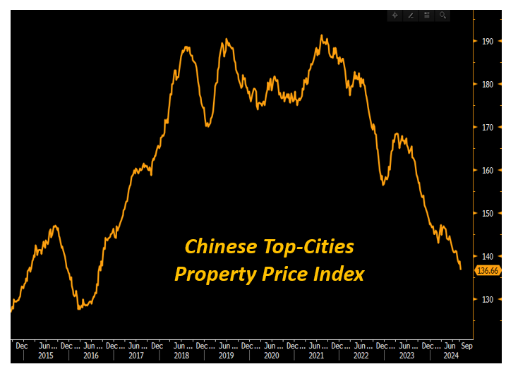
China Is Imploding
The news of the week is NOT the Fed cutting 50 bps - yes sure, that’s important but there is something much more relevant going on.The Chinese economy keeps imploding from within.And we should pay attention.The Property Price Index for Chinese tier-1 cities keeps making new lows, and it’s now approaching levels last seen 8 years ago!At this point you might ask yourself: well, is it so bad if house prices drop a bit?In standard circumstances I’d tell you this is not a disaster.But for Chinese people, things are different:Chinese households hold 60%+ of their wealth in Chinese properties.This is way higher than in the US, where households only hold 23% of their wealth in properties while the majority sits in the stock market or retirement plans.Now imagine if your stock portfolio dropped back to 2016 levels.How would you feel about it?That’s how Chinese households are feeling!But why is China imploding this fast?It’s because Xi Jinping wants to engineer a new ‘‘common prosperity’’ economic model which relies less on leverage, tech bubbles, bridges in the middle of nowhere and frothy house prices and more on internal consumption.The problem is that when you deleverage a 50 trillion (!) worth real estate market inflated with absurd levels of leverage…well, that’s not an easy task to achieve.China is cutting interest rates aggressively to try and limit the slowdown: Chinese 10-year interest rates just dropped below 2% for the first time..ever?Yet cutting interest rates while the real estate market is deleveraging won’t help much.Ask Japanese people in the 1990s for reference:China keeps imploding from within and this matters for the rest of the world.For example, China is the number 1 trade partner for many countries and for specific jurisdictions it represents a very large importer for the commodities they produce.See Brazil for instance:Everybody is talking about the Fed.But the real macro mover to watch here is China.Keep it on your radar!And of course - who am I not to spend a few words on the Fed as well.This week's 50 bps cut was initially celebrated by markets: after all, if the Fed proceeds with such a sizable cut what's not to celebrate?The problem with such a simple narrative is that the Fed's monetary policy needs to be measured against the underlying growth conditions.Fed Funds at 4.75% can be:- Still loose: if the US economy is running ultra-hot- Still tight: if the US economy is rapidly weakeningIn other words: the monetary policy looseness/tightness needs to be measured taking into consideration the ongoing economic conditions.The chart above does just that, and it compares Fed Funds (orange) with the underlying trend of US nominal growth (blue).The US nominal growth proxy is built using core PCE - the Fed's official target for inflation - and the NBER gauge for US real economic growth.Why the NBER gauge and not real GDP?Because the NBER is the body that ultimately determines whether the US is in a recession, and they do so using a broad basket of 7 indicators tracking every sector of the US economy (from consumers to industrial production to the labor market).The outcome of this analysis is straightforward.There is nothing to celebrate.The Fed's policy is still dangerously tight.As you can see, it only rarely happens that Fed Funds (orange) sit close or even above US nominal growth (blue) for a prolonged period of time.And when that happens, it's never good news for the economy.The Fed needs to do more.Or it risks falling further behind the curve.And now, some big news - adding even more value for you…FOR FREE!If you enjoyed this piece, you should know I launched a YouTube channel for my weekly show The Macro Trading Floor with Brent Donnelly.Every week we discuss a ton of macro with supporting charts, trade ideas, and trading/risk management education.Click below to watch our first video which just went online: I appreciate you!Please share this post with a friend/colleague if you want to support my workEnjoy the weekend, and don’t drink cappuccino after 11am. This is a public episode. If you would like to discuss this with other subscribers or get access to bonus episodes, visit themacrocompass.substack.com
This is a True Regime Change
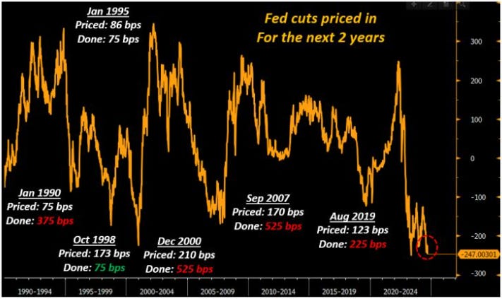
We are observing a true regime change in markets.And for macro investors, it’s incredibly important to stay vigilant and on top of our game at this stage.It all starts with this: the Fed is behind the curve, and it is playing with fire.Consider this.The recently released US job report showed the US private sector is only adding an average of 96,000 jobs per month over the last 3 months.Such a weak pace of job creation has last been seen in summer of 2007.The last CPI report also showed another friendly and disinflationary print: core CPI raised less than 0.2% on a MoM basis which is a trend in line with pre-pandemic ~2% yearly inflation trend the Fed targets.So, why is the Fed playing with fire?The chart below shows you why.Fed Funds at 5.25% while core PCE is convincingly sub-3% represent a real Fed Fund rate of 2%+.Real rates are what matter for the economy:* Investors care about their (risk-free) returns after accounting for inflation* Debtors care about their inflation-adjusted borrowing costsWith real rates now at 2%+ for quite some time, it's important to look back at past episodes and see what happened when the Fed forced such a tight policy for too long:A) In 1999-2000, the Fed kept real rates at 3%+ for a sustained period of time and a crisis unfolded in 2001;B) In 2007, the Fed kept real rates at 2%+ for a while and a crisis unfolded in 2008;C) In 2024, the Fed is keeping real rates at 2%+ and...you get it.On top of this, the Fed is also keeping policy very tight while the US job market is showing clear signs of weakness.The Fed is behind the curve, and it is playing with fire here.And when this happens, the bond market takes over.The chart above goes back to 1989 and it looks at the amount of rate cuts/hikes bond markets were pricing for the subsequent 2 years.I focused on periods when the bond market was very, very dovish and it priced in a robust amount of cuts.The big question is: what did the Fed ACTUALLY deliver?Did one make or lose money by buying bonds when markets were already super dovishly priced?Let's look at the data:1️⃣ January 1995, October 1998Cuts priced for the next 2 years: on average 130 bpsCuts delivered by the Fed: 75 bpsIf you bought bonds while markets were already at peak dovish pricing, you lost money (cuts delivered were less than priced in).2️⃣ January 1990, December 2000, September 2007, August 2019Cuts priced for the next 2 years: on average 145 bpsCuts delivered by the Fed: 412 bps (!)If you bought bonds while markets were already at peak dovish pricing, you ended up making a ton of money.The results are very interesting. As a rule of thumb, I always advocate that in macro you don’t make money by only ‘’being right’’. That’s a necessary but insufficient condition: you also need to surprise consensus, or in other words see something before the crowd does + position correctly for it + monetize when they converge to your view.Yet it seems like the bond market is quite good at sniffing when something is about to go wrong.The bond market is sending a loud message: are you listening?But it’s not only about the bond market here.It’s also about cross-asset correlations suggesting tectonic shifts are happening:We are witnessing a massive regime change in markets.Recently we experienced another large drawdown in equity markets lead by tech stocks - specifically, NVDA stock prices dropped by almost 10% in a single session.But the big news for investors is that bonds have started to exhibit one of their key features again.For the first time in a few years, bonds are acting again as a hedge against stock market drawdowns.Or in other words: after a period of positive correlation which wrecked 60/40 portfolios, the stock/bond correlation is turning negative again.This is a huge deal.The chart above shows the 6-month (120 trading days) correlation between the S&P500 and 10-year Treasury future prices.The correlation was negative for most of the last 15 years: this means investors could count on bonds acting as a diversifier during periods of equity drawdowns. But as you can see from the chart, this wasn’t always the case: for most of the ‘80s and ‘90s bonds and stocks were doing pretty much the same thing at the same time – they were positively correlated. The same happened in 2022-2023 as inflation was out of control.Hear me out now, because this is the key message you should bring home.When the stock/bond correlation changes sign, we are looking at tectonic macro shifts with huge implications for cross-asset portfolios.This is because ''bad news is good news'' doesn't work anymore.The market has switched into a regime in which:Bad news is actually bad news.Once bonds start acting as a diversifier for risky assets, it's likely we are on the verge of a massive regime change in macro and markets.Macro tectonic shifts are happening.The launch of my Macro Hedge Fund is now imminent.If you are a professional investor and you wish to remain updated on my fund, from now onwards you can on
Panic Monday! (What Now?)
We just witnessed one of the biggest market panic events ever seen in the last 4 decades.At some point, Asian markets were down 10%+ in a single session and the Japanese bank index saw the largest daily loss since Black Monday in 1987.During such panic events, it’s important to remember three crucial rules:* Markets can remain irrational longer than we can stay solvent;* Opportunities abound, but it’s crucial to structure trade ideas and investments in a way that can allow us to sleep at night;* Keep following your process.But first: let’s understand the nature of this gigantic liquidation event.Is it happening because a recession is now inevitable?If this time isn’t different, the recession playbook is unfolding correctly:* The Central Bank raises rates aggressively;* Markets signal conditions are too tight: the yield curve inverts* The curve stays inverted for 12-27 months (!)* The economy slows* A late-cycle yield curve steepening (!) happens* Finally, a recession occursThe chart illustrates this sequence by setting the x-axis counter at 0 once the 2-10 year yield curve slope inverts, and marking in red the onset of a recession (private non-farm payrolls increasing by 25k or less on a 3-month moving average basis).Notice how the ’89-90s, 2001 and 2008 recessions all followed a prolonged inversion, and all occurred only once the curve had disinverted (green vertical dotted line).But the crucial point here is this.Markets are pricing us close to step 6.Yet data shows we are still at step 4-5.In other words: the move comes a bit from fundamentals, and a lot from panic.Private job creation in the US still averages ~150k/month today (left chart, blue) while in the months preceding the 2001 and 2008 recession we were creating only 0-50k jobs/month (right charts, red).And while it’s true that today the US population is bigger and the labor force is expanding rapidly, one can argue that macro data only justifies a portion of the panic move we saw recently.Just to give you a sense of the panic: the bond market is now pricing 5+ cuts over the next 3 meetings, and some odds of the Fed being forced to deliver intra-meeting emergency cuts.For reference, as we walked into the 2001 recession and the 2008 Great Financial Crisis, the Fed did this:Markets are now pricing 50 + 50 + 25: something of a middle ground between the 2001 recession and the late 2007 Fed cuts heading into the GFC.To visualize the panic reaction in bond markets, this is the chart that shows the market-implied probabilities that the Fed will cut by 50 bps 3 times in a row = full recession mode:Ok, so we have:* Asian indexes recording their worst 1-day loss since Black Monday in 1987;* The Nasdaq down 16% in 16 trading sessions (* Bond markets pricing a full-fledged recessionary Fed cutting cycle in the next 3 months.Yet macro data are not fully justifying this panic (yet).So what’s going on? Why is this happening?And also: here are 2 macro trade ideas to benefit from this market panic! This is a public episode. If you would like to discuss this with other subscribers or get access to bonus episodes, visit themacrocompass.substack.com
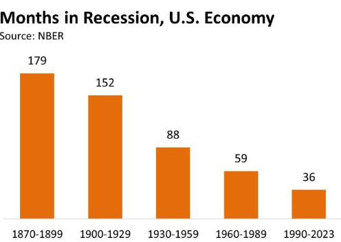
Macro Volatility Is Coming
The S&P500 realized volatility is below 10%.Credit spreads are super tight, and aside from some short-lived European political drama markets keep marching higher.Yet, I think macro volatility is coming back.First of all: we are suppressing economic cycles, injecting an artificial equilibrium which will only make the system more fragile in the long run.We are not allowed to have a recession anymore.This great chart from Prof. Lee Coppock shows the number of months the US economy spent in recession in 30-year periods starting from the 1870s until today.The message is pretty clear: our economic system has become much more stable, as we spend less and less time in recessionary conditions.But why?I would say there are 3 main reasons:1️⃣ Geopolitical stabilityNot rocket science here, but by having less systemically important wars you are going to have way more financial and economic stability2️⃣ The shift from a Gold standard to a fully elastic Fiat Money systemThe Gold Standard works by pegging the fiat currency to a fixed, hard asset whose supply can't be expanded - gold.Doing that reduces the odds of rapidly expanding or devaluing fiat money over time.But the flipside to the Gold Standard is exactly that: by not allowing for a rapid expansion of fiat money creation when needed (i.e. to stabilize the economy during recessions), you will end up with more volatile economic cycles and hence spend more time in recession.The Gold Standard had benefits but also downsides, and after the 1970s we migrated towards a fully elastic Fiat Money system.But this meant that...3️⃣ Policymakers try hard to ''cancel'' the concept of recessionsBeing able to expand fiat money creation in a fully elastic way is great, but politicians can abuse this system.This leads to where we are today: policymakers are trying hard to erase the concept of a recession altogether.But in a capitalistic system, that doesn't work!The side-effect of suppressing natural economic cycles is that productivity levels will decline rapidly (think of zombie companies), and most importantly as Minsky once said: (Artificial) Stability is Destabilizing.Recessions should be part of a standard economic cycle, where the system is allowed to ''cleanse'' and re-start stronger than ever.Yet, also this time policymakers have chosen to artificially stabilize the economy.This chart explains why the Fed hiked rates above 5%, and yet the US economy doesn't break.The last time Fed Funds were raised aggressively towards 5% and kept there with a long, hawkish pause was in 2006-2007.And clearly something broke then: the US housing market, which broke havoc in the banking industry too and generated the biggest financial crisis in the post WWII era.But there is a key difference between now and then.The big money expansion in 2005-2007 was Credit-Driven. Today, it’s Fiscal-Driven.Economies grow above-potential if new money is getting created in large size: this can be done via the government with generous pro-cyclical fiscal stimulus (today) or via private sector credit (bank lending, etc).And if brought to the extreme, these two sources of money creation lead to different imbalances over time.In 2005-2007, money creation was all about private sector borrowing (blue): the US private sector leveraged up a lot to chase the housing bubble via the subprime mortgage and credit market engines.Back then, the government wasn’t a large contributor to money creation.In late 2007, the housing market cracked under the pressure of excessive private sector leverage.When private sector credit as a % of GDP rises uncontrollably you often get a Credit Event – or basically: ‘’something breaks’’.The Japanese and Spanish real estate bubble, the Asian Tigers fever, the US housing bubble, or China today.Ok, sure - but today the story is different.Private sector credit isn’t the source of excessive money creation and instability - the US private sector has actually de-leveraged since 2008!Instead, it's all about government deficits!Today, the story is different: the scale of government deficits (orange) in 2020-2021 was enormous, and that was by far the main driver of money creation which is still circulating in the economy.We also got another fiscal shot in 2023, while private sector credit (blue) has been moderating for 2 years now.This means the risk this time isn't necessarily that ''something breaks'', especially in the US. The risk is that the US government keeps throwing fuel on the fire, and it might end up re-accelerating inflation and make the macro cycles more volatile.Which brings me to the real source of upcoming macro volatility: US elections.Since the Presidential debate, the Bond Market has been sending an interesting signal.As the debate ended, Biden's underperformance led to a sharpe increase in the odds that Trump might be the next President.These odds have now further increased after the terrible events of the weekend.The bond market didn't take long to respond.The yield curve has bee
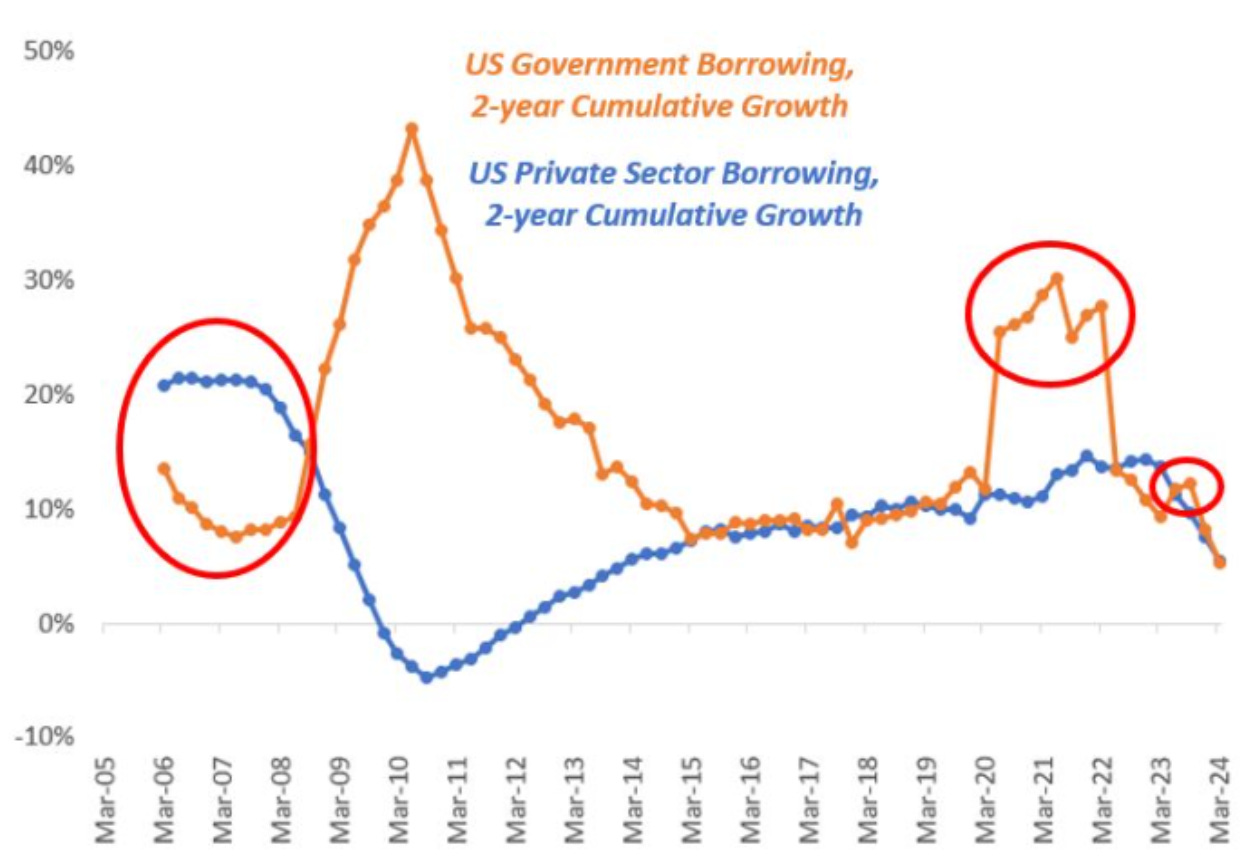
Why Doesn't The Economy Break?!
The Fed hiked rates above 5%, and yet the US economy doesn't break.Back in 2022 already, the yield curve inverted and it has stayed inverted ever since.The lags looked relatively short, and the US economy was going through a soft patch in 2023 when it became consensus that a recession was gonna happen.Something even broke in markets (regional banks), and yet nothing really happened.Here is why.High interest rates are supposed to break something because an overly indebted economy will have to service a mountain of debt at expensive rates and it will have less money for income and spending. The problem is that people are looking at the ''wrong'' debt.Private sector debt levels and trends are far more important than governmment debt.Contrary to the government, the private sector doesn't have the luxury to print money: if you get indebted to your eyeballs and you lose your ability to generate income, the pain is real.As Dario Perkins' chart shows, the biggest financial crisis happened as a result of high and growing private sector debt. The Japanese or Spanish house bubble bursting, the Asian Tigers, or China today are clear examples.And this is why we need to look at Debt Service Ratios.Debt service ratios measure the amount of disposable income which is used by non-financial corporations and households to service their outstanding debt payments.This is a crucial metric because it efficiently visualizes the pass-through of monetary policy tightening on the private sector.The US debt service ratio is going up but only slowly: it sits at 15% which equals its long-term average. There are really four ways Debt Service Ratios can move up fast:* The economy sits on a mountain of private sector leverage;* A large share of private sector debt (mortgages and corporate bonds/loans) is based on variable rates, hence as the Central Bank hikes households and corporates are immediately faced with higher debt servicing costs;* A large share of private sector debt works with interest rate resets, so in a short period of time all these debts will have to be reset at higher rates;* A large share of private sector debt is due for notional refinancing soon (e.g. a large maturity wall)It’s safe to say the US doesn’t face much of these 4 problems: private sector debt as a % of GDP is lower than 2007, loans and mortgages are mostly on fixed rates with no short-term resets, and maturity walls are gradual.But what about other countries?I looked at some of the major economies in the world and found that:- Australia- Canada- Korea- Sweden Are all under pressure: their DSRs are high in absolute terms and higher than their 20-year average, and the trend is also negative as they keep increasing over time.For example Sweden just cut interest rates under the pressure coming from higher debt service ratios.The US instead sits at a more reasonable ~150% of private debt/GDP and its private sector will take longer to feel the pain from higher interes rates.Think of the US in 2007 and how different the US economy is today.Back then the housing market cracked under the pressure of excessive private sector leverage and the Great Financial Crisis ensued.Today, the story is different: the scale of government deficits (orange) is enormous, but private sector credit (blue) is not roaring.Private sector credit isn’t the source of excessive money creation and instability - the US private sector has actually de-leveraged since 2008! Instead, it's all about government deficits today.And in short, this is why high interest rates and an inverted yield curve haven’t broken the US economy yet.Yet slowly but surely, a few cracks are appearing under the hood:If you lose your job today, it’s quite hard to get one back in a short period of time: therefore, you’re likely to be classified as a permanent job loser.The share of US permanent job losers as a % of the total labor force is increasing: companies facing 7-8% refinancing rates on their loans/bonds are reducing their spending and slowing their hiring intentions, hence cooling the job market.The US economy hasn’t broken so far.But if the Fed keeps rates high for a long enough period of time, they will eventually succeed.Thanks for reading!If you enjoyed this piece, let me know by smashing that Like button.And feel free to share it with friends and colleagues! This is a public episode. If you would like to discuss this with other subscribers or get access to bonus episodes, visit themacrocompass.substack.com
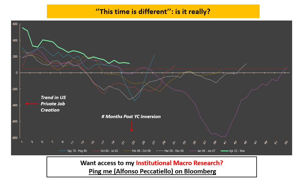
Yield Curve 101
When the yield curve flattens and eventually inverts, you worry.But it’s when a recession hits, the Fed cuts rates and the curve steepens that you become s**t scared.Yield curve dynamics represent a crucial macro variable, as they inform us on today’s borrowing conditions and on the market future expectations for growth and inflation.An inverted yield curve often leads towards a recession because it chokes real-economy agents off with tight credit conditions (high front-end yields) which are reflected in weak future growth and inflation expectations (lower long-dated yields).A steep yield curve instead signals accessible borrowing costs (low front-end yields) feeding into expectations for solid growth and inflation down the road (high long-dated yields).Rapid changes in the shape of the yield curve at different stages of the cycle are a key macro variable to understand and incorporate in your portfolio allocation process.Hence, in this piece we will:* Quickly walk you through the different yield curve regimes (i.e. bull steepening, bear flattening etc);* Assess these curve regimes within the growth environment, and derive important cross-asset macro signals;* Take a look at today’s yield curve regime.There are 4 main yield curve regimes to consider:* Bull Flattening = lower front-end yields, flatter curves.Think of 2016: Fed Funds already basically at 0% and weak global growth. Yields stay put at the front-end and could meaningfully move lower only at the long-end, hence bull-flattening the curve.* Bull Steepening = lower front-end yields, steeper curves.Late 2020, early 2021: the Fed was keeping rates pinned at 0% and stimulating via QE but the economy was flooded with fiscal stimulus and ready for reopening. The friendly borrowing conditions and the massive upcoming growth boost could mostly be reflected through higher long-end yields, while 2-year interest rates were pinned at 0% by the Fed. Bull-steepening of the curve.* Bear Flattening = higher front-end yields, flatter curves.2022 was the bear flattening year: Powell raised rates aggressively to fight inflation, but he ended up choking the economy off. This was reflected in lower future growth and inflation expectations at the long-end of the curve. Front-end rates went higher, but the curve bear-flattened.* Bear Steepening = higher front-end yields, steeper curves.Do you remember 2009? The worst of the GFC was behind us and (monetary-mechanics-illiterate) investors were afraid that QE would lead to runaway inflation and the Fed would be forced to start acting on it. Front-end yields moved a bit higher, but long-end yields took most of the hit as investors (mistakenly) bumped the inflation risk premium up = the curve bear-steepened.Rapid changes in the shape of the yield curve when growth is at turning points are a key variable to consider for a successful asset allocation process.Here is a Yield Curve Cheat Sheet you can use:Let’s see some quick examples.In 2024 the yield curve has mostly bear flattened while economists were busy revising growth prospects higher.👉 Take a look at ''Growth Up + Bear Flattening''.What does that imply, and what asset classes benefit the most from this combination?1️⃣ Cyclical stocks 2️⃣ CommoditiesIn an environment where growth is moving higher and the market is busy repricing away cuts (= the curve bear flattens as rates move up mostly at the front-end), the ''Old Economy'' does well: value, cyclical, energy-related stocks deliver solid performance as the growth cycle is re-rating higher.And these sectors don't need lower rates to thrive: they just need strong economic activity.But now let's take another example: what if growth slows down, and the Fed is forced to cut rates faster?👉 Take a look at ''Growth Down + Bull Steepening''.Well, in that case cyclical stocks and commodities actually do poorly.The yield curve bull steepens as the Fed is called to urgently cut interest rates because economic conditions are deteriorating.As you can see, understand yield curve dynamics in the context of the growth setup can provide with important cross-asset macro signals.But where are we today?The chart below shows the trend in US private job creation (blue) in the months following a persistent yield curve inversion. The red colored area is consistent with the onset of recessionary conditions, and the green dotted line signals a dis-inversion of the curve.See the pattern: 1) Every recession since the 1970s was preceeded by a yield curve inversion 2) The timing between the initial inversion and the start of a recession varies: in the early 80s or 2000s recession it was as little as 12 months, while in 2008 it took 27 months (!) for the macro lags to appear 3) Today the yield curve has been inverted for over 20 months and counting, and private sector job creation has slowed down a lot.A potential dis-inversion right here (green dotted line) would be the last step in the historical recessionary sequence.The US economy has proven to b
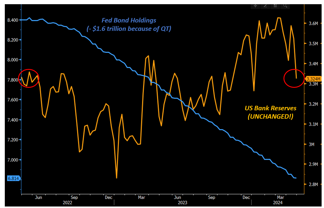
Tectonic Macro Shifts
Hey, this is Alf - welcome back to The Macro Compass!Last week was big for macro and markets.Today’s piece is going to cover:* The Fed’s dovish announcement: a sizeable tapering of their Quantitative Tightening program;* A potential upcoming shift in market dynamics: for the first time in a while the reflation thesis was challenged by a weaker suite of data clashing versus the very optimistic 5% economist expectation for 2024 US nominal GDP growth;''Beginning in June, the Committee will slow the pace of decline of its securities holdings by reducing the monthly redemption cap on Treasury securities from $60 billion to $25 billion.''With this sentence, the Fed announced the tapering of their QT program last week.The Federal Reserve has been running QT (Quantitative Tightening) since mid-2022: this process is aimed at unwinding the multi-trillion Fed bond holdings accumulated during previous QE episodes.The Fed doesn't sell bonds back to the market, but it merely allows them to roll over its balance sheet without reinvesting the full maturing notional.Summing up Treasuries and other bonds, the Fed was allowing $95 billion of bonds (60bn USTs + 35bn MBS) to roll-over its balance sheet each month.To be more accurate though, QT was actually running at about ~75bn/month.That’s because the loans underneath the Mortgage Backed Securities (MBS) sitting on the Fed balance sheet are being repaid slowly due to high interest rates hampering mortgage refinancing activities, and so MBS maturities are only ~15bn/month.See this excellent chart from Michael Gray:In any case, after Wednesday’s announcement QT will be running at roughly half (!) its previous pace: from ~75bn/month to about ~40/bn month.Why does it matter?This is a positive surprise for markets because it means the Fed will be doing more work to absorb the Treasury bond issuance planned over the next quarters to match the approved deficit spending.It means pension funds, asset managers, banks and other institutions are required to absorb this heavy-duration bond issuance to a much more limited extent.And the portfolio rebalancing theory suggests that private investors with more balance sheet and risk-taking capacity will reallocate some of that towards riskier assets like credit or stock markets.Also, a more measured QT pace implies an even slower drainage of reserves (aka ''liquidity'') from the interbank system.But since mid-2022, despite QT shrinking the Fed’s bond holdings by $1.6 trillion and counting the amount of bank reserves (‘‘liquidity’’) is literally unchanged:This is because we are witnessing QT Sterilization.The $1.6trn of bank reserves (''liquidity'') QT was supposed to drain were sterilized by a liquidity injection elsewhere.That elsewhere is due to Money Market Funds (MMF) draining down the Reverse Repo (RRP) Facility to buy the avalanche of T-Bills issued by the US government.As a result, US banks were not asked to step in and buy bond issuance amidst QT - the standard mechanics by which QT reduces reserves.Instead, QT has been effectively sterilized via T-Bill issuance absorbed by MMF draining the RRP.The Fed is being very prudent and risk-adverse with this early and aggressive move in reducing the pace of QT as they are scared of a 2019 repeat when a low amount of reserves in the system caused a blow-up of repo markets.But interbank liquidity isn’t low, and reserves aren’t nearly getting scarce.The Fed just went ahead with a proactively dovish monetary policy announcement.Which begs the following question.Will they also replicate such a proactively dovish stance when it comes to interest rate cuts and start their cutting cycle in summer despite the inflation comeback we witnessed in the first quarter?Basically: is the Fed Put back?A Fed Put refers to the setup where Powell virtually sells put options on the S&P500 – effectively putting a floor under risky assets. The Fed would achieve that by signaling a very dovishly skewed Forward Guidance: ready to proactively ease at the first signs of weakness, while not tightening if growth or inflation pick up.This dovish reaction function was prevailing for most of the 2013-2019 period.The Fed would ''have the markets' back'' and investors would know that at any sign of economic weakness, a big easing would be around the corner.But when the economy or inflation accelerated, the Fed won't react hawkishly but rather ''let the economy run hot''.Now, picture the US economy running at a 5.8% nominal GDP growth with economists expecting growth to remain at or above 5% for quarters ahead.The last time this happened was in 1996-1998 and 2004-2006:And now picture Powell refusing to talk about hikes at the press conference, but only focusing on potential downsides ahead to discuss when (not if) the Fed is going to cut.Doesn’t that look like a Fed Put?And why would the Fed risk such a proactively dovish reaction function - are they not afraid growth and inflation might pick up further as a result?Well: maybe it
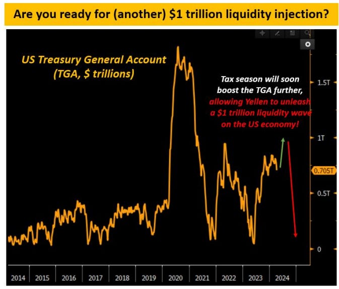
A Trillion (Dollar) Reasons
Here is a trillion (dollar) reasons why the US economy is likely to hold up until elections: between now and then, Yellen is likely to drain the Treasury General Account (TGA) and unleash a wave of almost $1 trillion liquidity on markets and the economy.In a second, I am going to walk you through the mechanics of the TGA drainage and its impact on markets. But before we do that, it’s important to take a step back and reflect on this: mastering the mechanics of the various monetary plumbing operations like QE, QT, fiscal deficits, RRP and TGA refill/drainage will provide you with a sizeable edge as a macro investor over the next decade. And that’s why today I am proud to announce the TMC Monetary Mechanics Course!3+ hours packed with monetary plumbing examples explained step-by-step so you can become a master at understanding how monetary mechanics works. The pitch is simple: * Once you buy the course, you can watch the lessons and download the material whenever you want;* You should buy it NOW, because I am offering a fat 50% off which is only valid until Sunday 28th! Use the discount code ‘’MONEY50OFF’’ at checkout and become a monetary plumbing master for only € 249.5. You can take advantage of the discount and buy the course HERE.And now, back to the piece.Nominal incomes are growing at 6%, and real GDP is crusing nicely around 2%.The labor market still holds okay, and there are no clear signs of broad economic weakness.How can we square this with one of the most aggressive hiking cycle in history which brought Fed Funds above 5% for almost a year and counting?! The answer lies in private sector balance sheets and fiscal stimulus.Higher interest rates generally slow down economic activity: corporates and households face higher debt servicing costs and therefore they must cut capex/hiring/spending to allocate more resources to debt servicing. Lower spending = the economy slows down.In other words: higher rates tend to negatively affect the liability side of private sector balance sheets. But what if this time that’s going to take much longer, and in the meantime the opposite is happening?Here is a very simple, stylized households balance sheet: bank deposits, stocks and T-Bills on the asset side and loans or mortgages plus net worth (equity) on the liabilities side. What’s been happening lately?* Continued fiscal stimulus: cheques and lower taxes increased the private sector net worth;* Higher rates provide an additional income boost: households and corporates can park money at 5% T-Bill yields and harvest the benefits of higher rates;* Higher rates are not affecting debt servicing: Fed Funds at 5% are less scary if households run on 30-year fixed mortgages and corporates have termed out their debt.Here is how the US Private Sector Debt Service Ratio looks like today: yes it’s going up but slowly if you compare it to the fast and vicious Fed hiking cycle.The main reasons for this slow pass-through are: A) Long-dated mortgages and corporate borrowing, meaning very slow refinancing cliffs hitting households and corporates so far;B) A low share of floating rate mortgages and corporate loans which limit the pass-through from higher Fed Funds;So, if the private sector is temporarily shielded from higher borrowing costs but enjoying the benefits of higher interest rates and continued fiscal injections……one could make the funny argument that higher rates are stimulative?!Such ‘’creative’’ arguments are generally heard at local tops in market and economic euphoria: soft landing headlines were popular in the second half of 2007, and with 5% 10-year yields in October 2023 we had a CNBC special on why yields were headed to 13%. But it’s hard to fight back against the private sector balance sheet plus fiscal argument presented above. In particular, while you can make the counter-argument that sooner or later the refinancing cliffs will start to bite and debt servicing costs will ultimately increase it’s much harder to fight against the fiscal largesse point. And that’s why today I’ll present a trillion (dollar) reasons why this economic and market regime might continue for another 6 months until the US election kicks in.Over the next 6 months, we might experience (another) huge liquidity injection in markets and the economy! How? By having Yellen drain the Treasury General Account (TGA). You can think of the Treasury General Account (TGA) as the checking account the US Government holds at its bank - which is the Federal Reserve. Every time the US government has accumulated excess money through taxes or bond issuance that it doesn't intend to immediately channel into spending, they will park it at the TGA account at the Fed.As you can see from the chart above, the TGA generally sits around 250-350 USD billions and it occasionally increases towards USD 1 trillion only to be subsequently drained back to its standard size. After the ongoing tax season, Yellen will soon have around USD 1 trillion in the TGA - that's quite
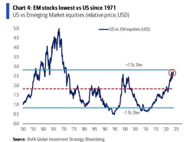
Do You Own These in Your Portfolio?
If you have been around for the last 10 years as a global macro investor you have experienced a situation where the US stock market was pretty much the only game in town. Since 2010 US stock markets largely overperformed Emerging Markets:In the investment world, recency bias is strong and people assume this has always been the case. Yet taking a 70+ years historical perspective the evidence is much more mixed: for instance, the chart above shows the impressive EM outperformance in the 70s-80s or the early 2000s.The next decade is likely to see a multi-polar world with geopolitical fragmentation, a bigger role for commodities, ongoing demographics and political shifts and increased US inflation and growth volatility. All these factors point to same conclusion: owning Emerging Market exposure in a long-term macro portfolio is a sensible thing to do. Yet Emerging markets were (and still are) seen only as an exotic addition to portfolios: a 2020 survey by Morningstar shows only 7% of global portfolio allocations are dedicated to Emerging Markets. For reference, EMs represent about 15% of the MSCI All Country World Index (ACWI) and account for almost 40% of global GDP!In other words: suffering from recency bias, global investors are largely under-allocated to EMs despite reasonable valuations and macro conditions in place for solid returns over the next decade. Ok, but which Emerging Markets to invest in and why? This article provides you with a framework to approach long-term EM investing, and it points to three of my favorite Emerging Markets to own for the next decade. We assess the most palatable Emerging Markets to invest in through fundamentals and valuations: countries with the best fundamental score and cheapest valuations make it to the shortlist. The focus is on EMs where sufficiently accurate data is available.The scoring model on fundamentals is based on 4 main pillars: * Economic growth (25% weight)* Institutional credibility (25% weight)* Leverage (25% weight)* External vulnerabilities (25% weight)Here is the summary table on fundamentals:Structural growth is a function of productivity and labor force growth – both are used in our analysis. We also look at the last 10-year average realized GDP per capita as a concrete measure (not a forecast) of recent economic performance in each EM – remember take the Chinese number with a pinch of salt.Eastern Europe (Poland, Hungary) and some Asian countries look good, while an ageing population and uneven allocation of resources in Brazil and South Africa don’t look promising for growth.Countries can grow organically but they can also make productive use of leverage to boost growth: for this reason private and public debt are both part of our assessment.China is pretty much tapped out on leverage, and some other Asian countries (Thailand, Malaysia) also score poorly – recency bias again as the 1997 crisis seems to have been quickly forgotten? On the other hand Indonesia, Mexico, Poland and Turkey have leverage space to boost growth going forward.Now a crucial point: investors hate volatility and unpredictability.Organic or credit-driven growth matters, but institutional credibility is key for investors: a 2015 paper from Lehkonen shows how political instability is negatively correlated with long-term EM returns. To assess institutional credibility we have blended four relevant World Bank indicators (government effectiveness, regulatory quality, rule of law, and political stability) into one index and ranked EM countries.Additionally, we reckon investors also assess policymakers’ credibility by their ability to keep inflation in predictable ranges – countries with the highest inflation volatility tend to be penalized by investors. We have therefore also ranked countries by their 10-year average standard deviation of CPI prints.Combining these two metrics the worst performing countries are (unsurprisingly) Turkey and Argentina, while ex-China Asian countries rank well – particularly Malaysia and Indonesia given their predictable inflation ranges and good institutional frameworks.Finally, it’s important to recognize that most EM countries have external vulnerabilities: either they owe to the rest of the world through a negative current account or through a net negative investment position (NIIP). Against this backdrop, EM countries will own a buffer of foreign exchange reserves (mostly USD and EUR) they can use to balance out their external vulnerabilities: we measure how many months of imports can be covered by the amount of net FX reserves each country has.Turkey is notoriously vulnerable to external shocks, while China has amassed a gigantic amount of net FX reserves – actually even more than publicly disclosed.It’s now time to blend together the fundamentals and valuations so we can derive actionable conclusions.The x-axis represents the country fundamental score: right is good, left less so. The y-axis looks at equity market valuations: up means cheaper valu
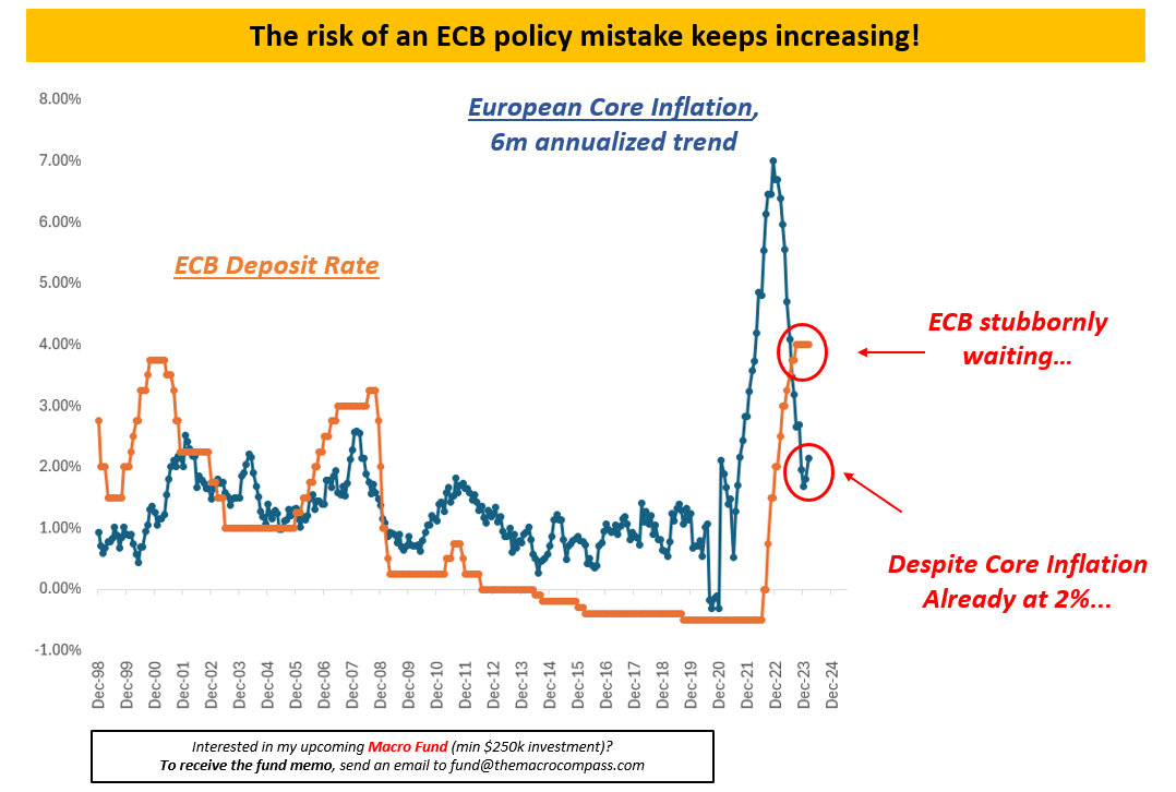
Beware Animal Spirits
Animal spirits are running loose.* Bitcoin just hit all-time highs;* NFTs of penguins and monkeys selling for over $500k; * Virtually bankrupt stocks like Carvana rallying to the moon;Investors aren’t thinking macro at all recently. They aren’t overweighting assets with better balance sheets or higher profitability, or going after companies because of their earnings growth profile. Instead they are busy sending Bitcoin, Gold, and other non-cash flow producing assets to the moon despite risk-free rates sitting at 5.25%.Is this so unusual as it sounds?Not really.In 1999 and in 2007 animal spirits were running loose as well.Do you want to guess where risk-free rates were back then?Yup: north of 5%.And it didn’t end well.But animal spirits are hard to defeat.Yes - you can have a healthy 4-5% drawdown in stock indexes but if you really want the tide to turn you need proper macro volatility events.So let’s take a look at the big macro events looming large ahead of us.US Macro Data and the Fed Reaction FunctionNext week we’ll have the new US CPI data for February, and that will be a crucial data point to shed light on the disinflation process.Was January a statistical aberration due to seasonal price resets, or is the disinflationary path stalling?In the meantime, we got quite an interest US job market report on Friday.On the surface, the Non-Farm Payroll report produced another friendly outcome for the Fed and markets. * 223k private sector jobs created* Only 0.1% MoM wage growth* Downward revisions to what seemed to be a super hot JanuaryHere is the key chart which shows the most important elements of the NFP report:The 3-month average print for private sector job creation (blue, RHS) is a nice +204k, slightly up from the late 2023 lows.Wage growth seems to be headed towards the 3.5% underlying trend which was consistent with 2% inflation before the pandemic.The 6-month annualized trend in wage growth (orange, LHS) printed below 4%.This is all the Fed wants to see: an okay amount of new jobs created, and wage growth moderating to help them achieve the 2% target.But there are a couple of worrying things going on under the surface.See that red line?That’s the U6 unemployment rate - also known as the broad underemployment rate.The U6 rate is a broader definition of unemployment.It includes not only the unemployed but also those who are working part-time for economic reasons and those who are marginally attached to the labor force. It’s steadily ticking higher.Additionally, cyclical industries hiring trends are very weak. Full-time hiring in manufacturing, trading, transportation, construction and similar sectors is the weakest since 2011. Softer (as long as not recessionary) job market conditions can even be positive for market sentiment…as long as the Fed accomodates accordingly.And this is where I think a potential risk ahead might lie.We are hearing the first rumors: some Fed officials think ‘‘this time is different’’.When you start hearing FOMC members discussing the potential for ‘‘higher neutral rates’’ it means they think something structural has changed in the US economy.They start to believe the US economy can bear much higher interest rates without harming its potential to sustainably generate 1.5-2.0% real GDP growth.A very recent BIS paper blended 4 models to estimate where r* (the real equilibrium rate for the economy) sits in the US.The Fed thinks it’s at +0.5%.The BIS models disagree: they point to a higher +1/+2% range.If more Fed officials marry the idea that neutral US rates are higher, this means that the cutting cycle will be shallow and short.A bit like in 1995.Back then, the Fed cut interest rates only 3 times and it took a multi-year pause after.Today, animal spirits are also fed by a more friendly bond market pricing.Markets are pricing 3-4 cuts this year, 4 more next year, and some more after that in 2026 and 2027.What if the Fed decides to go 1995-style hence disappointing markets right when the underlying weakness in the job market is starting to show up?Europe Playing With FireEurozone’s GDP growth printed at another meagre 0.0% in Q4 2023.The European economy is flat like a pancake, and some countries are basically in a recession already - especially the ones which are highly exposed to China, manufacturing (Germany) or the real estate market (Finland).Yet, the ECB keeps telling us it’s too early to proceed with interest rate cuts.Lagarde won’t admit it publicly, but like many other colleagues she’s looking at Powell to give his green light for cutting rates.And while she waits, growth and inflation keep trading lower while ECB rates remain prohibitively high - policy keeps tightening for the real economy.An ECB deposit rate of 4% while core inflation is already trending at 2% for quarters effectively imposes a policy rate of +2% in real terms (!) on a very fragile European economy.Last time ECB rates (orange) were above the underlying trend of core inflation (blu) for a sustained perio

IT'S BACK!
Welcome back to The Macro Compass.Let me cut to the chase: The Macro Trading Floor is back!TMTF was one of the most popular macro podcasts out there - I launched it with my friend Andreas Steno in 2022 and it quickly became very popular.I’d like to thank him for the great ride together.By mid-June 2023 I realized I had to focus on other urgent commitments, and hence we decided to suspend it.I am happy to announce that after a 9-month pause The Macro Trading Floor is back……and with some HUGE news.The show has a new co-host!Profile: former trader for large hedge funds and banks in the US, amazing writer and macro analyst, macro expertise with a focus on FX markets…did you make your guess?Want to find out who he is and listen to the comeback episode?Here you go:Apple PodcastSpotifyGoogle PodcastThe show goes out every Friday - subscribe in your favorite podcast app, and make sure you tune in every week!Macro Is EverywhereIn the podcast, we covered several global macro themes and investment opportunities.Macro is back, and it’s impacting markets everywhere you look.We discussed the chart above: it shows the market-implied probability distribution for where Fed Funds will end in December.I derive that market-implied distribution and table of scenarios from options on the SOFR December 2024 contract - in other words, I am looking at what fixed income option traders are willing to pay or get paid for different scenarios this year.The distribution is quite interesting.The modal outcome (the most observed in the distribution = the highest bar) is 475 bps or only 2 cuts! That’s even less than the 3 cuts the Fed projects in their Dot Plot.The recession tail is thin (11% probability only) but it still exists, and therefore it pushes the mean outcome towards 3 cuts - in line with the Fed.Markets aren’t assigning a meaningful recession premium anymore to bond market pricing, and have fully converged with the Fed Dot Plot here.‘‘Buy insurance when you can, not when you must’’ applies here?All Central Banks in the world have followed the Fed in a sharp hiking cycle.But not all economies are equipped the same way to handle the effect that higher interest rates bring.In this episode, we discussed a few of them including Canada.The chart above shows how the Canadian private debt as a % of GDP is larger (!) today than it was in Japan at the peak of the real estate bubble.Nevertheless, the Bank of Canada has raised rates aggressively and it’s now planning to only ease marginally - again, following the footsteps of the Fed.Is that credible?We also looked at China.China recently cut the 5-year Loan Prime Rate which is the reference rate used for mortgages, and so the idea was to reduce household borrowing costs for Chinese people.As other policy decisions have failed, authorities now hope that cutting mortgage costs will do the trick.But that’s unlikely to work.In the early 1990s the Japanese real estate bubble burst and the world’s most famous balance sheet recession unfolded – the Bank of Japan lowered and kept rates to 0% for decades after and…nothing happened.Look at this chart: Japan 10-year bond yields (orange) dropped from 8% to 1% and yet Japanese house prices (blue) kept falling! When you hit balance sheets hard through a deleveraging process, asking people to take on more credit isn’t going to work even if rates are low.We also discussed a few trade ideas on the back of global Central Banks trying to imitate the Fed even if domestic economies appear much more fragile.The comeback episode of The Macro Trading Floor is here.I discussed a lot of interesting macro topics, actionable investment ideas and had a ton of fun with my new co-host.Tune in here:Apple PodcastSpotifyGoogle PodcastThe show goes out every Friday - subscribe in your favorite podcast app, and make sure you tune in every week!And before you leave, remember I greatly appreciate your support.If you enjoyed this piece:* Smash that Like button;* Share it with friends and colleagues! This is a public episode. If you would like to discuss this with other subscribers or get access to bonus episodes, visit themacrocompass.substack.com
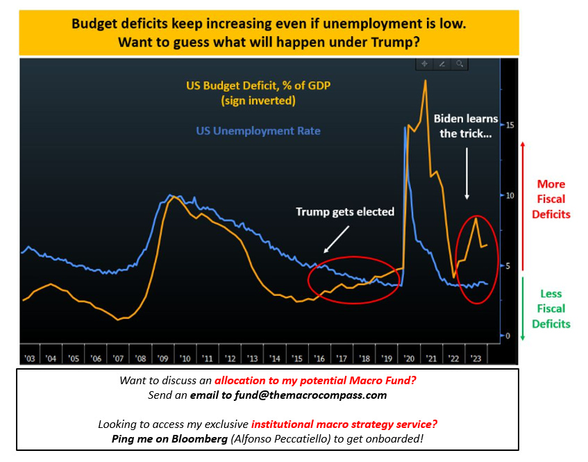
Pay Attention To Monetary Plumbing
Next week is huge: revisions to 2023 CPI, US labor market print, the Fed, and most importantly the Quarterly Refunding Announcement (QRA) everyone talks about.So I thought I’d share an initial framework for you to understand why everybody seems to care about the details of the US bond supply announced in the QRA.The key is to think of bond supply within the context of the US monetary plumbing.The first thing to understand is the tectonic shift happening at the policymaking level when it comes to the use of fiscal deficits.The chart shows how until 2016 US politicians applied fiscal policy in a counter-cyclical fashion.When unemployment rate (blue) was low like in 2006-2007, they proceeded with a conservative fiscal stance (orange) and reduced deficits.Instead when a big crisis hit like in 2008 and the unemployment rate moved higher, they tried to support the economy with more fiscal deficits.This is a textbook counter-cyclical application of fiscal policy: support the economy by injecting fresh money when it needs, and withdraw support when it's running hot by itself.But in 2016 something changed.Trump became the new US president, and despite unemployment rates dipping below 5% the US budget deficit started expanding anyway.A bit like crocodile jaws opening, for the first time in decades fiscal stimulus was not used to support a weak economy but instead ON TOP of an economy which was already strenghtening.As a result, in 2017-2018 the US economy was quite hot - the Fed raised rates, the stock market puked, and in 2019 Powell had to pivot.But as Biden got in office, he recently showed he learnt the same trick too!In the 2023 fiscal year, Biden rapidly expanded fiscal deficits despite a tight job market - hence the crocodile jaws were opened again.The result?A prolonged cycle for the US economy, with inflation which perhaps took a bit longer than expected to start slowing down.As Trump is gaining ground in his race to become the next US president, I wonder whether he's going to continue with this new crocodile jaw paradigm - and my hunch is that he will.US politicians are becoming familiar with the power of fiscal stimulus (but not with the dangers of its excessive use). And by 2028 the majority of voters isn’t going to be Boomers & Co anymore, but instead Millennials and Gen-Z looking for a change in wealth distribution.Therefore, we can expect a robust use of fiscal stimulus in a semi-permanent way.Now, back to 2024: the Fed is doing QT while Yellen marches ahead with deficits.These are the monetary plumbing mechanics of this exercise - visualized:1-2) The US government proceeds with deficit spending, households and/or corporates get an injection of new money, and (potentially inflationary) bank deposits go up together with reserves in the system;3-4) Simultaneously, bond issuance takes place: Yellen issues bonds, and banks (primary dealers) use reserves to buy bonds at auctions;5-6-7) The Fed runs down its balance sheet through QT, and that works like a net drain of reserves from the financial system.An excessive reduction in bank reserves can become problematic for the smooth functioning of the repo market: banks use reserves to settle repo transactions with each other, and if there is too much collateral (bonds) floating around and too little reserves the repo market can suffer (e.g. 2019).But there is a way around this problem: Yellen issuing T-Bills instead of bonds.This is one of the reasons why everyone is watching the QRA next week:In this case, QT does not drain bank reserves but it’s instead ‘‘sterilized’’.The bottom set of T-Accounts explains why: when the government issues T-Bills and money market funds buy them by draining their existing balances at the RRP facility, bank reserves don’t need to take the hit for QT.It’s basically sterilized QT.The other incredibly important dynamic is that issuing T-Bills or long bonds has a very different impact on market participants.T-Bills have very little interest rate risk, while long bonds are much heavier to absorb because of their big duration risk.I will be talking about the QRA in details next week, and analyze its direct impact on bond and equity markets.Finally, if you enjoyed this piece please:* Smash the like button;* Share it with friends and colleagues.It’s free after all, and I would really appreciate your support! This is a public episode. If you would like to discuss this with other subscribers or get access to bonus episodes, visit themacrocompass.substack.com
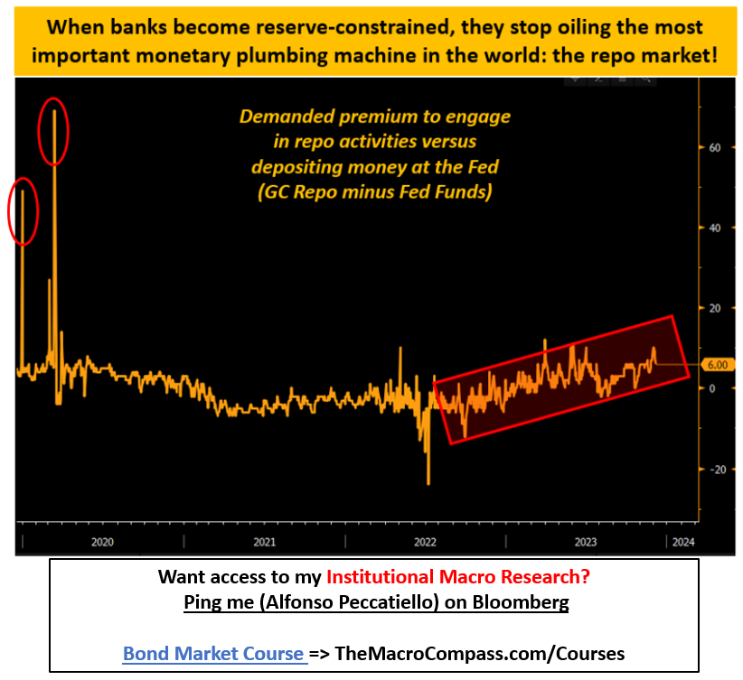
The Liquidity Conundrum
The Fed has been running QT for a while and yet there is still abundant liquidity in the financial system. Fed’s bond holdings are down $1.3 trillion from their peak (due to QT), yet only half of this supposed tightening has actually impacted bank reserves (aka ‘’liquidity’’) which are down a meagre $0.7 trillion.This ongoing ‘’money mystery’’ has caught many off-guard, and it has helped fuel several bullish narratives: the most famous one being that higher ‘’liquidity’’ has supported stock markets in 2023.2024 is shaping to be another year where monetary plumbing will matter a great deal.To understand the mechanics behind this money mystery, let’s start from QT. Here are 5 simple steps to understand how Quantitative Tightening works:Step 1-2: the Fed doesn’t reinvest maturing bonds (1) from its QE portfolio (= performs passive QT) and therefore destroys reserves (2) - also known as ‘‘liquidity’’’;Step 3-5: the government needs to roll-over its funding, but the Fed isn’t rolling over its bond holdings (3). Banks now needs to step up and absorb more of the newly issued securities (4-5). The resulting balance sheet changes are summarized in the bottom tables: the Fed reduces its balance sheet by 100 which sees a 1:1 reduction in reserves (aka ‘’liquidity’’) as banks must step up to absorb bond issuance. This is how QT normally works.Yet something different is happening this time.Back in 2021 the Fed had an issue: rates were at 0%, and there was too much money in the system. Money Market Funds (MMF) were bidding up T-Bills so much that yields were testing negative levels (!), and so to stabilize money market rates the Fed proposed a friendly alternative: the Reverse Repo Facility (RRP). This encouraged MMF to park money at the Fed, and they did in huge size: the RRP reached $2.5 trillion. You can think of this like pent-up ‘’liquidity’’ stored in a corner of our financial system. Here is the thing. In 2023 MMF have unleashed this pent-up force: the RRP usage has dropped materially, and this wave of supportive ‘’liquidity’’ has been thrown at markets.And this is likely to continue in 2024.How does this work? As always, let’s check our stylized balance sheets to find the answers:MMFs drain down their huge RRP balances (orange) and they buy T-Bills (green). The government has to roll-over debt while the Fed does QT (red), but this time the slack is picked up by money market funds and not by banks. The result is that QT doesn’t drain ‘’liquidity’’ but the RRP takes the hit (blue circle).Effectively, we are running a sterilized version of QT:In other words, the Fed is actually reducing its balance sheet but not draining the ‘‘excess liquidity’’ (bank reserves) from the system.A liquidity conundrum.So, what happens next?The RRP facility is down from $2+ trillion to $600 billion, so this ‘‘sterilization’’ mechanism can work for a bit longer in 2024 but it will ultimately come to an end.And dwindling liquidity can cause a lot of trouble in the biggest monetary plumbing machine in the world.The repo market.Claiming that the amount of reserves (‘‘liquidity’’) in the banking system somehow affects asset prices is outright wrong: banks don’t use reserves to buy stocks, and that’s why the supposedly direct relationship between changes in liquidity and stock market returns doesn’t exist. But banks do use reserves to engage in repo market activities with each others.And that matters! As the chart above shows, the requested premium to lend money in repo markets against simply depositing at the Fed is slowly increasing - levels aren’t worrying yet, but there seems to be a trend in place. The red circles in the chart show how unhinged repo markets became in 2019. Here are the 7 steps to the real monetary plumbing risk ahead for 2024: * The Fed continues QT but MMF stop immunizing the negative effect on liquidity;* Bank reserves take a serious hit, and banks’ appetite to engage in repo markets declines;* The US Treasury continues to issue large amounts of bonds;* The imbalance between collateral (bonds) to absorb and available liquidity (reserves) grows;* Repo rates steadily increase signaling more strains in the monetary plumbing arena;* Leveraged players relying on steady repo rates blow up;* Deleveraging occurs.In short: the money trick which made QT look like a walk in the park in 2023 might as well disappear later in 2024. And this is a very underestimated risk which almost nobody has on its radar. This is a public episode. If you would like to discuss this with other subscribers or get access to bonus episodes, visit themacrocompass.substack.com
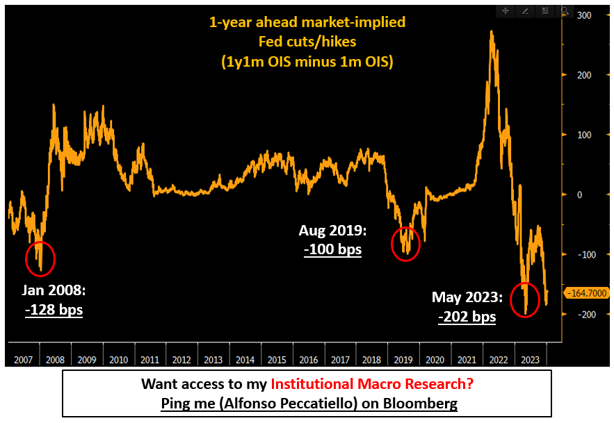
Unpacking Bond Markets
Macro investing without deeply understanding bond markets is like eating soup with a fork.You can still somehow make it, but it’s cumbersome and unproductive.We are at a crucial juncture for macro and monetary policy, which means getting a grip on bond markets is even more important.This piece will help you with that, and most importantly provide you with the right framework to use.Everyone is talking about this chart all the time:It shows the market-implied Fed cuts (in bps) over the next 12 months, and it says -165 bps.165 bps of cuts in 12 months is quite aggressive by historical standards.Even in early 2008 with Fed Funds at 4.50% and the US economy on the verge of a huge recession, markets were pricing only 128 bps of cuts for the consecutive 12 months.Why would bond markets be so aggressive now?In a nutshell, there are two main reasons:The first reason has to do with the Fed’s mandate – one could argue the job is done.The labor market is back in balance (glass half full) and judging from the trend in private job creation at only 115k/month and steadily declining one could argue there are risks it’s weakening too much (glass half empty).The labor market isn’t remotely hot anymore: job done?Core PCE (the preferred Fed’s inflation measure) is already annualizing at 1.9% which is below Fed targets.Further disinflationary tailwinds from the delayed pass-through of weaker rent inflation and a softer job market should corroborate the trend in H1 2024.The underlying trend of core inflation is already consistent with 2%: job done?The second argument for so many cuts priced in is tightly connected to the first.If the Fed’s job is done, what’s the appropriate level of Fed Funds?Back to neutral over the next 12-18 months.And if anything markets are more sanguine on where neutral Fed Funds are than the Fed is:The pandemic hasn’t changed the Fed’s mind on what’s a neutral stance: 2.50% nominal Fed Funds (orange) are still considered the rate which doesn’t overly stimulate or cool down the US economy.Markets have a different and more sanguine opinion right now.Prior to the pandemic, bond markets (blue) were always more pessimistic than the Fed about the neutral rate and they were proven right: the US couldn’t generate meaningful growth and inflation with Fed Funds often below 2%, let alone higher.The Fed was saying neutral was ~3%, and facts were showing this wasn’t the case.Today, bond markets disagree again but for the opposite reasons: neutral Fed Funds are seen >3.25% hence quite a bit higher than the 2.50% the Fed is stuck on.Let’s pause here for a second and recap.Markets are pricing 165 bps of cuts over the next 12 months which is aggressive by historical standards, yet this might be partially justified as judging from labor and inflation data the Fed’s job seems done.If the Fed’s job is done, policy should return to neutral over time – but here markets are more hawkish.They see neutral Fed Funds at 3.25% while the Fed thinks neutral is 2.50%.Ok, this is interesting: but here comes the real banger.Once you understand this, the bond market will make a lot more sense to you…Eager to read the remaining part of this macro report?Come join The Macro Compass premium platform to get access to Alf’s full-length timely pieces, actionable investment strategy and much more!Check which subscription tier suits you the most using this link or the button below: This is a public episode. If you would like to discuss this with other subscribers or get access to bonus episodes, visit themacrocompass.substack.com
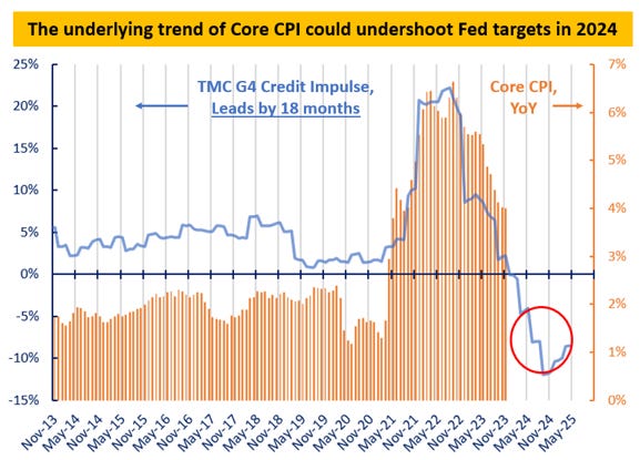
The 2024 Macro Playbook
Welcome back to The Macro Compass - may 2024 be your best macro year ever!Let me get straight to the point: our models show inflation is on its way to undershoot (!) Central Banks targets in 2024.Inflation is often a monetary phenomenon: print real-economy money too quickly for the supply side of the economy to adjust, give it enough time and the only release valve will be higher prices (inflation).Abruptly stop or reverse this process, and inflation will moderate rapidly.In plain words: the speed of real economy money creation leads inflation trends by roughly 18 months.The money creation boom of 2020-2021 led to the strong inflationary pressures we saw in 2022.Since then though mortgage applications and corporate borrowing collapsed as a result of higher rates.The TMC Credit Impulse series captured that, hence it has well anticipated the disinflationary trend in 2023.But there is more to come: the model now predicts these disinflationary lags to kick in further in 2024.US Core Inflation could annualize at or below 1.5% (!) by early summer.Inflation undershooting Central Bank targets is a big deal for macro investing in 2024.Which brings me to our improved Quadrant Asset Allocation Model (QAAM).The TMC asset allocation starting point is the Forever Portfolio which distributes a similar amount of risk budget to internationally diversified equities, bonds, commodities, and the US Dollar.In other words: a portfolio prepared for different macro outcomes.The next step is to look at our TMC macro models: they dictate the direction ahead for growth, inflation, and the monetary policy stance so that we end up in one of the Quadrants represented above.Based on the quadrant we land in, Macro Tilts are applied to the portfolio (e.g. more stocks, less bonds etc).Judging from the above snapshot, one should strongly overweight TLT + QQQ and go to sleep.Well: not so fast.Let’s dig deep into the full TMC macro investment process which leads us to the construction of our 2024 macro portfolio…Eager to read the remaining part of this macro report?Come join The Macro Compass premium platform to get access to Alf’s full-length timely pieces, actionable investment strategy and much more!Check which subscription tier suits you the most using this link or the button below: This is a public episode. If you would like to discuss this with other subscribers or get access to bonus episodes, visit themacrocompass.substack.com
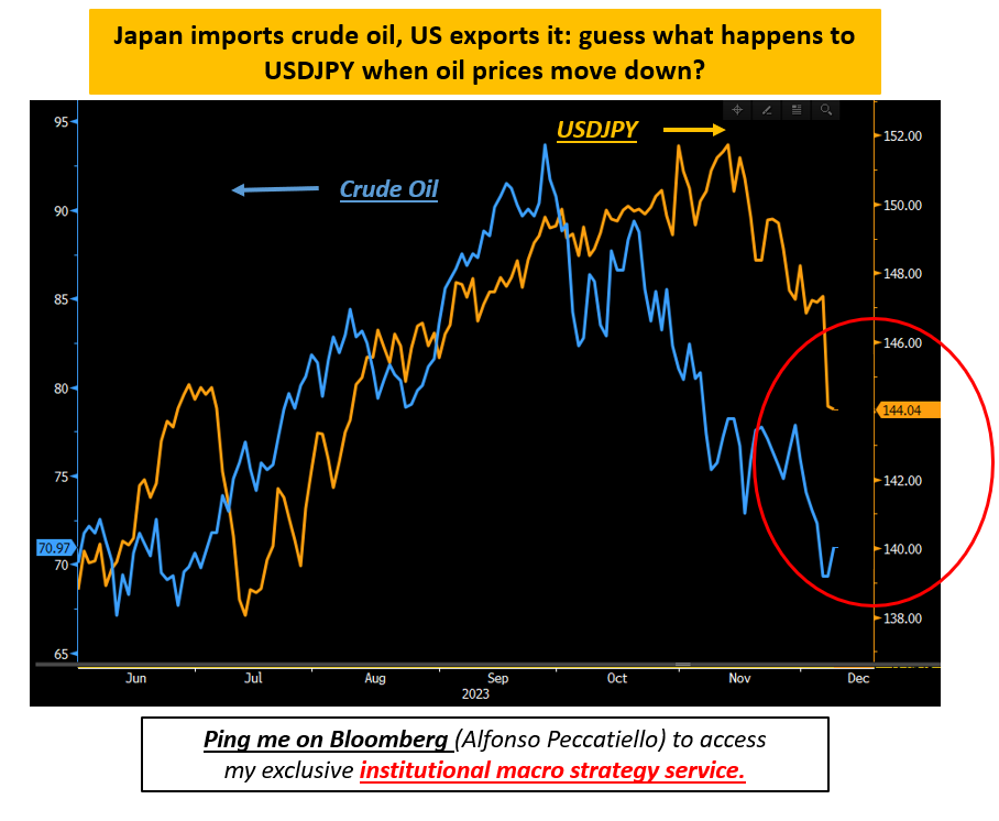
Japan: Here is What You Should Know
As macro investors we are often inundated with flashy headlines, and recently Japan has been front and center.Yet with all this noise it’s easy to miss the forest for the trees.That’s why in this piece we will:* Explain what really drove the recent moves in JPY;* Discuss the real underlying macro trends in Japan;* Assess what the BoJ is likely to do next;* Cover the implications for global bond markets and the Yen.The outsized moves in JPY and Japanese bond markets have been catching headlines recently - the common narrative is that Japan is finally there to unwind their super easy monetary policy and that pushes yields higher and the Yen stronger.Evidence says the move in JPY has more to do with something else.The chart above shows the very tight relationship between 10-year US vs Japan yield differentials (blue, LHS) and USDJPY (orange, RHS): if yield differentials shrink rapidly, the Yen gets a boost.It's really simple and intuitive FX pricing theory: wide yield differentials and low volatility will make people interested in borrowing JPY and buying USD, and when yield differentials narrow like today this ''carry trade'' will unwind and the JPY strengthens.Why are yield differentials narrowing? Because of the BoJ?Not really.Bonds have been catching a bid globally since October: the rapid decline in the blue line from 350 bps to 270 bps is almost exclusively due to Treasuries (not Japanese bonds). And now mind the gap in the red circle.At this level of yield differentials, USDJPY should already be at 140.Back in July the 10y yield differential between Japan and US was 280 bps and USDJPY was 138.Today it's 270 bps (lower!) and USDJPY is 144 (higher!) yet people seem to find the JPY move out of whack.The other important global macro driver of JPY price action has been crude oil.Japan is a net importer of crude oil, and the US is a net exporter: guess what happens to USDJPY when the price of oil goes down rapidly?USDJPY goes down: the Yen appreciates because the terms of trade for Japan become more favorable.In other words: the Yen is adjusting to international macro fundamentals, not reacting to Japanese macro or an immediate risk of a BoJ hawkish shift.Japanese services inflation (orange) was running at 3% in May but it’s now back below 2%, and nominal wages (blue) are growing at only 1.4%.If Ueda and the BoJ wanted to react to immediate price pressures, April/May was the moment to do so - the situation is much less urgent today.Imagine this.After 20+ years of ZIRP and QE the Bank of Japan tightens policy now, but global inflationary pressures continue to subsidize.The Yen strengthens rapidly, and it kills any hope for Japanese inflation and wages to actually settle at 2%.The deflationary mindset kicks in again, and Ueda doesn’t look great.Ok, quick recap:* Services inflation and wage growth in Japan don’t justify a BoJ hawkish shift;* Yet the JPY has been rallying rapidly: that’s a function of two things;* A global bond rally which compressed yield differentials;* Oil prices collapsing which helps Japan as a net importer of crude;The last piece of the puzzle to assemble here is the impact these crucial Japanese developments might have on global bond markets.Japan is a massive exporter of capital: Japanese investors own trillions of dollars of foreign assets and they are big in Treasury markets.What are they doing there?Japanese investors have been absent from Treasury markets since late 2021 and actively selling a ton of bonds in 2022.They are now back at buying Treasuries - what drives them?Japanese investors involved in buying foreign bonds will also face FX risks.To buy Treasuries they need to convert JPY into USD, buy the bonds, and at some stage revert back the FX transaction.This means USDJPY will largely affect the P&L of their bond transaction.This is why they generally look at Treasury yields in a different way: the orange line shows 10-year Treasury yields in the eyes of a Japanese investor which also hedges USDJPY risk for 12 months to cover that FX risk for a reasonable time.You can see the relatively tight correlation between the attractiveness of FX-hedged Treasuries (orange line up = more attractive) and the actual net buying flows in foreign bonds from Japanese investors (blue line up = they buy more).In 2022 Treasury yields went rapidly up but Japanese investors were on strike because the USDJPY FX hedging costs were prohibitive.Things are a bit better today, and Japanese investors are already back at buying.The Fed drives these USDJPY hedging costs more than the BoJ, and once again it’s global macro drivers that matter more than some flashy headlines about Japan itself.Get US growth and inflation right, get macro right.Don’t miss the forest for the trees.And DON’T MISS the next piece in your inbox.December 15: mark your calendars!Did you like this piece?Smash that like button below!And share this piece with a friend!It’s free to spread the word after all, and I really appreciate your sup
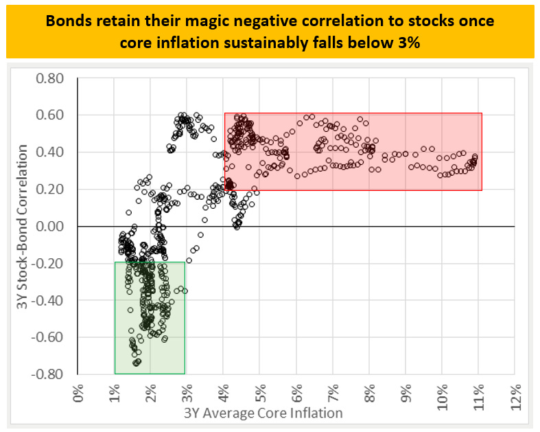
The Whales Are Coming
‘‘Who are the biggest whales in the bond market?’’If you’d go around and ask this question, most people would tell you that’s either the Fed or foreign Central Banks like the Bank or Japan or the People’s Bank of China.That’s wrong.And the real bond market whales might develop a renewed appetite for bonds in 2024.The chart above speaks more than 1,000 words: history shows (red boxes) how 70%+ of net buying flows in Treasury markets are attributable to pension funds, asset managers, insurance companies, and foreign investors.These foreign investors include both institutional players (the very same pension funds, asset managers etc) and foreign Central Banks.My estimate is that foreign Central Banks account for about 1/3 of the flows in the dark green stack.That leaves us with ~60% of the buying flows attributable to the real whales: pension funds, asset managers, banks, insurance companies.Not the Fed.The Fed played an outsized role only in 2020-2021, but that’s an exception attributable to the huge pandemic-related QE programmes.Recently most of the buying flows has been coming from households: 4-5% risk-free rates have become a palatable investment alternative for the first time in decades.A caveat here as well: this definition of ‘‘households’’ also include hedge funds, so take it with a pinch of salt.My point remains: the biggest whales in the bond market are banks, pension funds, asset managers, and insurance companies.The big question is: why do they bonds in the first place?* Their guaranteed (real) yields are high enough to help them meet their return objectives and simultaneously hedge interest rate risk!Insurance companies and pension funds run long duration liabilities like life insurances or pension contributions to be paid in 30-40 years.It’s good practice to immunize the interest rate risk from these long liabilities with long duration assets: 30-year bonds, for example.On top of it these industries have to achieve long-term return targets of (at least) 6-7% to remain viable over the long term.Today they can pretty much achieve both objectives by buying 30-year BBB corporate bonds: that’s a very solid proposition for these whales.* Bonds (can) act as a portfolio stabilizer when risk assets take a hitThis chart from the excellent Dan Rasmussen of Verdad Capital is key.Going back almost 200 years, it’s quite evident that the stock/bond correlation isn’t negative all the times: it’s actually often positive (!) and especially if core inflation is above 3% and particularly volatile (2022 anybody?).That makes sense: if core inflation is high and unpredictable, Central Banks will go a long way to tighten aggressively and get things under control again.Central Bankers rule #1 is to preserve credibility and therefore be able to retain control of the game.As they tighten aggressively, bond markets will sell off and equity valuations will simultaneously take a hit: positive correlation, poor stock/bond returns.Instead, bonds retain their amazing negative correlation to stocks only if core inflation falls predictably below 3% (green area). And that makes sense too: once core inflation is within the Central Bank comfort zone, big drawdown in equities or credit markets will be seen as destabilizing for the economy and Central Banks will attach more value to their growth/labor market side of the mandate and come to the rescue.If things get bad, bond makets will rally in anticipation of Central Bank easing: this is the negative stock/bond correlation institutional investors love so much.ConclusionToday core inflation is at 4% with the 6-month underlying trend hitting 3% already.History shows that below 3% the sought-after negative correlation between stocks and bonds might unfold once again.If that happens, bonds will be a very palatable asset for hungry whale buyers.The combination of a long duration asset which immunizes interest rate risk, delivers a high yield and protects portfolios in an equity drawdown is an irresistible proposition for this big bond market whales.These whales have been dormant, but their footprint can be enormous and much bigger than the Fed.Beware the stock/bond market correlation and the bond market whales.Did you like this piece?Smash that like button below and tell a friend to subscribe to The Macro Compass.It’s free after all, and I really appreciate your support.And that’s all from Alf: enjoy yourselves, and always stay hungry for more macro.If you want to discuss business, feel free to reach out at [email protected]. This is a public episode. If you would like to discuss this with other subscribers or get access to bonus episodes, visit themacrocompass.substack.com
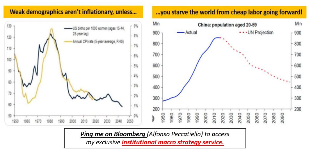
Inflation: What Next?
Before we start, a short announcement:* If you are an institutional investor and you want to try my dedicated macro research, ping me on Bloomberg (Alfonso Peccatiello) for a 2-weeks free trial.I will also be in London on Dec 6: if you want to meet for business send over an email at [email protected], back to the piece!Forget inflation predictably floating around 1.5% as in the last decade.Does this mean this paradigm shift will see inflation consistently print at 4% going forward? Not necessarily. But it sure means the volatility and uncertainty around inflation will be higher – and that’s all that matters for global macro portfolios. Let’s look together at the drivers of inflation going forward, bearing in mind there is a big difference between structural inflation (5-10 years horizon) and the inflation cycle (6-12 months ahead).Structural drivers of inflation include amongst others demographics, globalization, the fight between labor and capital, and energy policies. The short-term inflation cycle is instead mostly driven by real-economy money printing (credit and fiscal).1. Demographics, de-globalization and labor versus capital (structural)There are two schools of thought: weak demographics are disinflationary (it lowers organic growth rates and consumption while it increases propensity to savings) or inflationary over the long-run (scarcity of skilled labor leads to higher wages, older people will spend more due to higher social safety nets on healthcare etc).I think both are somehow right if you apply the right context: we live in a globalized economy.Using that context it’s clear that the last 10-20 years have seen a perfect confluence of disinflationary forces: weakening demographics in developed countries (left chart) generated disinflationary conditions and we solved the labor scarcity issue by offshoring production to China which in the meantime was benefitting from an ample availability of cheap workers (right chart).A great cocktail for disinflation: weak developed market demographics plus cheap Asian-outsourced labor. But here is the problem – this combo won’t be there anymore.Rapidly reversing Chinese demographics (red dots, right chart) and a marginal push towards de-globalization imply DM economies won’t be able to access a growing cheap pool of labour to the same extent anymore. This will force developed markets to on-shore some production and on the margin bump up wages for scarcely available domestic skilled workers: some impact is already visible.The counter-arguments here are two: 1. Manufacturing and cyclical industries which will experience scarcity of labour represent a small proportion of the overall labour market and that’s because… 2. …we live in a technology-driven world and that trend is only going to continue.The typical US company which needed 8 employees to generate $1 million of revenues in the 90s now only needs 2 - in the fight between capital and labour that doesn’t bode well for wage bargaining power. Today’s economy is way less labor intensive and less unionized than in the 90s.Overall, my take here is that the magic combination of disinflationary tailwinds which we experienced over the last 2 decades won’t repeat itself going forward – on the margin that pushes structural inflation a bit higher but let’s not forget we will still live in a (somehow) globalized, technology-driven world. In other words: inflation will be way less predictable going forward.2. Energy Policies (structural)The net-zero attempt (ehm…transition) will definitely be a net inflationary force for the next 1-2 decades.It’s pretty simple: as policymakers will penalize (read: tax more) industries that produce excess CO2 the economics will somehow force countries to decarbonize – but funnily enough in the initial phase of the transition the world will still consume fossil fuels whose after-tax prices will be higher (left chart).On top of it the net-zero transition requires a dramatically higher amount of green commodities (e.g. copper) which is an under-invested industry as shown in the right chart. Supply and investments in green commodities take time while the demand boost will be sudden: the likely outcome is that commodity prices will have to somehow adjust higher hence fueling inflationary pressures.The counter-arguments here are that the net-zero transition will take much longer and be much milder than anticipated, and that today’s assumptions about the needed quantity of green commodities doesn’t take technology into account: we will probably find smarter ways to generate the same output needing less input.My take here is similar to the demographics story: on the margin the net-zero transition will be net inflationary but look at the left chart – the volatility (rather than the ‘’new average’’) of inflation will be the key change.Conclusions – Structural InflationThe ‘’new average’’ for structural inflation over the next two decades is likely to be higher than the 1.5% we experienced
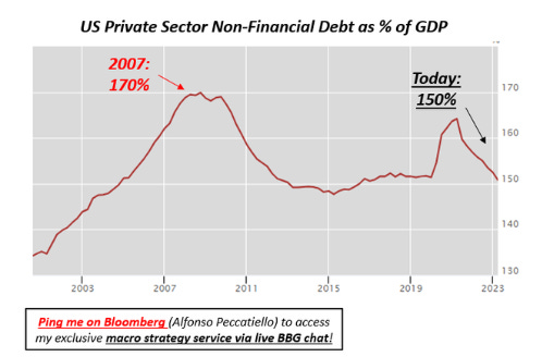
Something Will Break
After years of zero interest rates such an abrupt tightening is bound to break something. The main questions are: what, when and where does something break? When rates are low credit is cheap and so financial actors tend to lever up more aggressively. Debt levels increase and so does the coverage of government debt.''The US government will go broke'' ''This is not sustainable'' etcYet the reality is that governments are the issuers of fiat money and therefore they can always nominally (!) meet their obligations by issuing more debt.That obviously has limits too: over time they depreciate the real value of the currency and relentless fiscal deficits might lead to inflation overshoots.But my point is that governments can kick the can down the road for a long time, but you know who can't? You, I, and in general the private sector.If our mortgage costs as a share of disposable income move higher we can't print money to service our debt.If corporate borrowing costs soar and earnings growth doesn’t dramatically improve, companies will be quickly forced to deleverage or cut costs.So while in general it’s a good practice to keep an eye on both government and private sector debt levels (as the chart below shows the higher total economic debt, the lower rates must be to keep the system afloat)……during macro shocks countries with high & rising private debt levels are more vulnerable than countries with high public debt levels! And history shows that’s indeed the case: look at this great chart from Dario Perkins.* Japan's real estate crisis 1990s* Asian tiger's crisis late 1990s* Spain's housing crisis early 2010s* China now (?) All these episodes had one thing in common: private sector debt was too high and it was rising too rapidly!Funnily enough the obsession with government debt levels skews the vulnerability assessment towards the ''wrong'' countries. Countries that keep deficits super contained starve the private sector from fresh resources and so households and corporates go and lever up privately. Take China: their official government debt levels are very contained but behind the curtain they have been aggressively leveraging up their private sector. And if you do that too fast in an unproductive way, problems tend to occur... Or take Canada which has made a large usage of real estate debt to spur a domestic wealth effect. Today Canada is running a higher private sector debt/GDP than Japan did just before the implosion of their own real estate market in the 90s. Instead if you have a look at the US you'll find that their private sector non-financial debt as % of GDP today is 20 percentage points lower than in 2007. While mainstream media commentators obsess about US government debt despite the United States enjoying the privilege of issuing the reserve currency of the world (USD), private sector leverage trends in the US show a relatively benign picture if compared to other countries around the world.What countries score the worst by this metric, you ask?This table can help you quickly assess in which countries private sector debt is too high and it's been rising too fast over the last 10 years.Now, obviously levels and rate of change in private sector debt are not the only variables to consider when assessing when/where/what will break in macro.We also need to consider other fundamentals, the nature of the private sector debt market (floating or fixed rate, short-term or long-term), refinancing cliffs and many other variables.Hence this was just the appetizer of my investigation into ‘‘what will break in macro’’.The good news though is that I will be serving you the entire menu soon :)Now, before you leave two important points:* Learn to master bond markets!Even if a country is particularly vulnerable to macro shocks it doesn’t mean something will break there: it’s the combination of these vulnerabilities and these crucial but sometimes hidden messages the bond market is sending that will put you on the right path!Where do you get pro-level knowledge of the intricate and technical bond market?I unpacked it all for you: take a look here.The TMC Bond Market Course has added a lot of value for customers - this is the kind of feedback I can proudly say I am receiving so far :)* If you enjoyed this piece, please smash the Like and Share buttons!Hopefully you find these posts valuable.If you do please let your macro-friends and colleagues know, and let me know by clicking on that Like button :)Enjoy your weekend, and always stay hungry for macro! This is a public episode. If you would like to discuss this with other subscribers or get access to bonus episodes, visit themacrocompass.substack.com
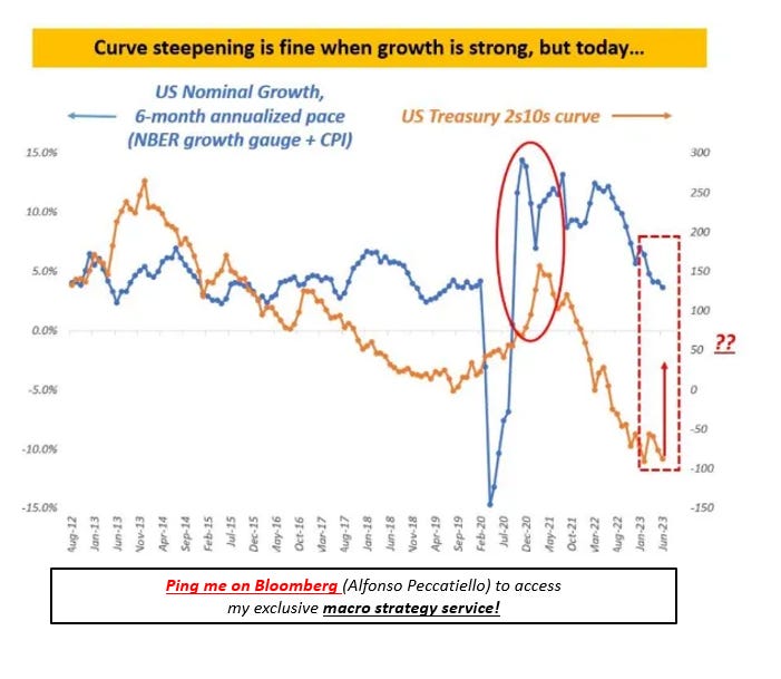
A Rare & Dangerous Trend in Bond Markets
Hi everybody, and welcome back to The Macro Compass!I will be in New York on Oct 2-3-4 presenting my macro investment outlook to institutional clients - if you are/represent a hedge fund PM, RIA, family office, investment firm or a finance professional and you want to arrange a meeting please send an email to [email protected] brief intro and why you want to meet would be appreciated.If you put pineapple on pizza I won’t accept the invitation :)Now: back to it!There is a rare and powerful trend occurring in bond markets.History shows that if left unchecked, it can cause serious damage to equity markets and the economy.Over the last 3 months, US bond markets are in an aggressive and prolonged period of bear steepening of the yield curve.Let’s cover the basics: what is a bear steepening of the yield curve and why does it matter in the first place?Bear steepening happens when interest rates move higher but it’s long-dated yields that take the lead, hence shifting the entire curve higher but also steeper.The chart above shows the 10-year market-implied path ahead for Fed Funds before and after bear steepening and the net change in the box below.To understand it, think of 10-year yields like a strip of all future Fed Funds for the next 10 years discounted to today.The reason why we didn’t see 10-year Treasury yields breaching 4% until recently is that the prevailing yield curve regime was bear flattening: the Fed would impose higher yields in year 1-2 of the chart above, but the market would discount damage to growth and inflation down the road and price materially lower Fed Funds from year 3-10 with a convergence towards a ‘’neutral’’ of 3% over time.That’s why higher terminal rates at 5%+ didn’t push 10-year yields higher than 4.00%.But over the last 3 months the music has changed with the bear steepening.Recently instead markets priced in a mildly higher terminal rate at 5.45% and most importantly listened to the Fed’s message: no cuts anytime soon.But while in the past that meant more cuts would be priced in immediately after, the bear steepening move implies that markets believe the economy can handle higher rates for much longer (red arrow).In a nutshell according to markets not only Fed Funds at over 5% for quarters on end aren’t going to generate a recession, but actually the economy will barely budge (?)But why is bear steepening such a rare and dangerous occurrence?Bear steepening regimes cause long-dated yields to rise rapidly, and this has a large and rapid tightening effect on the real economy: 30-year mortgage rates and corporate borrowing rates rise rapidly across the curve, financing becomes even tougher and negative mark-to-market effects (see regional banks) are amplified.The last part is particularly important: a 10 basis point rise in 30-year yields is about 10-12x more powerful than the same increase in 2-year yields from a mark-to-market perspective - this is because long-dated fixed income instruments have more duration and they are way more sensitive to changes in interest rates.All business models which make large use of long-dated instruments and leverage are vulnerable if their risk management wasn’t done properly: pension funds, insurance companies, shadow banking, real estate, and more.The Key Point: Bear Steepening + Weakenining Economy = DamageThe key point to understand is that higher yields and bear steepening aren’t a problem per se: if the economy is running hot it’s actually healthy to have long-end rates reflect the increase in nominal growth.That’s not the case today.The chart above shows the underlying trend in US nominal growth (blue, LHS) against the US Treasury 2-10 year yield curve slope (orange, RHS): notice how in 2021 the yield curve steepened reflecting rapidly accelerating growth from fiscal stimulus and reopenings. No problem at all there.But now look at today: US nominal growth is falling and yet markets are staging a prolonged bear steepening.As that’s not reflecting stronger growth, it has to be interpreted as a very late cycle attempt by bond markets to find out where the breaking point is - after all the Fed is preaching higher for longer so let’s go after it and see if it works.Very similar macro regimes with below-trend growth but recessions failing to materialize and markets pushing a bear steepening regime as people become convinced that ‘’economies can handle higher rates’’ were seen in:- September to November 2000- May to June 2007- September to November 2018In all three cases above rapid late-cycle bear steepening trends marked the end of the ‘’this time is different’’ experiment and ended up causing severe distress to economies (2001-2008) or markets (Q42018).I don’t think this time will be different.History serves as a useful guide and we just need to travel back in time to 2018 for a concrete example.The Fed was raising rates and tightening as the economy and inflation had picked up, with markets displaying the usual bear flattening...until
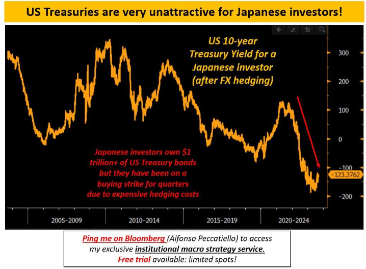
The Key Macro Charts To Watch
Hi all, and welcome back on The Macro Compass.Last call: there are only 53 spots (9%) left to secure your heavy discount for the TMC Bond Market Course!As a loyal TMC reader, there is an exclusive offer for you: using the coupon ‘‘BOND500’’ at checkout you can claim a chunky 25% off!You can watch the course and download the material anytime you want, but this exclusive offer won’t be there forever :)Not many spots left, so be quick and take advantage of it offer before it sells out!For more information, you can visit this dedicated page.The ECB Policy MistakeThe ECB hiked interest rates to 4% and I think they made a policy mistake.Lagarde keeps throwing fuel on the fire as the European economy is already feeling the tightening much harder and faster than the US: but why?This is a function of ECB tightening but also of the fact that the European private sector enjoyed amazingly cheap borrowing rates for so long – and hence the change of tune is felt much harder.Have a look at the chart below which shows European BBB 10-year corporate borrowing costs from 2013 to today:- 2013-2023 average: 1.69% (blue line)- 2016-2019 average: 1.35% (green line)- Today: 4.20% (!!!)European BBB-rated corporates could borrow for 10-years at 1.69% (!) all-in cost on average between 2013 and today – that’s the blue line on the chart. If we focus on the pre-pandemic period, between 2016-2019 that average was 1.35% only (green line).Today, life is much harder: borrowing costs have almost tripled (!!!) to 4.20% and most importantly they have been sitting there for almost 12 months now.That’s a serious tightening of borrowing conditions which is biting into the European economy pretty hard.Yet the ECB keeps hiking and it also ignores another macro beast threatening Europe much more seriously than the US: refinancing cliffs!The chart above shows the % of corporate loans and bonds maturing per each calendar year per different jurisdictions.As corporates spread out their borrowing over time, refinancing needs are not all clustered together: on average companies have to refinance about 10-15% of their entire borrowing needs each year (red line).As you can see, Europe (blue) faces a tough task next year: European companies will need to refinance 25% (!) of their borrowing needs in 2024 and they will have to do it at borrowing rates which are much higher than what they are used to.As the refinancing cliffs approach fast in Europe, companies have to take hard decisions: stay away from leverage and shrink their businesses altogether, or cut structural costs (e.g. jobs) to maintain a viable business despite higher borrowing rates.The ECB just hiked in the face of an already weak economy facing sizeable refinancing cliffs: I think Lagarde just made a policy mistake.Japan Matters for Global Bond MarketsIn a recent interview, Bank of Japan governor Ueda signaled the era of negative interest rates in Japan might soon be over.As a result, currencies and bond markets were on the move.But why does Japan matter so much for global bond markets?Japanese investors are amongst the biggest capital exporters in the world, and they have become gigantic buyers of US Treasuries, European fixed income and other foreign bond markets.As domestic yields have been depressed for so long and Japan kept accumulating savings and foreign reserves, it looked for ways to invest these abroad to generate higher returns.For reference, Japanese investors alone own over $1 trillion of US Treasuries and some EUR 400 bn in various European bonds (mostly French and German).Now that domestic yields in Japan might be on the rise, will they stop investing in foreign bonds?Here is the thing: they have already done that.The Japanese support for global bond markets has been fading for quarters already.But if Japanese bond yields have just started to rise, why did this happen already quarters ago?You see: when Japanese investors buy foreign bonds they must swap existing JPY for USD or EUR.This means they would run FX risk too which often they don’t want – from my personal experience speaking to Japanese investors in my previous job, they hedge the FX risk between 3 and 12 months which is considered a large enough period of time to assess the risk/return of their bond investment after hedging FX risk.The chart above shows you what a Japanese investors see when looking at investing in 10-year US Treasuries after the costs for hedging USDJPY for the next 12 months.For Japanese investors, today US Treasuries are extremely expensive to own because FX hedging costs are super high (Fed rate hiking cycles versus no BoJ hikes) while curves are inverted and hence the yield benefit in investing in foreign 10-year bonds is dramatically reduced.US Treasuries are the most expensive in decades for Japanese investors.They have been so for quarters now.And the next BoJ action will be crucial to determine whether this trend continues.Is Powell Done Hiking?US inflation surprisingly accelerated in August:
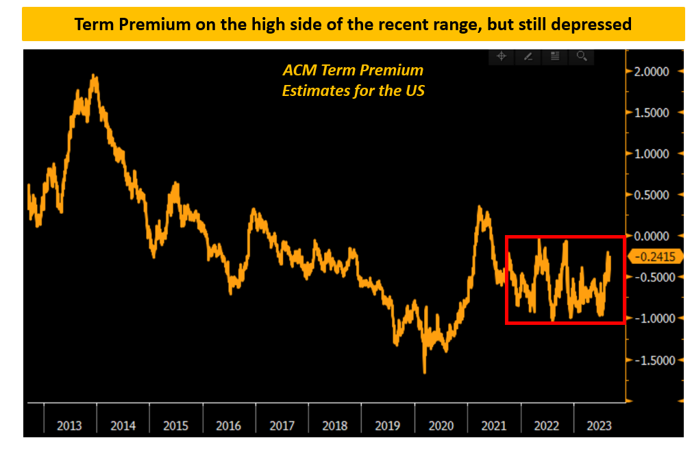
Bonds On The Move
Hi all, and welcome back on The Macro Compass.Quick reminder: The TMC Bond Market Course is out, and the heavily discounted spots are running off fast!As a loyal TMC reader, there is an exclusive offer for you: using the coupon ‘‘BOND500’’ at checkout you can claim a chunky 25% off!The offer though is spot-limited: out of the 500 available spots only 223 are left (55% already taken in 3 days).So: be quick and take advantage of this exclusive offer before it sells out!For more information, you can visit this dedicated page.Over the last few weeks bond markets have been on the move: 30-year Treasury yields have rapidly surged from below 4% to almost 4.50% catching many by surprise.Yet understanding why and what drives bond market action is a crucial skill for macro investors, so let’s explore together an approach that will help us make sense of the recent bond market developments.Nominal bond yields can be thought of as the interaction between:1️⃣ Growth expectations2️⃣ Inflation expectations3️⃣ Term premium1. Growth expectationsWhen it comes to economic growth we must consider two angles: structural and cyclical growth.Structural economic growth can be generated through more people joining the labor force (good demographics) and/or through a more productive use of labor and capital (strong productivity trends).The ability of an economy to generate structural growth is an important driver behind long-dated bond yields (strong structural growth = structurally higher long-dated yields and vice versa).Short-term economic cycles also matter for bond yields - particularly at the short-end.Cyclical growth trends are driven by the credit cycle, the fiscal stance, earnings growth, labor market trends and more - the healthier they are, the higher short-end bond yields can be pushed also as a result of a likely tightening from Central Banks that might grow worried about economic over-heating and inflationary pressures in such an environment.What happened to growth expectations recently?Analysts stopped revising down their 2023 earnings per share (EPS) expectations and started revising them higher for 2024 - they are now looking for a healthy 12% EPS growth for next year!On top of this, consider that:* The AI-mania led to speculations over big productivity gains, and therefore boosted the ‘‘higher structural growth’’ narrative';* The stubbornness of the US economy spurred discussions on whether we can handle higher rates for longer due to stronger structural growth;In short, long-term growth expectations were revised higher: the first item of the equation above contribute to pushing 30-year Treasury yields higher.2. Inflation expectationsThe second component driving nominal bond yields is inflation: but NOT TODAY'S inflation - instead we are referring to long-term inflation expectations.Central Banks might temporarily react to concentrated bursts of inflationary pressures by raising short-term interest rates but when it comes to long-dated bond yields investors will always pay close attention to inflation expectations.That's because consumers and borrowers will tend to make important decisions based on these rather than on volatile short-term trends in inflation.What happened to the inflation component?Contrary to popular belief, investors are generally not scared of sticky persistent inflation: the US 5y5y inflation break-even has traded in a 2.45-2.75% range for the last 12 months - that means investors expect US CPI inflation to float around these levels between 2028 and 2033.In short, investors have pushed 30-year Treasury yields higher NOT because of fear over sticky persistent inflation but because of:* Positive re-rating of cyclical growth (EPS expectations pushed higher);* (Some) Positive re-rating of structural growth (narrative driven: AI, higher r*);* Wait for it…3. Term PremiumAn investor looking to get fixed income exposure can do that via buying 3-month T-Bills and rolling them each time they mature for the next 10 years.Alternatively, it can decide to purchase 10-year Treasuries today.What's the difference?Interest rate risk!Buying a 10-year bond today rather than rolling T-Bills for the next 10 years exposes investors to risks – term premium compensates for this risk.The lower the uncertainty about growth and inflation down the road, the lower the term premium and vice versa.The chart above proves the point: the higher the uncertainty (x-axis moving to the right) about future growth and inflation, the higher the term premium (y-axis moving upwards).Per our simple equation shown earlier, a higher term premium pushes long-dated nominal bond yields higher.So, what happened to term premium?Estimates of the US Term Premium have moved higher and they are now testing the upper side of recent ranges: in other words, there is some more uncertainty being priced in about the path ahead for growth and inflation.Investors are less confident about a future of predictably contained inflation and growth, and they expect

US Downgrade! Now What?
Are we back in 2011 or what?After the US debt ceiling drama earlier this year we just witnessed a rating agency downgrading the US exactly like in 2011 – back then S&P, this time Fitch.Today you are likely to read plenty of scary and fear-mongering headlines.In this piece instead we’ll take a step back and rationally assess what the US downgrade means for investors and markets out there.A few words on the reasons behind the downgrade: Fitch pointed out the prolonged discussions on debt ceiling show ‘’deterioration in the standards of governance’’ and the rating agency also sees an economic downturn ahead which is likely to weaken government finances further.The chart below shows the US spending on interest payments nearing an annualized $1 trillion: a scary chart…if you think the US government has a constrained budget like a household.But that’s not how it works.The government doesn’t ‘’need to find money’’ before delivering deficit spending: the government is the very issuer of the money the private sector uses so its balance sheet doesn’t work like ours.Deficit spending creates a hole in government’s balance sheets and increase our net wealth (it’s nice when they cut your taxes or throw cheques at you right?) – this increases bank deposits in the system.More bank deposits (liability for a bank) imply more bank reserves (assets for a bank) in the system too, and when the government issues bonds to ‘’fund’’ its deficit spending primary dealers can swap these reserves (or use the repo market) for newly auctioned Treasuries.There are more steps and versions of how this could work, but this stylized example should help you understand the main concept: deficit spending creates money for the private sector and the government doesn’t ‘’need to find money’’ to spend money – the government creates money in the first place.Repeating this concept is useful to demystify ‘’scary’’ charts like the one you saw before: yes government interest payments are rising but it’s not like the US needs to ‘’choose’’ between spending on interest and spending money in the real economy – its balance sheet doesn’t work like ours.The real limitation to uncontrolled deficit spending is inflation and scarcity of resources (2021-2022 prime example) and not some budget constraints typical of a household.Ok, but how does the Fitch downgrade affect investors and market participants?The key point is that US Treasuries now have their second-best rating at AA+ instead of AAA given that only Moody’s preserved its top rating for the US.US Treasuries are the most widely used form of collateral in the world due to their high rating, liquidity, deep repo market and solid democratic foundations/rule of law: does the downgrade affect that?Let’s have a quick look at the rating requirements that different institutional players must adhere to when investing in safe government bonds to explore whether a downgrade to AA+ makes the difference.Commercial banks are huge buyers of Treasuries: they use them as regulatory liquid assets (HQLA), as collateral and also sometimes as an asset to hedge interest rate risk on their liabilities.The Basel regulatory framework introduced 10 years ago has 0% capital requirements for government bonds rated between AAA and AA- for its standardized approach: the downgrade to AA+ wouldn’t make any difference. Most banks actually choose an internal-rating based (IRB) approach based on internal models and in that case most jurisdictions apply an exception for any investment-grade rated domestic government bond which automatically assigns them a 0% risk weight.Bottom line: for banks this downgrade makes no difference at all.Pension funds and insurance companies are also large buyers of Treasuries: they use them as a long duration asset to match their long liabilities (life insurances payouts, pension payouts etc) and as collateral.For a pension fund considerations about risk/return profile are important: they not only need to hedge interest rate risk but also try to deliver long-term returns to make the pension system sustainable over time.AAA-rated or AA+ rated US Treasuries would still fall in the hedging camp or in the defensive asset allocation camp and a one-notch downgrade wouldn’t make the difference.When it comes to collateral usage, pension funds and insurance companies are very active in the repo market: they lend their unsecured cash parked at a bank against collateral to upgrade the safety of their ‘’cash’’ deposits – does a downgrade affect the collateral status of US Treasuries?These are the recommended haircuts that the Basel committee suggests to apply to collateral lent/received in these transactions:As you can see, bonds rated between AAA and AA- all fall within the same bucket.Certain pension funds have stricter collateral demands and only accept AAA collateral though, but still the marginal impact of the Fitch downgrade is likely to be extremely minor.Big buyers of US Treasuries also include FX reserve managers:
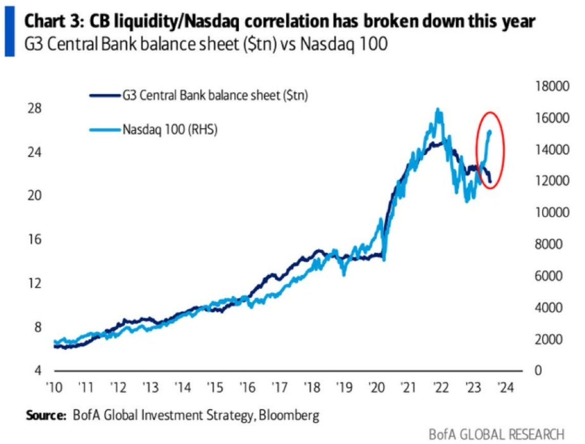
The Liquidity Illusion
The big Central Bank week is here: ECB, BoJ, Fed…wow!Well…if you are an institutional investor who enjoys my macro analysis, I have great news for you!I just launched a live Bloomberg chat service and institutional research service dedicated to you!I'll cover macro, Central Bank and market events daily through an interactive BBG chat and deliver institutional-focused macro research pieces - ping me on Bloomberg (Alfonso Peccatiello) or email at [email protected] for a 2-weeks FREE trial!Yes: it costs you nothing to try!This is one of the most popular and yet misleading charts in macro.People like simple narratives: the Fed is ''pumping money'' into the ''system'' and that's why equity markets go up.That’s just NOT how it works - let’s explain why.A good starting point is asking ourselves what’s ‘‘money’’ and what’s the ‘‘system’’.Let’s start from money.Central Banks' balance sheets expand mostly through monetary operations: the most known is QE, but there are also other tools like the recently created Fed's BTFP.In any case, when the CB expands its balance sheet by acquiring assets (QE) or providing financing in exchange of collateral (e.g. BTFP, TLTRO) it also expands the liability side - it prints ''money'', but to be more precise it prints bank reserves.Bank reserves are bank-money, not real-economy money: only banks can transact in bank reserves with each others, and these reserves can never (I repeat, never) reach the private sector.No: banks don't ''multiply'' reserves when they make loans.As the Bank of England shows, banks create new money when extending credit to the private sector and they do not ‘‘transform’’ existing reserves.But most importantly, no: banks don't buy stocks (!) with newly printed bank reserves!The idea behind this chart is just wrong: as the Fed creates new bank reserves (''liquidity'') there would be a mechanism for which banks deploy these reserves in financial assets hence pushing equity markets up.But banks don't do that.What are reserves used for?Mostly to settle transactions against other banks.They also account as a High Quality Liquid Asset (HQLA) together with government bonds and certain corporate and mortgage-backed securities: banks can use them to pay other banks if they buy HQLA assets from those, passing over bank reserves in a closed system like a hot potato.But they won't use reserves to buy stocks - they are effectively not eligible as a HQLA asset or only under extremely strict conditions.Equity ownership as a % of HQLA buffers from big European and US banks is negligible - conditions are so strict you could say it’s almost 0%.I know what you are thinking now: the portfolio rebalancing effect.If banks are bidding corporate bonds away from each other's HQLA buffers, spreads will tighten and this should invite a more aggressive stance from equity investors too.That's partially true, but it's a potential second-order effect which also requires fundamentals (!) to back the thesis: banks aren't gonna blindly over-allocate to corporate bonds because they have more reserves if they smell the risk of rising defaults.See what happened in 2008: the Fed ‘‘printed’’ almost $1 trillion (orange) very rapidly and yet corporate credit spreads (blue) kept widening as default risks were increasing due to the Great Financial Crisis.Economic conditions matter after all.Which brings me to the main point why the original chart in this piece is misleading.These two series trended up over the last 15 years for different reasons: Central Banks kept accommodating through QE & Co to bring inflation back to target and most importantly......the Nasdaq went consistently up also because earnings grew by roughly 10% on average per year (!!!).Don’t believe me yet?Let’s do some basic math together.Is it really true that ‘’liquidity’’ is so tightly correlated to stock market returns?We ran a simple linear regression analysis between the change in ‘’liquidity’’ (US bank reserves) and the S&P500 returns in the last 15 years – we played around with time lags, outliers, return windows...everything.Bank reserves and stock markets both tend to go up over time and hence they look ‘’correlated’’, but analysing the rate of change of liquidity and S&P 500 returns helps with smoothing this problem away.The result was consistently clear.A simple linear regression exercise tells us ‘’liquidity’’ is pretty bad at predicting stock market returns: as shown by the R2 data, in the last 15 years US liquidity only explained 3-4% (!) of the variation of SPX returns.So, yes: both series trended up over time and plotting them on a dual-axis chart looks great but stocks go up over time because earnings grow and not because Central Banks pump ''money'' in the ''system''.Money in this case means bank reserves, and banks can’t and won’t use reserves to buy stocks - the direct relationship and simple narrative suggested by mainstream macro commentators……simply doesn’t exist.The big Central Bank week is here: ECB, Bo
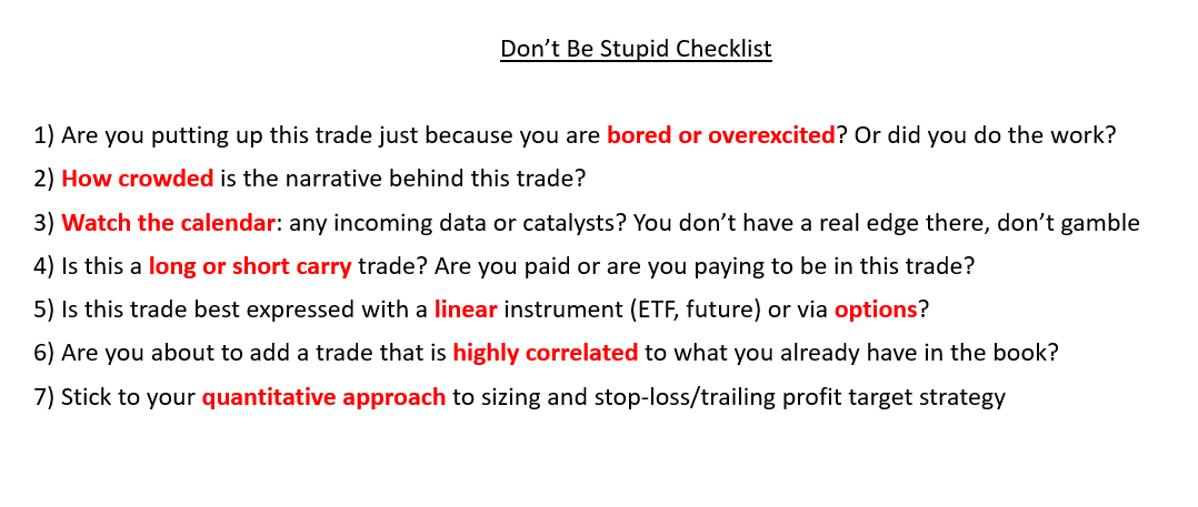
How Not To Suck At Trading
‘’I compile statistics on my traders. My best trader makes money only 63 percent of the time. Most traders make money only in the 50 to 55 percent range. That means you’re going to be wrong a lot. If that’s the case, you better be sure your losses are as small as they can be, and that your winners are bigger.’’ – Steve Cohen, Point72 hedge fund founderThis is a hard truth to accept for many macro investors: we will be right only about 50-55% of the times.If your win rate is much higher than this, I suggest you extend the sample of trades you are analyzing or assess whether you are not trading macro but rather just selling optionality – short vol/option strategies have win rates as high as 90%+, but they wipe you out completely when you are wrong.In the last 10 years, I scored a 53% long-term win rate on my directional macro trades.Once I realized that and given that the year-end P&L formula can be written as follows:I knew I’d better make sure the size of my losses doesn’t get out of control.This can be achieved in two ways: sizing trades correctly and designing a system that lets your winners run.We are going to talk about my approach to both angles in a second, but first another important remark.To step up the win rate on macro trades from 50% to say 55% over a long period of time, you need to gain some edge over other macro investors.What could that be?* A data-driven approach with superior macro models* The ability to assess the gigantic amount of cross-asset market signals via quantitative tools* A particular edge in a niche market that you have learnt to navigate well over time* Be less stupid than othersMacro models and interactive tools help, but my ‘’don’t be stupid checklist’’ adds value too - here is what I go through for every tactical trade I set up:Points 1-3 keep my emotions in check and ground me to a more rational assessment of the trade.Points 4-6 are about implementation.A warning: short carry trades (and long options) are expensive to hold over time if nothing happens.A reminder: in very choppy markets, you can get quickly stopped out with linear trades even if your thesis proves to be correct – consider whether the market regime favors linear or option implementations.Don’t be stupid: check whether the trade you are about to add is not just another expression of a trade you already have on – I have seen people blow up as the 10 trades they were running were just…the same trade.But it’s point 7 that sticks out: sizing and risk management define most of your P&L at year-end.Here is how I approach them through a practical example.Say you think that the S&P500 will keep marching higher over the next month: how many SPYs do you buy?Let’s find out some smart ways to size positions and apply effective risk management…Eager to read the remaining part of this macro report?If you are an institutional investor enjoying these free previews and you want info on our dedicated services, feel free to send us an email at [email protected] you are not, don’t worry - we are happy to onboard you on The Macro Compass premium platform too!Joining the All-Round tier you’ll get access to Alf’s full-length timely pieces (3x/week), actionable investment strategy, interactive macro tools and much more!Check this link or the button below: This is a public episode. If you would like to discuss this with other subscribers or get access to bonus episodes, visit themacrocompass.substack.com

Jawboning
Thanks for reading this piece and supporting The Macro Compass! :) If you are an institutional investor enjoying these free previews and you want info on our dedicated services, feel free to send us an email at [email protected] you are about to pause a hiking cycle and in the run-up to the event you have stock markets pushing higher and animal spirits running loose: what do you do?You still deliver the pause you promised, but you sound as hawkish as you can - in other words: jawboning.Powell’s press conference and the Dot Plot (the most overhyped and useless Fed tool, more on this later) were designed as hawkish as possible to try and deter a melt-up bid in SPX in response to the actual pause.Cutting through the noise, the reality is that the Fed is pausing as they are more confident in a soft landing and don’t want to run the risk of overtightening and be blamed for causing an avoidable recession.It reminds me of late 2006: pause, dream of soft landing in 2007, recession in 2008.History doesn’t repeat but it often rhymes?The Summary of Economic Projections (SEP) says a lot about the Fed’s high confidence in a soft landing:Contrary to March (red boxes), there are now a whopping zero FOMC members expecting a recession in 2023 (and in 2024 too).Also, less and less FOMC members see downside risks to their 1% GDP growth projection this year.Not only the base case for GDP growth has been revised higher, but also unemployment rate is expected to remain lower while core inflation will trend down but more slowly.The Fed is predicting the mother of all soft landings.The two additional hikes in 2023 (blue box) are there as a posturing exercise: we think the economy is doing ok and the labor market is still tight and while inflation is moving in the right direction, we feel confident we can nudge rates a bit higher if needed to be – after all, the economy can handle it in case, right? I think the Fed would highly prefer not to find out.If a year ago you’d tell Powell that jacking up rates to 5% and doing $95 billion/month in QT would have resulted in below-trend growth (no recession yet) and inflation convincingly moving towards the 3% area he would have jumped out of joy.At this point, you don’t want to risk ruining this apparent soft landing miracle.Under the surface though, overlooked but crucial corners of the markets are calling the Fed bluff…Eager to read the remaining part of this macro report?Come join The Macro Compass premium platform to get access to Alf’s full-length timely pieces, actionable investment strategy and much more!Check which subscription tier suits you the most using this link or the button below:For more general information, here is the website.If you are an institutional investor enjoying these free previews and you want info on our dedicated services, feel free to send us an email at [email protected]. This is a public episode. If you would like to discuss this with other subscribers or get access to bonus episodes, visit themacrocompass.substack.com
The Next Big Macro Trade?
The pace of the upcoming disinflationary impulse is likely to surprise many: most of our TMC models and leading indicators confirm our call for US core CPI to be in the 3% area by December, and to drop at or below Fed target in early 2024 already.We believe markets are far from fully appreciating this major disinflationary impulse which brings important implications for macro portfolios.Let’s review the evidence first.1. No, disinflation isn’t only in commodities and goods: services sector inflationary pressures are abating tooThe subcomponents that measure expected services’ sector price pressures in the ISM Services and the NFIB Small Business survey (orange and yellow, LHS) tend to lead trends in YoY US Core CPI by 6 months (blue on RHS, lagged by 6 months).Both indicators widely and correctly anticipated the rapid surge in core inflation in 2022, but they are now somehow ‘’overlooked’’ as delivering false signals on the downside – that’s called recency bias.Core (services) inflation is the most lagging macro variable in each cycle, and as the growth impulse and hiring trends have peaked in 2022 and slowed down ever since it makes sense core CPI would cool off too.These leading indicators suggest US Core CPI should be in the 3% area by December already, and judging by their downward trend a 2%-handle in 2024 is not out of the question.That would mean the Fed having effectively achieved their goal: that would be a massive change for macro investors out there.2. Don’t forget rent of shelter: the disinflationary lags are about to kick in!Rent of shelter represents about 40% of Core CPI, and as negotiated on-the-ground rent inflation has massively cooled off (blue, LHS) since mid-last year we should start getting some serious disinflationary impulse in the official Rent of Shelter component (orange, RHS) about…now.This is quite a known unknown amongst Fed members and market practitioners, but let me ask you this: what happens when we start actually getting consecutive 0.2% MoM Core CPI prints?Even as a decline in rent of shelter inflation is expected, do you think the market is ready? I doubt it, so bear in mind this known unknown for the next few months.3. Inflation is always a monetary phenomenon (you just need to know how to measure money…)This is one of the most important macro charts out there, and a powerful force behind the next big macro trade we believe lies just around the corner…Eager to read the remaining part of this macro report?Come join The Macro Compass premium platform to get access to Alf’s full-length timely pieces, actionable investment strategy and much more!Check which subscription tier suits you the most using this link or the button below:If you are an institutional investor, feel free to send us an email at [email protected] for further info on our dedicated services.For more general information, here is the website. This is a public episode. If you would like to discuss this with other subscribers or get access to bonus episodes, visit themacrocompass.substack.com

Liquidity: What's Next?
Assuming no last minute surprises, it seems like we might be getting a debt ceiling deal in the US which means you should be prepared to get overwhelmed with financial commentators’ takes about ‘’liquidity’’.The very unnuanced story goes like: the government needs to rebuild its Treasury General Account (TGA) buffer at the Fed so it issues bonds and it drains ‘’liquidity’’ from the ‘’system’’.And here I can picture you guys thinking: what the heck does that mean? And is it true?In this piece, we will:* Show the monetary mechanics that underpin a post-debt-ceiling-deal TGA rebuild;* Analyze if and how well ‘’liquidity’’ (e.g. bank reserves) predicts stock market returns;* Explain the role liquidity plays in our models to shape our Macro ETF Portfolio, and discuss our investment strategy accordingly.Monetary mechanics are best understood through the use of good old T-accounting.In our stylized model, we will assume 5 players (government, Fed, commercial banks, money market funds and households) and mimic each monetary transaction – colors will help you ‘’follow the flow of money’’.Before we go to the post-debt-ceiling TGA rebuild, let’s start from bond issuance to fund deficit spending.BLUE: the government spends $100 (deficit spending) and it injects net worth into the private sector (household’s equity) and so households now have $100 more bank deposits. These bank deposits end up as a liability for banks, and the corresponding increase in asset is a boost of $100 in bank reserves.GREEN: the government ‘’has’’ to issue $100 in bonds to ‘’fund’’ its deficit spending, and banks use some of their increased reserves to buy $100 in bonds.There is no reduction in bank reserves when the government issues bonds to ‘’fund’’ deficit spending.But what happens instead if the government issues bonds solely to refill its Treasury General Account as in a typical post-debt-ceiling-deal period?RED: the government issues $100 in bonds without spending anything in the real economy, and banks have to absorb the new bond issuance by depleting existing bank reserves ($ -100).GREEN: the government refills its Treasury General Account (TGA), and that is reflected in the composition of the Fed liabilities: TGA up $100, bank reserves down $100.This is how a TGA rebuild drains ‘’liquidity’’ (e.g. reserves) from the financial system.If the government issues bonds without spending real economy money and banks/private sector must absorb the new issuance without any fresh new resources, bank reserves take the brunt.But why are bank reserves referred to as ‘’liquidity’’ in the first place?Bank reserves are money for banks: they use reserves to transact against each other and with the Fed, and you can think of them as the lubricant of the monetary mechanics pipes – the more reserves out there, ceteris paribus the easier for banks to engage in repo markets and provide liquidity to market participants.Reserves are also part of banks’ high-quality liquid assets (HQLA), and hence a bigger reserve balance might encourage banks to take more risks in their liquidity portfolio for instance by buying corporate bonds – this compresses credit spreads and enacts a more favorable environment for equity investors.On the contrary, less reserves are often associated with banks taking a more defensive investment stance and in providing markets with less liquidity.So, is it as easy as saying that the TGA rebuild will for sure drain liquidity from the financial system?How to best track global liquidity, what’s its direction ahead and what does that really mean for investors in the second half of the year?Let’s dig in with some deep and actionable macro analysis…Eager to read the remaining part of this macro report?Come join The Macro Compass premium platform to get access to Alf’s full-length timely pieces, actionable investment strategy and much more!Check which subscription tier suits you the most using this link or the button below:For more information, here is the website. This is a public episode. If you would like to discuss this with other subscribers or get access to bonus episodes, visit themacrocompass.substack.com
Currencies Matter
Hey everybody! Before we start, a quick announcement.I just launched The Macro Compass YouTube channel!Every week I will release a 10-minute video that breaks down the most important macroeconomic and market developments - no jargon, in plain English and with the use of plenty of charts!It’s of course free, so what’s your excuse for not subscribing? :)This is the link to the channel.The FX market is one of the biggest and most liquid in the world.Fluctuations in currency valuations also greatly affect investors’ portfolios: for instance, a US investor buying Japanese equities will be inherently exposed to the Japanese Yen too.So, how to make sense of FX moves and valuations?Let’s get into this edition of the TMC Macro Education series where we are going to cover the most important fundamentals and drivers of currency valuations.Now, picture we are walking into an energy crisis with a tight Fed policy and a roaring USD like in 2022 and you want to rank global currencies (using the USD as denominator).The table above did just that based on current account, fiscal balance, net international investment position (NIIP), an index that measures debt vulnerabilities, net foreign exchange reserves and a measure of policymakers’ credibility.Let’s see why these indicators matter for the value of currencies.The current account balance measures whether the value of goods and services exported by a country exceeds (surplus) or is lower (deficit) than the value of its imports.Due to higher energy prices, dysfunctional supply chains and a de-globalization push currencies that heavily relied on cheap imported energy and strong exports suffered the most: EUR, GBP, JPY for instance.Countries with a stable current account surplus (e.g. Switzerland) export more than they import, and that means they accumulate more FX reserves they can use to stabilize their own currency.A good indicator to keep track of these developments is Terms of Trade (TOT), which is the ratio between the price of exports and the price of imports (higher = better for the currency).You can find current account balance and terms of trade data here and here.Net foreign exchange reserves represent the country’s war chest to stabilize their domestic currency against sharp devaluations – the larger the war chest, the easier to stop the bleeding.When the Japanese Yen was under pressure and trying to breach 150 versus the US Dollar, it was aggressive sales of USD from the Japanese net FX reserves war chest that discouraged sellers to proceed further.If Japan exports more than it imports, the country accumulates FX reserves which it invests in safe and liquid securities like US Treasuries – so far, so good.When running this analysis, watch out for the ‘’net’’ though: Japan can also borrow (!) US Dollars through the FX derivatives or the repo market and these borrowed USD offset the available FX reserves.In general, the bigger the net FX reserves war chest the more positive for the domestic currency.The best way to tally up foreign exchange reserves is by comparing them to months’ worth of imports: back in September when speculators were attacking the JPY, Japan could cover 1.5 years (!) worth of imports by selling its net FX reserves down.Data on FX reserves can be found here. For the net numbers, you have to dig into each Central Bank website.So far we talked about goods and services, imports and exports.But our world is highly financialized, and so the flow of financial assets and liabilities matters a lot: that’s what the Net International Investment Position (NIIP) tracks.Can you find the outlier? :-)Be careful extrapolating too much from this metric alone: as the provider of the reserve currency of the world, the US will always have foreign countries investing in US assets (Treasuries, US equities etc) to a larger extent than US investors export capital abroad.As ~70% of global trades are denominated in USD, these hard-earned Dollars are then recycled back into US asset markets contributing to a negative NIIP.Nevertheless, it’s important to remember that countries with a negative NIIP are net financial debtors towards the rest of the world and hence their domestic currencies are more vulnerable to financial shocks.You can find NIIP data here.What about domestic fiscal policy and external debt?When it comes to currency fundamentals, a key concept to understand is that despite getting a lot of mediatic attention government debt denominated in domestic currency is much less of an issue than private debt or foreign currency denominated debt.It’s much easier for a sovereign country to service a big amount of its own government debt denominated in local currency (Japan has been doing that for decades) than servicing foreign-currency denominated debt (China can’t print US Dollars) or for households to handle mortgage debt during a housing crisis.Therefore, look for external debt vulnerabilities and trends in private sector debt: guess where the most indebted househol
Will the US Default?
The US is dangerously close to triggering its debt ceiling limit, and yet markets seem very relaxed.The 2011 episode shows us how political incentive schemes can instead drag negotiations until the very last minute, and force investors to price in a more meaningful probability of an actual bad outcome.So, let’s have a look at:* The actual mechanics of government spending and the meaning of a debt ceiling;* The potential x-date and what happens if we cross that without a deal;* The impact on bonds, equities, and the US Dollar under a no-deal scenario.In our monetary system, the government doesn’t need money to spend money.As the very issuer of the currency we use, with deficit spending the government actually increases our net wealth – for instance, tax cuts imply we have more spendable money without incurring in any direct liability.The real limitation to uncontrolled deficit spending is not ‘’where is the government going to find money’’, but inflation: excessive deficits may lead to (unproductive) excess demand which often can’t be met by a rapid increase in supply or resources – and the release valve is then an ugly inflationary spiral.In any case, we also have another self-imposed accounting rule which dictates the government can’t run with negative equity and hence must issue bonds to ‘’fund’’ its deficit spending – see the table below.This is when the US debt ceiling becomes a problem: another self-imposed limitation which prevents the US from incurring in debt above a certain threshold to ‘’fund’’ its deficit spending.If the government can’t issue bonds anymore, to maintain its current level of (deficit) spending it will spend down its Treasury General Account at the Fed – but we are running out of fuel there too.The TGA has been rapidly drawn down from $600 billion in January to less than $70 billion as per last week.A key question is – when do we actually hit the zero lower bound?John Comiskey (here) has been doing a great job in tracking and estimating government cash flows to project the famous ‘’x-date’’ when the US government is going to empty its TGA completely.His latest analysis shows that between Jun 2nd and Jun 9th we are going to be dangerously, dangerously close to the zero lower bound – and as Yellen already warned us, we might actually hit it around these dates.It’s worth remembering that past these dangerous dates, by Jun 12th new tax receipts would be coming in hence providing a much needed TGA boost to the government.But let’s assume the TGA hits zero and the debt ceiling prevents the US government from issuing bonds to fund (deficit) spending.Would the US government default then?What would be the impact on bonds, stocks, the US Dollar and Gold and are markets preparing for such an outcome or would they be surprised?How to prepare a portfolio for such an outcome?Let’s dig in…Eager to read the remaining part of this macro report?Come join The Macro Compass premium platform to get access to Alf’s full-length timely pieces, actionable investment strategy and much more!Check which subscription tier suits you the most using this link or the button below:For more information, here is the website. This is a public episode. If you would like to discuss this with other subscribers or get access to bonus episodes, visit themacrocompass.substack.com
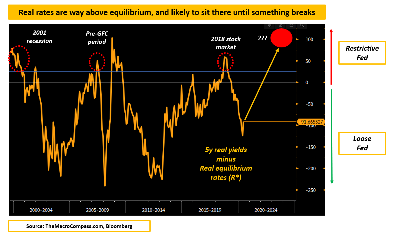
The Real Deal
Our economic system is ultra-financialized and dependent on leverage.That’s why understanding the incentive scheme for both investors and borrowers is an important step to piece the global macro puzzle together.Real yields play a crucial role in that puzzle.Rule #1: you can’t calculate real yields by subtracting today’s inflation from long-term interest rates!The right formula to calculate real yields is the following:From a borrower’s perspective, real yields represent the expected inflation-adjusted borrowing costs to take on more debt and leverage.Why do real borrowing rate matter more than nominals?That’s because as a borrower if you pay 3% nominal interest rate on your debt but you expect inflation and your cash flows to grow by 4% per year, servicing your debt burden won’t seem that scary.It’s about future inflation, not today’s - and that explains the formula above.Real interest rates matter for borrowers because they inform them on the expected inflation-adjusted cost they will face when taking on more debt and leverage.From an investor’s perspective, (risk-free) real yields represent the safest layer of inflation-adjusted returns they can make and hence set the bar for everything else.If you can make 5% real risk-free return per year, your appetite to go and YOLO into some unprofitable tech name will be much lower.If real yields are negative, you will be looking for alternatives to deploy your cash much more aggressively.Real yields play a big role in influencing investor’s asset allocation preferences.Here is a stunning chart: the US real yield curve today (orange) against 2 years ago (blue) - the curve is derived using Treasury Inflation Protected Securities (TIPS) for different maturities.In 2021, US real yields were deeply negative and projected to remain so for the next decade (!).Borrowers had the best time of their life as they could lock in extremely cheap inflation-adjusted borrowing costs, and investors were charged with negative real yields for the ‘‘luxury’’ to own risk-free government bonds.Back then, it was all about TINA (there is no alternative): you have to get involved in risk assets at whatever valuations, and you have to go a step further before the herd does so - buy altcoins and unprofitable tech stocks, sell it to the next guy coming.The absolute level and the rate of change in real yields are important drivers of stock market valuations.As the chart below shows, if long-dated real yields are negative (blue, LHS) for a prolonged period of time people will at some point be happy to pay 30x forward P/E (!) to pile up in the S&P 500.We used 5-year forward 5-year real yields to isolate market expectations in 2021 for where US real yields would have been between 2026 and 2031.In 2022 the Fed changed its mind, and Powell started to worry about inflation and hiked rates aggressively - he even explicitly mentioned real rates multiple times as he wanted to see them in positive territory.A sharp increase in real yields (blue, LHS) led to a rapid drop in stock market valuations (orange, RHS) in 2022.As soon as investors were actually given an alternative through positive real rates on risk-free Treasury bonds, they understood there was no reason to pay frothy multiples for equities.A rapid change in real yields affects markets behavior, and a persistently positive or negative level of real yields slowly affects investors’ preferences over time (positive real yields = less appetite for risk assets and vice versa).But real yields also matter a great deal for economic growth.Because real yields are so important for borrowers and providers of capital and our economy functions smoothly when there is balance between the two, let’s define a crucial macro concept: equilibrium real yields (r*).R-star is the equilibrium real rate at which our economy functions smoothly and delivers its potential GDP growth without overheating or falling into a recession.The younger, more productive and less indebted our economy is the higher r* is.Unfortunately weaker demographics, stagnant productivity and a big burden of debt have lowered the equilibrium real rate at which our economies can smoothly function.Today, estimated r* is at 0.00% - 0.25% in the US and at -0.50% to -0.75% in Europe.R-star is a theoretical equilibrium real rate, but we can observe where real yields are actually trading in markets - and hence we can estimate whether markets are forcing the economy to work with real yields which are higher or lower than equilibrium.The chart above shows a 20+ year history of US 5-year real yields minus equilibrium real rate r*: if the series records a negative level Fed policy was loose (real yields equilibrium.Notice how every time real yields were sitting above equilibrium, something broke in the economy and in markets (2001 recession, 2008 GFC, 2018 stock market).To the contrary, periods when real yields were below equilibrium were generally good for growth and markets (2004-2007, 2012-2017).Real yield

Credit Crunch
Investors have been asking themselves when and if are we going to see a real credit crunch.I think that’s the wrong way to phrase the question.Data shows we are already in a credit crunch.The real questions to ask are how badly and when is it going to affect the economy and markets.Let’s try to answer both questions together.Why so much attention on credit creation in the first place?A fiat system with weakening demographics and stagnant productivity trends can only achieve acceptable growth levels through the use of leverage: ample and cheaply available credit to the private sector.When you want to engineer cyclical growth, providing the private sector with cheap credit works like magic.Even as wages and earnings are unchanged, through cheap and readily available mortgages people can bid up the housing market and through lower borrowing rates companies can more easily finance their businesses and engage in more sales.With a lag, this drives up economic activity and a virtuous cycle begins: cheap credit, strong activity and earnings, buoyant markets, more robust hiring trends and higher wages.And the opposite happens when the flow of credit dries up and lending conditions tighten.This black-and-white chart from the St. Louis Fed shows how this has always been the case, even 60+ years ago: stop the credit flow and you get a recession (shaded areas).This is why credit data and things like the Senior Loan Officer Opinion Survey (SLOOS) get plenty of attention in the late stages of the macro cycle – but let’s clear some stuff before we dive into this data.The SLOOS mostly looks at bank lending and demand for bank loans: and while banks are an important driver of credit creation they are not the only one.In our highly financialized system credit creation also happens through capital markets, shadow banks, governments (and gov’t sponsored entities) and through more channels.In the US, bank lending accounts for only ~40% of total credit creation for the private sector.In order to get the holistic look, we developed the TMC Credit Impulse index – a refresh on that metric later.So, you are not looking at the full credit creation picture – but at roughly 40% of it.The second important point to remember is that the SLOOS asks banks and borrowers whether credit conditions and loan demand have changed relative to last quarter.If the net % of banks tightening their credit standards moves from 45% to 40% it doesn’t mean things are getting better: it means a net 40% of US banks have tightened (again) credit standards this quarter.0% means banks are applying the same (tight or loose) credit standards as last quarter.With this in mind, let’s look at the credit data and the SLOOS together.How tight are credit conditions today?Are they likely to get worse, and when will the economy and markets feel the heat?How do asset classes historically behave in similar conditions?Let’s dig in!Eager to read the remaining part of this macro report?Come join The Macro Compass premium platform to get access to Alf’s full-length timely pieces, actionable investment strategy and much more!Check which subscription tier suits you the most using this link or the button below:For more information, here is the website. This is a public episode. If you would like to discuss this with other subscribers or get access to bonus episodes, visit themacrocompass.substack.com

The Fed Meeting Explained
Most likely, this was the last Fed hike of this tightening cycle.Even before the press conference, the omission of the key sentence ‘’some additional policy firming may be warranted’’ from the statement release was a clear signal.Moreover, the statement about what comes next was eerily similar to the one used in June 2006 when the Fed paused its hiking cycle for 13 months.At this point, the base case is that Powell feels he is done: after raising rates by 500 bps in 15 months and considering the ongoing Quantitative Tightening on top…wouldn’t you feel like pausing, too?Sitting with rates at 5% and watching how ‘‘The cumulative tightening of monetary policy, the lags with which monetary policy affects economic activity and inflation, and economic and financial developments’’ play out is exactly what the Fed wants to do here.But after months spent underestimating how hot and persistent inflation would be, what gives the Fed enough confidence that 5% Fed Funds are restrictive enough to sit and watch how they cool inflation off?History.Over the last 30+ years, every time Fed Funds (blue) were raised above the levels of core sticky inflation (orange), policy turned out to be restrictive enough to cool inflationary pressures back to 2% or below.By summer, core sticky inflation should be trending in the 4% annualized area while Fed Funds will be sitting at 5% - and history suggests that means the Fed has tightened enough.Now the real questions are: how long does a pause last, how did markets historically perform in this period and how are they likely to perform this time?This excellent chart shows how the median Fed pause at the peak of the hiking cycle lasts only for about 5 months, and it is followed by pretty marked easing cycles.The dispersion around the duration of these pauses is big: in the 80s we could only pause for a month, while in 2000 or 2018 we paused for 7-8 months before seeing Fed cuts.Back in summer 2006, the pause was as long as 15 months…and it led us to the Great Financial Crisis.This time, the bar for the Fed to both raise and cut interest rates is very high.As Powell himself said, 5% Fed Funds plus ongoing QT are an undoubtedly restrictive policy tool and if you sum up the banking stress and tighter credit conditions you are looking at quite the cocktail.Why would you volunteer to tighten even further unless really forced to?On the other hand until inflation trends back to 2% you are obliged to look through the various alarm bells: banking stress, credit tightening, housing market dysfunctionalities – the hurdle to cut rates is very high, too.Which brings us to markets: if this pause is going to last for a while, what should we expect? In a nutshell: something to break.Let’s dig in together…Eager to read the remaining part of this macro report?Come join The Macro Compass premium platform to get access to Alf’s full-length timely pieces, actionable investment strategy and much more!Check which subscription tier suits you the most using this link or the button below:For more information, here is the website. This is a public episode. If you would like to discuss this with other subscribers or get access to bonus episodes, visit themacrocompass.substack.com

The Most Misunderstood Concept in Finance
Welcome back to another episode of our TMC Macro Education Series.Before we dive into it, a quick reminder: if you enjoy these educational pieces and you haven’t subscribed yet to The Macro Compass premium platform……well, what are you waiting for?Come join thousands of investors receiving unique, jargon-free macro insights and actionable investment strategy for their portfolios every week!For more information, here is the website.Now, back to this educational piece!Recently, US House Speaker McCarthy tweeted this:And although it sounds like common sense, it’s dead wrong.The government doesn’t need money to spend money.The government creates money for the private sector when it goes for deficit spending.Let’s explain this with the use of some simple T-accounts and a stylized example involving the government, the Central Bank, commercial banks and the private sector (us).Before government deficit spending, here is the stylized situation:1) The government has liabilities (bonds issued, purchased by commercial banks and the Fed) and assets in the form of student loans for example and money parked at the Fed (Treasury General Account);2) The Central Bank takes deposits in from the government (TGA) and issues bank reserves on the liabilities’ side, and it owns government bonds and other assets (say foreign exchange reserves);3) Commercial banks have deposits on the liabilities side, and an asset base composed of reserves at the Central Bank + government bonds + loans to the private sector;4) The private sector has deposits at commercial banks on the asset side, and debts and capital on the liabilities side.What happens when the government goes for the so-demonized deficit spending?The government blows a hole in its balance sheet, effectively creating negative equity through deficit spending – public opinion would say it spent money it didn’t have, and hence it must borrow (issue bonds).But have a look at what the government really did.The government spent $100 by sending cheques home to people (private sector), which all of a sudden find their bank deposits have gone up by the same $100 without any liability (!) immediately attached to it.In other words, the government blew a hole in its balance sheet but increased people’s net worth!Now, as private sector with an increased net worth (cheques sent to us) we might decide to immediately spend that money or keep it in a commercial bank.If we’d spend this newly created money on buying a car, the car seller would now own the new bank deposit.In any case, this new money will end up as a deposit in the commercial banking system.Hence, commercial banks now have more deposits (+$100).Given how balance sheets work, this also means they must have more assets right?The standard is that as deposits go up, commercial banks have more reserves to deposit at the Fed.We could literally stop here.Merely accepting the fact the government issues the very money the private sector uses, and it does not ‘’need’’ to save or find money before it spends it as McCarthy and many others believe.Another way to visualize this is by understanding that government deficits = private sector surpluses!The government doesn’t ‘’need’’ money from us, but instead it increases (deficit spending) or decreases (austerity) the private sector net wealth through its fiscal decisions.Back to the T-accounts for one last step.In our system, we have several self-imposed rules: one of them is that the government can’t run negative equity positions, but instead it issues bonds – it doesn’t ‘’need’’ to, but accounting standards dictate it does.Remember where we stood: the government does deficit spending, the private sector has more net worth and more bank deposits and commercial banks receive these deposits and increase their reserves at the Fed.When the government issues bonds to ‘’fund’’ deficit spending, commercial banks use reserves to buy them: after all, bonds often provide with higher yields than reserves and banks are in the business of making money.Now you can square all the process through the T-accounts above, and get it right: government deficit spending adds net worth to the private sector, and commercial banks use reserves to buy bonds issued to ‘’fund’’ deficits due to our accounting standards.The government doesn’t need money to spend money.The government creates money for the private sector when it goes for deficit spending.Does this mean the government can proceed with limitless deficit spending without consequences?No.The limits to government deficit and debt are inflation and real resources.Excessive deficit spending creates too much money for the private sector, and if the supply of labor and real resources can’t expand rapidly enough we get sharp bouts of inflation.This is exactly what happened after the US spent $5 trillion (!) in 2020-2021, and inflation ran hot after.The main point is that government deficit spending is not bad per se – actually, it’s the obsession with zero deficits and ‘’

New Bull Market or Bear Market Rally?
The S&P 500 has recently tested the 4,200 area after rallying all the way from the lows seen in late 2022.With the Fed probably delivering its last rate hike in May and the US economy staying clear from a recession so far, investors are grappling with a key question.Are we looking at a new bull market or is this just another (looong) bear market rally?In this piece, we will:* Discuss the prospects for earnings growth and valuations;* Assess the current stage of risk premia for equity markets around the world;* Present some historical parallels and conclude with our assessment on the stock market for 2023.We are often fascinated with the S&P 500 price as a barometer of short-term risk sentiment.As a macro investor though, buying stocks means taking a view on the stream of future cash flows (earnings) the company will deliver and the price (valuation) you find reasonable to pay for them.So, let’s start from earnings per share (EPS) prospects in 2023 and beyond.As the table from Earnings Whispers shows, this week companies worth over $10 trillion will report earnings.The big bang is late next week with Apple’s earnings on Thursday followed by Friday labor market data.So far, ~25% of S&P 500 companies reported earnings with 68% beating consensus: strong, right?My career in banking taught me to take analyst consensus with a pinch of salt and rather focus on what really matters: are earnings rising, at what pace and how broad is the positive/negative momentum?Equities have been a negative carry trade since summer 2022, and they will likely continue to be one.Let me explain what I mean.The chart on the left shows the realized S&P 500 annual earnings per share: it currently sits at $223.Since mid-2022 though the momentum of earnings growth has clearly stalled around the $220 area, and the expectations for future 12-month EPS growth has collapsed from the $240 to the $225 area.In other words, investors that were buying equities since mid-2022 were:* ‘’Promised’’ a 8-10% EPS growth over a 12-month period ($238 expected EPS in 12 months versus $220 spot earnings), and saw these expectations being slashed back to almost 0%;* Delivered no actual earnings per share growth in almost one year.When deploying capital, stock investors expect a future stream of above-consensus growing earnings.When actual cash flows are strong and above market consensus, equities are a ‘’positive carry’’ trade as investors are handsomely paid to sit in the stock market.Since last year, the inverse scenario unfolded: realized earnings were weak, and future EPS growth expectations have been slashed.As risk-free rates are now in the 5% area, equities are a negative carry trade.Nevertheless, negative carry trades can still make money – how?Valuations expansion, or simply people willing to pay more to be in the trade.The S&P 500 rally from the late 2022 lows has been almost completely driven by multiples expansion: as the green arrow shows, the 12-months forward P/E moved from 16x to 18.5x pretty rapidly as the disinflationary trend started and the Fed removed some of the ‘’Volckeresque’’ uncertainty from markets.The question now is: what about future earnings, valuations and risk premia?In other words: is this a new bull market or just another bear market rally?Let’s dig in!Eager to read the remaining part of this macro report?Come join The Macro Compass premium platform to get access to Alf’s full-length timely pieces, actionable investment strategy and much more!Check which subscription tier suits you the most using this link or the button below:For more information, here is the website. This is a public episode. If you would like to discuss this with other subscribers or get access to bonus episodes, visit themacrocompass.substack.com