
The Macro Compass
131 episodes — Page 3 of 3

Fading The Soft Landing Narrative
A ‘‘very strong’’ labor market report coupled with the first preliminary signs of inflation slowing down have brought back 2021-like euphoria in risk assets: junk credit spreads are tightening fast, meme stocks are going through the roof and even Turkey (!) is now priced as a much safer investment despite front-end real interest rates as low as -60%.In the investment world, when markets are behaving as if the economy is delivering decent growth and inflation is predictably low we call that ‘‘Goldilocks’’ - as in the story of Goldilocks and The Three Bears, markets are not hot or cold but just right.There is one problem: the Goldilocks or Soft Landing market interpretation seems very misplaced at this stage.In this article, we will:Discuss the latest CPI and labor market reports, and show how they do not necessarily imply high odds of a Soft Landing;Look at the behavior of different asset classes and discuss implications for long-term and tactical portfolio allocations. This is a public episode. If you would like to discuss this with other subscribers or get access to bonus episodes, visit themacrocompass.substack.com
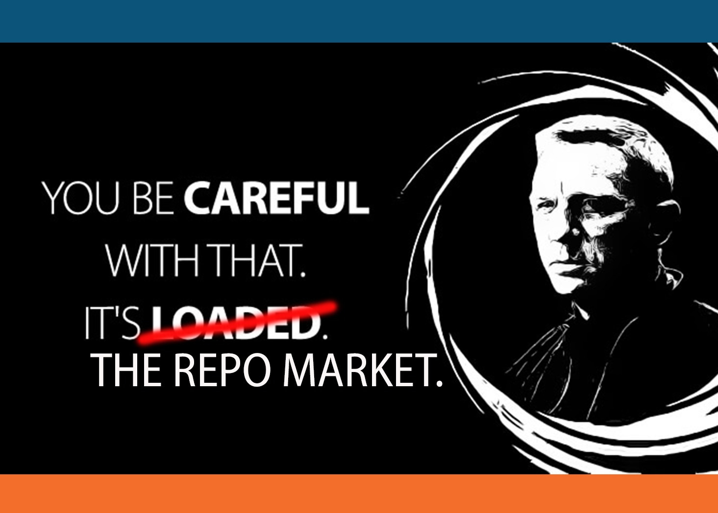
The World's Most Important Market
‘‘Almost every financial blow up is because of excessive leverage.’’Seth Klarman - Hedge Fund ManagerHi all, and welcome back on The Macro Compass!I find August to be a great month to focus on the big picture and thoroughly enjoy the never-ending learning journey in global macro - no Central Bank meetings, (often) quiet markets and perhaps a bit of well-deserved relax.Hence it seems like the perfect time to revive our Bond Market 101 Series with an educational piece on the most important market in the world: the Repo Market.It’s a very relevant corner of the fixed income market which is often overlooked but given its role in underpinning the smooth functioning of government bond markets and the broad range of different players involved, its importance can’t be overstated.In this article, we will:* Unpack the repo market, including its different players and how/why they use repo and reverse repo;* Explore previous stress episodes and relate them to today’s pricing and structure of the repo market: how likely again?The Repo Market ExplainedBefore we start, a big ‘‘thank you!’’ to this wonderful community which keeps growing at a very rapid pace - we are now the biggest Finance newsletter on Substack: wow!Delivering free educational material is a key objective of The Macro Compass - and as this is an article of my Bond Market 101 Series, for those who are not familiar yet that is my best effort at demystifying the bond market and providing you with the tools to analyze such an important and yet very deceptive market.In case you want to explore it further, here are my previous pieces of the Bond Market 101 Series:- Helicopter View of The Bond Market- Real Yields and Inflation Expectations- The Yield Curve- Credit SpreadsNow, back to it: let’s explore the Repo Market.A repurchase agreement (repo) is nothing else than a form of collateralized loan, where the cash borrower posts collateral (i.e. a security, for instance a bond) against its loan but he also agrees to repurchase the security back at the end of the agreement.The collateral “posted” by the cash borrower is basically a form of protection for the cash lender in the event that the borrower becomes insolvent - hence, repo is a secured or collateralized form of lending.The biggest repo markets in the world use bonds as collateral.Also worth noticing that the cash lender who receives the security as collateral can further redeploy that security in other repo transactions (!).Essentially, we are looking at a low-risk (collateralized) financing mechanism underpinning the largest and most liquid markets in the world (bonds) with a built-in feature to enhance leverage and redeploy the same security over and over again as collateral (re-pledging).I guess you can already understand how systematically important is the Repo Market.Two important things to notice before we dig deeper.* The global repo market is huge, with an estimated size of $15 trillion and a turnover of $3-4 trillion worth of repo transactions per day!* Repo transactions require a cash borrower (security-rich agent) and a cash lender to interact. Notice how the balance sheet expands for the cash borrower.Ok, but now: who are the players involved and what’s their incentive scheme?A) Commercial banks: low-risk solution to monetize their liquid assets.Since after the Great Financial Crisis, regulators have forced commercial banks to own very large amount of liquid assets (e.g. HQLA = mostly bonds). As natural buyers of these securities, commercial banks often engage in the repo market as a cash borrower (lends securities, receives cash) to monetize some of their liquid assets.B) Insurers, pension funds, MMF and corporates: deploying cash in a safer way.These large institutional investors do not have accounts at their domestic Central Bank. This means their ‘‘cash’’ is nothing else than an unsecured bank deposit at a commercial bank - very little reward, quite some risk.Participating in the repo market as cash lenders (reverse repo: lends cash, receives securities) allows them to deploy cash in a secured, collateralized way.C) Hedge funds and dealers: exploit market opportunities via leverage and provide liquidity through financing large inventories.Due to their high-quality and low-volatility, using bonds as collateral in repo transactions requires small haircuts and initial margins: a convenient way for hedge funds to amplify leverage when arbitraging away small pricing inconsistencies in bond markets (little capital required to magnify the size of your trade).For dealers, repos are important to finance large bond inventories required to accommodate flows and provide secondary market liquidity for their clients.Given their tactical and opportunistic nature, hedge funds and dealers are often both cash lenders and borrowers in the repo market.In short: the repo market is a gigantic machine underpinning the most liquid asset class in the world, and able to unlock leverage and investment opportunities f
The Crazy Market Rally Explained
‘‘We are now at levels broadly in line with our estimates of neutral interest rates, and after front-loading our hiking cycle until now we will be much more data dependent going forward.’’Jerome Powell, July 2022 FOMC press conferenceHi all, and welcome back on The Macro Compass!Despite admitting that economic growth is clearly slowing down, the Fed just hiked by another 75 basis points and reiterated the path of least resistance from here is well represented by the Dot Plot: more hikes ahead - all the way to Fed Funds at 3.75%!And yet, markets have staged a humongous rally led by the most valuation intensive and risk sentiment driven asset classes: Nasdaq and Crypto.So, what the heck?!It all boils down to how one single sentence Powell pronounced was able to affect the probability distributions investors were projecting for different asset classes.Does it sound complicated? Bear with me: it’s not!In this article, we will:* Break down the FOMC meeting, and in particular discuss why that ‘‘one single sentence’’ spurred such a crazy rally;* Assess where this leaves us now: is the music changing?Why Such a Humongous Rally?When the FOMC meeting press release was out, it all looked like business as usual: a well telegraphed 75 bps hike with the only small surprise represented by an unanimous vote (George did not dissent) despite a clear acknowledgment that economic growth is softening.But not even 15 minutes into the press conference, the fireworks went off!And particularly when Powell said:‘‘We are now at levels broadly in line with our estimates of neutral interest rates, and after front-loading our hiking cycle until now we will be much more data dependent going forward’’.This is very important for several reasons.The neutral rate is the prevailing rate at which the economy delivers its potential GDP growth rate - without overheating or excessively cooling down.With this 75 bps hike, Powell told us the Fed just reached its estimate of neutral rate and hence from here they aren't contributing to economic overheating anymore.But that also means any hikes from here are going to put the Fed in an actively restrictive territory. And the bond market knows that every time the Fed became restrictive in the past, they ended up breaking something.Until yesterday, you could be completely sure the Fed would have just pressed on the accelerator - inflation must come down: no space for nuances.So journalists went on and asked questions to find out something more about the ‘‘new’’ forward guidance. It went roughly like this:Journalist: ‘‘Mr. Powell, the bond market is pricing you to cut rates starting in early 2023 already: what are your comments?’’Powell: ‘‘Hard to predict rates 6 months from now. We will be fully data dependent’’Journalist: ‘‘Mr. Powell, due to the recent bond and equity market rally financial conditions have eased quite a lot: what’s your take?’’Powell: ‘‘The appropriate level of financial conditions will be reflected in the economy with a lag and it’s hard to predict. We will be fully data dependent’’He did it.He totally ditched forward guidance.And what happens when you do so?You give markets the green light to freely design their probability distributions across all asset classes without any anchor - and that explains the gigantic risk rally.Let’s see why.If the Fed is so data dependent and there is basically one data they care about, it all boils down to how inflation will evolve in the near future - and the bond market has a very, very strong opinion about that.Using CPI inflation swaps, I calculated the 1y forward, 1y inflation break-evens (CPI) in the US - basically the expected inflation between July 2023 and July 2024 which is represented in the chart above and sits at 2.9%.Remember the Fed targets (core) PCE, which tends to historically be 30-40 bps below (core) CPI: basically, the bond markets expects inflation to slow down very aggressively and roughly hit the Fed target in the second half of 2023 already!So if the Fed is not nearly on autopilot anymore, and markets have a strong opinion on inflation and growth collapsing then they can also price all other asset classes around this base case scenario: it starts to be more clear now, right?This is what my Volatility Adjusted Market Dashboard (VAMD, here a short explainer) showed soon after Powell pronounced that one single sentence.Reminder: the darker the color, the bigger the move in volatility-adjusted terms.Notice how I highlighted three movers, but let’s start from US real rates.If the Fed isn’t gonna blindly keep hiking but be more data-dependent, contingent on their view that CPI will quickly come down traders have a green light to price a more nuanced tightening cycle and hence still restrictive real yields but less so than before.And indeed 5y forward, 5y US real yields rallied 11 bps and hit their lowest level in over two months.When real yields decline, valuation intensive and risk sentiment driven asset classes generally tend to ou

Bear Market Rally or Turning Point?
‘‘I've lived through enough bear markets that if you get aggressive on the short side, you can get your head ripped off in rallies.’’Stanley Druckenmiller, June 2022Hi all, and welcome back on The Macro Compass!In an interview released last month, legendary investor Stanley Druckenmiller reminded everybody how bear market rallies can be a challenging experience for people comfortably sitting on the short side.Due to their fast and furious nature, they seem to be somehow designed to mine the confidence of the short side.‘‘What if I am wrong on the big picture macro thesis?’’’’What if I find myself big times under-allocated in equities and we keep rallying?’’Over the years running large institutional books I learnt that markets can be humbling, and that continuously challenging your own core thesis is a wise exercise to keep practicing - echo chambers are counterproductive.Hence, in this article we will:* Look at the current stock market rally in perspective, and try to assess whether we are looking at a bear market rally or witnessing a turning point in risk sentiment that will push equity indexes meaningfully higher;* Refresh our portfolios accordingly.Is The Music Changing?Actually, before we jump right in.Have you ever listened to a macro podcast and asked yourself by the end: how do I actually trade the very interesting views I heard for the last 45-60 minutes? Well, The Macro Trading Floor fixes that for you!Every Sunday Andreas Steno and I interview the best worldwide macro strategists and risk takers for a discussion on their current thesis, but after we’ve unpacked their macro big picture we ask them to deliver one actionable macro investment idea!By the end of the show, Andreas and I also debate how to implement the trade (for both professional and retail investors) and whether we like the trade or not.We aim at producing a very educational and actionable macro podcast but most importantly also a show full of banter - expect plenty of jokes along the way!After only 13 episodes, our show is already listened by over 50,000 macro enthusiasts every Sunday - if you are not amongst them yet, why not paying us a visit?(Apple podcast, Google podcast, Spotify, Blockworks YouTube channel).Now, back to it: bear market rally or turning point?Let’s first assess the magnitude of this rally in historical context - our friend Mr. Blonde has put together quite the dataset in his exceptional, outstanding free macro newsletter (must subscribe: link here).Over the last 50 years, there have been 5 major and sustained bear markets which saw 40 episodes in total of 5%+ rallies from the 1-month lows.Bear market rallies, indeed.They lasted on average 3 weeks and delivered a fast and furious 7-8% return.The 8% rally we just experienced from the June 16th lows would hence be of average size, with its length (> 4 weeks) being above average - notice though most of the returns were achieved already after one single week.Now that we know more about the size and length of this rally from a historical perspective and keeping in mind that equity market returns are mostly driven by changes in valuations and earnings growth, let’s look at what global macro indicators are telling us about its nature: bear market rally or turning point?1. Real Rates, Valuations and Risk PremiaChanges in equity valuations are closely linked to changes in (long-end) risk-free real interest rates.That’s because:A) Large, multi-asset investors don’t look at asset classes in a vacuum and their starting point isn’t ‘‘cash under the mattress’’ - it’s the real return of the most liquid, risk-free investment they can make: Treasuries. When that prospective return changes, the marginal appetite to buy more or less risky assets changes too.B) Stock prices are the net present value of all future (inflation-adjusted) cash flows whose value is discounted to today - change the real discounting factor, and ceteris paribus the stock price will change too.After a very aggressive (+150 bps!) move up from the lows in Nov-2021 (-90 bps) to their highs in June (+60 bps), US 30y real yields (chart: orange, LHS) have slightly dropped and stabilized around 50 bps.As you can see, this has helped the 12-month forward S&P 500 earnings yield (chart: blue, RHS) drop from 6.1% to 5.8% - that’s the equivalent of 1 full point higher in forward P/Es from 16.4x to 17.3x and explains most of the rally seen so far.Could real yields drop further and spur another valuation-led rally?The Fed has been very vocal: as they want to keep conditions tight to tame inflation and they estimate the US equilibrium rate sits around 25 bps, they are keen to keep the entire US real yield curve above this level until they see meaningful progress.Moreover, do equity valuations always blindly follow real yields?Not really: it depends on the Equity Risk Premium.When real yields increase or drop but valuations don’t adjust accordingly, it means the perception of risk amongst investors is changing.My simplified

Nothing Else (Except Macro) Matters
‘‘Trust I seek and I find in you (global macro)Every day for us something new (right, J-Pow?)Open mind for a different view (always)And nothing else (except macro) matters’’Metallica after reading The Macro CompassEhy guys, welcome back on The Macro Compass!Hopefully the Metallica are fine with me borrowing one of their most famous songs, but it’s really true: nothing else except macro matters here!There were 3 important pieces of economic data released over the last week: a leading (NFIB survey), a coincident (Jobs Report) and a lagging indicator (CPI).The picture couldn’t be any clearer: * Inflation (lagging indicator) showing the most acceleration on the upside;* The labor market (coincident/slightly lagging) holding on okay-sh for now;* The NFIB survey (leading indicator) flashing red.In this article, we will quickly cover those 3 reports and then analyze investment opportunities by breaking down each big macro asset class and answering the same question for each of them: is it time to go long, to go short or to go fishing?The Lagging, The Coincident, The LeadingActually, before we jump right in.I’d like to take a second and thank you all.The Macro Compass is now a community of 70,000+ macro enthusiasts and investors, and sharing this journey with you nice people has been such a blessing.I am working on delivering even more for you: interactive tools for screening markets and sizing positions, ETF-only portfolios backed by my macro models and courses that will cover global macro, monetary mechanics and portfolio management - effectively, a Global Macro University.Expect plenty of fireworks in Q4!In the meantime: if you like TMC and you’re excited about what’s next…feel free to tell a friend or colleague!Now, back to it: let’s quickly look at the latest piece of US economic data.1. The CPI report: once again, the inflation momentum is accelerating and inflationary pressures are broadening.While mainstream headlines would focus on the 9.1% YoY print, I’d like to highlight two more relevant statistics that would worry the Fed further here.A) MoM headline and core inflation are the highest in 20+ years: the inflation momentum is not only failing to decelerate, but it’s even picking up!B) Inflationary pressures are really broad now: roughly 75% of the components of the CPI basket have seen prices increase by more than 4% over the last 12 months. It’s not only used cars or energy prices anymore: it’s everywhere.The Fed will be very uncomfortable with both developments, and we can’t discard a 100 bps hike in a few weeks now.But they’ll be adding fuel to the recession fire by setting their monetary policy stance based on CPI which is a lagging indicator: over the last 50 years, every sharp economic slowdown has always managed to substantially reduce inflation and commodity prices are already dropping like a stone.But the Fed won’t take a more nuanced stance anytime soon, and who are we to fight the Fed…2. The labor market report: holding on okay, but…A) After accounting for negative revisions to prior NFP reports, the pace of job creation over the last 3 months is much less impressive than it would seem by reading headlines;B) The labor force shrank (!) by 350,000+ people: the number of total employed people in the US divided by its total population in the 25-54y age bracket dropped below 80%.Over the last 30 years, at the peak of each economic cycle this ratio was over 80%.Once we got there and some weakness started to emerge (Mar 2000, Feb 2007 and Feb 2020) the next 12-18 months weren’t particularly pretty for the global economy.This time around we failed to even get there and we might be receiving some preliminary signals of unease in the labor market.Also, Google announced they are going to materially slow down hiring over the next 6 months - kind of a polite way to progress towards a hiring freeze?The labor market is a coincident/slightly lagging indicator, and hence it would make sense to see some material weakness emerge over the next few months already.3. The National Federation of Independent Businesses (NFIB) survey: bad, really bad.The NFIB survey is a comprehensive set of questions addressed to roughly 800 US small companies across the country.A) Small companies hold their worst future outlook on the expected volume of sales since 2009: in a high-inflation environment, it’s good to look at volumes and real numbers to avoid distorting the picture with nominal figures.B) The diffusion index built with answers to a question addressing the outlook companies have for general business conditions ahead looks like this:The NFIB survey is a very decent leading indicator for both economic activity and employment with a lead time of a few quarters.Ain’t looking pretty…But now: what does this mean for each of the big macro asset class out there?An Overview of Macro Asset ClassesFour big macro asset classes, and for each:* Three main points* One chart to rule them all* A Long/Short/Fishing call with investable
So, Recession?
‘‘We are at the early stages of the U.S. economic expansion’’James Bullard - June 24, 2022Hey guys! Back from my holiday, and happy to be writing a piece of The Macro Compass again.While I was out, the Fed kept talking the US economy up but economic data showed clear signs of slowdown and we witnessed big moves in markets that seem to compound that thesis.‘‘Global R’’ calls even are making the rounds.That begs two questions:* Will we actually see a global recession? * And if so: when, and how bad?Is A Global Recession Coming?Actually, before we jump right in.If you are reading The Macro Compass, you’ll probably be interested in other good quality newsletters.The guys at The Daily Upside are doing a great job at sifting through the clickbait-y headlines traditional financial media poses. Instead, their team of investment bankers, scholars, and journalists condense the latest financial stories in a clear, concise, and occasionally witty daily newsletter - it is read by over 500,000 people every day and by the way…it’s free!I definitely recommend checking them out: here is the link.Now, back to it: how likely is a global recession? And when is it going to hit?Amongst the many forward-looking economic indicators I focus on, you will know by now that one of my preferred metrics is my G5 Credit Impulse series: it measures the pace of change of credit creation in the 5 largest economies worldwide and it serves as a very reliable leading indicator (6-15 months lead time) for economic growth and the performance of several asset classes.Why?Because as our structural ability to deliver economic growth is impaired by weak demographics and stagnant productivity, we learnt that printing money out of thin air works as a (temporary) substitute: the more money we inject in the private sector, the more likely we’ll get a cyclical boost to economic growth.Slow down that process, and growth will cyclically slow down too.Notice two things:* Printing money = printing bank deposits held by the non-financial private sector (us), not bank reserves printed by Central Banks. The former represents the ‘‘real economy’’ money printing, and the printers sit within commercial banks and governments - not Central Banks.More about that in these pieces (here, here and here).* The pace of change (acceleration or deceleration) in real-economy money creation matters more than the mere direction.That’s because our system is based on the continuous expansion of credit and leverage, and hence while the direction is generally set in stone (up, apart from rare global de-leveraging episodes) the pace of change is more relevant.So, how is the G5 Credit Impulse looking like today?I am in the process of updating the series, but these are the preliminary indications.Sharp changes of direction in the Credit Impulse series have historically predicted aggressive acceleration or deceleration in the S&P 500 YoY earnings per share by a few quarters.Courtesy of the massive fiscal drags and tepid refinancing activity in the private sector, we are now witnessing a contraction in credit creation which is even faster than the one we experienced during the Great Financial Crisis.As a result, we shouldn’t discard an earnings recession in late 2022/early 2023 already - for reference, analysts are still expecting earnings to grow by almost 10% this year and next year.But what actually defines a recession?While I discussed above a potential earnings recession, the historical NBER definition implies two consecutive quarters of negative real GDP growth.The truth is a proper recession involves the labor market: after all, US consumer spending accounts for almost 70% of GDP and as long as the labor market holds consumers might hold too.The labor market is a coincident indicator: when it materially weakens above certain threshold, you are already in a recession.Keeping that in mind, let’s have a look at one of the most forward looking labor market indicator out there - US Initial Jobless Claims.The 1990, 2001 and 2008 recessions all happened when the % change in the 3-months moving average in US Initial Jobless Claims exceeded 7% for at least 3 of the last 4 observations.The last two prints for the 4th week of May and June 2022 were +18% and +14%.A print in the 220k area at the end of July would add fuel to the fire, confirming the US labor market is indeed weakening and contributing further to the recessionary narrative.Markets are beginning to validate this narrative, too.Copper is considered the bellwether for global industrial activity due to its multiple end-uses and applications in the real economy.Its recent -25% monthly drawdown only occurred 0.45% of the times since 1992 (32 times in over 7500 rolling monthly return observations).If you exclude the idiosyncratic Sumitomo Copper affair (cool story, read here) such a magnitude of Copper drawdowns was only experienced around the GFC period.Additionally, Mr. Bond Market is now pricing the Fed to convincingly cut rates im
Time To Buy Bonds?
I don’t see recession chances as particularly elevated now, as consumers have a very substantial cushion of savings. 100 bps hikes are not off the table.Jerome Powell - Senate Banking Committee hearing, June 22nd 2022In yesterday’s Senate Banking Committee hearing, Powell brought his hawkish stance to new highs: a strong economy underpinned by healthy levels of consumers’ savings, 100 bps hikes not off the table, and to top it off a good likelihood the Fed will actively sell (!) mortgage-backed securities from their balance sheet.Ok, so just more of the same?Well, there is a big news: for the first time in 8 months, the bond market isn’t compounding Powell’s hawkish rhetoric. Actually, it isn’t even aligning with his stance in the first place.Instead, fixed income investors have become loud enough we can almost hear them ask one big question: a recession is becoming increasingly likely, so what are you going to do about it J-Pow?In this article, we will:* Discuss the cross-asset evidence that demand destruction might be intensifying to more worrisome levels;* Look at the whether the conditions to buy bonds are finally fulfilled;* Update our portfolios accordingly.Wen Bonds, Alf?Actually, before we jump right in.There are so many good macro newsletters out there, and there is always so much going on in global markets - and honestly it’s hard to keep track of everything!I personally find Harkster’s free newsletter extremely useful: every morning, you get your global macro and news highlights in a concise and to-the-point format.It only takes 5 minutes to parse through and you also get an overview of the top 5 trending macro articles on their fantastic free newsletter aggregator platform.Such a useful (and free) service: I definitely recommend to check it out (link here)!Now, back to it: is it time to buy bonds?For decades, bonds have been a beautiful asset to own in a diversified portfolio: a positive carry, return generating asset class with the ability to dampen equity market drawdowns. Wow.But does this hold true in every macro regime?The chart above shows a 20-year history for the US 5y inflation expectations (swaps, orange) against the 3-months rolling correlation between bonds and stocks returns (TLT vs SPX 90d rolling correlation, bottom part of the chart).The interpretation is very clear: keep inflation expectations comfortably around/below the 2% area instead and bonds are going to be negatively correlated to stocks on a consistent basis.Instead, once you cross the 2.5% threshold in 5y inflation expectations the negative correlation property quickly disappears.But why?That’s because once inflation expectations meaningfully surpass the Central Bank’s stated objective (2%), when equity markets experience a drawdown policymakers are faced with a hard choice: either accommodate conditions to stop the market bleeding or stay the course and preserve credibility about their inflation mandate.For the time being, Powell has chosen to stay the (tightening) course.Can you guess what that meant for markets?As the equity market experienced a severe drawdown and bonds couldn’t serve as a portfolio hedge in this environment, we just witnessed the largest ever ‘‘financial wealth’’ destruction in history.Ouch!Even without factoring in crypto and other asset classes, US bonds and equities markets combined have experienced a drawdown from previous peak of about $15.5 trillion (or 60% of GDP). Just. Huge.So: when will bonds regain their magic property of return-generating, drawdown dampening asset for your portfolio?In other words: when can we buy bonds again?Let’s have a look at my 3-points checklist and see where we stand.1. Is the momentum of growth slowing? Yes.The PMI New Orders / Inventory ratio is one of the many forward looking indicators I incorporate in my macro investment process, and it’s been on a never-ending downward path for 14 months now. Check.And not only the momentum, but also the outright level is quite telling: prints 2. Is the momentum of inflation slowing? Meh, not really…but.In a previous article (here), we have explained how inflationary pressures have been broadening from food and commodity-related prices to the stickier categories like core services.Nevertheless, commodity prices across the board (in the chart: blue/orange/green) still contribute for a good portion towards the high US CPI prints.We also discussed how for bonds to regain their magic portfolio properties, we need 5y inflation expectations to drop below 2.5%.And do you know what correlates well with inflation expectations?Yep, you guessed it: commodities.And while we will have to wait to get any evidence of a slowdown in the inflation momentum, my Volatility-Adjusted Market Dashboard (VAMD) shows some interesting patterns this week.* Industrial/cyclical commodities: down.* Commodity exporters (Brazil) underperforming importers (India, Japan).* Fixed income in Europe (whose hiking cycle will be inevitably influenced by the evolut
Stop Fooling Around, J-Pow
We won’t declare victory until we see a series of consecutive, sharp declines in the monthly rate of inflation. Jerome Powell - FOMC press conference, June 15th 2022Heading into yesterday’s Fed meeting, the bond market asked a tough question to Powell: do you mean business?Powell took a ‘’Bad Cop, Good Cop’’ stance: he answered with a firm ‘’Yes’’ at first, and then tried to soften the message during the press conference.This spurred a relief rally in risk assets, but it won’t last.Bond markets hate half-hearted stances, and they will keep testing the Fed and risk assets until they get what they want: clarity.In this article, we will:* Unpack the Fed meeting by looking beyond the mainstream media headlines, and instead focusing on the nuances that really matter;* Analyze the market reaction across asset classes, and assess the likely path ahead;* Recap what does that all mean for your portfolios.Bad Cop, Good CopActually, before we jump right in.We are now 58,000+ strong here on The Macro Compass!Being very grateful for this beautiful community of macro enthusiasts and investors, I am wondering how can I help you further? What’s that very thing you’d really want me to deliver, so that you can enjoy The Macro Compass even more?All topics, tools, formats, ideas: anything is fair game.Let me know in the comments!Now, back to it: Powell played Bad Cop, Good Cop yesterday.Let’s start from the Bad Cop part - an opera in three acts.1. The ‘‘growth is strong’’ mantra is unchanged, and that reinforces the Fed’s commitment to take aggressive steps to tame inflation.Despite forward-looking growth indicators showing rapid signs of deterioration, the actual Q1 real GDP growth print in negative (!) territory and the Atlanta’s Fed GDP Nowcast pointing to 0% real GDP growth in Q2……Powell told us there are no signs of economic growth slowdown.The economic growth mantra is unchanged.But if the Fed’s assessment is that the economy can take it, they will feel more confident about delivering a more aggressive hiking cycle.And indeed this was reflected in the updated Summary of Economic Projections (SEP), which also contained some more interesting piece of information.Let’s have a look.A) The FOMC’s estimate of ‘‘longer run’’ (i.e. neutral) rate moved slightly up to 2.5%, and they intend to hike rates all the way to 3.8%. That’s 130 bps above neutral. A pretty decent amount of tightening!B) In 2022, unemployment rate is going to be 3.7%. In 2023, it is going to inch up to 3.9%. Nevertheless, in 2023 the Fed will keep hiking 40 bps according to their projections: a bit of collateral damage doesn’t seem to scare them at all.This was also reflected in the introductory statement where ‘‘The Committee expects inflation to return to its 2 percent objective and the labor market to remain strong’’ has been replaced by ‘‘The FOMC is strongly committed to returning inflation to its 2 percent objective’’.No mention of a persistently strong labor market anymore.C) Even with all this tightening and some collateral damage to the real economy, core PCE is expected to revert back to only 2.7% in 2023 and 2.3% in 2024. A strong signal that even more might be needed.When it comes to the hiking cycle, the Dot Plot allows us to evaluate the distribution of opinions within FOMC members.While in March only Bullard was voting for Fed Funds at 3% or higher by December, today no FOMC member (!) expects rates to be below 3% by year-end.Nobody.2. Powell went to great lengths to explain they are seriously concerned about inflation and inflation expectations. And he means: seriously.One chart to rule them all: the University of Michigan consumer survey for long-term inflation expectations.We can talk about inflation swaps or TIPS all we want, but ultimately long-term consumers’ inflation expectations matter the most for Central Bankers.Based on those, consumers decide whether to borrow/spend more and whether it’s time to push for a stronger nominal wage increase to offset inflationary pressures.As a Central Banker, you really don’t want these long-term consumer inflation expectations to get de-anchored and we just printed the highest figure since 2008…And that’s why to top it off, Powell said ‘‘we are not going to declare victory until we achieve a series of consecutive, sharp drops in MoM inflation prints’’.3. To achieve that, Powell is going to keep pushing until (more than) enough damage has been done.He sent two very clear messages on that front.1. ’’Interest rates, yield curve shape, credit spreads and equities are going to tell us how restrictive we are and how successful we are likely to be in slowing inflation down’’.The Fed will take the foot off the gas pedal only if inflation markedly slows down.There is NO Fed Put until then. At any level.2. ‘‘We’d like to see positive real interest rates across the entire curve. That will make us more comfortable inflation will be slowing down’’.This is a big statement.Why?This is the US real yield curve: nomin
The True Reason Why Central Banks Do QE
Pelley: “Where does it come from? Do you just print it?”Powell: “We print it digitally. So as a Central Bank, we have the ability to create money digitally.’’.Jerome Powell - ‘‘60 Minutes’’ interview, May 2020In a famous interview released on May 2020, Jerome Powell stated Central Banks can print money in digital format.And he is right, they indeed do that when they embark in policies such as QE.But he forgot to mention that what they print is bank reserves, which is money only for commercial banks and not for us common people.And that these bank reserves don’t have legal tender, they can’t be used to transact in the real economy and most importantly they never reach the private sector. Never.Running a large fixed income book for a big European bank for years, I have personally been on the ‘‘receiving end’’ of the QE trade - I am very excited to try and convey some of the experience and knowledge accumulated throughout that period!In this article, we will answer the following questions:* If Central Banks only print digital bank reserves and not real economy money, why do they engage in QE in the first place?* If bank reserves are not money for the common people, what are they useful for then? What can commercial banks do with bank reserves?The ‘‘Portfolio Rebalancing Effect’’ ExplainedActually, before we jump right in.If you are a macro enthusiast based in the US, pay particular attention here!Being aware of how complicated it can be to translate a macro view in action as often you need complex derivatives contracts, I wanted to flag that a company named Kalshi is offering a neat solution to that problem.Kalshi offers event contracts, which are "Yes" or "No" shares tied to specific future events — think of the May CPI report released on Friday: if you have a macro view on inflation, you can directly translate it into action!They have markets on various strikes for what the MoM inflation rate will be, ranging from 0.1% to 1.2%. If you have a view that inflation will surprise on the upside or on the downside, you can buy ‘‘Yes’’ or ‘‘No’’ shares directly tied to that outcome.I definitely recommend to check them out (link here).Now, back to it: Central Banks create bank reserves when they perform QE.But if bank reserves are just money for banks stuck in the financial system, why would they bother to do that in the first place?Mainly because of the many channels through which QE helps generating the so-called Portfolio Rebalancing Effect.To understand this, let’s start from what QE does to the balance sheet of a commercial bank.When a Central Bank performs QE and directly buys bonds from a commercial bank, they merely change the composition of the commercial bank asset side by reducing the amount of bonds they own and instead increasing the amount of reserves.No new spendable money for the private sector has been created in the process, as commercial banks don’t use reserves to make new loans.So why the heck would Central Banks embark in QE and forcefully change the portfolio composition of commercial banks in the first place?In short: to encourage them to rebalance their portfolios towards riskier assets.How does this work? Let’s go through it together.Historically, commercial banks own a portfolio of bonds because:A) Regulators incentivize them to do that;B) Bonds are interest-bearing and liquid instruments which are also widely accepted as collateral: all very desirable features for a bank;C) They serve as a hedging tool for the interest rate risk of their liabilities.Now, QE is taking away these bonds and flooding banks with reserves instead.Let me show you why reserves are a sub-optimal asset to own for a bank, and hence why they’ll instead tend to rebalance their portfolio towards (riskier) bonds.There are 3 main reasons.* #1: Regulators have made bonds (almost) as ‘‘regulatory-friendly’’ as reserves.After the Great Financial Crisis, regulators realized that commercial banks weren’t always owning enough liquid assets to survive a sudden spike in deposit outflows and therefore implemented a new regulatory constraint: the Liquidity Coverage Ratio (LCR).It basically forces banks to own enough High Quality Liquid Assets (HQLA) to be able to meet an avalanche of deposit outflows during a stressful period (e.g. bank runs).European and US banks are now forced to own about $12 trillion (!!!) of cumulative HQLA assets at any point in time.Sounds huge, it is huge.Curious to know what’s eligible as High Quality Liquid Assets (HQLA)?In yellow, our usual suspects: bank reserves and government bonds.But the orange boxes contain some interesting information, too.Subject to a maximum of 15% of the total HQLA portfolio, BBB corporate bonds, mortgage backed securities and even certain stocks (!) are HQLA eligible.By making bank reserves and (riskier) bonds virtually inter-exchangeable from a regulatory standpoint, regulators have vastly increased the marginal appetite banks have for ‘‘regulatory-friendly’’ HQLA bonds.After
The Biggest Macro Risk You Might Be Ignoring
‘‘Before you invest, you must ensure that you have realistically assessed your probability of being right and how you will react to the consequences of being wrong’’.Benjamin Graham - The Intelligent InvestorInvesting is all about probabilities: all you need to do is assess the chances markets are assigning to different scenarios today and anticipate how this probability distribution will move over time.In other words, you don’t need to be necessarily right on what happens next but just be able to grasp how market consensus will move from here.Ignoring this simple principle has been a very expensive exercise for European fixed income investors over the last few weeks: the-ECB-will-never-really-hike mantra is melting under the eyes of bond investors married to a dovish narrative which has been successful for a decade but offers a very bad risk-reward today.In this article, we will:* Discuss the biggest volatility-adjusted moves seen in global macro last week;* Explain why Europe is in a tight spot, which will lead us to…* …assess where the best tactical risk-reward investment opportunities might lie.What? European Rates Are Actually Moving?!Actually, before we jump right in.There are so many good macro newsletters out there, and there is always so much going on in global markets - and honestly it’s hard to keep track of everything!I personally find Harkster’s free newsletter extremely useful: every morning, you get your global macro and news highlights in a concise and to-the-point format.It only takes 5 minutes to parse through and you also get an overview of the top 5 trending macro articles on their fantastic free newsletter aggregator platform.Such a useful (and free) service: I definitely recommend to check it out (link here)!Now, back to it.Here is what the Volatility Adjusted Market Dashboard (VAMD) is showing for the last 7 days: as the legend points out, the darker the color tonality the more significant was the move in standard deviation terms.Most of the action happened in rates, and specifically in the Eurozone front-end of the yield curve with some 3+ weekly standard deviation moves: wow!So, what’s going on there?Inflation keeps surprising on the upside, and price pressures are broadening: core CPI is running at almost 4% annualized and the stickier components of the inflation basket (ex-energy services) are getting hit too.If it sounds familiar, it’s because a similar dynamic started unfolding in the US a few quarters ago already.Not only that, but the momentum of the latest European inflation pickup has been impressive - if you annualize the 3-months change in CPI, you realize such a concentrated inflationary impulse has been last experienced in…the ‘80s?!So obviously the European bond market had to react, and it did.But let’s look together under the hood and appreciate a few macro nuances.In particular:A) What’s the market pricing now, and is it enough - what’s the neutral rate in Europe anyway?B) How does this square with the ECB ‘‘hidden dual mandate’’, i.e. prevent the hugely important geopolitical project (aka Eurozone and the EUR) to disintegrate?After the sharp sell-off in front-end European yields, the EUR Overnight Index Swap curve (see here why I prefer OIS to look at yield curves) is pricing the following:110 bps worth of hikes being priced by December 2022: 4x25 bps with a 50% chance the ECB will hike by 50 bps in one of the 4 meetings between July and December.After that, roughly another 100 bps hiking cycle in 2023 and after that…Ladies and gentlemen, your next and final stop: the market-implied ECB terminal rate, which currently sits at around 1.70%.But as I explained in this article, when a Central Banker is faced with a prolonged period of high, broadening and stickier inflation the reaction function can quickly become very aggressive as the need to preserve credibility dwarfs anything else.And an aggressively tighter monetary policy stance is not reflected in an absolute level of interest rates, but in how much higher these rates are versus the neutral rate.So, the question is: what’s the neutral rate in Europe?My model-estimate for the European nominal neutral rate is pictured in blue: it has been unsurprisingly trending down over the last 30 years due to poor demographics, higher and higher loads of unproductive debt, capital misallocations and so on.It now stands at around 1.40% (roughly -0.60% in real terms).As the current market pricing for the ECB terminal rate stands at 1.70%, one might argue the ECB reaction function is correctly priced: a swift tightening of monetary policy to levels above neutral rates (30 bps above) to fight inflation.Well, not really.I went back and looked at the latest episode of prolonged price pressures which pushed European inflation meaningfully above 2% for a while: it happened in the early ‘90s - and as the EUR didn’t exist back then, I used France as the barometer for the Eurozone in my analysis.As you can see in the red box, in order to t
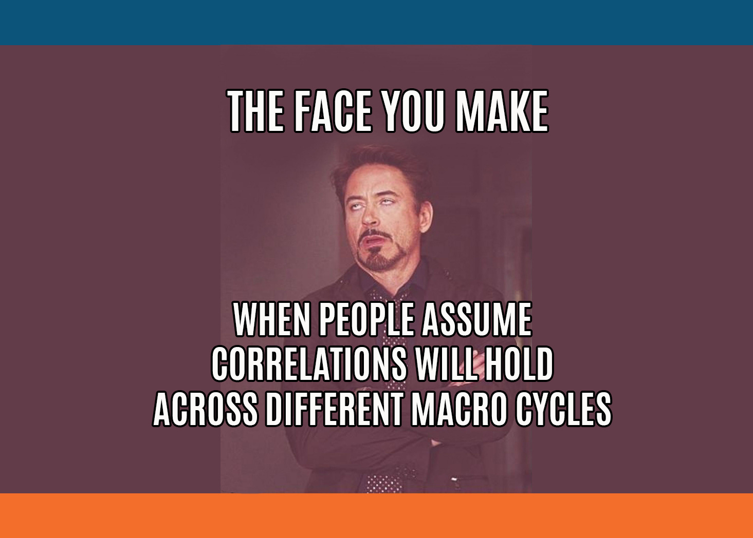
How To Avoid Stupid Mistakes
‘‘The most important rule of trading is to play great defense, not great offense.Every day I assume every position I have is wrong. I know where my stops are, and I do that so I can define my maximum drawdown.At the end of the day, the most important thing is how good you are at risk control.’’Paul Tudor Jones, CEO of Tudor InvestmentsDifferent investors perceive and measure risk differently, but there is one common objective they all want to achieve: avoid making stupid mistakes.For a long-term investor, the worst possible outcome is to experience big enough drawdowns whose magnitude far exceeds her risk tolerance and hence lead to the cardinal sin of them all: ‘‘panic-hit-the-sell-button’’.This happens when investors assume correlations across asset classes will hold regardless of the macroeconomic regime we are in and/or size their positions without paying attention to the very diverse underlying volatility each asset class has.In this article, we will:* Discuss the strategic objective and the main risk management pillars a long-term investor should pursue, and why;* Announce a couple of exciting news!Risk Management Pillars for a Long-Term InvestorActually, before we jump right in.In an attempt to reduce my innate ‘‘boomer-ness’’, this week I am launching my Instagram profile (link here)!Expect plenty of macro charts and short video clips unpacking price action across asset classes.And when it comes to non-macro content, also expect a healthy dose of Southern Italian food pics and recipes! :)Jokes aside, if you use Instagram feel free to follow my work there too!Now, back to it: whether you are a medium to long-term investor or a more short-term oriented trader, a healthy dose of systematic approach to risk management is key if you want to survive and possibly try to generate some decent returns, too.Let’s look at a medium to long-term investor: what’s her objective in the first place?Many decades ago, Ray Dalio explained how the holy grail for every long-term investor should be to find return-additive, yet not highly correlated assets to add to her portfolio.You see, a long-term investor is paid to harvest risk premia: when you actively decide to provide funding or capital to a public entity (you buy government bonds) or to a private sector entity (e.g. you buy stocks), you are exposing yourself to several risks and therefore you will be demanding some sort of compensation.There are several risk factors out there: credit, liquidity, growth, inflation, etc.And for all of those risks you are facing, your main form of compensation should be a long-term, inflation-adjusted positive total return for your investments.Here is a 200+ years chart of total real returns for US stocks, bonds, gold and USD: it makes a lot of sense, doesn’t it?But if on a long enough time horizon you can be relatively sure you will be compensated with positive real returns, why would a long-term investor need any systematic approach to risk management in the first place?Easy: to avoid making stupid mistakes.The most common being:A) Assume correlations across asset classes will hold regardless of the macroeconomic regime we are in;B) Which often contributes to big drawdowns, whose magnitude far exceeds the long-term investor risk tolerance and leads her to the cardinal sin of them all: ‘‘panic-hit-the-sell-button’’ and say goodbye to harvesting long-term risk premia.How do you avoid these mistakes?The Macro Compass can help you identifying which macroeconomic regime are we in and hence what to expect from asset classes returns and correlations.If you want to know how it works in details, check this article.In today’s macro environment where the economic growth impulse is decelerating and Central Banks are tightening monetary policy more aggressively than expected and pushing risk-free real yields quickly above equilibrium levels, correlation regimes can swiftly change.At the end of 2021 we moved to Quadrant 4, which sees risk assets’ correlations converging to 1: even the long-standing negative correlation between bonds and stocks doesn’t work anymore as the sharp tightening in monetary policy and hawkish forward guidance prevent bonds from rallying despite a decelerating economic growth impulse.That led to the ''pain everywhere trade'': the 6-month rolling Sharpe ratio (returns in excess of risk-free rate adjusted for volatility) for a basket of S&P500, Treasuries, corporate bonds and gold reached the worst level seen in over 30 years!Having a robust framework that helps you navigating different macro cycles and correlation regimes is hence important, and The Macro Compass can help you wit that.But every long-term investor also has a different tolerance for the severity of portfolio drawdowns she is able to endure before making ‘‘stupid mistakes’’.Yes, portfolio drawdowns are a function of how truly uncorrelated your holdings are but they are also a function of how big your positions are relative to their underlying volatility: even

Let The Macro Polar Stars Guide You
‘‘What we need to see is inflation coming down in a clear and convincing way, and we’re going to keep pushing until we see that: we clearly have still a job to do when it comes to cooling down demand’’Jerome Powell, May 17th 2022Powell’s remarks in the Wall Street Journal interview this week were quite interesting, and markets seem to have noticed: we have seen quite some wild moves, but again the most relevant price action is happening under the surface.In such a choppy market environment, systematic risk management techniques and a data-driven investment approach are key to tell the forest from the trees and reduce drawdowns in your portfolio.In this article, we will:* Reflect on some interesting market moves happening under the surface;* Discuss two of my macro ‘‘polar stars’’ indicators that can help us navigate and explain current market circumstances;* Introduce for the first time my Volatility Adjusted Market Dashboard (VAMD), a tool I’ve been working on to further deliver value to The Macro Compass community.The Macro ‘‘Polar Stars’’ IndicatorsActually, before we jump right in.Andreas Steno and I have been putting quite some effort to deliver the most fun and actionable macro investment podcast out there, and so far the response has been huge: almost 50.000 unique listeners per episode across platforms!If you haven’t yet listened to The Macro Trading Floor podcast, this week is your chance: Andreas and I interviewed a very special guest and trust me, you don’t want to miss this! :)Links here: Apple, Spotify, Google, YouTube.Please also consider subscribing to the show on your favorite podcast app so you don’t miss any new episodes, and help us spread the word if you like the podcast!Back to it: Powell played the hawkish horn again, and markets are reacting in quite some interesting ways.The three main lines from his interview were:* ‘‘Financial conditions overall have tightened significantly. That’s what we need to see’’;* ‘‘We need to see growth moving down from very high levels, and we clearly have still a job to do on cooling down demand’’;* ‘‘If that involves moving past broadly understood measures of neutral rates (i.e. 2.00-2.50% on Fed Funds), we won't hesitate to do that’’.You gotta admit he can’t be more straightforward than this.The FOMC is totally comfortable (!) with financial conditions tightening, as we clearly still (!) have a job to do on cooling down demand and if that involves raising Fed Fund rates >2.50% we won’t hesitate (!) to do that as we need to see is inflation coming down in a clear and convincing way (!).But now, why would I define market reactions as ‘‘interesting’’?We all see the consequent bloodbath in equity markets and it doesn’t strike as particularly surprising, right?Well, here are a couple of interesting moves going on beneath the surface.After a relentless move up, for the first time this year US implied real yields between 2027 and 2032 (5y5y forward) have experienced a remarkable drop.But wait a second, I thought a tighter monetary policy stance would push real yields up via a combination of higher nominal rates (reflecting the new, hawkish stance) and lower inflation expectations (as markets expect Central Banks to be successful in this exercise)? Also if real yields are lower, shouldn’t that support risk assets?Let me help you understand what’s going on.Real yields are now responding to markets repricing demand down in a significant way: let’s have a look at commodities and GDP/earnings revisions for example.Since the pandemic-related trough in 2020, Agricultural Commodities (Invesco DBA ETF, blue) and Industrial Commodities (copper, in orange) have basically moved up in sync: as the gargantuan amount of fiscal spending fed through the economy and supply bottlenecks were popping up, the demand/supply imbalance kept growing and supported price increases across the entire commodity space.But now look at the divergence in that red box.Over the last month copper - a bellwether metal for the global economy - has been hit with a 12% drawdown while Agricultural Commodities are trying to test new highs. The rather global-industrial-demand-driven commodities (orange) have started to show signs of weakness against the more supply-bottleneck-driven commodities (blue).Additionally, credit spreads are kinda blowing up with US high-yield spreads having now exceeded the 2018 peak of 500-ish bps and they seem to be heading towards the 600 bps 2016-global-growth-scare level.Alright, so this must be reflected in GDP and earnings forecasts too, right?I mean, Wall Street analysts and us on The Macro Compass must be looking at similar screens and charts after all :)Analyst consensus for the 2022 US real GDP growth has been consistently revised down this year and now sits at 2.7% - but still nicely above trend, though.And while even big consumer staples companies (e.g. Walmart, Target) have missed their earnings per share target and have warned investors they could actually deliv
What If?
‘‘Nothing so weakens a government as inflation’’John Kenneth GalbraithThe latest US inflation report was all but portraying a benign slowdown in inflationary pressures. On the contrary, the less distorted month-on-month measures showed a pickup in CPI and most importantly the composition of such inflationary pressures is quickly broadening towards the stickiest components of the CPI basket.What many market commentators don’t fully appreciate is that a deceleration in inflationary pressures is not enough for the Fed to take the foot off the gas pedal: the momentum and the composition of such slowdown against the FOMC’s expectations will be the most important drivers behind the Fed’s reaction function in 2022.In this brief article, we will:* Look behind the curtain of the latest CPI report, and assess what happened to the momentum and the composition of inflationary pressures;* Reflect on the ‘‘what if’’ question: what if inflationary pressures remain stickier than the Fed expects? How would their reaction function look like?* Discuss what probability Mr. Market assigns to this ‘‘what if’’ scenario by having a deep look at the fixed income market.Without further ado, let’s jump right in!Let’s Look Behind The CurtainActually, before we jump right in.If you are interested in any kind of partnership, sponsorship, or in bespoke consulting services feel free to reach out at [email protected] to it: the US CPI report which came out yesterday showed inflation is moving towards the stickier components in the basket and the pace of the slowdown might actually disappoint the Fed’s expectations.While most of the headlines focused on ‘‘Core CPI slowed down to 6.2% YoY in April’’, a more nuanced look to the CPI report provides with some more interesting details that conflict with this simplistic thesis.In particular:* Month-on-month core inflation accelerated to 0.6%, beating all the 67 estimates in the Bloomberg economists’ survey;* Core services prices rose at their fastest monthly pace (+0.7%) since 1990;* For core inflation to slow towards 4% by year-end (Fed’s own expectation), the next 8 monthly prints need to come in below 0.15% against the realized average MoM print of 0.50% so far in 2022.In the latest press conference, Powell was often referring to month-on-month inflation rather than the yearly change: I agree with him there, as the base effects from early 2021 can easily distort the YoY analysis - think about the crazy swings in used car prices for example.Well, month-on-month core CPI accelerated to 0.6% and the composition of such acceleration doesn’t look friendly either for the Fed.Inflationary pressures are moving from the pandemic-related supply and demand imbalances in durable goods (blue) to the stickier services categories (orange).The Fed’s delay in withdrawing accommodative policies has allowed inflation to seep into stickier services categories -- even as many goods prices are starting to decline.What’s worse is that the pace of this pickup in core services prices is the fastest we’ve ever experienced in over 30 years - however you slice and dice it (MoM, YoY).But what’s driving such a sharp acceleration in the sticky core services prices?Apart from the big print in airline fares (+19% MoM) which contributed by about 0.1% to the upside surprise in core inflation, the lion share of the pickup came from shelter inflation.The chart below shows the contribution of Owners’ Equivalent Rent & Rent of Primary Residence to the overall CPI prints over time: it’s quickly becoming a significant component of inflationary pressures.As house prices dramatically increased and nominal disposable income levels were supported by the C-19 related fiscal transfers, measure of Owner’s Equivalent Rent started moving up (and more aggressively so after rent moratoria waned).Here is another way to visualize the contribution to CPI over time:The contribution from the volatile ‘‘used cars and trucks’’ (red line) and commodities (green) has been moving down while rent of shelter (white) has significantly gone up.This explains why the Fed has been so adamant in engineering higher mortgage rates.It will inevitably slow demand for houses, which achieves two objectives at once for them: it slowly helps achieving the ‘‘reverse wealth effect’’ and it also lowers shelter inflation via second round effects.The global real estate market is by far the biggest asset class in the world, and it hence represents a big contributor to the wealth effect we’ve experienced over the last 40 years: more leverage at cheaper borrowing costs = higher asset prices = to some extent, more buoyant attitude towards spending.By cooling down the housing market, the Fed is trying to reverse this wealth effect.As they slowly work towards achieving this, with a lag also shelter inflation will slow down contributing to their objective to lower inflation.But now, what could this mean for the Fed’s reaction function?And what does Mr. Market think of
A Mistaken Attempt at Sounding Dovish
‘‘The FOMC is not actively considering 75 bps hikes’’Jerome Powell, May 4th 2022 Fed MeetingHow do you assess whether the outcome of a Central Bank meeting was hawkish or dovish? Simple: you look at the delivered outcome against the probability distribution which was priced in before the meeting.It’s not an absolute but a relative assessment.Yesterday, the Fed delivered a 50 bps rate hike and a balance sheet run-off schedule which closely met expectations but the press conference turned to surprise expectations on the dovish side - and it was a mistaken attempt at sounding dovish, in my opinion.In this brief article, we will:* Analyze the Fed decisions and the main highlights of the press conference* Look at market pricing across asset classes pre and post meeting, and assess what happened* Discuss what this Fed meeting means for your short and medium-term portfolio allocationWithout further ado, let’s jump right in!I am Damn Serious about Inflation, Or Maybe Shall we say ‘‘Serious-ish’’?Before we jump in, I want to share with you guys a lesson I learnt from my mentor.’’Never proxy-trade; always trade the closest instrument to your underlying macro assumption as correlations can easily break!’’.I’ve noticed you are often looking for easy, direct ways to trade your projections on inflation or the chances of a recession but it might be you don’t have access to complex derivatives and hence end up being forced with imperfect proxy trades.I recently came across Kalshi and they provide a great solution for that problem: they allow you to directly trade probabilistic economic and market outcomes without the hassle of complex derivatives product or leverage!For instance, you can buy "Yes" or "No" shares on markets such as "Will April inflation be higher than 0.4% MoM?". Pretty cool company, check them out!Now, back to it.Yesterday the Fed proceeded with the first 50 bps interest rate hike since more than 20 years. Moreover, the Fed announced a time schedule and a pace for their balance sheet runoff (QT): the Fed balance sheet will drop by more than USD 500 billion in 2022 and if the pace is kept constant, by an additional USD 1.1 trillion in 2023 too.This decision package roughly met expectations, but the proper fun was in the press conference.The presser started with a strong and concise message to Americans: we understand inflation is squeezing you, but we have your back. We’ll get this under control asap.We are serious about inflation!Powell then proceeded to paint a picture of how strong is the American economy and how tight is the US labor market: several times, he referred to the ratio between the big amount of job openings and the relatively small amount of unemployed people.Here is the chart the Fed is looking at:One note from my side is that while cyclically the labor market is indeed very tight, using this ratio ignores the fact that a large number (around 2 million) of the US workforce seems to have just left for good.This makes the supply of available labor optically very tight, but a structurally shrinking participation rate doesn’t bode well at all for the long-term economic growth of a country.Anyway, we had already heard this song from the Fed: the US economy is super strong and can take a proper amount of monetary policy tightening without much issues.Now, shall we talk about how much that is and hence the forward guidance?Here is where we had the two dovish surprises of the press conference, if you ask me.1. ‘‘The committee is not actively considering 75bps rate hikes at this stage’’We are watching fixed income markets trying to test the Fed’s resolve since the beginning of 2022 by pricing incrementally higher December 2022 implied Fed Funds rates and higher terminal rates for the Fed hiking cycle.This was the probability distribution for the Fed meeting in June pre and post press conference:The probability of a 75bps rate hike (orange bar) moved down, although markets are still trying to push the Fed in that direction.And this was the probability distribution for where Fed Funds are going to be in December pre and post press conference:As you can see, the distribution moved to become centered around a Fed Fund rate at 2.75% by December (from 3% before) and the right tail became much thinner as the probability of Fed Funds rate above 3% almost disappeared.By trying to truncate the right tail of the distribution, Powell attempted at removing some of the hawkish uncertainty in fixed income markets. This lowered implied volatility and encouraged investors to reload on their risk assets exposures: indeed, equities staged a strong rally while credit spreads tightened and the US Dollar depreciated against most other currencies.But wait a second: stronger equities, tighter credit spreads, weaker US Dollar…this basically means looser financial conditions?! We thought the Fed was all after tighter financial conditions here!2. ‘‘Assuming that economic and financial conditions evolve in line with expectatio

The Name is Spread. Credit Spread.
‘‘Stability breeds instability because stability itself is destabilizing’’Hyman MinskyThe main point behind the Financial Instability Hypothesis developed by Minsky was that artificial stability and low volatility generate complacency amongst economic agents and ultimately lead to suboptimal decisions: the seeds of the next crisis are sown in the good time.Once economic agents are confident nothing can ever go wrong, borrowing happens on more and more relaxed terms until anybody qualifies for leverage without credible possibilities to produce enough cash flows to service their liabilities.And at some point, something breaks.Credit spreads are an incredibly important variable to monitor if one wants to grasp at which stage of the leverage cycle we’re in: very narrow credit spreads imply borrowers have easy and abundant access to leverage while widening credit spreads are generally the canary in the coal mine for things to get worse for the private sector.In this Bond Market 101 Series article, we will:* Define credit spreads, and analyze what determines their price action;* Dig deep into the buyers of credit spreads: what are their institutional and regulatory constraints, and why they matter;* Look at the credit spread market today and discuss where to find relevant (and free) credit spread data to monitor.Without further ado, let’s jump right in!What are Credit Spreads, and Who’s Buying Those anyway?Actually, before we jump right in.If you are reading this piece, there is a good chance you like macro newsletters - the question is: where do I find them, and in particular the good ones?The guys at Harkster have done a fantastic job creating this free app that allows you to track and find finance newsletters - super handy to use, highly recommended!Go and check out which macro newsletters I’m reading myself - there is some great content out there!Back to it: in this previous Bond Market 101 Series piece we discussed the below decomposition of bond yields and in particular the risk-free rate (OIS) and the meaning of various yield curve shapes.Today, we are going to focus on credit spreads - yes, we are leaving that weird animal called ‘‘asset swaps’’ for last.Credit spreads can be defined as the additional yield over risk-free government bonds demanded by lenders to compensate for the credit risk (default risk) of the borrower.Let’s take the US and Europe as examples.In the US, you can lend to the government (buy risk-free US Treasuries) or to private sector economic agents which bear a certain risk of default: you can purchase investment grade or junk corporate bonds, mortgage-backed securities etc. For instance, US companies rated below BBB- (investment grade) have to face on average more than 400 bps additional cost vis-à-vis the US government to borrow for a 5 year period. In Europe, that’s around 450 bps.Those are credit spreads investors demand to be rewarded for lending to risky business rather than buying risk-free government bonds.Ok, so far so good but things get interesting now: let’s move to Germany for a second.The German government-owned development bank Kreditanstalt für Wiederaufbau (KFW) provides funds for housing, environmental protection and to German small and medium enterprises on behalf of the government.Germany issued a direct and unlimited statutory guarantee that covers all of KfW's liabilities - basically, KFW bears no additional credit risk compared to the German government as its liabilities are explicitly and fully guaranteed by Germany.It’s indeed rated AAA as the German government is.And still:What the heck, Alf? No real credit risk, even the same AAA rating and still KFW bonds bear a 30-40 bps credit spread over German government bonds?That’s because credit spreads don’t necessarily reflect only credit risk, but also regulatory and institutional constraints the big-whale bond buyers have to adhere to when purchasing fixed income instruments.Who are the big whales? Mostly bank treasuries, Central Banks’ FX reserve managers and pension funds: today, we’ll have a deep look at the first two.After the Great Financial Crisis, regulators woke up to the fact that commercial banks weren’t owning enough liquid assets on their balance sheet.Hence, they introduced the Liquidity Coverage Ratio (LCR): banks must always have enough High Quality Liquid Assets (HQLA) to meet deposit outflows in a stressed scenario.This effectively means that 10-15% of banks’ balance sheet has to be invested in HQLA assets. Do you want to know how big that is?Summing Europe and the US, that’s roughly $10 trillion chasing HQLA assets.And guess what?Not only risk-free government bonds, but also some credit risk bearing fixed income instruments are considered as High Quality Liquid Asset: here is how it works.If you purchase a government bond or keep bank reserves at your domestic Central Bank, you face no liquidity haircut: $100 million US Treasuries = $100 million HQLA in your LCR calculation.If instead you want t
The Macro Vigilantes Are Waking Up
‘‘We're in a brave new world of excesses in fiscal and monetary policy, and that's where the bond vigilantes thrive’’Ed YardeniIn the ‘80s, independent economist Yardeni coined the term ‘‘bond vigilantes’’ to refer to fixed income investors disciplining authorities for running inflationary fiscal and monetary policies and ultimately restoring order through the bond market.In 2022, we are witnessing the first preliminary signs of the return of the global macro vigilantes. Amongst others, George Soros is an eminent member of this selected group of macro investors who challenge policymakers across countries and relentlessly chase regime-change narratives once they see a good opportunity.In this brief article, we will:* Go through some of the ‘‘macro vigilantes’’ price action going on in global macro, and assess to which extent markets are incorporating any meaningful probability of regime changes across asset classes;* Announce an exciting news!Without further ado, let’s jump right in!Quite some price action in global macro!Actually, before we jump right in.If you are interested in any kind of partnership, sponsorship, or in bespoke consulting services feel free to reach out at [email protected] to it: there are some quite interesting moves going on in global macro I’d like to shed some light on, so let’s get into it!* Inflation expectations are talking loudly, while the bond market is whisperingThe distribution of market-implied inflation expectations over the next 5 years keeps on moving dangerously to the right.Investors now expect US CPI to average 3.5% over the next 5 years, way above the Federal Reserve target.What’s more impressive is that investors assign the same probability to these outcomes unfolding over the next 5 years:* The Fed will be able to get inflation back to their symmetric 2% target* Inflation will print on average above 5%!Yes, I had to read it twice to check it was true too.But wait a second, Alf: it seems like the macro vigilantes are back when it comes to short-term inflation expectations, but are we anywhere near pricing a regime change in the bond market?No.The chart below shows how the market-implied terminal rate for the current Fed hiking cycle is still below 3%, roundabout where it was trading in 2018.But back then we had CPI at 2% and inflation expectations stuck around the same level with very thin tails - very few investors were pricing inflation to print above 3%, let alone any higher.Markets are therefore pricing in a relatively benign scenario where Central Banks proceed with a decent dose of monetary policy tightening and they are happy to see inflation only slowly (very slowly) converging back to their targets.If you really believe inflationary pressures are not going to slow down at the pace predicted by policymakers and you assign a meaningful probability to a regime-shift there, as a macro vigilante you can’t be happy with US 2y bond yields at 2.32%.In other words, after making sure inflation expectations reflect a partial regime-change macro vigilantes might decide to seriously challenge the benign assumptions Central Banks and bond markets are using to form their base case today.Watch out in this space.2. The Japanese Yen is on the move, and it matters!The JPY depreciated 10% against other developed market currencies over the last month, which is quite a move in the FX space.The Bank of Japan has been relentlessly defending the 25 bps yield cap on the domestic 10-year government bonds, and therefore signaling their monetary policy stance isn’t going to move much (or at all) to the hawkish side - quite in stark contrast with all their Central Bank peers.As interest rates differentials keep increasing (higher rates in EUR, USD etc. versus unchanged in Japan), JPY/xxx keeps depreciating.But are the macro vigilantes doing the hard work already, or just peeking into this?Despite the sharp move over the last month, option-derived implied annualized volatility in USD/JPY for the next year still stands below 9%.This level is still consistent with periods of aligned monetary policy stances across the globe (2003-2007, 2019, 2021) rather than periods of uncertainty and divergence.Also here, the macro vigilantes are just waking up from their long sleep but they are not yet doing the heavy lifting.But why does Japan matter, anyway?Since the 1980s, Japan has been one of the biggest exporters of capital in the world: an ageing population with high propensity to save and a lack of domestic investment opportunities have led Japan to invest large sum of capital abroad, especially in foreign fixed income markets.Here is what they see when looking at foreign fixed income opportunities.The chart above shows US and French 10y government bond yields after FX hedging costs (for 1 year) versus 10y Japanese bond yields: effectively, it measures what would be the opportunity-cost for a Japanese investor to embark in a foreign bond investment rather than just buying the domestic
Has Your Portfolio Realized That The Money Printer is Out of Order?
‘‘There are no gurus. There are only cycles.’’Michael GayedThe money printer is out of order in 2022.Actually, we are even looking at BRRRR in reverse: the flow of credit reaching the private sector continues to materially slow down, as indicated by my G5 Credit Impulse metric.On top of it, inflation is roaring its ugly head and Central Bankers are committed to turning monetary policy into explicitly restrictive territory as fast as possible.When the flow of credit slows down and policymakers double down by pushing monetary policy into restrictive territory, you don’t play offense with your portfolio.You play defense.In this article, we will:* Update my main macro models, and discuss what are they telling us;* Look at the risk/reward profile of different asset classes going into Q2.Without further ado, let’s jump right in!A Tough Macro Cycle AheadActually, before we jump right in.If you are interested in any kind of partnership, sponsorship, or in bespoke consulting services feel free to reach out at [email protected] to it: my updated macro models continue to indicate we are looking at a challenging macro cycle, and that playing defense with your portfolio is the way to go.Let’s see where we stand for a second: this is how different macro asset classes performed throughout Q1 2022 (total returns, in USD).Effectively, all asset classes delivered negative (inflation-adjusted) returns except for certain commodities and commodity exporting countries: a challenging environment for a diversified, long-only investor.Alright, what next though? Let’s update my main macro models.My investment thesis relies on several inputs, but my ‘‘polar stars’’ macro indicators are two: the G5 Credit Impulse as % of GDP and the implied monetary policy stance relative to a neutral setting (r*).Charted together in a 4-Quadrant setup, they constitute The Macro Compass.I will quickly cover the methodology here, but for further info see this piece.The G5 Credit Impulse captures the pace of change of the flow of credit to the real economy. It tells you whether the private sector is receiving credit at an accelerating or decelerating pace.Credit creation is the process of creating spendable money out of thin air that reaches the real economy and could be used to increase nominal economic activity. Governments create new spendable money for the private sector every time they incur in budget deficits (stimulus checks, tax cuts etc.) and commercial banks create new spendable money every time they extend a new loan to the private sector.Central Banks don’t print spendable forms of money.If the real economy was inundated with credit at any given point in time, give it a few months and you’ll see growth (and inflation) pick up. Do the opposite, and it will cool off quickly.Credit creation is the real BRRRR.After the largest ever credit creation in the shortest amount of time in 2020-early 2021, we are now witnessing one of the sharpest deceleration in credit creation over the last few decades.Analysts still expect earnings for the companies in the S&P500 index to grow at 9% this year, but my model suggests this is too optimistic.When I overlay PMIs or GDP growth on this metric, the same conclusion stands: economic activity will sharply decelerate going forward, and consensus expectations are still too high across the board.My second polar star macro metric is the implied monetary policy stance relative to a neutral setting (r*): both the absolute difference and the pace of change matter here.The implied monetary policy stance is calculated using a blend of metrics, but for the sake of time we’ll focus on the market-implied terminal rate and only look at the US.The US real terminal rate is the highest level Fed Funds can reach in the upcoming hiking cycle as priced in by fixed income markets, minus the inflation target (2%).We will compare this market-implied metric with the “natural” rate of interest, or r-star (r*), which is the inflation-adjusted interest rate that is consistent with full use of economic resources and steady inflation. When the prevailing real interest rate in the economy is around r*, the economy runs at its potential rate without excessively under or overheating.Currently, fixed income markets price the terminal Fed Funds just shy of 3% and hence the inflation-adjusted version at around 1%.My estimate for the US neutral real rate r* is around 0%.This means the relative monetary policy stance is expected to become restrictive, which is a rare phenomenon since 2015: last time this happened was in Q32018, with risk assets suffering a severe drawdown in Q42018 and the economy decelerating for several quarters.On top of the expected restrictive monetary policy, the pace of change from a very accommodative setting in 2021 is expected to be very rapid: that matters too, as the private sector struggles to quickly adjust to increased (real) borrowing costs.Here is a chart showing the pace of the Fed hiking cycles sinc
China: To Invest or Not To Invest?
‘‘I said that we needed to shift the focus to improving the quality and returns of economic growth, to promoting sustained and healthy economic development, and to pursuing genuine rather than inflated GDP growth and achieving high-quality, efficient, and sustainable development.’’Xi Jinping, July 2021China is supposed to become the largest economy in the world over the next decade, and yet it still looks like a black box to many.By many metrics, investors are still under-allocated to Chinese exposure but arguably there are structural reasons why that’s the case.So, how does China fit in a global macro portfolio?In this article, we will shed some lights on China and discuss:* The future of the Chinese cheap-labor and export-based business model, and Xi’s attempts to transition to a new ‘‘common prosperity’’ model;* Whether China is an attractive global macro investment on a medium-term horizon, and why.Without further ado, let’s jump right in!How did China get here, and what’s next?Actually, before we jump right in.If you are interested in any kind of partnership, sponsorship, or in bespoke consulting services feel free to reach out at [email protected] to it: China has quickly become a global powerhouse.Over the last 20 years, the Chinese share of global exports of goods has jumped from 7% to 18%!But how the heck did they get here and what’s next?There are 2 sources of growth: structural and cyclical.Structural, long-term potential growth is mostly driven by the growth in the labor force and total factor productivity trends.Cyclical growth trends are instead mostly dictated by credit cycles: lever up an economy and you’ll give it a temporary boost, de-lever it and it’s going to be painful.Over the last decades, China has engineered a tremendous cocktail of both structural and cyclical growth. Let’s see why, and what’s next.A) In the last 40 years, Chinese working age population grew from 600 million to >1 billion. That’s a whopping 67% increase (!) in the amount of people that could actively contribute to economic growth. It’s huge!As long as you can keep the employment figures on the right track, such a demographics boost is a massive tailwind to structural growth.(By the way, the chart is from the fantastic Andreas Steno Larsen: must follow on Twitter here and subscribe to his free newsletter here).But what about future demographics trend?As you can see, the lagged effect of the one-child policy and the widespread population ageing will take a big toll on the Chinese working-age population over the next decades: in the United Nations medium fertility scenario, the Chinese workforce will shrink from >1 billion now to around 700 million by 2065.Ouch!B) Productivity trends have been very favorable especially until 2011, although they have started to stagnate over the last decade.The chart above shows the estimated Chinese total factor productivity (log-scale) over the last 20 years.Especially in the early 2000s, as China joined WTO and applied several reforms to reduce external trade and internal migration barriers productivity picked up very strongly (+22% between 2003 and 2011 alone!).What next, though?Productivity trends seem to have stagnated a bit over the last decade: WTO tailwinds are behind us and the creation and rapid growth of young Chinese private firms has slowed down. Large-scale and socially ‘‘painful’’ structural reforms would be needed to boost productivity growth going forward.Effectively, a combination of strong demographics and productivity tailwinds markedly increased Chinese long-run potential (and delivered) GDP growth over the last few decades.But looking ahead, the structural long-term GDP growth drivers face strong headwinds: the Chinese working-age population is set to materially shrink and total factor productivity growth has lost some steam.What about cyclical growth drivers?C) As highlighted, since the early 2010s both demographics and productivity growth started to slow down and so China decided to aggressively overlay cyclical growth with an unprecedented amount of credit expansion in a short period of time.The chart below shows the total debt (government debt plus the often overlooked private sector debt) as a % of GDP in China against US and EU.Notice how China took only 10 years (2011-2021) to lever up its entire economy from 170% to almost 300% of GDP.It took the US and Europe about 30-40 years to achieve the same credit expansion.Effectively, when structural growth drivers peaked China resorted to large-scale credit creation to boost cyclical growth.Debt isn’t bad per se: it’s the long-term productivity of newly created credit that determines whether levering up the economy was a profitable exercise or not.So where did all these Chinese credit creation end up?Mostly in the private sector: Chinese corporates and households took on large amounts of leverage between 2000 and 2020. Explicit government debt in China isn’t nearly as large as in Western democracies

Yes, But Which Yield Curve?
‘‘My early blackjack career taught me several things. The first is that if you apply yourself with a lot of hard work and mathematical prowess you can beat the system.’’Bill GrossUnderstanding the bond market is paramount important to achieve that clear macro big picture most investors strive for when designing their investment portfolios: the Bond Market 101 Series is my best attempt to help you unpack and navigate fixed income markets, in plain English.This is the third article of my Bond Market 101 Series. You can find the first two pieces here (general intro) and here (breakdown of nominal yields into real yields and inflation expectations).Today, we will answer the following questions:* Risk-free rates and Overnight Index Swaps (OIS): what are they, and why do they matter?* Should you look at the Treasury yield curve or the OIS curve shape? And which tenors should you focus on, and why?Also, I will share with you a website where you can find live quotes for an instrument that can be considered a good proxy for the OIS curve!Without further ado, let’s jump right in!Treasury curve? OIS curve? 2s10s? 5s30s? Help!Actually, before we jump right in. If you’re struggling to keep up with all the good macro newsletters out there, I get you.But the guys at Harkster.com have a handy solution: they created a fantastic, free newsletter aggregator that allows you to keep track of the ones you like, and find brand new ones to read.I am using Harkster myself: you can even check out which newsletters I am reading!Back to it: today, we will start digging into this bond yield decomposition:In particular, we will focus on breaking government bond yields into a risk-free rate component and an asset swap spread. I will use Treasuries to show how it works and why it is important, but this is applicable to basically any government bond out there.In our monetary system, the closest proxy of a credit-risk-free investment would be parking cash overnight in local currency at your domestic Central Bank.Central Banks are public institutions mandated and backed by governments to primarily make sure commercial banks can smoothly settle payments against each other’s at the end of the day. They are also in charge of setting monetary policy to achieve price stability, but that’s irrelevant if the interbank payment system is impaired.Effectively, placing money at a Central Bank would be tantamount to an overnight deposit at the government-backed clearing house for all commercial banks.Alright, this sounds pretty much credit-risk-free.But can I compare a 10-year Treasury yield to an overnight Central Bank deposit rate? No.And do we know in advance what will be the overnight Central Bank deposit rate for every day over the next 10 years? Also not.So, is there a ‘‘yield curve’’ that reflects the term structure of overnight Central Bank deposit rates over time?Yes: the Overnight Index Swap (OIS) curve.The 10-year US OIS rate for instance reflects market-implied expectations for the Federal Fund rate overnight path over the next 10 years.That’s because a 10-year Overnight Index Swap contract implies a counterparty agreeing today to receive a fixed 10y rate and in exchange committing to pay overnight the prevailing Federal Fund rate for the next 10 years.Today, market participants are finding a clearing price for a 10-year US OIS trade at 2%: roughly, it means the market-neutral expectation is for Fed Funds rate to ‘‘average’’ around 2% for the next decade (I know, discounting matters; but please allow me this simplification for now).So, assuming you had a bank account directly at the Fed your 10y credit-risk-free investment would be expected to yield roughly 2% per year.Before we touch upon the difference between OIS rates and Treasury bond yields, a quick word on the shape of the US OIS curve and why it matters.If you haven’t read it here few months ago already (sometimes I get it right!), you must have recently heard that ‘‘curves are inverting’’ - everybody talks about the Treasury yield curve, but what are OIS curves telling us and which tenors to use?The chart above shows three often-mentioned curve shapes: * 30y vs 5y (blue);* 10y vs 2y (orange);* 10y vs 3m (grey, dotted line).As you can see, both the 30y vs 5y and 10y vs 2y OIS curve shapes are basically trading at 0 bps today - actually, the 5s30s curve has inverted a few times already since February. The 10y vs 3m curve on the other hand is trading way off inversion and it’s actually even steepening. How come, and which one to focus on?Curve inversions are relevant because they signal borrowing conditions for the real economy agents are getting too tight (higher front-end yields) against the equilibrium borrowing rate they can afford given their structural capacity to generate earnings to service their liabilities: these drivers are instead reflected in long-end rates.10-30 years is considered to be a long enough time horizon for structural factors to have an impact on potential GDP
The Fed is Hitting The Brakes: Are You Wearing your Seatbelt?
‘‘We are attentive to the risks of potential further upward pressure on inflation and inflation expectations. The Committee is determined to take the measures necessary to restore price stability. The American economy is very strong and well positioned to handle tighter monetary policy.’’Jerome Powell, March 2022 FOMC press conferenceI am not sure everybody has grasped yet how important was the message Jerome Powell sent yesterday during the FOMC press conference.While market commentators are focusing mostly on the mere 25 bps hike and the lack of details on Quantitative Tightening, I believe they are missing the point: the forward guidance was very hawkish, and very clearly so.This piece will try to unpack the Fed decision for you, and more specifically:* Go through the most important, and yet overlooked parts of Powell’s strong forward guidance for what the Federal Reserve reaction function will look like in the near future;* How bond markets and risk assets reacted, and how I believe investors should consider adjusting their portfolio accordingly.Without further ado, let’s jump right in!Hawkish to the Power of FourActually, before we jump right in.If you are interested in any kind of partnership, sponsorship, or in bespoke consulting services feel free to reach out at [email protected] to it: Powell is becoming more and more hawkish as time goes by.I identified 4 key hawkish messages he conveyed yesterday, let’s go through them.* Wage growth is very strong, the labor market is extremely tight, households’ balance sheet are healthy: this is the strongest economy in a while.Powell started the press conference by telling us how strong is the US economy. He deliberately chose to focus on the positive aspects of the labor market, and explicitly ignored any (evident) signposts that could counter his very bullish macro assessment.For instance, he referred multiple times to a very tight labor market which is causing wage pressures left, right and center: true in nominal terms, but we all know real wages have been shrinking for more than one year. Powell didn’t mention that.Most importantly, he often referred to a supply/demand imbalance in the labor market: tons of job openings, not enough workers. ‘‘The labor market is hot.’’Sure, but the constrained supply of workers also acts as a big drag for potential long-run real GDP growth: a lower labor force participation rate (blue, left hand side) constraints the supply of available labor, which is negative for potential economic growth and drags down the equilibrium real interest rate (orange, right hand side) at which the economy can function.This part was also largely ignored.By focusing only on the positives, Powell tried to prepare investors for the (enhanced) hawkish forward guidance.* The Fed is very confident (!) that the private sector can not only withstand, but flourish (!!!) in the face of less accommodative monetary policy Really, this is quite a statement.It goes to show how confident is the FOMC about the strength of the economic cycle in the US, and therefore how aggressive they can be in tightening monetary policy without impairing the economic recovery at all.This was also reflected in the Summary of Economic Projections (SEP):Notice how:* Federal Funds rate are now assumed to be 1.9% by December 2022, but most importantly at 2.8% in 2023 - which is 40 bps above the longer run neutral Fed Fund rate;* Even with this sharp tightening of monetary policy to above-neutral levels, real GDP growth is expected to be comfortably above trend and unemployment rate to stay at 3.5% for the next 3 years;* And that even with this sort of tightening, core inflation forecasts are still above the symmetric 2% Fed target.Effectively, the Fed thinks the cycle is so strong that it can easily withstand a relatively sharp tightening back to neutral rates, and even ‘‘flourish’’ with interest rates above neutral levels: a truly impressive assessment!* The FOMC is attentive to the risks of potential further upward pressure on inflation and inflation expectations. The Committee is determined to take the measures necessary to restore price stability.In this piece I published 10 days ago, I explained how the probability distribution of US inflation expectations over the next 5 years had not only shifted to a higher average level (>3% for PCE, the inflation indicator tracked by the Fed), but its right tail had dangerously become fatter: traders now price in a non-negligible probability of very high inflationary prints between 2022 and 2027.That’s a scary proposition for Powell, which wants to make sure inflation expectations remain anchored around 2% and expectations for high inflation do not become anchored in investors’ mind. How do you that?You explicitly tighten monetary policy above neutral rates.The chart above shows the distribution of FOMC’s participants expectations for the appropriate level of Fed Funds rate in 2023 and 2024; notice that their own median e

The Bears are Knocking at The Door
‘‘When people begin anticipating inflation, it doesn’t do you any good anymore.’’Paul VolckerWe are at important global macro crossroads: Central Banks are trying to remove accommodation from markets to tame inflationary pressures right at a point when the impulse of global growth has lost momentum and we are witnessing a military escalation in Ukraine.This piece will try to unpack for you:* How Central Banks, the bond and the stock market are reacting and are likely to react further in such a macro backdrop;* How I am approaching this environment with my tactical global macro portfolio.Without further ado, let’s jump right in!The Good, The Bad and The UglyActually, before we jump right in.If you are interested in any kind of partnership or in bespoke consulting services, feel free to reach out at [email protected]. Back to it: markets are all over the place, what’s going on?Let’s start from the master of them all: the fixed income market.Over the last few weeks, bond yields have dropped and yield curves continued to flatten across the board. But the most interesting moves are visible once you decompose nominal yields into inflation break-evens and real yields, and focus on forward looking metrics and probability distributions.The 35 bps move down in 10y Treasuries over the last 10 trading sessions can be decomposed in:* A 20 bps move up in 10y inflation swaps;* A 55 bps move down in 10y real yields.The decomposition is even more impressive for 10y European rates: the 20 bps move down in 10y European swap rates is due to a 65 bps increase (!) in inflation expectations versus a 85 bps drop (!) in real interest rates in only two weeks.Let’s look at inflation swaps (a proxy for market-implied inflation expectations) first.As markets are forward looking, so should we: instead of focusing on spot inflation swaps, why don’t we have a look at what markets are pricing in down the road and what is the market-implied probability distribution for future outcomes?The chart above shows how the spike in 10y US CPI expectations (blue) is largely not reflected in 5y forward, 5y CPI expectations (in orange, average inflation prints expected by market participants between 2027 and 2032).This means that the bulk of the upward inflationary pressures are still expected in the first 5 years, or to be precise: very high CPI in 2022, still high in 2023, declining after.Good news for Central Banks: long-term inflation expectations have not become unanchored on the upside yet.Now, let’s move to the bad news.The Minneapolis Fed database is a fantastic tool to quickly grasp market-implied probability distribution: they have data for US inflation (chart above), but also for S&P, bond yields, commodities and more.The chart above shows the probability distribution for US inflation over the next 5 years priced in by markets today (in blue) versus roughly one year ago (in red).The distribution has not only meaningfully shifted to the right (mean from 2.60% to 3.40%), but it has become leptokurtic: don’t worry, it sounds difficult but it’s not.It means market participants are expecting a higher likelihood of non-standard inflationary events, and they are skewed to foresee them realizing in the form of very high CPI prints rather than very low (see here for more on kurtosis).Average inflation expectations >3% for 5 years and a probability distribution with a fat right tail: bad news for Central Banks with a target of 2%.Now, to the ugly.Real yields are dropping like a stone - but not for good reasons.The impulse of global growth started decelerating in the second half of 2021, and judging by the cliff in my G5 Credit Impulse metric experienced in H121 the downward trend in earnings is likely to persist for few quarters.That’s because the G5 credit impulse leads earnings by roughly 15 months.The chart above shows how the global credit impulse leads worldwide YoY changes in equity earnings by 15 months on average.The direction of travel is clear: downward revisions are coming to a place near you.Actually, you might argue some of them are already happening.The chart above shows the 3-months average of the MSCI World net earnings revisions: essentially, this metric measures the difference between the number of companies revisiting their forward earnings estimate up versus down.Last time companies were revising their forward earnings estimates down on a net basis while Central Banks were attempting to tighten monetary policy was mid-2018: do you remember what happened few months later? A 20% equity drawdown: the ugly.Now to Central Banks: March is going to be a paramount important month for policymakers around the world.If you are the Fed or the ECB, do you look at the good, the bad or the ugly?As always, the answer lies in the incentive scheme: at this juncture, as a Central Banker you want to manage the worst tail risk for yourself - a loss in credibility.Powell has already declared inflation to be his enemy #1, #2, and #3; and while lo

A Healthy Long for Your Portfolio
Hey everybody, welcome back to The Macro Compass!‘‘Long ago, Ben Graham taught me that price is what you pay but value is what you get. Whether we’re talking about socks or stocks, I like buying quality merchandise when it is marked down.’’Warren BuffettThis is a special edition. We have the pleasure to host a discussion with a great macro analyst: Lyn Alden!I sat down with her for a fireside Q&A session on a stock market sector she believes is primed for outperformance.Without further ado, let’s jump right in!Alf: ‘‘Such a pleasure to have you here on The Macro Compass, Lyn! Let’s not waste time and dive right into it: what’s the equity sector you like here?’’Lyn: ‘‘My pleasure, Alf! I am talking about the Healthcare sector. Healthcare stocks tend to do better than the broad S&P 500 in risk-off environments and periods of slowing economic growth. The majority of economic indicators look much weaker for 2022 than they did for 2021.This following chart shows the ratio of healthcare stocks to the broad S&P 500, and you can see that the spikes are generally associated with recessions and risk-off periods.These spikes include the Savings and Loan crisis (early 1990s), the Asian Financial Crisis (1997-1998), the aftermath of the dotcom bubble (early 2000s), the aftermath of the subprime bubble (2009), the oil crash and global economic slowdown (2015/2016), the liquidity issues that resulted in the Powell Pivot (late 2018), and the COVID-19 crash (early 2020). I wouldn’t be surprised to see another leg up for that ratio in the coming years, and quite possibly within 2022.’’Alf: ‘‘So, from a cyclical macro perspective it seems you believe we are entering a cyclical economic slowdown and perhaps leaning risk-off here?’’Lyn: ‘‘Yes: an economic slowdown is in the cards. Further fiscal stimulus has been on hold due to Senate gridlock, high energy prices are eating into consumer pockets, and the economy is coming down from somewhat of a sugar high. The flattening yield curve suggests future economic weakness, and so does the Atlanta Fed’s GDPNow indicator, which currently models 1.3% annualized real GDP growth for Q1 2022 based on a wide array of economic data points.The purchasing managers’ index and various leading indicators continue to suggest economic deceleration is in store for 2022Alf: ‘‘Alright, but the impulse to economic growth has started to slowdown in the second half of 2021 already: why have healthcare stocks struggled in that period, too?’’Lyn: ‘‘For the second half of 2021, many healthcare stocks, especially pharmaceutical companies, were held down by the possibility of legislation that would control their prices. Democrats in the House of Representatives passed legislation to limit their price increases in line with inflation, and allow for more negotiation by Medicare. When it came time for inclusion in the Build Back Better bill, which had to get through a tightly-divided Senate if it was going to pass, the legislation was watered down. Even then, however, the entire Build Back Better bill stalled, and healthcare price reform remains in limbo. With a divided US Senate, there doesn’t seem to be any major healthcare reform on the horizon that would disrupt healthcare stock profitability in a major way. Polling currently suggests that the government will be even more divided after the 2022 mid-term elections, which further pushes away the horizon for serious reform.Meanwhile, healthcare stocks generally have attractive valuations. They’ve not been piled into by hedge funds or meme traders, and have generally been unloved in a risk-on environment while drug pricing reform added an extra layer of uncertainty. Alf: ‘‘Fair points! Do you have a couple of names investors could look into?’’Lyn: ‘‘Yes, two names within a sector that remains overall attractive. Cigna (CI), a health insurer and pharmaceutical benefits manager, is trading at under 11x earnings with solid growth. It initiated a dividend in early 2021, and then raised that dividend by 12% in early 2022. The credit rating is A- by S&P.At a deeper value but with less growth is Bristol Myers Squibb (BMY). It trades at 9x earnings and has a dividend yield of over 3%. The company is reliant on a few blockbuster drugs, but due to its 2019 acquisition of Celgene, it also has a decent long-term pipeline of new drugs. The credit rating is A+ by S&P.While I wouldn’t bet too big on any one stock, the sector seems attractive. A diverse collection of healthcare stocks seems primed to outperform Treasuries over a 5-year view, with better yields and then some growth on top. Unlike many other areas of the stock market, there are no significant signs of overvaluation in the healthcare sector.Since healthcare stocks trade away most of their cyclical risk in exchange for having more regulatory risk, but with regulatory risk held back for the moment, they are well-positioned for 2022 in my view.’’Thanks to Lyn for this good piece and macro chat with us on The Macro C
House (Prices) of Cards?
‘‘Buy land, they’re not making it anymore.”Mark TwainThe real estate market is likely to experience a short-term slowdown in 2022 amidst its intact long-term bullish trend.While its dynamics seem to be somewhat unpredictable, in this piece I will argue that both the short-term and long-term path for house prices depend on some clearly identifiable drivers: inflation-adjusted mortgage rates, real wages, supply/demand imbalances, and demographics amongst others.The idea is to provide you with the tools to understand and navigate the biggest asset class by market cap in the entire world: the real estate market.Without further ado, let’s jump right in!The Drivers Behind the Most Systemic Market in the WorldActually, before we jump right in. If you are struggling to keep up with all the good macro newsletters out there, I get you. But the guys at Harkster.com have a handy solution: they created a fantastic newsletter aggregator that allows you to keep track of the ones you like, and find brand new ones to read.I am using Harkster myself, and you can also check out which macro newsletters I am reading!Back to it: do you know what’s the biggest market cap asset class in the world?Equities? No.Bonds? No, try again.The real estate market is by far the biggest asset class in the world: summing up residential and commercial real estate with agricultural land, at the end of 2020 the estimated market value of the global real estate market was at $326 trillion or about 40% bigger than the global bond and equities markets combined!Ok, now that I have your attention let’s talk about the drivers of the most systematic asset class in the world.House prices can be essentially thought of as the price of a long term inflation-adjusted bond, whose coupons depend on inflation-adjusted long term mortgage rates and the ability to service those depends on the trajectory of real wages.Additionally, other factors like regulation, demographics and temporary supply/demand imbalances can affect house prices but we’ll cover them later.About 70% of real estate transactions across the world are backed by mortgages: this percentage fluctuates depending on the ‘‘health’’ of the market - in a bear market like 2009, there were virtually no cash buyers while in a long bull run you’ll find more.Mortgage origination is nothing else than the commercial banking sector printing new money (see here on how it works) and crediting your account with the funds necessary to buy the house: the trick is that you as a private individual can’t print money, so you need to be able to service this debt with your wage over time.Inflation eats away your liabilities but also your wage, hence we will look at long term inflation-adjusted mortgage rates and real wages.First: real mortgage rates.The chart above shows US 30y mortgage rates adjusted for consumer inflation expectations (right-hand side and inverted, in orange) versus US house price YoY change, lagged by 12 months (left-hand side, in blue).Changes in real borrowing costs for the private sector affect YoY changes in house prices with a lag: a more expensive mortgage (2018) slows down the house price appreciation process, while a cheaper mortgage (2021) gives a boost to the long-term structural bullish trend in real-estate.Inflation-adjusted 30y mortgage rates abruptly became more expensive by about 1 percentage point over the last few months as nominal mortgage rates increased from 3% to 4% while consumer inflation expectations remained unchanged around 3%: this alone would justify a short-term slowdown in house price YoY changes in 2022.The short-term unfriendly trend is compounded by weak developments in real wages.After all, if your real mortgage costs increase but your inflation-adjusted salaries are increasing too…you can still afford purchasing the same house at the same price.Unfortunately, real wages are down -3% on a YoY basis while the monthly mortgage payment required to be the US median house spiked up as both mortgage rates and house prices increased at the same time over the last 6-12 months.Finally, a word on the supply/demand imbalance.Plenty of attention is paid to houses under construction as an indicator for upcoming supply, but I believe the correct way to look at supply is housing starts adjusted for population. Plenty of houses are labelled as ‘‘under construction’’ due to shortages in components and tight labor supply, but have most likely already found a buyer before the recent spike in 30y mortgage rates.Housing starts adjusted for population are a less polluted metric of upcoming real estate inventory coming to the market, in my opinion.On this front, we are still way below the 2006 housing starts mania when adjusted for population size but the housing starts per capita are increasing.As a recap:* House prices can be proxied as the price of long term inflation-adjusted bond, whose coupons depend on inflation-adjusted long term mortgage rates and the ability to service those depends

The Real Deal in the Bond Market
‘‘When you combine ignorance and leverage, you get some pretty interesting results’’Warren BuffettReal interest rates were in a secular declining trend centuries before the Federal Reserve or other central banks were established.That’s because the most important drivers of long-term real yields are to be found more in demographics and productivity trends than in monetary policy decisions.But why are real interest rates so important?Leverage is the very backbone of our credit-based monetary system.Real interest rates determine how cheap or expensive economic agents find the access to new credit to be, and what matters the most is their level relative to the equilibrium real interest rate.In this piece, we are going to discuss the importance of real interest rates, their long-term drivers and trends and the interaction between monetary policy and the equilibrium real rate r*.Without further ado, let’s jump right in!It’s Going Down, For RealIn the introductory piece of my Bond Market 101 Series, we discussed how the first way to deconstruct bond yields such that you really understand what’s going on under the hood is:Real yields are the barometer of how cheap or expensive is the inflation-adjusted cost for the marginal economic agent to incur into more leverage.Now, the first thing I want to clarify is that you cannot calculate real yields as 10-year nominal yields minus today’s YoY inflation figures.Long-term nominal yields incorporate long-run expectations (and risk premium) for inflationary pressures, so comparing them to the latest YoY CPI figure makes very little financial sense.If you have one, think about your own 10y+ fixed-rate mortgage: what you really care about is for inflation-adjusted servicing cost over the lifetime of the mortgage.When it comes to assessing how cheap or expensive incremental borrowing will turn out to be, it’s all about assessing future CPI: hence, inflation expectations matter much more than today’s CPI print.Ok, but why are real yields so important in the first place?We operate in a fully elastic credit system that allows governments and commercial banks to create new resources for the private sector (e.g. ‘‘money’’) out of thin air and without an explicit hard peg.For instance, when commercial banks lend they increase their balance sheet by extending a new loan (white stack with orange borders up) and crediting the consumer’s account with a new bank deposit (red stack with orange borders up).The private sector now has more spendable ‘‘money’’ (bank deposits) and can hence contribute to a pick-up in cyclical economic growth.Government deficits work in a similar way: the government pumps net resources into the private sector (think of stimulus checks) by expanding its balance sheet and it doesn’t plan to tax them back. More spending capacity for the private sector, again.Cool, right?Wait a second: the flipside of credit creation is debt, though. And we have been pretty good at this game across the world over the last 40 years.The private sector balance sheet also has liabilities (debt) and private economic agents must be able to service these obligations with their long-term cash flow and earnings generating abilities.It’s all about balance: real yields measure the inflation-adjusted cost for the marginal economic agent to access this newly created credit, which must then be serviced with the long-term ability to generate earnings.A quick look at 700 years of history of real interest rates reveals that the declining trend started way before Central Banks were even a thing.So, what are the drivers behind the secular decline in real yields?Poor demographics and stable but low productivity growth.Except for the the post-WWII period between 1950 and 2000 when the world’s population grew at about 1% per year, we historically grow our population at yearly rates United Nations forecast point to 0% world’s population growth by 2050-2070.As world’s population numbers struggle to go meaningfully up and our society ages too, the labor force tends to stagnate or even shrink in some jurisdictions.The productivity of capital and labor force has hovered around 0-2% for centuries: we become more productive year after year, but at a relative slow pace when we consider the aggregate economy.Central Banks are not the cause of structurally low and declining real yields: they merely calibrate monetary policy to achieve their goals in such a secular environment.It’s All About the EquilibriumAs the structural drivers of the economic growth needed to service an increasingly high leverage remain poor, real yields tend to decline to allow the marginal economic agent to access new credit at affordable costs.It’s all about equilibrium, really.In order to ensure economic growth and price stability, Central Banks are very attentive to this balance and monitor a metric called equilibrium real interest rate or R-star.R-star measures the (unobservable) real interest rate at which an economy runs at its own po

The Bond Market in Plain English
‘‘As a rule, any loan that had been turned into an acronym or abbreviation could more clearly be called a subprime loan, but the bond market didn't want to be clear.’’Michael Lewis in The Big Short.Let’s face it: the bond market can be deceptive for many.Plenty of incomprehensible jargon and technicalities, which often lead to the opposite outcome: over-simplified narratives, easy to grasp but…outright wrong.This article will provide you with the tools to approach the fixed income market like a seasoned professional investor. In plain English.Ok, perhaps with my funny Al-Pacino accent…but you get what I mean.We will decompose bonds into their basic components, discuss the importance of the repo market, and touch upon regulation constraints for the biggest whales in this market - e.g. banks, pension funds, and Central Bank reserve managers.A helicopter view of how to approach one of the biggest and most misinterpreted markets in the world.Ah, and at the end of the article…two surprises, too!Without further ado, let’s jump right in!Piece By PieceBefore we start, a quick shoutout to Andreas Steno Larsen’s new Substack - his content is always fantastic, go and check him out!There are two important ways to deconstruct bond yields such that you really understand what’s going on under the hood.The first one is:(Risk-free) real yields represent the barometer of how cheap/expensive is the inflation-adjusted cost for incurring into more leverage.Borrowing at 2% nominal yields with inflation reducing the real amount of your due liabilities by 3% per year sounds good for borrowers, but bad for lenders/investors.As our monetary system relies on ever-increasing leverage to bring forward future consumption and oil the ‘‘wealth illusion’’ mechanism, keeping a close eye on the real borrowing costs is paramount important.Not only in absolute terms, but especially in relative terms. Relative to R-star.R-star represents the equilibrium risk-free real yields at which the economy runs at potential growth rate: with those prevailing real yields, the economy doesn’t overheat or excessively slows down.The chart below shows US 5y forward, 5y real yields against my estimate for equilibrium real yields: every time observed real yields approach or cross the equilibrium levels…ouch for risk assets and the economy.Inflation expectations play an important role, too: Central Bankers often have a mandate to keep inflation around 2%, and hence they pay close attention to the fixed income market expectations for medium-term inflationary pressures.Why the obsession with 2%? Simple: incentive schemes.As we rely on increasing debt to produce some decent cyclical growth, deflation is very scary: the real value of your liabilities would increase over time, making debt-servicing costs unaffordable and leading to a toxic deleveraging exercise.On the other hand, high level of inflation potentially de-anchoring expectations on the upside are tricky, too: the private sector might reprice their perceived inflation risk premium and demand higher wages to compensate for that, which in turn might boost aggregate demand and lead to a vicious spiral.Policymakers love the status quo, so guess where they set their targets?Far enough from each scary tail scenario.So, when you see 10y Treasury yields moving up or down always ask yourself: is it real yields, or inflation expectations moving?Are they moving in the same or opposite directions, and why? Are real yields above or below r-star, and how fast are they moving in which direction?Don’t worry: I’ll help you answering all these questions in one of my next pieces here on The Macro Compass!The second way to decompose bond yields is the following:I promised plain English with an Italian accent, so let’s get in there.In our monetary system, the purest proxy for a risk-free investment is an overnight deposit at the domestic Central Bank - after all, that’s the clearing house for all commercial banks and an entity fully backed by the government.For instance, if you have access to a Fed account you’re lucky enough to get this risk-free investment outlet and ‘‘earn’’ around 0% per year at this stage.But bonds have a maturity longer than overnight, and the fixed income market is very much forward looking: the long-term expectations for the overnight Central Bank deposit rate are captured by OIS swaps, which tell you where the fixed income market consensus expects Central Bank deposit rates to move over a fixed period of time.If you want to grasp what the market expects Federal Funds rate to be in the future, don’t look at Treasury yields: focus on OIS swaps (for more, see here).Cool, now let’s move to credit spreads.What the heck is an Asset Swap Spread (ASW)?That’s the difference between Treasury yields and OIS swap rates.Wow, a positive ASW spread: Treasury yields (blue) are above OIS swap rates (green).Does this mean that long-end Treasury bonds have some sort of embedded credit risk that makes them riskier than de

The Yield Curve Inversion is Coming
Clinton’s political adviser Carville once said: ‘‘I used to think that if there was reincarnation, I wanted to come back as the president or the pope. But now I would like to come back as the bond market. You can intimidate everybody.’’At the end of 1994, 10-year Treasury yields climbed over 8% in response to increasing US fiscal deficits. The Clinton administration made an effort to reduce deficit spending, and yields dropped to around 4% by November 1998.Around that time, Carville went public with the iconic statement you read above.But if outright yield levels can intimidate everybody, yield curve inversions can literally terrify entire economies and financial markets.An inverted yield curve not only predicts, but it directly contributes to sharp economic slowdowns: as refinancing credit short-term becomes prohibitively expensive while markets already price in poor expectations for long-term growth, the economic engine actually slows down and a vicious circle unfolds.Today, we will talk about which yield curve to look at, why it’s very likely to invert and what does this mean for markets and the economy.Without further ado, let’s jump right in!Why The Yield Curve Will InvertLet’s start from why I think the yield curve will invert.Upward sloping yield curves are generally associated with markets expecting a healthy expansion down the road: why?An upward slope implies that short-term borrowing costs are low enough to ensure decent long-term nominal growth. Also, in this macro backdrop investors demand a higher compensation for holding riskier long-term bonds rather than simply rolling over the ownership of short-term bills - that compensation is called term premium (more here).Today though, the macro environment doesn’t fit the picture above - quite the opposite actually: I argue the yield curve is likely to invert soon.Starting in summer 2021, the yield curve has been flattening at a quick pace reflecting a slowdown in growth impulse and the Fed marginally tightening their stance.The slowdown in growth impulse is well captured in this chart from the excellent Eric Basmajian, which shows the 6m annualized growth rate of a basket of four relevant US economic indicators. The peak in growth impulse was in May 2021.At the January FOMC press conference though, Chair Powell went a step further: he didn’t do anything to remove the most hawkish Fed tail risks (e.g. 50 bps hike in March, hiking at every meeting etc) despite the slowdown in economic data being even more evident than before.The chart above shows how the probability distribution for Fed’s monetary policy actions in 2022 has not only shifted to the right after Powell’s press conference, but it also has a fatter right (hawkish) tail compared to the end of 2021.The fixed income market now prices a cumulative 30% chance the Fed will hike 6 or more times (!) in 2022 - as Powell validated this as a non-remote possibility.By saying ‘‘there is quite a bit of room to raise rates without hurting the labor market’’ and ‘‘tighter financial conditions don’t matter until they threaten our dual mandate’’, Chair Powell gave markets the green light to price a more aggressive tightening stance and hence higher front-end bond yields.For the curve to invert though, long-end yields also matter: what about them?Long-end bond yields = long-term nominal growth + term premium.Poor demographics and stagnant productivity trends already weigh on long-term nominal growth prospects. On top, since summer 2021 we are witnessing a cyclical slowdown in growth impulse and now the Fed is on a mission to tighten financial conditions and increase short-term borrowing costs for the private sector: prospects for future nominal growth aren’t looking great.Also, term premium is unlikely to increase: the uncertainty around future growth outcomes is not that high (it will suck) and hence the marginal compensation investors require to own long-term bonds in such a macro backdrop is pretty low.Basically, long-end bond yields are going nowhere (or lower) while short-end bond yields shoot up to reprice an incrementally more aggressive Fed tightening cycle.Up to the point when the yield curve inverts.Ok, But What Yield Curve?Yes, but what yield curve exactly?The OIS swap curve - I like to look at the 5y-30y slope in this curve.I know, it sounds complicated but it’s not: bear with me.Most financial commentators look at various slopes in the Treasury yield curve to determine whether it’s inverted or not, but that’s not the correct way to do this.Investors buying bonds are compensated with a bond yield that should cover both interest rate risk and credit risk.A common mistake is to include the credit spread component in the assessment of yield curve slopes - it unnecessarily pollutes the analysis.Instead, our focus should be on what market participants expect for the short-term and long-term path of the purest risk-free rates instrument: Fed Funds rates.OIS stands for overnight index swaps and they are
How To Trade This Market Eruption
One of the best European government bond traders (and a good friend) on the street has his alarm set to ring at 6.15am every morning.Every morning, the alarm rings and asks him ‘’How consensus are my trades?’’Markets have moved sharply year-to-date, and in one clear direction: short Cathie Wood and Bitcoin, long cyclicals (banks & oil).This relative stance has now likely become consensus.While there are good macro reasons for the first leg of the move, the second leg seems less justified at this stage.What are the macro drivers for this move, and how do we trade it?Let me share my thoughts with you.Without further ado, let’s jump right in!A Peak Behind the Macro CurtainsOn Dec 6, I argued the risk/reward for Central Banks at this juncture in the macro cycle was definitely skewed towards engineering a ‘‘gentle’’ tightening.As the labor market heals and we enter the mature phase of the cyclical recovery, financial and monetary conditions can be gradually and gently tightened in an effort to reduce inflationary pressures. There are two main drivers Central Banks often look at while attempting to deliver a mild tightening in financial conditions: real interest rates and credit spreads.Why?Because the private sector borrowing costs are nothing else than the sum of real yields and credit spreads, and those financing costs can mildly rise as far as real wages and output are growing at a decent pace too.Mess up with this chemistry, and you have a problem.‘‘Abrupt’’ is the key word here. An abrupt move in real yields and credit spreads relative to real wages and earnings causes a repricing in risk premia: in that case, the chemistry has not been respected.In order to define ‘‘abrupt’’, I looked at the 10-year history of bi-weekly moves in 5y forward, 5y US real yields.The Jan 3-17 move ranked like this:It was the 7th worst rolling bi-weekly move up in 5y5y US real yields (+40 bps) over the last 10 years, ranking in the worst 2% percentile of the distribution!Wow. That’s abrupt.Such a sharp move in real yields weighed on risk sentiment, and the highest P/E & highest beta assets were hit the most - it makes sense, as those assets are highly dependent on risk premium and their cash flows (if any) are to be seen far away in the future.On the other hand though, the move in high-yield credit spreads (only +20 bps during the same period) didn’t rank at all as an abrupt outlier and analysts consensus for S&P500 earnings growth in 2022 moved from 9% to…8.5%. Basically, the market told us the real economy can handle this.See below the outperformance European Banks staged over High-Beta stocks.As explained, there are good macro reasons for the downside move in high-beta, high-multiples but much less so for the long cyclical move to continue its upside move.In my opinion, there are three underlying reasons why:* My credit impulse metric suggests earnings and inflation are going to disappoint consensus;* The tailwind from higher real yields without a substantial negative EPS repricing is likely over, as we get dangerously close to the magnetic cap represented by the 0% level for 30y US real yields;* It’s becoming pretty crowded.Point 1: Mr. Credit Impulse is telling us the earnings bonanza is over.Point 2: 30y US real yields traded close to 0% at some point last week. With a 300%+ world economy debt/GDP, the equilibrium levels for real yields are ever lower. We could try to temporarily break higher, but this is going to weigh on the private sector ability to hold together.Point 3: everybody and their mother moved to chase long cyclicals and short tech.Alright, so what are the trades here?The TradesSharing my macro knowledge and framework and being fully transparent are the backbones of my work at The Macro Compass (I highly recommend Jon Turek as a fellow macro investment strategist: his Substack is worth the money, big times).So, before we jump into the trade ideas I believe I should provide clarity on my investment approach (it’s described here in details, but there are some minor tweaks so I’ll summarize it again below).I have two portfolios: a long-term secular portfolio where I invest 90% of my savings and a short/medium-term tactical global macro portfolio where I invest 10% of my savings. Plus, I own some real estate and some liquidity of course.The long-term secular portfolio is invested 70% in global stocks (IWDE), 20% in US Treasuries (TLT) and 8% in Gold (PHAU) and 2% in Bitcoin.This is primarily a secular risk-premium and earnings growth harvesting portfolio. TLT and Gold benefit from the secular move lower in real yields while reducing my drawdowns and/or serving as a tail risk hedge for a monetary reset. Bitcoin is a highly leveraged call option on risk sentiment with some marginal potential to play a role in the Macro EndGame too.I hardly touch this portfolio apart from yearly rebalancing.The tactical global macro portfolio aims at generating >10% total return regardless of market conditions, and the time horizon
The Fed's QT Explained (No, it's Not The End Of The World)
15’ reading timeA good friend and hedge fund portfolio manager once told me: ‘‘You see that guy? He likes chasing screens. Once the news is already out, any information asymmetry you perhaps had it’s gone. You can’t successfully trade old news. Don’t chase the screens’’.Yes, QT matters. No, QT ≠ mayhem.Quantitative Tightening is now old news: everybody and their mother are talking about it, and headlines about QT are everywhere.So, instead of chasing the screens and trading on the news of QT…Why don’t we have a look at what QT really is and what should you pay attention to?Without further ado, let’s jump right in!The QT explainer you were looking for (I hope)As anticipated here, Central Banks will tighten.They will try to do it in a gentle way, yes. But they will tighten.The best definition of ‘‘gentle tightening’’ I can find comes from a speech former ECB president Mario Draghi gave in summer 2017.If you remember, in 2017 the global economy staged a strong and concerted cyclical recovery - mostly due to the lagged effect of a huge 2016 Chinese credit expansion and some fiscal stimulus in the US.‘‘As the economy continues to recover, a constant policy stance will become more accommodative, and the central bank can accompany the recovery by adjusting the parameters of its policy instruments – not in order to tighten the policy stance, but to keep it broadly unchanged.’’Jokes aside, the prospect of 4 hikes plus QT at the same time sounds all but gentle.So, where is the trick?The devil is in QT’s details.Quantitative Tightening is the opposite of QE: Central Banks reduce their balance sheets by eliminating reserves from the system and they force the private sector to rebalance their asset composition from zero-risk, zero-duration reserves (banks) or bank deposits (non-banks) into credit and duration-intensive bonds.Analysts now expect the Fed to shrink its balance sheet by about $1.5 trillion between mid-2022 and the end of 2023.Here is what analysts were expecting in Q2-19 (orange) and what really happened (red).Why is it so complicated to engineer a successful QT, and will Central Banks manage this time around?Let’s look at the mechanics for a second - I was inspired by this post from The Fed Guy (Joseph Wang): check him out, he’s great!In the example above: A) The Fed has reduced its balance sheet with a couple of keystrokes; just as it created reserves out of thin air to run QE, now it doesn’t reinvest maturing bonds from its QE portfolio (= performs QT) and therefore destroys reserves;B) We assumed the government would just roll-over its funding needs: as the Fed isn’t rolling over its bond holdings, the private sector now needs to step up and absorb more of the newly issued securities;C) The private sector (identified with commercial banks here) has to forcefully change its asset side portfolio composition into owning more bonds and less bank reserves. For a non-bank private entity, the conclusion is similar: it would need to own more bonds, and less bank deposits.So, what makes running QT so hard?There are two reasons: the ‘‘cash’’/collateral positive imbalance gets reversed and the QE-driven incentive to move down the risk curve gets incrementally reduced.To understand why that’s really hard to do, let’s look at what QE does first.After all, QT is the opposite of QE.Say you are a pension fund in the Eurozone.On the asset side of your balance sheet you need bonds to a) offset the duration risk of your long liabilities, b) generate some yield, c) because the regulators say so.Now, with QE the ECB has been forcefully changing the composition of your portfolio by removing bonds from the system and injecting inert bank deposits.Here is a stylized example:Notice: pension funds don’t have access to the ECB, and therefore their default choice would be to deposit money overnight at European commercial banks.Yes. Unsecured, non-collateralized bank deposits at -58 bps (banks swimming in excess reserves will obviously charge rates below the -50 bps ECB deposit rate for additional deposits, such that they can generate returns able to compensate for balance sheet and leverage ratio costs).Not a nice proposition.So, what do they do instead? Reverse repos.Pension funds would lend away their ‘‘cash’’ (i.e. inert bank deposits) and get back ‘‘collateral’’ (i.e. bonds) in exchange - this way, their overnight unsecured deposit at a commercial bank has turned into a secured, collateralized reverse repo transaction.As the ECB drains collateral from the market and continuously injects ‘‘cash’’ (bank reserves and inert bank deposits), the positive ‘‘cash’’/ negative collateral imbalance becomes bigger and repo levels become incrementally more expensive - sometimes even returning way less than a risk-free overnight deposit at the Central Bank.So: more ‘‘cash’’ chasing less and less ‘‘collateral’’ = more expensive repo levels.Why does it matter?Repos are used by primary dealers, hedge funds and about any other financial institu

Vikings At The Gate
12’ reading timeHey everybody, welcome back to The Macro Compass!This is a special edition. We have the pleasure to welcome back a great macro strategist and friend: Andreas Steno Larsen. I sat down with him for a fireside Q&A session on his global macro and asset allocation views - enjoy!We are in the late ‘80s. Ross Johnson, the CEO of the massive food and tobacco corporation RJR Nabisco, attempts to buy the company. Before long, other major players become involved, most notably Kravis and Forstmann. It all quickly turns into a ruthless bidding war.Forstmann argues that to stop raiders like Kravis: "We need to push the barbarians back from the city gates’’. In the end, the ‘‘barbarian’’ Kravis wins the bidding war.You can try to push them away, but Vikings always come back at the gate.Without further ado, let’s jump right in!Alf: ‘‘Welcome back to the Macro World, mate! Hot topic first: what do you make of the latest C-19 pandemic developments?’’Andreas: ‘‘Thanks! Several people have already tried calling the “end of the pandemic” with limited luck, but it seems as if the data we receive on the severity of Omicron brings about an increasingly compelling case for this pandemic to be close to ending. Right about every expert agrees that Omicron is substantially milder but also more transmissible than Delta. This is textbook virology. A virus mutates in a milder but more transmittable direction and soon lethality times transmissibility will prove benign enough for this to be treated as just yet another endemic virus. Enough bodega-virology for now.. .’’Alf: ‘‘I see. Well, shall we expect a crack-up boom in economic growth if you are right on the pandemic coming to an end?’’Andreas: ‘‘Not really. The power of the rate of change of things is very important here. Look at money creation for example.The extreme volatility in credit creation is a result of Covid-policies since the first round of lockdowns did bring about the most bizarre short-term credit expansion in history as 1) governments ran humongous unfunded deficits and 2) everyone and their mother started utilizing idle revolving credit facilities at commercial banks.This expansion led to a massive yearly increase in actual money creation (and here we are not talking about QE, but private/public sector credit creation), but it also leads to a so-called credit cliff as soon as the pandemic dissipates. No more public credit schemes to SMEs while larger corporates start to bring down revolving credit facilities again as liquidity improves due to the increase in economic activity. All in all, a material tightening of the so-called credit impulse.What comes up, must ultimately come down in rate of change terms and besides the GFC in 2008/2009, such a material change of the credit environment from a rate of change perspective has not been seen in modern history. If you pair that with the Federal Reserve contemplating an outright shrinkage of the balance sheet, we may be in for a 2019-like contraction in USD reserves in the financial system already before year-end.Alf: ‘‘So: the rate of change of both credit creation (mostly deficits and bank lending) and reserves creation (QE/QT) is moving in the wrong direction: what does this mean for bond yields?’’Andreas: ‘‘Interestingly, the rate of change of credit means a lot to asset allocation as a credit boost equals an activity boost with a time-lag. A massive credit expansion in 2020 hence meant booming energy and industrial commodities, higher long bond yields and a decent performance in value-stocks in 2021.We are now standing at those exact cross-roads again, as the rate of change in credit has come down materially through 2021 and will come down much further through 2022, in particular if the recent Federal Reserve rhetoric is any guide. Interestingly, we have had a peak in long bond yields exactly when the Fed ended QE1, QE2 and QE3, which makes the current end to QE4 an exciting empirical experiment.Right about everyone expects bond yields to skyrocket again alongside the end of asset purchases: we are not so sure even if inflation is running hot and unemployment is running low, and it has to do with both the power of rate of change and the end of the pandemic. When the credit creation in rate of change terms has been running hot (measured by a rapid increase in dollar reserves), we have also seen a tendency towards higher long bond yields, not lower, which is in sharp contrast to the supply/demand picture through such period. As a consequence of tapering, the consensus this time around again - as it was when QE1, QE2 and QE3 ended – that fewer purchases of longer-dated bonds must lead to a higher long bond yield. The thing is that consensus around higher bond yields and booming commodities is always extremely uniform when the rate of change in credit creation peaks, and it makes sense as actual creation of money in the real economy leads to an increase in activity.Alf: ‘‘And what does this mean for inflation

The Macro EndGame
15’ reading timeHey everybody, welcome back to The Macro Compass!What’s the Macro End Game? In short, another great reset of our monetary system.We often talk about what markets are going to do next month, or this year. We like the feeling of being in control of asset class performances: after all, achieving consistent alpha year after year is has remained an elusive task for many. Hence, we must try.This obsession about short-term market performance puts investors at great risk of missing the forest for the trees - this article will zoom out and focus on the forest.Specifically, we will cover:* How did we get here (our current monetary system)* The options ahead* The Macro End GameWithout further ado, let’s jump right in!Cheap credit is cheap money from the futureIn 1971, the Gold Standard effectively came to an end.President Nixon ended the convertibility of USD into gold at a fixed price, and effectively introduced the fully elastic fiat system we have been living with since then.That’s how it works: commercial banks and governments can now create credit out of thin air and add net worth to the private sector without having to worry about the intrinsic value of the newly created money - the peg to gold is gone.For more insights on how commercial banks (via lending) and governments (via deficits) create money out of thin air, check out our evergreen article on this topic.The main drivers of long-term economic growth peaked in the ‘80s, and politicians find it unpalatable to have the economy grow at a slower pace. Especially when they are sitting on a monetary system that allows fully elastic credit creation: so, let’s leverage it up guys!The main drivers of economic growth in the long run are working-age population growth and productivity growth: both peaked in the ‘80s.Here is a 2000-years chart of the growth rate of world population.I guess the trend is clear, right?And here is a 250-years chart of UK productivity growth.I added a red arrow, which probably wasn’t necessary to prove the point.Alright, so long-run potential growth after the ‘80s started moving inexorably south, and what did we do? As any company looking to boost earnings and activity… World Inc. started to use leverage.Healthy private sector balance sheets allowed for private sector debt expansion, and governments across the world started running more fiscal deficits too.The chart below shows private and public debt as % of GDP - the party starts in the mid-80s in the US. Also notice as every jurisdiction in the world is doing the same, perhaps with a different mix between private and public sector leverage.But everybody has leveraged up, big times.Cool, but servicing a mountain of (often unproductive) leverage is expensive. Inflation-adjusted servicing costs are relevant for borrowers: while you pay nominal interest rates to service your debt, inflation reduces the real amount of your due future liability. Hence, real interest rates are the relevant metric to look at.The trick here is simple, but genius: lower real interest rates.Here, it’s important for you to understand that the downward trend in (real) interest rates since the ‘80s is a feature of our monetary system, rather than merely the result of monetary policy actions.True, Central Banks have gone the extra mile in cutting short-term nominal interest rates and embarked in once-considered unorthodox monetary policy (e.g. QE) but the equilibrium real interest rates would be very low anyway.Equilibrium is the key word here.Short recap:* Our economic system produces poorer and poorer long-term economic growth due to low population growth and stagnant productivity* To achieve politically and socially acceptable growth rates in the short-term, we continue to leverage up both in the private and public sector* Real interest rates drop further and further to keep the system afloat: Central Banks accommodate this process with monetary policy actions.The chart below shows how 30-year US real interest rates (blue) must drop to lower and lower levels as debt/GDP (orange, inverted) grows larger and larger.The real genius feature of this system is what I call the ‘‘wealth illusion’’ effect.Let’s go through this theoretical exercise to understand what I mean.Say you bought a house in the US during the early ‘90s and let’s assume the bank lent you 100% of the purchase value (100% LTV). Just an assumption, bear with me.You wanted to spend about $1.000 per month in mortgage installments and given 30-year mortgage rates at 10%, that meant you could buy a house worth approximately $120.000.Now, fast forward to today.You still want to spend $1.000 per month in mortgage installments, but now your 30-year mortgage rate is 3%.You can now ‘‘afford’’ a house worth $240.000: double the initial price.The previous owner who paid $140.000 for the house now feels ‘‘richer’’.To further back the wealth illusion point, consider that the US Case-Shiller Home Price index has gone up by 258% (!) since 1990 but once
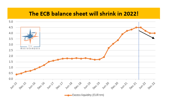
Central Banks speak, Alf translates
18’ reading timeGood morning everybody and welcome back to The Macro Compass!This article will break down last week’s Central Bank meetings: why and what should you care about, and what does that mean for your portfolio.Specifically, we are going to touch upon:* The most interesting (yet overlooked) takes from ECB/Fed meetings and what to pay attention to in 2022* The resulting overweight/underweight in my medium-term ETF portfolioWithout further ado, let’s jump right in!The devil is in the detailsCentral Banks meetings last week were mildly hawkish across the board - let’s have a look at some interesting takes from Powell and Lagarde.The Fed decided to accelerate its tapering plan to ‘‘retain optionality’’ on when to start the hiking cycle as the FOMC noticed rapid progress towards maximum employment and inflation running consistently above targets. Powell mentioned few interesting things.The labor market is hot, but we recognize that labor force participation rate is weak. Nevertheless, we need to make policy now and we are facing strong inflationary pressures.We all know the Fed has a dual target: price stability and maximum employment.In 2020, their monetary policy review exercise concluded that FAIT (flexible average inflation targeting) was the way to go: as the St. Louis Fed explained, ‘‘under this new strategy, the Fed will seek inflation that averages 2% over a time frame that is not formally defined. This means that after long periods of low inflation, the Fed will not enact tighter monetary policy to prevent rates higher than 2%. One benefit of this flexible strategy to managing the mandate of price stability is that it will impose fewer restrictions on the mandate of full employment.’’The FOMC is watching a robust cyclical recovery in the labor market, but it’s well aware of the structural and long-lasting damage (read: lower participation rate) caused by the pandemic shock. Nevertheless, they chose to accelerate their tightening plans as inflationary pressures persist.FAIT is basically out of the window.Within the dual mandate, it seems now clear that price stability > > > labor market.The other interesting thing was the updated FOMC forecast for inflation over the next 3 years.The Fed now expects their preferred measure of inflation (PCE) to drop to 2.6% in 2022, 2.3% in 2023 and then quickly converge to their long-term target of 2.0%.The chart above shows that while both FOMC members and market participants foresee inflation converging to 2% over the next few years, the Fed inflation projections (orange line) are more benign than what’s priced in via forward inflation swaps (blue line).As the labor market keeps healing, if realized PCE ends up being closer to what market participants price in (rather than the benign FOMC forecasts) we might be in for some additional hawkish surprises.Interestingly though, despite being more sanguine on inflation projections traders have a hard time believing in a robust hiking cycle.Post FOMC meeting, the OIS-implied path for Fed Funds rate over the next 5 years has diverged further from the Fed’s dot plot.After pricing 3 hikes in 2022, market participants simply don’t believe the Fed dot plot can materialize: terminal Fed Funds rate are priced around 1.5% versus the Fed’s own long-run dot at 2.5%.Summing up:The Fed has turned: as maximum employment seems within reach, the focus has now turned on inflation - despite relatively benign PCE forecasts, the pressure to act is strong. FAIT has been watered down aggressively again.Watch out for PCE, changes to the terminal Fed dot and the first announcement about quantitative tightening!What about the ECB meeting?The ECB meeting also delivered a mildly hawkish outcome: the 2022 net QE envelope has been effectively set in stone at approximately EUR 450 bn, hikes were foreseen possible in 2023 and no new cheap TLTRO funding for banks was announced (very relevant point, we will cover it later).The two most interesting points from Lagarde?She tried hard to stress ECB has flexibility to restart PEPP (mmmhhh) and that there is no end date yet to APP, so QE is still open-ended (mmmhhh)One of the most impactful aspects of the ECB’s pandemic QE program was its flexibility to adapt to market conditions: this feature effectively served as a virtual cap for spreads and a volatility killer - I argue this feature is largely watered down now.Restarting PEPP would require an unlikely ad-hoc ECB Governing Council approval, and the fact that the APP pace for 2022 has already been decided strongly hints that flexibility is very little.Moreover, the declining APP pace throughout next year signals that the base case is for QE being completely phased out in 2022.Next year, the ECB will still absorb most of net borrowing needs from governments and the European Union but the private sector will be required to step in a bit.That’s a relatively large change from 2021, a year who saw the private sector being crowded out by the ECB who scooped