
The Macro Compass
131 episodes — Page 2 of 3

The De-Dollarization Fairytale
Brazilian President Lula recently asked the following questions:‘’Every night I ask myself why should every country have to be tied to the US Dollar for trade?’’‘’Why can’t we trade in our own currency?’’‘’Why can’t a BRICS Central Bank have a currency to finance trade between BRICS countries?’’Lula’s speech sparked yet another mediatic hype on the upcoming De-Dollarization.So, let’s explain how today’s USD-centric system works and why it’s been impossible to replace in 50+ years.Before we dive into it, a quick reminder: if you enjoy these educational pieces and you haven’t subscribed yet to The Macro Compass premium platform……well, what are you waiting for?Come join thousands of investors receiving unique, jargon-free macro insights and actionable investment strategy for their portfolios every week!For more information, here is the website.Now, back to it.In a globalized economic system you want to trade with as many partners as possible in a seamless way.When Brazil exports its commodities to China or Japan and the trade happens in USD, Brazil accumulates Dollars – it might also use them to buy goods or services it needs from other countries.In other words, today the US Dollar is the Global (Reserve) Currency of choice: over 80% of global FX transactions and 50%+ of global trades and payments happen in US Dollar.More importantly, in the last 30 years competitors could not alter this massive USD dominance: why?Well, it’s because being the US Dollar seems fun from the outside.But it ain’t easy.Let’s start from the asset side.When Brazil exports commodities in USD more than spends USD to import stuff from the outside, the country accumulates USD foreign exchange reserves.These USDs enter the domestic banking system, and ultimately the local Central Bank is responsible for managing this FX reserve buffer – that means keeping these US Dollars safe and liquid.In our monetary system, keeping money ‘’safe and liquid’’ means avoiding credit risk and investing in deep and liquid markets that guarantee a painless turnover if necessary (either via selling or repo-ing securities).The US Treasury market stands out as the global leader in this field: as big as 20+ trillion in size, liquid and underpinned by a deep repo ecosystem it ticks all boxes.No capital controls, democratic roots and the rule of law reinforce the case.Most importantly, an ample supply of US Treasuries (read: deficits) provide to the rest of the world what they need: a safe and liquid asset where to recycle the USD proceeds from their global trades.But so, what’s the potential alternative?Japan? Its government bond market is 60%+ absorbed by the BoJ, and there have been multiple days in a row (!) where no trade happened in the JGBs – how can you store your FX reserves in such an illiquid market?Europe? With such a fragile monetary but non-fiscal union, and the only AAA countries potentially able to provide the world with safe collateral (German Bunds) instead sticking to austerity for decades?China? Brazil? Russia? You are facing a combination of capital controls (China), lack of democracy/rule of law (Russia), corruption and frequent episodes of double-digit inflation (Brazil) – do you want to take these risks when storing your hard-earned FX reserves accumulated from selling your goods and services abroad?The truth is that US Treasuries don’t have a valid competitor as a global vehicle where to invest FX reserves.And this is also true for the other side of the coin: debt.USD-denominated foreign debt is huge, and it makes an orderly De-Dollarization not more than a fairytale.Entities sitting outside the United States have accumulated $12 trillion of USD-denominated debt: this is because to finance global businesses that sell stuff in US Dollars…well, you need US Dollar debt.I can’t stress how important it is to understand this concept: if you want to break this system and ‘’De-Dollarize’’, you need to deleverage a $12 trillion debt system.Brazil walking away from USD-denominated trades would hamper its own organic inflows of US Dollars, and Brazilian corporates would be choked under USD scarcity as they need to repay and refinance their USD debt.When you de-leverage a debt-based system, you are either bidding up the debt denominator (the USD) or you are witnessing tectonic geopolitical events (e.g. wars) where the world order is at stake.An orderly unwind of the US Dollar is a fairytale: there is no valid alternative for a smooth transition, and de-leveraging the global USD debt based system would be a very painful process.And this is why you keep hearing about the De-Dollarization, but it never happens.If you have enjoyed this piece, consider joining The Macro Compass premium platform.The best investment you can make is in your own macro education, and TMC is trusted by thousands of worldwide investors to deliver unique and actionable macro insights every week.For more information, here is the website. This is a public episode. If you would like t

5 Things Hedge Funds Are Watching
Hedge funds are often called fast or smart money because they are one step ahead of herd market thinking.I am blessed with the opportunity to have several of them as clients, and pick up their brains on what they are watching in markets and what the next big macro trade might be.In this piece, I will share with you 5 macro developments and charts hedge funds are watching.1. Are you watching the deflationary tails?!The Minneapolis Fed runs an excellent algorithm that plots the market-implied distribution for 5-year ahead expected inflation in the US (here).It uses options on inflation-linked products to determine what investors are expecting as base case, and what they are willing to pay for upside (hot inflation) or downside (disinflation) in US CPI over the next 5 years.If we compare today’s distribution (blue) versus 2 years ago (red) we notice that the median base case for investors is that US inflation will average around 2.25% over the next 5 years: quite a comfortable sight.But the devil is in the (de)tails.While 2 years ago the 10th percentile of the distribution settled at 1.56%, today is sits at 0.63% - quite close to actual deflation.The ‘’hot inflation’’ tail (90th percentile) is also a bit higher at 4.63% vs 3.76% in 2021.While the base case for inflation ahead is very benign, today investors are more worried about tails than they were in 2021.And in particular deflationary tail risks are staging a comeback.2. Bond market volatility: look under the surface…As the banking crisis was unfolding, bond market volatility literally exploded: the cost to hedge against an abrupt Fed cutting cycle skyrocketed, and bond market liquidity quickly evaporated.Lately, as we find out the world is not coming to an end anytime soon bond market volatility is quickly receding…but are we out of the woods?This chart shows the 3-month market-implied volatility in US 2y rates (orange, RHS) and 30y rates (blue, LHS).Bloomberg users can find the tickers here: USSN0C2 BGN Curncy and USSN0C30 BGN Curncy.If you don’t have Bloomberg, you can find and chart these tickers on our Volatility-Adjusted Market Dashboard (tickers: US 3m2y Swaption ATM Vol, US 3m30y Swaption ATM Vol).This chart is interesting because it shows that while front-end bond market volatility (orange) receded but remains elevated, the long-end (blue) seems to be much less uncertain about future outcomes.Why?As this hedge fund client eloquently puts it: the Fed can have a strong influence on 2y rates, but 30y rates are rather based on investors’ expectations and uncertainty about future growth and inflation.And there is not much to be uncertain about there – the Fed is on a mission to kill growth and inflation, 30y rates know it and you never fight the Fed.Which brings me to the 3 most crucial charts hedge funds are watching to find the next big macro trade, and that you should care about too.Let’s dig in…Eager to read the remaining part of this macro report?Come join The Macro Compass premium platform to get access to Alf’s full-length timely pieces, actionable investment strategy and much more!Check out which subscription tier suits you the most using the link below.For more information, here is the website. This is a public episode. If you would like to discuss this with other subscribers or get access to bonus episodes, visit themacrocompass.substack.com
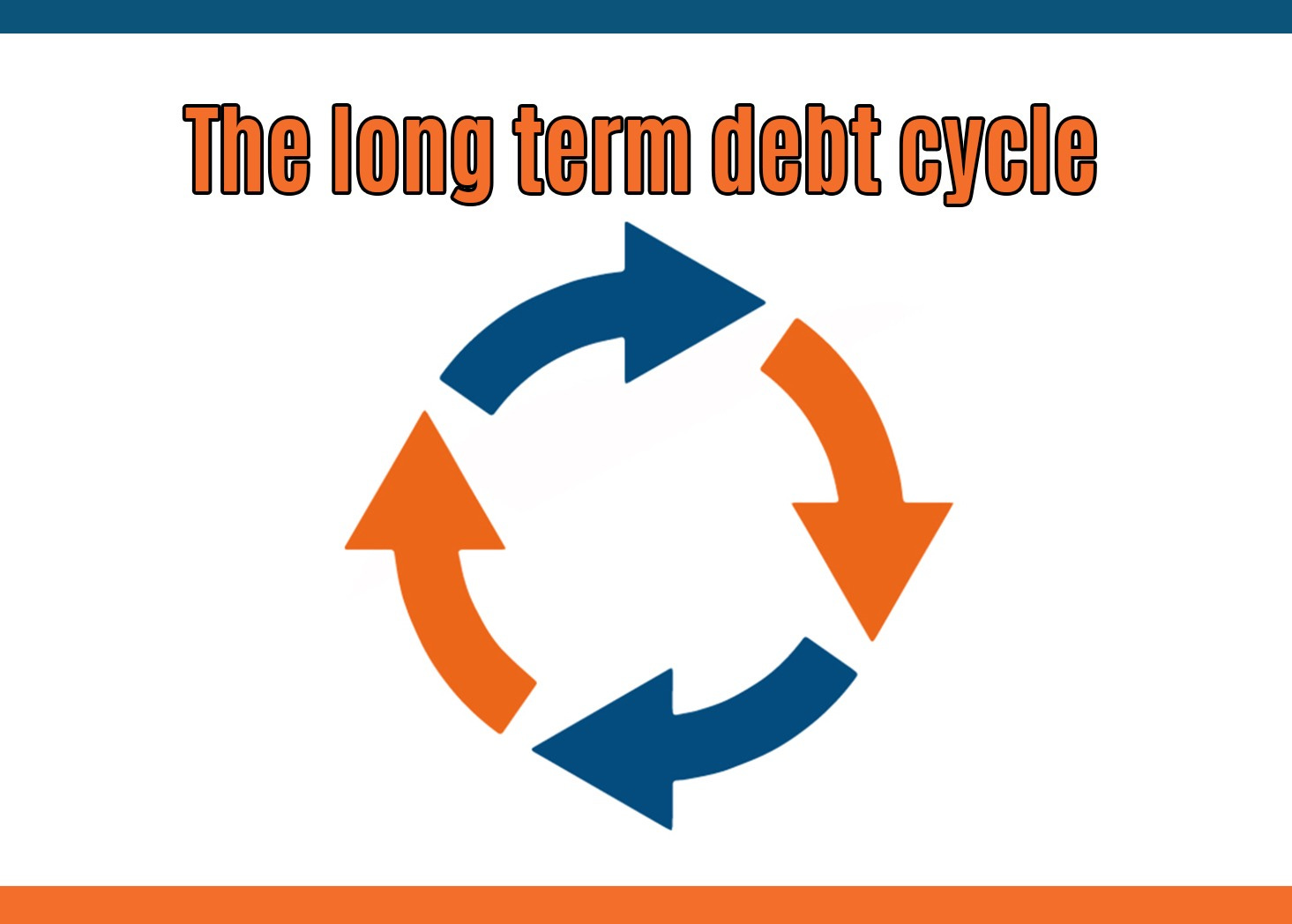
The Long Term Debt Cycle
Hey guys! Before we start, an important announcement: welcome to the first piece of the TMC Macro Education Series!Once a week, I will deliver some bonus educational content covering big picture macro trends, the bond market, monetary mechanics, risk management and more in a quick, 5-min read.Financial education is a key TMC principle – hence the Macro Education Series is and will always remain FREE.I hope you enjoy it!Long-term, structural economic growth is mostly driven by two factors: demographics and productivity.Both peaked in the late 80s, and we chose to fix the problem with a ton of debt.It worked until now, but we are at very late stages of the long-term debt cycle.Healthy demographics and high fertility rates facilitate a growing labor force: retirees are more than offset by new young workers, and hence the share of working-age population as % of total increases.More workers, more potential for growth.Over the next decades though, the share of working-age population will decline across many countries: for instance, the Chinese workforce is likely to shrink by 250-300 million people – a hard hit for global growth.Total factor productivity (TFP) growth measures how productive are capital and labor resources.Effective capital allocation and technological progress contribute to achieving positive productivity growth.As the marginal benefit from technological progress declines over time and capital misallocation took center stage over the last 1-2 decades, TFP growth stagnated around 1% per year – not exciting.As per the early 90s, labor force and productivity growth trends weakened materially.Potential GDP growth started declining to socially and politically unacceptable levels – so, how did we fix that?With a ton of debt.Public + private debt levels as % of GDP amongst developed economies skyrocketed from Be it mostly through government (Japan) or the private sector (China), credit creation was the ‘’easy fix’’.To be precise: cheaper and cheaper credit.Real interest rates relentlessly declined for 3 decades, allowing a system with lower structural growth offset by more and more leverage at cheaper and cheaper borrowing costs to thrive.The more unproductive debt, the lower real yields must be for the system to survive.This long-term debt cycle is at its very last innings.Fighting inflation requires higher real yields, and our over-leveraged system can’t bear that.And once you deleverage a credit-based system, it’s hard to get it back on its feet.Just ask Japan.If you have enjoyed this piece, consider joining The Macro Compass premium platform.The best investment you can make is in your own macro education, and TMC is trusted by thousands of worldwide investors to deliver unique and actionable macro insights every week.For more information, here is the website. This is a public episode. If you would like to discuss this with other subscribers or get access to bonus episodes, visit themacrocompass.substack.com
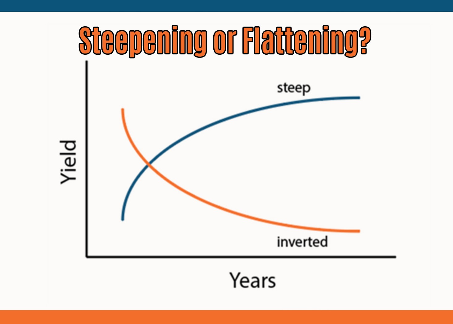
The Big Yield Curve Shift
Before we start, a quick announcement: starting this week, I’ll be kicking off The Macro Education series!I will publish short and educational pieces covering the bond market, monetary mechanics, portfolio construction, risk management and much more.It will be and it will forever remain FREE.Looking forward to share some educational macro insights with this nice community!When the yield curve flattens and eventually inverts, you worry.But it’s when a recession hits, the Fed cuts rates and the curve steepens that you become s**t scared.Yield curve dynamics represent a crucial macro variable, as they inform us on today’s borrowing conditions and on the market future expectations for growth and inflation.An inverted yield curve often leads towards a recession because it chokes real-economy agents off with tight credit conditions (high front-end yields) which are reflected in weak future growth and inflation expectations (lower long-dated yields).A steep yield curve instead signals accessible borrowing costs (low front-end yields) feeding into expectations for solid growth and inflation down the road (high long-dated yields).Rapid changes in the shape of the yield curve at different stages of the cycle are a key macro variable to understand and incorporate in your portfolio allocation process.Hence, in this piece we will:* Quickly walk you through the different yield curve regimes (i.e. bull steepening, bear flattening etc);* Analyze 50+ years of asset classes returns through these different regimes;* Assess where we stand today, and what the labor market is telling us about the macro cycle;* Conclude with our actionable investment strategy.* Bull Flattening = lower front-end yields, flatter curves.Think of 2016: Fed Funds already basically at 0% and weak global growth. Yields stay put at the front-end and could meaningfully move lower only at the long-end, hence bull-flattening the curve.* Bull Steepening = lower front-end yields, steeper curves.Late 2020, early 2021: the Fed was keeping rates pinned at 0% and stimulating via QE but the economy was flooded with fiscal stimulus and ready for reopening. The friendly borrowing conditions and the massive upcoming growth boost could mostly be reflected through higher long-end yields, while 2-year interest rates were pinned at 0% by the Fed. Bull-steepening of the curve.* Bear Flattening = higher front-end yields, flatter curves.2022 was the bear flattening year: Powell raised rates aggressively to fight inflation, but he ended up choking the economy off. This was reflected in lower future growth and inflation expectations at the long-end of the curve. Front-end rates went higher, but the curve bear-flattened.* Bear Steepening = higher front-end yields, steeper curves.Do you remember 2009? The worst of the GFC was behind us and (monetary-mechanics-illiterate) investors were afraid that QE would lead to runaway inflation and the Fed would be forced to start acting on it. Front-end yields moved a bit higher, but long-end yields took most of the hit as investors (mistakenly) bumped the inflation risk premium up = the curve bear-steepened.Rapid changes in the shape of the yield curve when growth is at turning points are a key variable to consider for a successful asset allocation process.We looked at 50+ years of cross-asset returns through different growth and yield curve regimes, and here is what we found:The implications from this table are crucial for your portfolio allocations.Let’s dig in…Eager to read the remaining part of this macro report?Come join The Macro Compass premium platform to get access to Alf’s full-length timely pieces, actionable investment strategy and much more!Check out which subscription tier suits you the most using the link below.For more information, here is the website. This is a public episode. If you would like to discuss this with other subscribers or get access to bonus episodes, visit themacrocompass.substack.com

How To Invest In Q2
Soft landing, no landing at all, banking crisis leading to an immediate recession.Chinese reopening yes, reopening no.S&P 3850, 4200, no again 3850, wait it’s back up to 4150.Push & pull macro and market dynamics dominated Q1, leaving investors confused on how to approach Q2.This is why in this piece we will:* Quickly review Q1 through the lenses of Volatility-Adjusted market performance across asset classes;* Refresh the key variables behind our quantitative TMC Asset Allocation Model;* Reflect on asset classes valuations and conclude with our ETF Portfolio allocation to kickstart Q2.For long-term macro investors, Q1 brought mildly positive returns with a truckload of volatility and went away without marking the start of any major macro trends.Reminding ourselves that US cash equivalent products yield ~5%, there was little to be excited about.Our Volatility-Adjusted Market Dashboard (VAMD) screens global macro asset classes returns from a risk-adjusted performance, and it shows a 3-month Z-Score no major vol-adjusted action.Rather than in being outright long or short a certain asset, the most significant Q1 macro trend was a rotation in US equity sectors.Tech and Consumer Discretionary largely outperformed defensive sectors like Healthcare and Utilities.But why?This excellent chart from Goldman explains why: mechanical re-leveraging flows, not fundamentals.Back in November, Powell was channeling his inner Volcker – no end in sight for the hiking cycle, and the most hated assets in such macro environments are high-beta, unprofitable tech/meme companies.Fast forward to early 2023: disinflation first and a more prudent Fed after the SVB saga bring in systematic flows and ‘’pivot buyers’’, leading to a massive short squeeze.Nothing to do with fundamentals, but a good reminder to respect the power of macro-insensitive flows.So, with that in mind how do we approach Q2?First: the macro fundamentals.The TMC Quadrant Asset Allocation Model (QAAM) blends together monetary policy and economic growth indicators to identify the prevailing Macro Quadrant and hence the most appropriate asset allocation tilt.It combines that with an assessment on valuations, correlations and portfolio volatility to come up with the final allocations depleted in the Long-Term Macro ETF Portfolio.The Y-Axis of our QAM tells us the global monetary policy stance remains tight due to elevated and sticky real yields, and about to get tighter as the flow of financial money turns more negative.Long-dated real yields are now positive and above equilibrium in many jurisdictions, and that is negative for growth and markets as our debt-based system struggles to roll over cheap leverage.In the US, sustained periods of above-equilibrium real yields lead to poor market performance (2015, 2018).In 2022, it was the rate of change in real yields that scared markets: going from the -0.75% March YOLO levels to the +1.50% October ‘’Powell = Volcker’’ levels in only 6 months required tectonic adjustments in valuations.Since then, real yields have stabilized but have averaged a tight +0.93% for 6 months already.In Q2, real yields are likely to remain in tight territory again.And markets don’t like tight conditions, especially if they last for a long period of time.Ok.But what are we really doing QT or are Central Banks printing money?How does that affect macro and markets in Q2, and how to best position portfolios?Let’s dig in…Eager to read the remaining part of this macro report?Come join The Macro Compass premium platform to get access to Alf’s full-length timely pieces, actionable investment strategy and much more!Check out which subscription tier suits you the most using the link below.For more information, here is the website. This is a public episode. If you would like to discuss this with other subscribers or get access to bonus episodes, visit themacrocompass.substack.com
Look Beyond
The world is big, and macro investment opportunities pop up where you least expect them.Looking beyond the US and focusing on true global macro is an underrated and fruitful exercise.So, let’s do that.In this piece, we will cover the latest macro developments and discuss trading opportunities in Europe, China, Japan…and yes, ok, we will sneak in a quick word about US liquidity too – very important for global markets.China - Opportunity or Bull Trap?Let’s start from China: what about the reopening trade?The Chinese Communist Party’s plan put in motion back in 2021 had as its first objective to clamp down speculative behavior in sectors that weren’t considered ‘’in line’’ with the CCP’s views for China: excessive animal spirits in the real estate and tech sectors were to be tamed.And they were – a substantial deleveraging was achieved, which brings us to the second step.The Chinese reopening: bring back domestic consumption and steer growth where you want to see it.So, where do we stand there?Chinese official data is often to be taken with a pinch of salt, but here is an interesting take on PMIs:The New Orders subindex just printed at multi-decade highs (orange), while the Exports subcomponent has rebounded but not nearly as much (blue): the Chinese reopening is real, but it’s been met by sluggish global growth and hence exports struggle to pick up.Don’t trust Chinese official data?Alternative data show how domestic flights are up 40% YoY, and a pickup in international flights should follow with holiday season and higher temperatures.On top of it, China has pre-emptively stimulated in H2-2022 delivering a solid flow of credit to corporates.As this interesting chart from Clocktower shows, once China credit creation picks up (purple) it’s only a matter of time before Chinese equities (blue) rally.Chinese equities continue to look attractive over the medium term here, with stock indexes still well below the January highs and with a 10%+ potential upside based on broader macro data further reflecting the reopening trends in Q2 and supportive credit creation.This view is reflected in our Macro ETF Portfolio, where…Eager to check out Alf’s Macro ETF Portfolio and trade ideas?Want to keep reading his global macro analysis on Europe, Japan and the US?Come join The Macro Compass premium platform to get access to Alf’s full-length timely pieces, actionable investment strategy and much more!This article is available to the All-Round subscribers - get in that premium TMC tier using the link below. This is a public episode. If you would like to discuss this with other subscribers or get access to bonus episodes, visit themacrocompass.substack.com

Follow The Money
In 1992, judge Giovanni Falcone was killed by the Sicilian mafia.Falcone and his colleague Borsellino were at forefront of major investigations that uncovered much of the mafia’s business and led to the incarceration of many criminals.His method was pretty simple: follow the money, find the mafia.The same methodology can be very useful in understanding the real extent of today’s banking stress, which is crucial for macro and markets going forward.Follow the money, assess the banking stress.That’s why in today’s piece we will:* Show you how to ‘’follow the money’’, explaining which reports to focus on and how to analyze them week by week to assess the depth of the banking stress;* Refresh our market views and actionable long-term macro ETF portfolios.Let’s follow the money together.If banks are under stress from deposit outflows, they sure will be tapping the available liquidity facilities.So, have they? And by how much?Before we answer this question let’s first define which liquidity facilities are available to US banks – they differ in conditions, eligible collateral, loan tenors etc.A) The Discount Window (Fed): very wide set of collateral accepted (not limited to Treasuries and MBS, but also some loans) at market value, max 90 days term lending at top of Fed Funds range (5% now); it comes with a strong stigma from the GFC.B) BTFP (Fed): newly created Fed facility that accepts Treasuries and MBS without any liquidity or market haircuts (!) and lends for up to 1-year at 1y OIS (~Fed Funds) + 10 bps (4.75% now);C) FHLB Advances (not Fed): the Federal Home Loan Banks program that allows member banks to post collateral with haircuts (UST, MBS and some mortgage loans) and at market value to get funding (‘’advances’’). Funding duration is flexible, but FHLB advances are relatively more expensive.Here is a very handy table from JP Morgan summarizing the 3 facilities:So, let’s now follow the money – did banks use these facilities, and by how much?The Fed’s H.4.1 report is released every week (here) and it informs us on the Discount Window and the BTFP.Banks drew $160 bn from these facilities in the SVB debacle week, and net zero (!) the week after.We also know that First Republic Bank drew about $110 bn from the Discount Window, which means all other US banks only drew $50 bn from the combined Fed facilities 2 weeks after the stress started.Not much, really.But maybe banks used the third option - FHLB Advances more aggressively?FHLB disbursed loans to commercial banks are only reported quarterly, but you can track the amount of money FHLB is raising through bond issuance here – even if not fully distributed, it gives us an idea about the potential incoming demand FHLB expects.Now, stand ready for the number.The FHLB has raised as much as $300 billion in the last 7-10 days, largely outpacing its normal issuance pace.A huge figure.So, are US banks truly experiencing severe stress after all?Let’s keep following the money together to find the answer to the most important question for markets right now…Eager to read the remaining part of this macro report?Come join The Macro Compass premium platform to get access to Alf’s full-length timely pieces, actionable investment strategy and much more!Check out which subscription tier suits you the most using the link below.For more information, here is the website. This is a public episode. If you would like to discuss this with other subscribers or get access to bonus episodes, visit themacrocompass.substack.com
Powell Strikes Again
The Fed understands that banking stress is ultimately disinflationary as the flow of credit to the real economy slows down and so does economic activity, and inflation with it.Markets are now busy interpreting what it all means, and this is why in this timely piece we will:* Discuss the 2 most important takeaways from the Fed meeting;* Assess market reactions across asset classes, with a particular focus on the bond market;* Disclose the resulting tactical trade ideasWait: Have We Broken Something Here?“Recent developments are likely to result in tighter credit conditions for households and businesses and to weigh on economic activity, hiring, and inflation.”With inflation sticky and still trending above 5%, for the Fed to come out of the gate with a forward-looking statement like this is quite something.Powell & Co deeply understand the disinflationary nature of banking stress.This was also reflected in the economic forecasts, and particularly in the uncertainty surrounding them.Due to the banking stress, a large number of FOMC participants is worried about downside risks to GDP growth while less and less participants expect upside surprise on inflation.In other words, the FOMC is more worried about a disinflationary recession than anything else.“The Committee anticipates that some additional policy firming may be appropriate to attain a stance of monetary policy that is sufficiently restrictive to return inflation to 2 percent over time.”From “ongoing rate increases” to “some” and “may”.Again, this shows that the Fed will be on the lookout for signs that they might have done enough damage through this banking stress.This is something deeply new, as until now the Fed was effectively on autopilot: keep monetary policy incrementally tight until you get people unemployed and inflation comes down.Don’t make any assumptions, just get the job done.Here, we are looking at a different Fed.And the Summary of Economic Projections (SEP) clearly shows it.Despite predictions for lower unemployment rate and higher core inflation in 2023, most likely to account for the banking stress uncertainty the median Fed Dot for December 2023 wasn’t revised higher.This is a proactively cautious Fed looking to assess the damage despite inflation still running hot.But the second point was even more important, as it led to crucial market moves and therefore opened the door to some interesting market opportunities.Let’s dig in…Enjoyed it so far and eager to read the remaining part of this macro report?Come join The Macro Compass premium platform to get access to Alf’s full-length timely pieces, actionable investment strategy and much more!This article is available to the All-Round subscribers - get in that premium TMC tier using the link below. This is a public episode. If you would like to discuss this with other subscribers or get access to bonus episodes, visit themacrocompass.substack.com

What Now?
The giant Swiss bank Credit Suisse is no more.Central Bankers have announced several facilities during weekends to calm markets down.The 2008 vibes are very strong – what now?In this piece, we will provide you with a level-headed analysis of:* The Credit Suisse deal, including its repercussions on the broader European bank and credit markets;* The scope and effectiveness of the Fed’s BTFP facility and the reactivation of global $ swap lines;* How are we managing our portfolio, and what lies ahead for markets.Credit Suisse has been acquired by UBS for $3.3 billion in a deal brokered by the Swiss government over the weekend – the deal also includes about $10 billion the Swiss government will cover for potential CS losses hitting UBS and around $108 bn of liquidity facilities the Swiss National Bank will make available to UBS.This is a decent deal for UBS, and yet markets were unhappy because of one important detail.While CS equity investors got (some small) residual value out of the deal, $17 billion of CS’ Additional Tier 1 bonds (a “hybrid” instrument between bonds and equities) were completely written down to zero.Regulators decided to sweeten the deal for UBS by sacrificing AT1 investors denying the standard waterfall.Investors were busy extrapolating that AT1 are now a no-go if regulators can subordinate these bonds to equity capital in events of stress – returns don’t warrant the risk in these bonds, and the AT1 market in Europe is pretty big at $275 billion.That’s an incorrect extrapolation, in my opinion.If they did their homework (I doubt…), CS AT1 investors knew already the risks they were running: the absence of “write-up” mechanism is very clear for these bonds, which means the risk of getting marked down to zero if a Viability Event/AT1 Trigger (read: bank about to go belly up) occurs is high.Such a permanent write-down in AT1s is NOT the standard in Europe, as you can see below:So, yes: CS AT1 investors have been penalized but they knew they were running permanent write-down risks.And no: the AT1 market in Europe is not dead and the spill-over risks in the banking sector are low.After the GFC, the bilateral unsecured exposure between banks has been massively reduced: unsecured interbank loans through the Euribor/Libor markets are mostly a thing of the past, and regulators ensured banks are highly penalized for holding uncollateralized bonds issued by other banks (like AT1s).In other words, that means the direct contagion from the CS debacle within the banking system will be low.Central Banks have announced plenty of facilities during recent weekends.After the SVB debacle, no other US banks have capitulated yet and the Credit Suisse saga has been solved.So why are markets still so stressed?Is the bond market smelling something bad?Let’s dig in…Enjoyed it so far and eager to read the remaining part of this macro report?Come join The Macro Compass premium platform to get access to Alf’s full-length timely pieces, actionable investment strategy and much more!Check out which subscription tier suits you the most using the link below.For more information, here is the website. This is a public episode. If you would like to discuss this with other subscribers or get access to bonus episodes, visit themacrocompass.substack.com

The Moment of Truth
Market pressures on US banks are now spreading to Europe, where the already troubled Credit Suisse asked the Swiss government for help and got a liquidity boost.Investors are asking the tough questions now, which means the moment of truth looms large.Data-driven, holistic macro analysis is crucial to correctly answer these questions.In this piece, we will:* Review the current banking situation, assessing the widely different degree of tightness in regulatory and accounting frameworks US and European banks are subject to;* Do the heavy lifting on digging up the real metrics you need to monitor when assessing the vulnerability banks have to higher interest rates (spoiler: not HTM unrealized bond losses…);* Conclude with the big picture macro take on banks, and important changes in our Macro ETF Portfolio allocations.Nothing like a front page of The Economist to tell us we have moved to the panic phase.Let’s review where we stand, starting from the US.The US banking regulation and accounting frameworks have some pretty big flaws.Yep, you read that right.1. Banks with a balance sheet below $250 bn can act a lot like cowboys…No need to adhere to NSFR (Net Stable Funding Ratio), a rule that forces large banks to have a good proportion of their liabilities in sticky, long-term funding which limits liquidity risks.No need to adhere to LCR (Liquidity Coverage Ratio): ‘’small’’ banks can buy a disproportionate amount of less liquid securities like corporate bonds or mortgage-backed securities instead of Treasuries.The problem is that a $249 bn balance sheet bank is not small.For reference, a top 3 German bank has a balance sheet of less than $200 bn – seriously, top 3 in Germany.This lax regulatory treatment for ‘’small, but not so small’’ banks is very dangerous.2. Even large banks booking bonds in HTM are disincentivized (!) to hedge interest rate risksHTM = friendly accounting: book bonds there, forget about them as they are valued at amortized cost.Prudent risk management still suggests you should hedge interest rate risk.Yet, US accounting rules disincentivize interest rate hedging for HTM bonds – nuts.But the cherry on the cake…3. No proper interest rate risk stress testing (!!!)Guys, this is out of this world.As we will discuss, Europe has a quite extensive framework to stress test the interest rate risk that European banks take on their aggregate balance sheets (the net exposure deriving from loans, mortgages, bond investments, bond issuance, long-term liabilities and swaps).It’s called IRRBB (Interest Rate Risk in Banking Books) stress-testing.The US equivalent? It doesn’t exist!Here is the IMF calling US regulators out on the topic:Please take a second to reflect on how bad this is.‘’Small’’ US banks are subject to much laxer regulatory requirements.But even large US banks are disincentivized from hedging rate risk on HTM bonds and even worse they are not subject to extensive stress testing on the overall interest rate risk they run on their balance sheets.Europe has much tighter regulatory standards and accounting framework, and yet the panic seems to be spreading there too.So, here are the key questions.What’s the correct approach to assess how and which US and European banks are really vulnerable to higher interest rates and liquidity risks?And what’s the big picture macro take here when managing a long-term ETF portfolio?Let’s dig in…Enjoyed it so far and eager to read the remaining part of this macro report?Come join The Macro Compass premium platform to get access to Alf’s full-length timely pieces, actionable investment strategy and much more!Check out which subscription tier suits you the most using the link below.For more information, here is the website. This is a public episode. If you would like to discuss this with other subscribers or get access to bonus episodes, visit themacrocompass.substack.com

Contagion Risks
If a couple of regional banks were so bad at managing their interest rate risk and deposit outflow risk to blow up in a few hours, how can we really be sure other banks won’t face similar problems?Having run a large investment portfolio at a European bank and been part of the management for the Treasury department, I will try to use my practical experience to provide you with:* A quick primer on how banks approach risk management of a large securities portfolio;* A level-headed analysis of the damage that higher interest rates do to a banks’ balance sheet, and the resulting assessment of broad contagion risks;* An update on inflation and the likely Fed reaction function in this environment.Banks buy bonds for two main reasons: clipping coupons and regulation.When you attract deposits and do nothing on the asset side, you are going to accumulate reserves at your domestic Central Bank.But banks want to make money, and bonds generally yield more than Central Bank reserves (chart below).Sum up regulation (LCR) forcing large banks to own ~20% of their balance sheet in liquid assets (read: bonds) and there you go: banks have huge investment portfolios to clip coupons and meet regulation.How do banks approach the risk management of such gigantic portfolios?A prudent bank hedges most if not all its interest rate risk coming from the securities portfolio with swaps.The bank buys bonds (receives fixed rate) and pays swaps (pays fixed rate) against them as a hedge.Banks earn the (credit) spread between bond yields and swap yields, and that’s it.But now comes the trick: accounting.Swaps are derivatives, and their standard accounting treatment is to directly hit the P&L of the bank hence causing quite some immediate volatility for the financial results of the bank.Banks don’t like that at all.That’s why the regulator allows for something called hedge accounting: if you buy bonds and put them in Available-For-Sale (AFS) and use swaps to hedge the interest rate risk, all that P&L volatility is gone.The small volatility of offsetting bonds and swaps hits the capital position of the bank.Easy-peasy, no drama: little volatility as risks are hedged, and friendly accounting treatment (no P&L vol).But what happens if you book bonds in Held-To-Maturity (HTM) instead?In the US, once you book bonds in HTM the accounting rules are such that hedging the interest rate risk on these bonds is quite punitive.Swaps hedging HTM bonds do not receive the friendly accounting treatment and hence hit the P&L of the bank – but bonds don’t, which creates a massively inconvenient asymmetry and P&L vol that banks hate.The result is that US banks end up NOT hedging the interest risk on HTM bonds.This is important because the HTM losses accumulated on these bonds can be very large.P.S. My spreadsheet failed me on Schwab. The bank’s capital is 25+ bn, not 8. Hence losses are about 50%+ of capital, not 171%.Even for systemically important banks like Bank of America these losses could wipe out half of their capital!So, are large US banks at risk of going belly up too?And given today’s inflation print, what will the Fed do?Let’s dig in…Enjoyed it so far and eager to read the remaining part of this macro report?Come join The Macro Compass premium platform to get access to Alf’s full-length timely pieces, actionable investment strategy and much more!Check out which subscription tier suits you the most using the link below.For more information, here is the website. This is a public episode. If you would like to discuss this with other subscribers or get access to bonus episodes, visit themacrocompass.substack.com

Banking Crisis?
Silicon Valley Bank went belly up in about 30 hours.And no, it’s not the Fed’s fault.It’s the result of a very concentrated funding base, embarrassingly bad market risk management and a ton of moral hazard at play.This piece will attempt at answering the questions all of us have been asking:* What exactly went so wrong for a $200bn+ balance sheet bank to go down so fast?* How serious are the spillover risks? Is the entire US banking system in trouble?* How will the Fed and markets react?Disastrous Risk ManagementWhat SVB did with their investment portfolio is either a signal of enormous incompetence or of outright moral hazard at play – gamble away billions as policymakers will rescue you anyway.I can’t believe incompetence reaches these levels, and there are some clear hints moral hazard was at play.First of all: why do banks buy all these bonds?Post GFC, regulators forced banks to own an amount of high quality liquid assets (HQLA) at least big enough to meet a stressed outflow of deposits for 30 days => Liquidity Coverage Ratio (LCR) above 100%.What qualifies as HQLA?Reserves at the Central Bank, Treasuries, but also corporate bonds and MBS to a certain extent.As a result of LCR regulation, banks all over the world have flushed their balance sheets with trillions of bonds. Such a large amount of bonds on the balance sheet also comes with risks though, right?Interest rate risk comes to mind: if you purchase Treasuries and yields rise, you lose money.That’s why banks hedge (!) the lion share of the interest rate risk coming from their HQLA investments.The mechanism is simple.When you buy Treasuries, you lock in a fixed yield you receive and rising interest rates represent a risk.To hedge that risk, you enter into an interest rate swap: this time, you pay away a fixed yield and receive variable payments in exchange.There you go: you received a fix rate when buying Treasuries and you pay a fixed rate in the swap – a hedge.Treasuries generally yield a bit more than swaps, and that’s where you make your money (swap spreads).In this example, SVB (A) would buy 10-year Treasuries and enter into a swap to hedge interest rate risk.SVB (A) pays a fixed 10-year rate (OIS) in the swap, and receives the variable overnight Fed Funds rate for the next 10 years plus a spread (swap spread).This would allow SVB to hedge the interest rate risk and earn a small spread on their HQLA portfolio.The problems?SVB had a gigantic investment portfolio as a % of total assets at 57% (average US bank: 24%) and 78% was in Mortgage-Backed Securities (Citi or JPM: around 30%)……and most importantly they DID NOT hedge interest rate risk at all!The duration of their huge portfolio before and after interest rate hedges was…the same?!Effectively, there were NO hedges.This means SVB was not applying basic risk management practices, and exposing its investors and depositors to a gigantic amount of risk.Economically speaking, a $120 bn bond portfolio with a 5.6y non-hedged duration means that every 10 bps move higher in 5-year interest rate lost the bank almost $700 million.100 bps? $7 billion economic loss.200 bps? $14 billion economic loss.Basically the entire bank’s capital wiped out.As the tech/IPO boom faded, deposits stopped coming in 2022.Recently, depositors started taking their money away and forced SVB to realize this huge losses on bond investments to service deposit outflows.The concentrated nature of the deposit base and awful risk management meant SVB went belly up real quick.Many people are now calling for a blanket bailout.But the evidence that moral hazard was at play are too big to be ignored.And we should not reward moral hazard.Moral HazardCompanies go belly up – it happens.Perhaps it was just huge incompetence at work, or bad luck.But please consider the evidence that moral hazard played an important role.Here are 3 interconnected facts which are hard to ignore:1. The outrageous use of accounting tricksHQLA investments can be booked either under the Available For Sale (AFS) or Held To Maturity (HTM) accounting regimes.AFS investment unrealized gains/losses do not hit the P&L of the bank, but they do show up in the capital position of the bank.Booking bonds in HTM instead prevents gains/losses from showing up at all – convenient, right?See for yourself: SVB had a gigantic bond book and made an unusually large use of the convenient HTM accounting regime.The unrealized losses as per Dec 2022 in the HTM portfolio alone amounted to $15 billion, enough to wipe out the bank’s capital but conveniently hidden through the abnormal use of this accounting trick.You don’t book $90 billion of unhedged (!) bonds in HTM by mistake or incompetence – this is moral hazard.2. Not hedging: just ignorance, you say?In December 2021, SVB had about $10 billion of interest rate swaps.Probably way too little to hedge the entire interest rate risk, but that’s not my point.In their financial statement, they show a clear understanding of what these swaps ar

Money
Money creation is king.It leads economic activity and therefore financial markets performance.That’s why despite following countless macro data, market practitioners often pay particular attention to indicators tracking ‘’money printing’’.But money isn’t a trivial topic: how do we correctly measure money creation for the real economy?Which countries are printing more or less money today?What does this imply for growth and markets ahead?This article answers all these questions by:* Walking you through the principles behind the construction of my flagship Global Credit Impulse index;* Providing you with the most recent money creation figures both at a country level (US, China, EU, UK) and at an aggregate level;* Discussing the implications for economic growth and asset classes performance.Let’s start with a 3-months old chart that speaks very loud about the importance of ‘’money printing’’:The TMC Global Credit Impulse index (orange, left-hand side) accurately predicted the direction of travel for S&P500 earnings per share growth (blue, RHS) with a few quarters of lead time.Back in late summer 2022, analysts were expecting EPS to grow healthily in 2023.Our flagship money creation indicator instead suggested 2023 EPS would contract and perhaps turn negative already by March.Well, it turns out our flagship indicator was right.But how do we actually measure real-economy money creation?First, let’s set the record straight: commercial banks and governments print money we can use, not Central Banks – they print money for banks, also known as bank reserves.Here is how banks and governments print real-economy money:When the banking system extends a loan or a mortgage, it creates a new liability for the consumer (loan/mortgage) but also a new asset (a new bank deposit).That newly created credit is money that didn’t exist before, and it is used to purchase a new car/house.Bank credit creation = real-economy money printing.When the government spends more money than it taxes us for (deficit), it blows a hole in its balance sheet and throws net wealth at the private sector.Lower taxes or stimulus cheques increase the real-economy money available for the private sector.Government deficit spending = real-economy money printing.Take a look back at the first chart: the more real-economy money sloshing around the largest economies in the world, the more economic growth ahead and vice versa. It makes sense, right?We have established that bank credit creation and government deficits are key pieces of the puzzle to track real-economy money creation.But what else is needed to build a proper money printing indicator?How has the TMC Global Credit Impulse index changed with the latest data update?And what does it mean for growth and markets ahead?Let’s dig in…Enjoyed it so far and eager to read the remaining part of this macro report?Come join The Macro Compass premium platform to get access to Alf’s full-length timely pieces, actionable investment strategy and much more!Check out which subscription tier suits you the most using the link below.For more information, here is the website. This is a public episode. If you would like to discuss this with other subscribers or get access to bonus episodes, visit themacrocompass.substack.com

Nope
Hi everybody, and welcome back to The Macro Compass!Economic data is surprising on the upside, and markets are busy trying to digest what this means for the Fed. Terminal rates are now priced well over 5% in the US and now around 4% in Europe, and bond traders are quickly dismissing all cuts in 2023 too.So, have we avoided a recession for good and how resilient is the global economy to higher interest rates? The answer to this question will be vital for portfolio performance in 2023.Hence, in this piece we will: * Discuss the recent upside surprise in macroeconomic data – how resilient is the global economy?* Dig deep into Dr. Yield Curve – what’s this PhD in economic telling us now?* Conclude with our assessment and portfolio construction going forwardRecently, macro data has been surprising on the upside: retail sales, PMIs, housing data all look better. And this is why.US financial conditions have materially eased from November to early February. A sharp loosening of financial conditions is often associated with an improvement in macro data with a 1-2 months lag.The chart above proves the point: the US NAHB Housing Index (blue, RHS) readily responded to looser financial conditions (orange, LHS) with a small time lag exactly like it did in 2021 and 2022. The mechanism is easy to understand: lower interest rates and easier access to credit allow more home buyers to step in, hence leading to improved sentiment in the housing market. Looser financial conditions also help companies and consumers via cheaper access to leverage, higher equity prices and a weaker USD and hence feed into better PMIs for instance.Should we expect further upside surprises in economic data?For soft indicators (e.g. PMIs) the lag is pretty short, while coincident indicators (e.g. labor market, industrial production) take a little longer to react – March might bring some more positive news…but. Financial conditions have aggressively tightened again in the last two weeks. And March data releases cover February data, where the major seasonality boost from January could reverse.The January Non-Farm Payroll numbers were boosted by a much lower amount of post-holidays seasonal layoffs than usual – February NFPs (released on March 10) could disappoint if seasonality trends reverse.So, further upside surprises or not?Lack of conviction is the name of the game recently. We went from pricing a 40-50% chance of a near-term recession in December to pricing away all 2023 Fed cuts in early February.The results of this poll are very telling – I asked FinTwit whether they’d buy or sell 30y Treasuries here. Over 13,000 people replied and basically they have no clue.I am showing you this so you can zoom out. In this business we are often overwhelmed with information – or rather with noise, I should say. This is why I like smoothing macro data: it allows me to take a step back from the noise of daily data and ever-changing narratives and have a panoramic view.So, let’s:* Look at the big picture for macro data;* Ask the PhD in economics Dr. Yield Curve a couple of questions;* Conclude with our assessment and portfolio construction going forwardEnjoyed it so far and eager to read the remaining part of this macro report?Come join The Macro Compass premium platform to get access to Alf’s full-length timely pieces, actionable investment strategy and much more!Check out which subscription tier suits you the most using the link below.For more information, here is the website. This is a public episode. If you would like to discuss this with other subscribers or get access to bonus episodes, visit themacrocompass.substack.com

Yes, But What About Europe?
Hi everybody, and welcome back to The Macro Compass!Most macro commentary focuses on the US.But over the last few months, the real golden kid has been Europe.Recently the EUR has appreciated 10%+ against the US Dollar, macro data seems to suggest a recession has been avoided and the European stock market is on a roll having outperformed the S&P500 and other peers.For foreign macro practitioners, the complex European architecture and its many dimensions appear like an unattractive black box to analyze.This is why in this piece, we will:* Discuss the main drivers behind the recent European macro and market outperformance;* Answer the big question: where do we go from here?September 2022.European stock markets in free fall, EUR/USD at 0.95 – will Europe be able to keep its lights on this winter? These worries were justified by the complex macro and energy picture back then.But while not good at long-term policymaking, Europe is great at avoiding last-minute disasters.The chart above shows the gargantuan amount of GDP per capita allocated by different European countries to households and firms in an attempt to fight the energy crisis.On average, countries allocated ~5% of GDP per capita against the energy crisis: that’s a huge figure.To put it in context, an entire year’s Italian fiscal deficit ranges about EUR 50-60 bn and Italy allocated over EUR 90 bn (!) solely to shield consumers and firms from higher energy prices. Wow.Again, Europe is bad at long-term policymaking but good at emergency measures.Using public finances to shield the private sector from a structural trade/commodity problem isn’t a viable long-term solution, but it sure works in the short term because it fixes terms of trade.What’s that?Terms of trade indices measure the relative performance of a country’s export and import prices.Better (higher) terms of trade = the value you get out of your exports is outperforming the value of the stuff you need to import from outside, and vice versa.Terms of trade are important for the currency: deteriorating/improving ToT often involve a weaker/stronger currency since the country has to spend more/less to import the same amount of products.I mean, this chart is quite telling: as soon as Europe massively intervened and terms of trade (orange) started improving, the EUR caught a relentless bid.A stronger EUR and better sentiment underpinned the recovery in European risk assets too, but the kicker was that government intervention also killed the recessionary vibes.The extreme pessimism around the manufacturing industry was now less justified as input and energy costs were subsidized by governments, and so an immediate earnings recession had to be priced out.European stocks staged a massive rally and outperformed many global peers.On top of it, soft macro data started validating this new narrative as PMI surveys saw more optimistic answers about future economic growth. This begs the question: where do we stand now, and what’s ahead for Europe?The chart below is an eye-opener…Enjoyed it so far and eager to read the remaining part of this macro report?Come join The Macro Compass premium platform to get access to Alf’s full-length timely pieces, actionable investment strategy and much more!This piece is reserved to All-Round Investor subscribers - check out the product clicking on the button below.For more information, here is the website. This is a public episode. If you would like to discuss this with other subscribers or get access to bonus episodes, visit themacrocompass.substack.com

When To Buy Bonds?
Hi everybody, and welcome back to The Macro Compass!There is a time to be long, a time to be short and a time to go fishing.As inflation skyrocketed and the Fed turned hawkish, bonds were kryptonite for investors for most of 2022: it was time to be short.Between October 2022 and today we have instead seen inflationary pressures somehow moderate but the economy hanging in there, with 10y Treasuries stuck between 3.50% and 4.00%: time to go fishing.With long-dated Treasury yields once again approaching 4%, might this be the time to go long?In this piece, we will:* Look at history and identify what were the ideal conditions to buy bonds (you’ll be surprised);* Focus on the present, and assess whether these conditions are met today;* Answer the big question: is it time to buy bonds?Let’s say you were looking for a 10%+ return by buying bonds and holding them for 12 months.Your objective is to capture that initial, vicious 100+ bps move down in 10-year Treasury yields.Now imagine somebody asked you this question.In hindsight, what were the prevailing conditions in that very perfect moment when to go long bonds and harvest a 10%+ return in the subsequent 12 months looking at the past 3 decades?Don’t cheat.You probably said ‘’when the Fed announced QE’’ or ‘’right at the beginning of the 2001 or 2008 recession’’.And while these periods were good for bonds, they didn’t deliver that banger return you’re looking for.The best periods to buy bonds were when:* Nobody wanted or thought he needed bonds at all;* A few quarters before companies started losing money and people started losing their jobs.Let’s talk about the chart and the table above.Buying 5-10 years US Treasuries in April 2000, March 2007 and October 2018 delivered a subsequent 12-month return north of 10% - in medium term bonds, that’s quite a banger return.Notice: no QE was announced in the immediate aftermath, and neither we were in a recession already.Instead, the first common feature across these periods is that everybody hated bonds.In April 2000 the Fed was still hiking rates as core inflation had upside momentum, animal spirits were still running wild in the Dot-Com space and the economy was holding on okay – nobody needed bonds.In March 2007 we were in the midst of the US real estate miracle (read: bubble) with unemployment rate at cycle lows and the S&P500 in an unstoppable march higher – who needed bonds, again?And do you remember October 2018? Ongoing QT, Powell talking about a higher neutral rate, and a strong labor market – nobody wanted bonds.The second common feature is that the odds of negative EPS growth and higher unemployment rate were rising rapidly.Basically, nobody wanted bonds but everybody would soon need them.For all these period in the subsequent 4-5 quarters earnings growth didn’t look good, the labor market cooled off and core inflation stalled.Macro data was unequivocally showing a nominal growth slowdown, which in 2 out of 3 cases morphed into an outright recession (2001, 2008).History shows the best moment to buy bonds is right at the intersection when nobody wants them, but macro data will soon remind investors they do instead need bonds.So, with 10-year Treasury yields fast approaching 4% again……is it now time buy a truckload of bonds?Let’s dig in together…Enjoyed it so far and eager to read the remaining part of this macro report?Come join The Macro Compass premium platform to get access to Alf’s full-length timely pieces, actionable investment strategy and much more! Check out which subscription tier suits you the most using the link below.For more information, here is the website. This is a public episode. If you would like to discuss this with other subscribers or get access to bonus episodes, visit themacrocompass.substack.com

FREE Article - To YOLO or Not To YOLO?
This is a free full-length piece available to everybody.If you find it valuable, consider subscribing to the premium TMC service.On the premium The Macro Compass platform, we do the hard work to deliver high-quality macro insights, tools and actionable investment strategy week in and week out.Institutional-level macro strategy in plain English at a fraction of the cost.Hi everybody, and welcome back to The Macro Compass!The YOLO crowd is back with a vengeance.Over the last month we have seen nearly bankrupt companies rallying 100%+ in a single day, and companies reporting awful earnings staging a 20%+ rally the day after.In other words: YOLO is back, bro.In this piece, we will:* Look back & quantitatively assess the mechanics behind this big Meme Rally;* Answer the big question: if bonds yields are rising and cash-like products now yield 5%, how on Earth is it that we are witnessing such a high-beta rally? And is this the start of a new bull market?Let’s take a step back in time – precisely to early November 2022.The leading narrative was that ‘’Powell is channeling his inner Volcker’’: as the momentum of core inflation kept increasing (orange), the Fed was revising their expectations for the terminal rate (blue) higher & higher.The Fed was all about tighter financial conditions, which is jargon for less animal spirits: a stronger US Dollar, higher borrowing costs and lower multiples.Higher borrowing costs are lethal for very leveraged, interest-rate sensitive sectors like real estate, (unprofitable) tech and Meme/YOLO stocks.Not only that: uncertainty around the Fed terminal rate led to highly volatile bond markets.Rising bond market volatility hurts risk sentiment as the backbone of many institutional portfolio (fixed income) doesn’t dampen overall portfolio volatility but instead contributes to it.Hard to take additional risks in such an environmentBut then, something abruptly changed.We got a couple of ‘’disinflationary’’ prints, and before the recent revisions it even seemed that Powell’s preferred measure of sticky inflation (core services ex-housing) was decelerating on a trending basis.On the backdrop of these disinflationary prints, the bond market staged a relief rally...…and Powell didn’t fight back, at all.And this is when the magic starts to happen: mechanical buying flows from leveraged investors kick in on a very large scale.Here is how it works.Commodity Trading Advisors (CTAs), risk parity and volatility-targeting funds often use volatility as one of their buying/selling signals: the more implied volatility drops and realized volatility keeps declining, the more these accounts can lever up and buy.These mechanical flows can be very large – I estimate these systematic strategies could be easily lifting $1-2 billion (!) of US stocks per day, and the more volatility remains compressed the longer these buying flows last.Why do these mechanical flows matter?Their model-driven, valuation-insensitive nature has a disproportionate effect on two type of stocks:* The most shorted and hated stocks out there;* The least liquid and more flow-prone sectors in the market.Think back in November: what sectors qualify for this definition?Yes: homebuilders, Meme/YOLO stocks, unprofitable tech & co.The short squeeze has been gigantic so far, and it’s well reflected in these two charts from Goldman Sachs.Macro investors were caught very short Tech between November and January, and given the mechanical systematic buying flows we discussed above the need to cover shorts has been big.Particularly over the last 2 weeks, the extent of short covering in Tech has been almost unprecedented.To further validate this thesis, the worst performers in 2022 (left side of the quadrant) happen to be exactly the best performers of 2023 YTD (top side of the quadrant) with the YOLO guys standing out in the crowd.Now, to the big question.Our interactive Volatility-Adjusted Market Dashboard points to some interesting inconsistencies.On a 1-month rolling basis, US front-end nominal rates have moved by over 2 (!) standard deviations and most importantly long-dated real yields trade above 100 bps – that’s quite a restrictive level.The US Dollar is strengthening against most major currencies.Bond, stock and FX implied volatility has stabilized and struggles to decline further.Systematic vol-targeting accounts might have exhausted most of their buying needs, and yet……the Nasdaq and the Russell are 3-6% up over the last month.Can this continue?Look, there are two realities to face.1) Markets can remain irrational longer than we can remain solvent;2) Long-lasting bull markets require rapidly expanding valuations and/or strong earnings growth.The Dot-Com bubble and the US housing market frenzy happened with Fed Funds around 5-6%, not 0%.Animal spirits can be hard to contain, but the Fed doesn’t really have a choice.After the recent revisions, core services ex-housing CPI (the sticky inflation) is still running at over 4% annualized levels a

The Inflation Numbers Explained
Hi everybody, and welcome back to The Macro Compass!We are at that funny phase of the cycle when we look at the most lagging macro indicator (inflation) to assess how late the Fed is going to be this time.In 2021, a gigantic amount of fiscal stimulus and credit creation led to a red-hot economy and yet the Fed was still doing QE and imposing negative real rates – because you know, inflation was subdued.As we speak, the economy is growing very slowly and the housing market is frozen.Still, the Fed is likely to impose 100+ bps positive real rates and QT for much longer than needed while it awaits for the ultimate confirmation that they have damaged the economy for good.And today’s CPI report sent another clear message in that direction.To all the disinflationary soft landing cheerleaders out there: forget about it.In this macro piece, we will:* Have a deep look into the just-released CPI report, assessing its subcomponents according to Powell’s own approach and deriving the likely Fed’s response to these updated inflation figures;* Draw our own conclusions on what this means for macro and markets ahead, with a particular focus on the bond and stock market and considerations on our portfolio strategy.The CPI ReportHow do you analyze inflation numbers?Easy – like the Fed does.It might not be the best way to do it, but it’s the only one that matters.In a speech released a few months ago, Powell told us he divides inflation into three main categories: core goods, housing and services ex-housing inflation.According to the Fed, this is how things stand:* Core goods are in a disinflationary trend due to the post-pandemic economic recalibration back to services and to much easier global supply chains;* Housing inflation lags what happens on the ground, so it’ll keep increasing for a bit and then start declining in line with much softer asking rents we have seen recently;* Services ex-housing is where they pay most attention and want to see sustained progress to 2%.Let’s analyze today’s inflation numbers under the Fed’s approach.Core goods prices are still in a disinflationary trend, but that powerful impulse seems to be alleviating.The excessive imbalance between sizeable goods inventories and rapidly declining demand had led to outright core goods deflation (orange and blue lines), but prices seem to be bottoming here.Nevertheless, freight costs have materially decreased and as shown by the NY Fed the global supply chain keeps normalizing – both positive developments for a continued disinflationary trend in core goods.Core goods inflation is still looking benign for the Fed, but the disinflationary tailwinds might be alleviating.Now, to the hot topics: housing inflation, and most importantly Powell’s preferred measure which is Core Services Ex-Housing inflation.There were important news on both fronts, and the messages coming from the bond market couldn’t be louder.Let’s dig into it, and assess how medium-term investors should approach such a macro environment…Getting access to The Macro Compass full-length pieces requires a paid subscription.On the new TMC platform, you’ll find not only deep and unique macro insights but also ETF Portfolios, tactical trade ideas, interactive tools, and much more.Come join this vibrant community of macro investors - check out which subscription tier suits you the most using the link below.For more information, here is the website. This is a public episode. If you would like to discuss this with other subscribers or get access to bonus episodes, visit themacrocompass.substack.com

What If?
Hi everybody, and welcome back to The Macro Compass!Our base case remains negative EPS growth and higher unemployment rate from May/June 2023. In other words: a recession. But what if we are wrong? In this piece, we will:* Refresh some of our key indicators to assess where are we in this macro cycle;* Update the probability and timing of a US recession;* Unveil our main tactical trade idea.Labor HoardingDuring the pandemic, companies experienced serious staff shortages and faced major challenges when trying to hire new qualified staff. These memories might still be very fresh – look at this chart, for instance.The rapid deterioration in the US housing market (blue) would historically suggest big layoffs in the construction sector which would significantly move the needle for unemployment rate (orange). Some back-of-the-envelope calculations suggest such a frozen housing market should involve roughly 1.5 million job losses in all sectors related to real estate (construction, financials, brokers, ancillary activities). These job cuts alone would put the US in recessionary territory. And instead, the construction sector has been net hiring (?!) over the last 12 months.The only reasonable explanation here is labor hoarding. As companies experienced serious difficulties in hiring qualified staff during the pandemic and perhaps expect this housing market freeze to be short-lived, they are not actively laying off people as they fear it might be hard to get them back. Two confirming factors: wage growth isn’t accelerating and the average workweek hours keep declining. If companies want to hoard labor even if activity slows down, to save costs they will decrease their employees’ working hours and be more mindful about bumping up wages. Labor hoarding seems real, and it might well delay the start of a recession. Ultimately though, it’s a kick-the-can-down-the-road exercise.2. Just Too Much Money? (TMC’s Global Credit Impulse)Let’s now have a critical look at our flagship TMC Global Credit Impulse indicator, and how the Chinese reopening and stimulus interplay with it.And after that, let’s discuss our tactical trade ideas…Getting access to The Macro Compass full-length pieces requires a paid subscription.This article is reserved to All-Round Investor subscribers, which get:* A long-form Macro Report (1x/week); * Timely Tactical Market Reports (additional 2x/week);* Tactical Trade Ideas and the TMC Long-Term ETF Portfolio;* Access to our flagship Interactive Tools to step up your macro investing game;* A Monthly Q&A Zoom call with fellow TMC subscribers and myself;* 50% (!) off any Macro Courses we will ever release.Thousands of macro investors have joined the TMC community already.What are you waiting for? This is a public episode. If you would like to discuss this with other subscribers or get access to bonus episodes, visit themacrocompass.substack.com
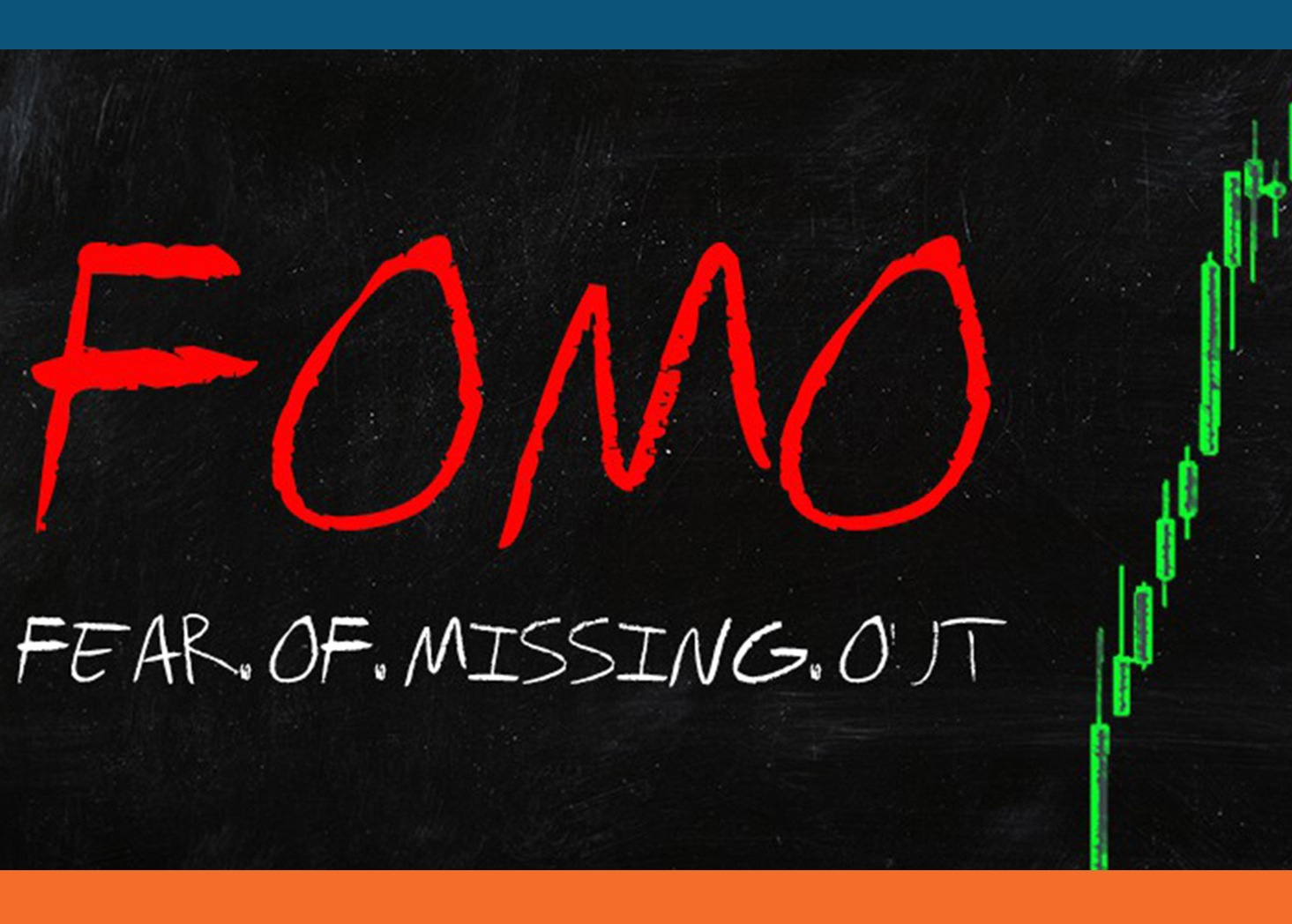
Can You Smell The FOMO?
Hi everybody, and welcome back to The Macro Compass!Last week, FOMO (Fear Of Missing Out) became the prevalent market narrative.As data seemed to further validate the soft landing narrative and Central Bankers became ‘’data dependent’’, markets are FOMO-ing like it’s 2019 again.But 2023 isn’t 2019 – for many macro reasons we are going to touch upon.In this article, we will:* Reflect on last week’s important macro data and Central Bank meetings;* Dig deep into how markets reacted, what’s the new consensus macro regime being priced in and whether macro data will validate it or not;* Assess how to best position portfolios in this environment.Can You Smell The FOMO?In 2019, the Fed pivoted hard and the economy managed a proverbial soft landing.The 2018 hiking cycle which Powell abruptly reversed with his early 2019 pivot slowed the economy down, but not nearly enough to result in a hard landing.The S&P500 earnings growth was only +0.6% (but not negative), core inflation was stable around 2% and the US added 160k new jobs per month: low nominal growth, but not a recession – in other words, a soft landing.But 2023 isn’t 2019 – for many macro reasons we are going to touch upon.First, let’s picture the current market regime.The chart above shows the TMC’s Market Regime Scrutinizer.It measures the market-implied odds assigned to a US recession, soft landing or strong growth regime ahead.It is derived by scrutinizing option markets in fixed income, equity, and currencies and blending the resulting market-implied probabilities in this flagship TMC indicator.Markets are currently pricing a US soft landing as the dominant probabilistic regime (~65% probability), and in recent weeks the left recessionary tail has been aggressively priced out (now ~15%) while the chance of a strong growth regime ahead has been bumped up to ~20%.Even after the apparently very hot labor market data and ISM services, the bond market keeps screaming immaculate disinflation/soft landing as the main regime ahead.* Inflation is priced to drop to 2.5% by year-end, and stay close to 2% in the long run;* Fed ‘’soft landing’’ cuts are priced in: as inflation slows down but without a recession, the Fed can gently cut rates to neutral levels (2.50-2.75%) without resorting to recessionary cuts or being forced to keep rates higher for longer.Bond markets assign only a ~15% probability to recessionary cuts, and a ~30% chance to Higher-For-Longer Fed Funds amidst strong growth and sticky inflation.As a result, the option-implied market points to a ~55% probability of a disinflationary soft landing.When a disinflationary, immaculate soft landing becomes the dominant market regime it’s all about selling insurance and getting paid while…well, not much happens and the Fed is on a very predictable path.And indeed, as the Fed is assumed to be on a more predictable path ahead bond volatility is getting crushed.Lower bond volatility is leading to a much better risk sentiment in equity markets.Now, to the key questions.Are macro data really validating the soft landing base case priced in by markets?Are Central Banks really on a predictable path ahead?And finally: is 2023 going to look like 2019, a year when the S&P rallied 30%+ with minimal volatility?Let’s find out…Getting access to The Macro Compass full-length pieces requires a paid subscription.On the new TMC platform, you’ll find not only deep and unique macro insights but also ETF Portfolios, tactical trade ideas, interactive tools, and much more.Come join this vibrant community of macro investors - check out which subscription tier suits you the most using the link below.For more information, here is the website. This is a public episode. If you would like to discuss this with other subscribers or get access to bonus episodes, visit themacrocompass.substack.com
Markets Don't Believe You, J-POW
Hi everybody, and welcome back to The Macro Compass!Powell didn’t push back enough, and so markets are now rallying hard in his face.And given J-Pow’s lack of real pushback, markets won’t stop unless data comes in very hot (or recessionary). The window for the soft landing narrative is now extended.With one caveat: the narrative is very misplaced.In this piece, we will:* Dissect the Fed meeting, focusing on Powell’s important comments about inflation and the labor market;* Scrutinize markets’ reaction, with a particular focus on the bond market;* Conclude by refreshing our actionable tactical trades and ETF PortfolioPowell didn’t nearly push back enough, and so markets are now rallying hard in his face. And given J-Pow’s lack of real pushback, markets won’t stop unless data comes in very hot (or recessionary). The window for the misplaced soft landing narrative is now extended. Picture this. The first innings of a recession always look like a soft landing, as growth and inflation come down but not to alarming levels yet – exactly like today. And as markets myopically embrace this soft landing narrative, Powell’s lack of pushback against easier financial conditions adds fuel to the fire.Taking a deeper look at what Powell actually said, it becomes increasingly clear markets don’t believe him. At all. #1: On Inflation ‘’We need substantial more evidence to be confident about inflation returning to 2%, in particular as we see core non-housing services inflation still running at 4% annualized with no progress there’’ ‘’We need to be honest with ourselves: inflation might be more persistent in this sticky category, and that means we have to do more’’The 6-month (annualized) rate of change in core services ex-housing CPI is down to 4% - and despite the clear downward trend, Powell told us he is not happy about it.The composition of this downward move (right chart) is indeed a bit messy: medical care deflation accounted for a large portion of it. Despite the progress on inflation, Powell didn’t remotely sound the all-clear yet. The bar for a proper Fed pivot remains high.But then, why did the market rally like if a new round of QE was announced?What’s the bond market trying to tell us here?And most importantly, how to tactically position portfolios now?Let’s dig in…This timely, premium article on the Fed meeting is reserved to paid subscribers to the All-Round and Pro tiers of The Macro Compass.A subscription gets you deep and unique macro insights but also ETF Portfolios, tactical trade ideas, interactive tools, courses and much more!Come join this vibrant community of macro investors to continue reading this piece on the Fed and get access to The Macro Compass platform.For more information, here is the website. This is a public episode. If you would like to discuss this with other subscribers or get access to bonus episodes, visit themacrocompass.substack.com

''Liquidity''
Hi everybody, and welcome back to The Macro Compass!The Fed intends to drain ‘’liquidity’’ at a rapid pace in 2023.And while the pace might be more friendly for the next months, don’t get distracted. Banks, the repo market and Wall Street will soon start feeling the heat.In this piece, we will:* Explain what ‘‘liquidity’’ really is in plain English;* Go over the drivers of US liquidity in 2023;* Assess how they will interact with each others and drive markets;* Conclude by refreshing our market views and our actionable ETF PortfolioLet’s start with the basics: ‘’liquidity’’ = bank reserves.It’s one line item you can easily track on the Fed balance sheet (liabilities), and you don’t need any fancy formula to calculate it.Bank reserves are money for banks.Banks use reserves to transact with each other and with the Fed: to settle transactions, buy bonds (!) from each other, and lubricate the biggest funding mechanism in the world – the repo market.A regime of ample reserves helps banks in providing liquidity to financial markets.In that regime, banks will facilitate a smooth functioning of the repo market and have appetite for absorbing high-quality bonds (Treasuries, high-rated corporate bonds and mortgage-backed securities etc).As repo markets work smoothly and banks bid high-quality bonds, investors tend to take more risks.Instead, tighten ‘’liquidity’’ rapidly and over time investors’ risk appetite could fade.No, I will not draw a line chart of ‘’liquidity’’ versus the S&P500 and tell you that is the magic formula. Because that’s macro gaslighting, or aka bull…. :)Banks don’t use reserves to buy stocks because equities are not a regulatory well-treated asset (HQLA). Monetary plumbing is not so easy. But yes, the amount and the rate of change of bank reserves matter for repo markets and risk appetite. And in 2023, a lot will be going on with bank reserves. Let’s start with the elephant in the room: Quantitative Tightening.In its simplest form, QT shrinks the balance sheet of the Fed on the asset side (bonds not reinvested) and on the liability side – here, the standard is that bank reserves are destroyed. As the government keeps issuing bonds over time, it’s up to the private sector to absorb bond issuance. Reserves are destroyed, and private investors have less room to allocate towards riskier assets. The Fed will be running QT at a yearly pace of > $1 trillion. So, does this mean reserves are going to linearly shrink by $95 billion per month? And most importantly: how will other factors like the Treasury General Account (TGA) or the Reverse Repo Facility (RRP) impact US liquidity?Understanding ‘‘liquidity’’ is crucial to navigate markets.Let’s dig in, and assess how we position for these dynamics at The Macro Compass…From January 2023, getting access to the premium The Macro Compass content will require a paid subscription.Not only deep and unique macro insights but also ETF Portfolios, tactical trade ideas, interactive tools, courses and much more are available on the TMC platform.Come join this vibrant community of macro investors - check out which subscription tier suits you the most using the link below.For more information, here is the website. This is a public episode. If you would like to discuss this with other subscribers or get access to bonus episodes, visit themacrocompass.substack.com

Recession or Soft Landing? (FREE ARTICLE)
Hi nice people, and welcome back to The Macro Compass.This is an old-style free macro piece for everybody - enjoy!The soft landing crew is increasingly taking over.No, the bond market’s base case is not a recession - it’s immaculate disinflation.Yes, getting this call right is crucial for your portfolio performance in 2023.In this article, we will:* Look at different corners of the bond and equity markets to assess what are the market-implied probabilities of a recession or a soft landing;* Debate how to approach macro investing in such a binary environment.The Bond Market - Immaculate Disinflation‘‘The bond market is pricing 200 bps of cuts = the bond market says recession - 100% !’’No, not really.The bond market’s base case is immaculate disinflation, and let me show you why.Most of the confusion stems from an overly simplistic approach.In the average recession over the last 30 years, the Fed cut by 350 bps over an 18 months period.The bond market is pricing 200 bps worth of cuts between Jun-2023 and Dec-2024, so that must mean the bond market’s base case (60%) is a recession.This simplistic analysis is misleading because it ignores:- The ultimate landing point for Fed Funds and real yields- The credit market- The tailsLet’s start with a clear chart.Fed Funds are priced to peak at ~5% in summer, and then 200 bps of cuts are expected.Yet, Fed Funds are never (!) priced to be below reasonable estimates of neutral rate (2.25-2.75% in nominal terms) throughout the next 2-5 years.This would be the first time ever the US is in a recession and the Fed doesn’t cut rates below neutral - it doesn’t make sense, right?Indeed, because the bond market’s base case is not a recession: it’s immaculate disinflation.This is also evident in the expected path for real yields, which compares expectations for Fed Funds (see above) against inflation expectations.In any recessionary or growth slowdown episode of the last 15 years, real Fed Funds 2-year ahead were priced to be between -100 and -200 bps.That’s the bond market asking the Fed to be very accommodative given poor growth.This time, market-implied US real yields in 2025 are priced to be…positive?!Again, that doesn’t square with the ‘‘bond market is pricing in a recession’’ mantra.Inflation slowing down to 2.5% quickly, and the Fed cutting rates to neutral (and never below) is not recessionary pricing.It’s immaculate disinflation pricing.The credit market wholeheartedly agrees: a recession is not the base case.US high-yield credit spreads are trading barely above 400 bps, below the 20-year average and far away from median recessionary episodes (1000 bps).Additionally, the default cycle is priced in to be very mild and downside protection in the broad credit market is not as expensive as it would be if a recession was base case.Finally, the tails.Insurance is very expensive when the house is already on fire.So, what tail risks are markets trying to insure against by December 2024?A recession with Fed cutting rates below neutral (say, to 1.5% - orange line) or higher-for-longer (say, Fed Funds above 4% - blue line)?Using a 2-year horizon and option-implied probabilities, insurance on the Fed keeping rates higher-for-longer is more expensive than insurance on Fed cutting rates in a magnitude consistent with a recession.The bond market’s base case is immaculate disinflation, not a recession.A relaxed credit market, inflation rapidly declining to 2% and the Fed cutting rates back to neutral, forward real rates still expected in positive territory and the lack of aggressive insurance bid for recessionary cuts all point in that direction.Recession: 20-25% probabilityImmaculate disinflation: 45-50% probabilityGrowth regime/higher-for-longer: 30% probabilityThe Equity Market - Soft LandingThe equity market’s base case has rapidly shifted towards soft landing.There are three main angles to cover:- Earnings expectations - The internals of the stock markets - The tailsFirst, the more recessionary vibes.Analysts are realizing their 2023 EPS estimates might have been too optimistic.The pace and breadth of negative revisions is in line with other recessionary episodes.Also, highly cyclical sectors like semiconductors are experiencing EPS slashes in the 30% area which are almost consistent with a recession.Yet, 2023 EPS consensus at $225 implies roughly a 4% earnings growth this year.In recessionary episodes, the average EPS decline is instead -30%.The Chinese reopening is obviously playing a role in boosting cyclical growth expectations around the world.Countries with tight Chinese trade relationships like Germany or Australia have outperformed in a risk-adjusted way.Within sectors, US semiconductors and high-beta have been the market’s darling while defensive sectors like staples and utilities are lagging.Soft landing vibes getting stronger, helped by the Chinese reopening.What about tails?If markets were truly worried about an earnings recession and a stubbornly higher-for-longer Fed,
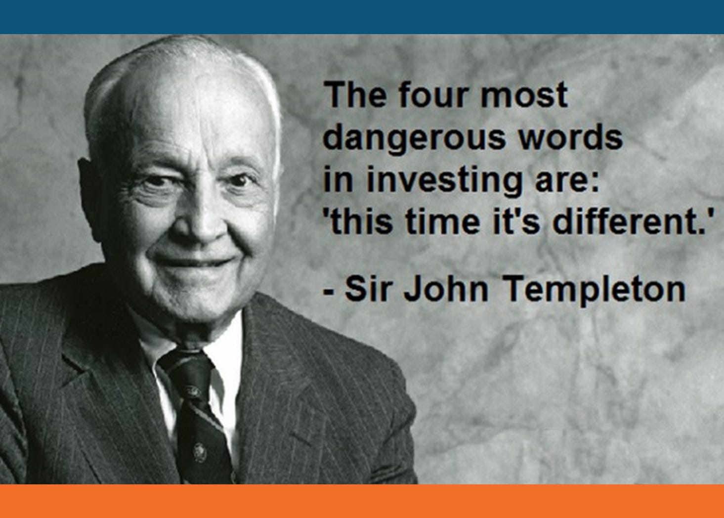
Yes, This Time Is Different
Hi everybody, and welcome back to The Macro Compass!Markets are front-loading the Fed pivot, and it’s a bad idea.In this piece, we will:* Have a look at the last US inflation report;* Answer the big question: Powell pivoted in 2019, is he going for it again in 2023?* Analyze what’s priced in for bonds and equity markets: a recession, Goldilocks or what regime exactly?* Conclude by refreshing our market views and our actionable Macro ETF PortfolioYes, this time is different: front-loading the Fed pivot is a bad idea. Last week’s US CPI report delivered good news: inflation is coming down, and fast. Fixed income traders are nodding to this trend, and expect YoY CPI to print at 2.50% (!) by late summer already.Not only that, but Powell got exactly what he is looking for: - Inflationary pressures are less broad: the share of CPI items whose MoM annualized price increases exceed 4% is now quickly heading back down to 50% from its 75% peak a few months ago; - The momentum of sticky inflation is fading: the 3m moving average of MoM core services ex-shelter CPI has dramatically slowed down, and it’s now in line with a 2.5-3.0% annualized core inflationMarkets have a huge recency bias. For the last 10 years, every time inflation and growth were slowing down you had to do one simple thing. Buy every asset you can, and front-load the upcoming Fed pivot. So that’s exactly what markets did.Junk bonds, Bitcoin, BBBY & Co to the moon. Implied volatilities crushed across the board. My mentor used to tell me the most expensive 4 words in finance are ‘’This Time Is Different’’. Yet, I think the old adage is wrong here.Let me show you why, what bond and stock markets are pricing in and how at TMC we position our macro ETF portfolio accordingly…From January 2023, getting access to the premium The Macro Compass content will require a paid subscription.Not only deep and unique macro insights but also ETF Portfolios, tactical trade ideas, interactive tools, courses and much more are available on the TMC platform.Come join this vibrant community of macro investors, asset allocators and hedge funds - check out which subscription tier suits you the most using the link below.For more information, here is the website. This is a public episode. If you would like to discuss this with other subscribers or get access to bonus episodes, visit themacrocompass.substack.com
The CPI Report Matters
Hi everybody, and welcome back to The Macro Compass!The Three Main Themes of 2023Last week’s macro data releases provided relevant support to our three most important thesis to start 2023:1) US nominal growth is fast deceleratingEvidence was provided by sharply declining services PMI and lower momentum of Non-Farm Payrolls: the rate of change for real growth is negative.Moderating wage growth implies that the rate of change for inflationary pressures is negative too.2) EUR core inflation keeps marching higherInflation is mostly the byproduct of excessive printing of real-economy money that will chase a relatively inelastic basket of goods and services whose supply can’t be easily adjusted.Europe went ahead with a large amount of real-economy money printing (pandemic fiscal stimulus), so why does European core inflation lag US core inflation by roughly 6 months?That’s because the European fiscal stimulus (via EU programs) was much more spread out over time in nature and the European labor market is much more rigid – it takes a bit longer for European core inflation to show up.But it does, and it likely will continue to do so over the next 3-6 months.This will force the ECB to be (mistakenly so) very hawkish.3) The Chinese re-opening trade has legsIt’s simple: it takes time to climb a mountain, and it takes time to fully reprice the Chinese re-opening.After all, how could it all be ‘’priced in’’ when all = the sudden complete re-opening of the second largest economy in the world boosted by 2022 pent-up stimulus waiting to be put at work by consumers?To that, sum up the fact Emerging Markets fund managers couldn’t literally allocate to China last year: locked-down economy, massive clampdown on tech and real estate, CCP anti-investment behavior etc.In 2022, most EM fresh money went to Latin America.In 2023, if you are an EM fund manager you are forced to reallocate to China & co (e.g. Korea etc).Macro push and pull forces keep dominating 2023.The gravitational pull is coming from a fast deteriorating picture for global growth and inflation.The push force comes from the sudden reopening of the Chinese economy.Wrestling with these macro cross currents, it’s important not to miss the forest for the trees.What forest?Let’s dig in.Subscribe to The Macro Compass to read the restBecome a paying subscriber of The Macro Compass to get access to this entire macro report, and to the actionable Macro ETF Portfolios and tactical trade ideas.Hurry up - on Thursday we are releasing our live macro coverage of the US CPI data, its impact on markets and resulting trade ideas - you don’t want to miss that!The CPI timely report will be available to All-Round and Pro investor subscribers.A subscription to the All-Round Investor tier gets you:* A weekly macro report and access to our Macro ETF Portfolios;* Additional, deeper & timely macro insights (e.g. US CPI on Thu) during the week;* Tactical trade ideas to generate returns from market mispricings;* Access to our flagship interactive tools to step up your macro investing game;* A monthly Q&A Zoom call with fellow TMC subscribers and myself;* 50% (!) off any macro courses we will ever releaseCheck out all the subscription tiers at this link. This is a public episode. If you would like to discuss this with other subscribers or get access to bonus episodes, visit themacrocompass.substack.com
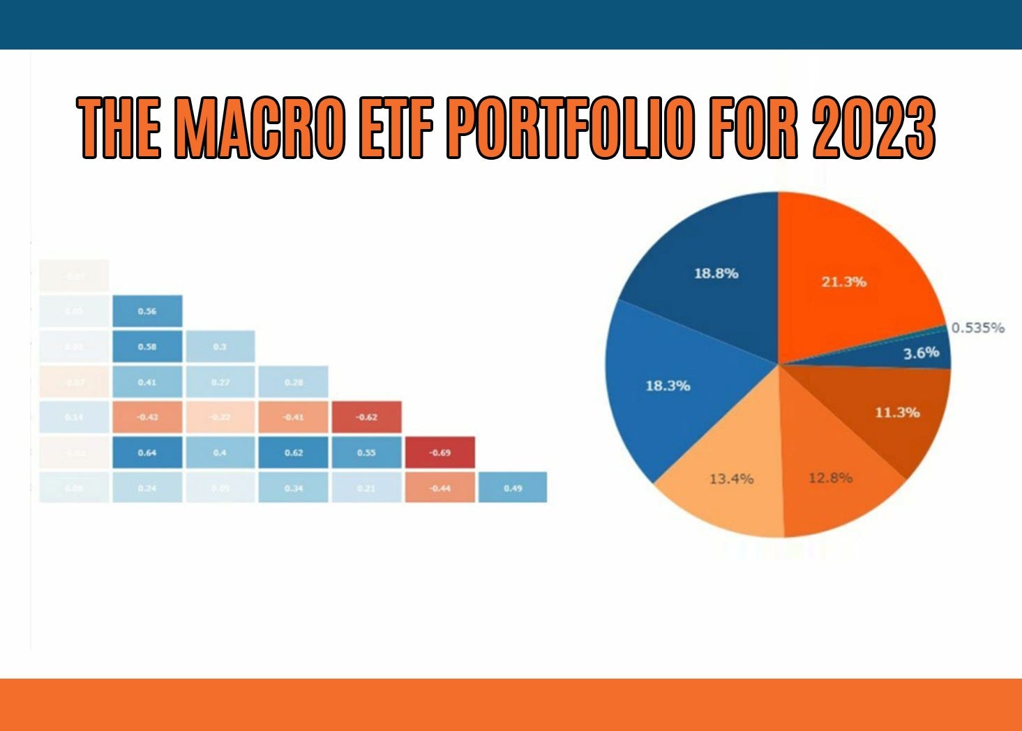
The 2023 Macro ETF Portfolio
Welcome back to The Macro Compass - and happy 2023!Thank you for the amazing support last year.I wish you and your families the best for this upcoming year.Tell Me - What Are The Macro Models Saying?The two main forces driving global macro and markets are the rate of change of (nominal) growth and the monetary policy stance.Real-economy money creation and leading macro indicators inform us on the path ahead for economic growth.Financial money creation and risk-free real yields are key to understand the Central Bank stance and its implications for markets.The TMC Quadrant Asset Allocation model deploys a data-driven approach to assess where do we stand on both fronts, and it’s a useful tool to start our 2023 asset allocation journey.In short: for both the US and Europe, we are sitting in Quadrant 4 – the trickiest quadrant for long-term macro investors.Let’s quickly analyze both the x-axis (RoC of nominal growth) and the y-axis (MonPol stance).The x-axis: nominal growth is set to rapidly decelerate in 2023.A) The pace of real-economy money creation as measured by our flagship TMC Global Credit Impulse index is very low.This index measures the rate of change in the quantity of money (in real terms, as % of GDP) held by the non-financial private sector in the 5 largest economies in the world.In other words: whether the real spending power of households and corporates is accelerating or decelerating.As per preliminary October 2022 data, the -3.5% reading is by far the worst in 10 years and in line with the GFC levels.The TMC Global Credit Impulse index (black, LHS) leads earnings growth (blue, RHS) and inflation (orange, LHS) by 4-6 quarters.As a result, nominal growth is set to dramatically slow in 2023.B) Other leading macro indicators point to a rapid deterioration of the job market.The Global Credit Impulse is only one of the many forward-looking macro indicators in TMC’s data-driven macro and portfolio strategy approach.Amongst many others, the dramatic tightening of US Financial Conditions in 2022 sets the stage for a much weaker labor market in 2023.After all, it’s how the economic cycle works.Higher rates, wider credit spreads, lower equity multiples, higher US Dollar => tighter financial conditions => companies cut discretionary spending => weaker growth and earnings => deleveraging: companies cut capex and labor.Rapid deterioration in US Financial Conditions lead weaker hiring trends by roughly 3 quarters.By this measure, US Non-Farm Payrolls should quickly converge to zero in H1 2023.Bottom line: both in Europe and in the US the real-economy printing press has stopped working, and leading macro indicators also point to a sharp deceleration in nominal growth.We are sitting on the left side of the TMC Quadrant Asset Allocation model.What about the other axis?The y-axis: the monetary policy stance is very tight.So far we talked about the real economy – credit, growth, inflation, the labor market.The y-axis of the Quadrant model instead focuses on the monetary policy stance and the pace of financial money (i.e. bank reserves) creation.A) Risk-free real yields are much higher than equilibrium – and that’s a problem for risk assetsAre interest rates high or low?It’s all about relativity and equilibrium.The US and European economies are both hyper-financialized, over-leveraged and grey-haired; perhaps to slightly different extents, but they are roughly in the same boat.That implies that the equilibrium real rate (r*) at which these economies can run smooth and deliver potential growth without overheating or falling into recession are very low – high private and public debt levels, stagnant productivity, and an ageing population are to be blamed.R* is estimated to be at roughly +25 bps in the US and -50 bps in Europe.Today, market-implied medium term real yields are much higher than these equilibrium levels both in the US and in Europe.This has important implications.Real yields much higher than equilibrium impair the private sector ability to borrow cheaply, and hence dampen growth prospects while providing a high risk-free return for investors.Not a surprise to see that every time such a setup was prevalent in the US (2009-2010; 2013 taper tantrum; 2018 hikes and QT; today) and in Europe (2011-2012: Eurozone debt crisis) risk assets had a hard time.B) The financial money printing press seems broken too: from BRRR to RRRB.The rate of change of financial money (i.e. bank reserves) is the other important component necessary to gauge the overall monetary policy stance.When the amount of interbank money is rapidly increasing, banks tend to increase their appetite for riskier investments and provide more liquidity to financial markets.But given the ongoing US QT, the newly announced European QT and the large amount of TLTRO repayments in Europe the 6-month rate of change of EU+US Bank Reserves is likely to hit its lowest level in 10 years during 2023.Bottom line: real-economy money printing has come to a halt an

What The Heck Is Happening In Japan?
Hi all, and welcome back on The Macro Compass.In this timely piece we are going to cover the recent Bank of Japan meeting and its implications for markets.Before we start, a kind reminder: if you find value in the timely macro analysis and portfolio strategy The Macro Compass provides, this (and much more) will very soon require a paid subscription.Gates are closing in only 10 days: check out which subscription tier suits you the most and come join us - I’ll be waiting for you to come onboard!Surprise, Surprise!We all woke up to a major macro surprise: the Bank of Japan (BoJ) widened the allowed trading band for the 10-year Japanese government bonds (JGBs) by 25 bps - 10y JGBs can now trade between -50 bps and +50 bps.While this doesn’t seem like a major change, it really is.To understand why, we need to take a small step back.For years, Japan implemented an aggressively dovish monetary policy stance. Bank of Japan rates were effectively pinned at 0% for decades. Large-scale QE was standard practice, and a few years ago the BoJ switched to Yield Curve Control (YCC).This was necessary as relentless QE purchases had led the BoJ to own >50% of the Japanese government bond market, and buying more bonds would seriously alter the functioning of the market. For days, there were basically no trades happening in the JGB market.So to keep 10-year yields low, the Bank of Japan moved from targeting a quantity of bonds to buy (QE) to a qualitative measure (YCC). It was a successful move: the charts below show how predictable the BoJ monetary policy was - front-end rates stuck at 0% for decades, and 10y JGBs constantly trading in the prescribed +/- 25 bps yield range for 6+ years.Until today.But Alf, the BoJ didn’t raise rates and they widened the 10y JGB trading band by a mere 25 bps: how can such a ‘‘small’’ move have worldwide macro implications?It does because global macro is a giant interconnected puzzle - bear with me.Japan is a huge exporter of capital.Since the '90s, Japanese investors are used to look abroad for opportunities to deploy their domestic excess savings.For instance, as of July 2022 (left chart) Japanese investors are the largest holders of US Treasuries in the world - Japan accumulated over $1 trillion in USTs as it was a convenient way to recycle excess savings: yield differentials were positive, and often more than offsetting the cost of hedging USD/JPY risks.The right chart below shows how convenient it was for Japanese investors to buy Treasuries and cover the FX risks. They would on average get a 100-150 bps additional return by purchasing USTs rather than simply buying Japanese government bonds. The BoJ decision and the new direction of travel can significantly alter this flow of capital - one of the global macro impacts of today’s BoJ decision.Said that, to really grasp the potential market implications and trade opportunities going forward we must answer two main questions.#1: Why Now, And Will The BoJ Continue Along This Path?The best macro investors are always keen to assess a crucial yet elusive variable: policymakers’ incentive schemes.Here is my attempt at doing that for Japan.Japan has a new Prime Minister (Kishida, who succeeded Abe) and in April 2023 BoJ Kuroda’s term will expire - hence, it will have a new Governor of the Bank of Japan too.Abe and Kuroda worked together to try and pull Japan out of a deflationary spiral, and while it can be argued they didn’t succeed much so far Kuroda now has the chance to leave office with a ‘‘victory lap’’.Core inflation in Japan could soon stabilize around 2%, and while the BoJ has basically nothing to do with it Mr. Kuroda is likely to seize the opportunity.The cherry on the cake would be to lay the foundations for a new (more hawkish) monetary policy path his successor could follow.And that’s my answer to the ‘‘why now’’ question.Will Kuroda’s successor continue along this path?I think so.And that’s because core inflation is likely to keep trending towards 2% (left chart), and despite fixed income investors not being fully convinced (right chart) yet they are also expecting Japanese CPI to justify a more hawkish stance.The ‘‘new sheriff in town’’ approach is relevant because it signals this is not a one-off move, but rather a sustained shift in the approach to monetary policy and inflation.The second important question to grasp macro implications and potential trade ideas is: what are markets pricing in at this stage?#2: What’s The Market Pricing In?Tracking global market moves across their many dimensions and assigning the right relevance to each mover is very hard - but the Volatility Adjusted Market Dashboard (VAMD) will fix that for you.You’ll literally be able to screen the entire global macro universe in a fully customizable way, identify the biggest vol-adjusted moves and draw analytical charts to test your macro ideas.The VAMD is telling us that:* Despite the BoJ not raising deposit rates, markets are pricing in 30+ bps hikes in 2023 (
Pay Attention!
Hi all, and a warm welcome back!Quick reminder: from January 1st, getting access to The Macro Compass content will require a paid subscription.The more I look at what the team is producing for 2023, and the more I get excited about achieving our mission: help people step up their macro game and become better macro investors.The regular content you are used to on this newsletter will be greatly enhanced: more frequent macro reports, courses, ETF portfolios, tactical trade ideas……and most importantly groundbreaking interactive macro tools!In other words: top quality content, data and tools for a fraction of the cost involved with Wall Street services (e.g. Bloomberg, institutional research).Not much time left, so what are you waiting for? :)Check out which subscription tier suits you the most and come join us!IntroductionThe ECB really went for it.Lagarde was as assertive and committed in her press conference as Draghi was in 2013.The main difference is that Draghi was unequivocally committed in being dovish and using all the ECB powers to save the Euro.Lagarde was relentlessly hawkish in an attempt to show unwavering commitment to slaying the European inflation dragon. Therefore, this was the most iconic ECB meeting since the Draghi era.And it leaves macro and markets with crucial repercussions across asset classes both in the short and in the medium term.In this article, we will:* Break down the ECB meeting piece by piece, analyzing the 3 most important parts of the iconic press conference;* Assess the broad impact for markets and discuss the resulting implications for tactical trade ideas and long-term portfolio allocations.The Most Iconic ECB Meeting In A DecadeIn my opinion, the reason why the ECB decided to go ballistic has to do with the nature and timing of the European inflationary shock.As a reaction to the pandemic, both the US and Europe went ahead with large-scale fiscal stimulus - a ton of newly printed real-economy spendable money at a time when supply can’t adjust is obviously inflationary.But there were two major differences.The gigantic US fiscal stimulus was very much concentrated between Q12020 and Q12021, while the European stimulus was mostly implemented through the European Union programs and hence much more spread out over time.Think about this: a decent portion of the European fiscal stimulus will be reflected only into the 2023 and 2024 single states fiscal budgets.Additionally, while the US labor market quickly adjusts to the ebbs and flows of the macro cycle the European job market is much more rigid - it takes a while for aggregate demand to reflect into wages.The result is that European core inflation has lagged US core inflation by 6 months, and looking ahead that means inflationary pressures in Europe might well broaden and persist for another few quarters.That’s a serious problem for the ECB!And indeed the ECB still foresees core inflation at 4.2% by December 2023.Yes, you read that right.Despite already incorporating the effect of a much tighter monetary policy in their projections, the ECB expects core inflation will be still at more than double (!) its 2% target in 1 year (!) from today.This ‘‘a-ha’’ moment and its reflection in the updated ECB projections led to the most iconic ECB meeting since the Draghi era.Lagarde’s hawkish strategy to slay the European inflation dragon revolves around two main pillars: (much) higher interest rates for longer, and QT.Let’s go into it.#1: The Inflation Dragon Is Not Slayed With Baby StepsThe chart below is one of the most important I ever produced.Lagarde is French, and she must remember the sticky inflation experience France had to go through in the ‘90s.Back then, core inflation averaged almost 4% for 2 years, and the Banque de France was called to tighten monetary policy - but by how much to slay the inflation dragon?The tightness of monetary policy isn’t measured by looking at absolute interest rates, but at rates relative to equilibrium.In the ‘90s demographic trends were more promising, productivity slightly stronger and the amount of unproductive debt burdens much lower - in other words, equilibrium interest rates were higher than today (~4.5% in the ‘90s vs ~1.5% today).So, how much tighter than 4.5% rates was Banque de France forced to go?A lot: 5y French government bond yields averaged 8% (300+ bps above neutral) for 2 full years before French inflation finally came back to target.The reason why this matters a lot to the ECB today is that Lagarde understands she might need to push rates as restrictive as 300+ bps above neutral again.And that means an ECB deposit rate above 4% - oh gosh.This was a true shock for markets.You see, so far markets believed the ECB would push as hard as 3% terminal rates: roughly 150 bps above neutral is quite something, and you know - Europe has a lot of fragilities to deal with and they won’t risk it.The problem is that when core inflation is above 5%, as a Central Banker you are losing control an
Don't Fight The Fed
(Audio file now fixed)Hi all, and welcome back on The Macro Compass.In this piece we are going to cover the Fed meeting and its implications for markets.For free. One last time.So, a kind reminder: if you find value in the timely macro analysis and portfolio strategy The Macro Compass provides, this (and much more) will very soon require a paid subscription.On the TMC platform we will step up the game: unique market insights, courses, ETF portfolios, tactical trade ideas, top notch interactive macro tools and much more.Gates are closing soon: check out which subscription tier suits you the most - I’ll be waiting for you to come onboard!The Fed Meeting ExplainedTo explain what happened today with the FOMC meeting, we need a short step back.The latest US CPI release materially surprised on the downside: both headline and core inflation rose way below the expectations of 65 out of the 67 (!) economists surveyed by Bloomberg.Powell recently divided inflationary pressures in 3 main categories:- Core goods: supply bottlenecks combined with the pandemic-related binge spending led to hefty core goods inflation, but the Fed understands this category will suffer from disinflationary pressures ahead and it’s not where its focus lies;- Housing-related: Powell knows negotiated rents are cooling down, but he also understands housing-related CPI will take a while to reflect these trends; the Fed likes shelter inflation lower, but it can only wait and see;- Ex-housing core services: the stickiest inflationary components that the Fed can directly influence via a weaker labor market and lower wages = this is what must go convincingly down.The latest CPI print showed ex-housing core services pricing cooling further: its annualized 3-month rate of change is now rapidly dropping towards 2%.Markets interpreted this as the ultimate dovish signal, and sent bond yields sharply lower and equity prices higher in a typical ‘‘Fed pivot’’ move.After all, if the stickiest components of the CPI baskets are showing signs of cooling this must be a green light for the Fed to be more confident they’ll achieve their objectives and hence loosen up?Instead, today the Fed comes with their updated economic projections showing Fed Funds at 5.125% (!) by December 2023 (!)…and core PCE still at 3.5% (!) by that time.An incredibly restrictive Fed Funds rate for a very long period of time will only be able to slow core PCE down to…almost double (?!) the Fed mandate?Let’s look at 3 important points from today’s Fed meeting.#1: The Fed Believes The Labor Market Is Still Red HotI must stress out two concepts here.A) The Fed is really opinionated about this, as much as forecasting the first time in history when the Sahm rule won’t apply: in their projections the 3-month moving average of unemployment rate would move way more than 50 bps above its last 12 month low, and yet this time ‘‘it will be different’’ and we won’t have a recession.B) I disagree: this time is never different, and we will have a serious recession.Powell believes the only way to convincingly bring ex-housing core services inflation is via weakening the labor market, which he believes to be ‘‘super strong, and incredibly out of balance’’.My estimates are that he spent at least 7-8 minutes of the press conference endlessly repeating how hot the labor market is.But it’s not.Forward-looking labor market indicators show US Non-Farm Payrolls are likely to slow to 0 (yes, zero) by March next year and turn negative (!) after that.Financial conditions and banks lending standards have tightened very aggressively in 2022, and they lead hiring patterns by 9 months.Powell is setting policy looking in the rearview mirror, and he will lead the US into a recession with Fed Funds above 5%.Don’t fight the Fed.#2: The Bond Market Is Calling The BluffBond investors have made up their mind: the Fed can change the Dot Plot all they want, but at this point in the cycle there is no chance they’ll be able to keep rates above 5% for the entire 2023.The left chart shows market-implied Fed Funds (blue) for 2023 implying net interest rate cuts towards the 4% area while the Fed Dot Plot (orange) points to further hikes above 5% and a long pause.But the most interesting nuance in fixed income markets is how inflation swap traders are pricing YoY CPI to develop in the months ahead (right chart): from today’s 7%+ to basically 2.5% in only 8 months.That’s a much more aggressive disinflationary trend than even the optimistic Fed expects, but there is a catch.The bond market understands that if you tighten financial conditions like hell, and keep doing so by ignoring all forward-looking indicators you will definitely succeed in slowing down inflation.But that’s because you’ll be causing a serious recession.History shows us how a recession always succeeded in slowing down inflation very rapidly, and this time won’t be different.Don’t fight the Fed.#3: Changing The 2% Inflation Mandate? Forget About It'''Changing the inflat

How Much Is A Recession Priced In?
Hi all, and welcome back on The Macro Compass.As you know, from January 1st getting access to this content (and much more!) will require a paid subscription.Today we have a big news: monthly subscriptions are now open!Check out which subscription tier suits you the most, and come join this exciting macro learning journey.Let’s step up your macro game!Yes, But Is It Priced In Already?This short article will focus on answering a very relevant question: ok, recession, but is it already priced in?Over the last few weeks we kept hearing a recession has become consensus amongst analysts and market pundits, and onboarding consensus macro views at the wrong price in one’s portfolio can be a very expensive exercises.But we can do much more than rely on hearsay.Using different techniques, we can test to what extent a recession is priced in both in bonds and equity markets and derive actionable conclusions.That’s what this macro piece will be all about.A Cross-Asset Analysis of Recession ProbabilitiesLet’s start with a very telling chart.The number of respondents in the US SPF (Survey of Professional Forecasters) now foreseeing a recession in 2023 hit 44%.That’s by far the highest percentage of respondents expecting negative GDP growth in over 50 years.A recession is definitely becoming the consensus view amongst economists and market pundits.Yet, economists don’t take risks in markets.Investors do.Hence, the most appropriate question is: what’s the probability of a recession being priced in by market participants across asset classes?The answer to this question is very important when looking at asset allocation in 2023: once a view becomes market consensus, onboarding it in your portfolio at the wrong price can be very detrimental to returns in case that consensus view doesn’t materialize.A bit like when the music stops in a very crowded dancing floor with a single tiny exit door - everybody wants out at the same time, and it can become tricky.Let’s have a look at what the bond and equity markets are really pricing in.The Bond MarketOver the last 30 years, the average recession led the Fed to cut rates by 300 bps in the first 12 months and by a cumulative 400 bps in the 24 months following the start of the recession.Apart from the 2020 (green line below) C-19 flash recession the pattern of the Fed cutting cycle in 1990, 2001 and 2008 followed similar trajectories.300 bps cuts in the first year.Followed by another 100 bps cuts in the second year.So the question is: what’s priced in today?To answer, we first need to determine a potential start date for the 2023 recession.My work suggests March-June 2023 is highly likely - to be conservative, let’s say a recession (net job losses, negative YoY earnings growth) starts in June 2023.The chart below shows how the bond market is now pricing the most aggressive Fed cutting cycle immediately following a hiking cycle.The closest example is 1990: Fed Funds (dotted blue) were raised to ~10% and the bond market smelled a recession and subsequent cutting cycle ahead, but they could only price in as much as 100 bps Fed cuts in the period going from the 6th and the 18th month ahead.Today, the bond market has broken that record and it’s pricing almost 150 bps worth of Fed cuts between June 2023 and June 2024.In other words: the bond market base case is definitely ‘‘a recession’’.But.Let me explain why ‘‘a recession’’ is different from ‘‘a proper recession’’.As we said before the average Fed cutting cycle during a proper recession is 300 bps in the first year since the start of the recession - which we postulate around June 2023.One thing is to price in ‘‘a recession’’ as base case, the other is to price in ‘‘a proper recession’’ that involves cutting Fed Funds from 5% to 2% by June 2024.The option-implied probability derived from Eurodollar contracts that bond investors are assigning to ‘‘a proper recession’’ is still below 20%.In short: yes, the bond market definitely expects a sharp slowdown in growth and given the shape of the money market curves a recession is definitely base case.But a mild recession, not a proper one.The market-implied probability of 300 bps cuts between June 2023 and June 2024 sits around 20%, while that of 400 bps cumulative cuts until June 2025 sits in the 25% area.Overall, the bond market prices a recession as a 40-45% probability event.But it prices a proper recession only as a 20-25% probability event.The Stock MarketWe also hear that ‘‘everybody is bearish’’, hence a recession must be fully discounted by the stock market.Well, let’s have a more scientific look shall we?Over the last 60+ years, an average recession involved earnings declining for more than 5 consecutive quarters and by almost 30% from peak to trough.Here is your garden variety of EPS contractions - different lengths and magnitudes:The equity market isn’t all about earnings though, but also about multiples.Historically, earnings and multiples don’t bottom together - why?Because when earning

The BIS ''Hidden USD Debt'' Story Explained
Hi all, and welcome back on The Macro Compass!Quick reminder: from January 1st, getting access to this content (and much more!) will require a paid subscription.As a loyal TMC reader, there is an exclusive offer for you: get in now and pay only 9 months instead of 12!The offer is time-limited: it runs for only 4 more days, and out of the 1,000 available spots only 224 are left (78% already taken).Last round: check out which subscription tier suits you the most and take advantage of this exclusive offer before December 10th!King Dollar MattersOur monetary and credit system is USD-centric: the lion share of international debt, trade invoices, asset classes and FX volume is settled or denominated in US Dollars.Funnily enough though, direct access to $ liquidity is only available to entities located in the United States but in a credit-based system the rest of the world also has an incentive to leverage in US Dollars to boost or enhance their global business models.That means European banks, Brazilian corporates or Japanese insurance companies which want to do global business will most likely get exposure to $-denominated assets and liabilities ($ debt) despite being domiciled outside the United States.The required USD funding happens both on and off-balance sheet, and the FX derivatives market is an important part of the latter and the focus of the latest BIS report which is making the rounds.In this article we will:* Discuss the BIS paper, with a deep dive into the ‘‘hidden USD debt’’ story…but in plain English, and in a 15 minutes reading-time article;* Present our conclusions and findings - spoiler: it’s much more nuanced than the clickbait-y media headlines floating around.What’s This ‘‘Hidden Debt’’ All About?Let’s first define some basis concepts first.A Japanese insurance company which wants to purchase US Treasuries needs USD funding for this transaction, the same way a Brazilian corporate needs USD funding to boost their international activities.USD bond issuance and repo funding are accounted on-balance sheet and hence transparent and easy to track: we know there is roughly $20-25 trillion of $-denominated funding sitting outside the United States. Big number.But there are also ways to get USD funding off-balance sheet.FX derivatives (mostly FX swaps and cross-currency swaps) account for the lion share of off-balance sheet USD funding, or what the BIS called ‘‘hidden debt’’.It sounds complicated but it’s not.A FX swap is an agreement in two steps:* I sell JPY to buy USD spot (leg 1: spot exchange);* I agree with the counterpart to sell back the USDs and buy back the JPYs at a pre-agreed price at a given date in the future (leg 2: forward agreement).Notice how we exchange the full principal at maturity: in other words, this is loan secured by the FX amounts - a property not common to all derivatives, which makes this transaction also somehow similar to a funding deal.Easy, right?A cross-currency swap is basically the same, but it’s done for longer tenors and it requires exchanges of cash-flows throughout the life of transaction.Now, why does the BIS tag the USD FX derivatives funding as ‘‘hidden debt’’?Because accounting rules allow for it to be off-balance sheet.FX swaps are reported on a net basis, while repo or bond issuance in US Dollars is reported on a gross basis and hence immediately visible on the balance sheet.As per any derivatives, FX and cross-currency swaps require variation margin to be posted by the counterpart under water and hence their mark-to-market is continuously recorded but on average it accounts for 5-10% of the notional amount.So, how big are these notionals?The BIS estimates off-balance sheet USD funding from entities outside the United States roughly in the $60 trillion ballpark, or ~3x the one recorded on balance sheet.Massive number: is it all going to collapse?Hold your horses - it’s all much more nuanced than it seems.Notional amount in derivatives generally matter very little: these contracts are often used to offset existing positions, and being mostly centrally cleared the Clearing House takes care that the continuous mark-to-market and margin posting exercise.The main question is: who are the players involved, and are they really offsetting existing positions?The BIS shows they are.The FX derivatives notionals (chart: red) sitting on corporates and banks’ balance sheet outside the United States show a positive relationship with the amount of world trade (chart: black).A $1 billion increase in quarterly global trade over a 6-month period is associated with a $660 million increase in corporates’ FX derivatives positions.In other words, if a Brazilian corporate gets continuous access to $ cash flows because of its flourishing trade business, using FX swaps will actually be a risk-mitigating exercise as it will allow them to smoothen the USD/BRL FX risks ahead.So, nothing to worry about at all?Again, it’s nuanced - which means there are material downsides too.Where Is T
You Think The Labor Market Is Hot? Think Again
Hi all, and welcome back on The Macro Compass!Quick reminder: from January 1st, getting access to this content (and much more!) will require a paid subscription.The exclusive offer to get in by paying 9 months instead of 12 runs until December 10 (only 6 days left), and spots are limited.If you find value in these macro strategy pieces, you are going to love the enhanced TMC products in 2023 - check out which subscription tier suits you the most and take advantage of this exclusive offer!The Labor Market Holds The KeyEspecially at turning points, looking beyond the main headlines in macro data can make the difference in understanding where do we really stand in the macro cycle.The last US payroll report was tagged as very strong - but if you look deeper you realize the current state of the US labor market is far from ‘‘hot’’.Job creation is clearly trending down, alternative real-time and forward-looking labor market indicators point to a sharp deterioration ahead and statistical inconsistencies are artificially boosting non-farm payrolls to the point the US government reached out to ask if I could help them look into it.The labor market holds the key to the Fed reaction function in 2023, and hence it will be a crucial driver of asset classes performance - calling it right can make the difference for portfolios next year.In this article, we will:* Dissect the latest labor market report, starting from a deep look into the BLS official data and moving into alternative real-time and forward-looking job market indicators to grasp where do we really stand;* Assess what that implies for the Fed policy and portfolios in early 2023.The Devil Is In The DetailsThe labor market is much less hot than you think.Let’s get one thing straight though: we are not in a recession yet.Job losses aren’t here, and nominal wages are still growing at a robust pace.But the labor market is clearly deteriorating fast: its current state is far from the ‘‘very tight’’ definitions we often hear, and looking forward it might get real ugly.Let’s start from a thorough assessment of the official Bureau of Labor Statistics (BLS) latest data on the Non-Farm Payrolls (NFP) released on Friday.#1: The NFP Report: Doing Okaysh, But…Non-Farm Payrolls beat expectations, we had small net positive revisions and nominal wage growth surprised on the upside - it must be hot, right?I can definitely agree that US wage growth remains way too strong to be achieve 2% inflation - right now, it’s rather consistent with 4.0-4.5% core CPI.But nominal wages are possibly the most lagging macro cycle indicator of them all.For them to drop, you need: forward-looking growth down, activity down, companies cutting discretionary spending, consumption down, companies cutting capex and excess labor, activity down further, companies cutting core labor…and finally you’ll see nominal wages trending down as demand/supply in the job market rebalances.And on top of it, one reason why nominal wages might remain strong is a stubbornly low participation rate: and while it’s true that less supply of labor coming back online means more wage bargaining power, it also means less people are actively contributing to economic growth.Focusing on the momentum of job creation and where these jobs are actually created tends to be a more useful forward-looking macro exercise than focusing on wages.The 3-month moving average of US NFPs is clearly trending down and in November the BLS reported most jobs were created in leisure&hospitality, education, healthcare and government.Accommodation and food services are still playing catch-up with the pandemic disruptions, and job creation in the government/education sectors are not necessarily a sign of strong economic activity.The fact that economic-sensitive sectors like retail trade, transportation, manufacturing and some areas of housing-related jobs are all showing weakness is very telling - they move first, and they are clearly showing the direction ahead.Now, the elephant in the room: there are some material methodological and statistical issues with the current BLS establishment survey, and hence the NFP numbers might well be…almost totally off.Let’s see why.#2: The Household Survey vs The BLS Establishment ReportA statistically significant survey requires a very large amount of respondents.Well, the last NFP Establishment survey got the lowest response (49%) in 20 years.Luckily, we can benchmark the NFP survey with another regular job market gauge which is the Household survey.There are three main differences between the two surveys:* The NFP survey asks businesses and government agencies about job creation; the Household survey asks households;* Multiple jobholders are counted for each (!) nonfarm payroll job in the NFP, while in the Household survey multiple jobholders are counted only once;* The NFP surveys makes large use of statistical adjustments (e.g. net business birth/death adjustment) while the Household survey doesn’t.According to th
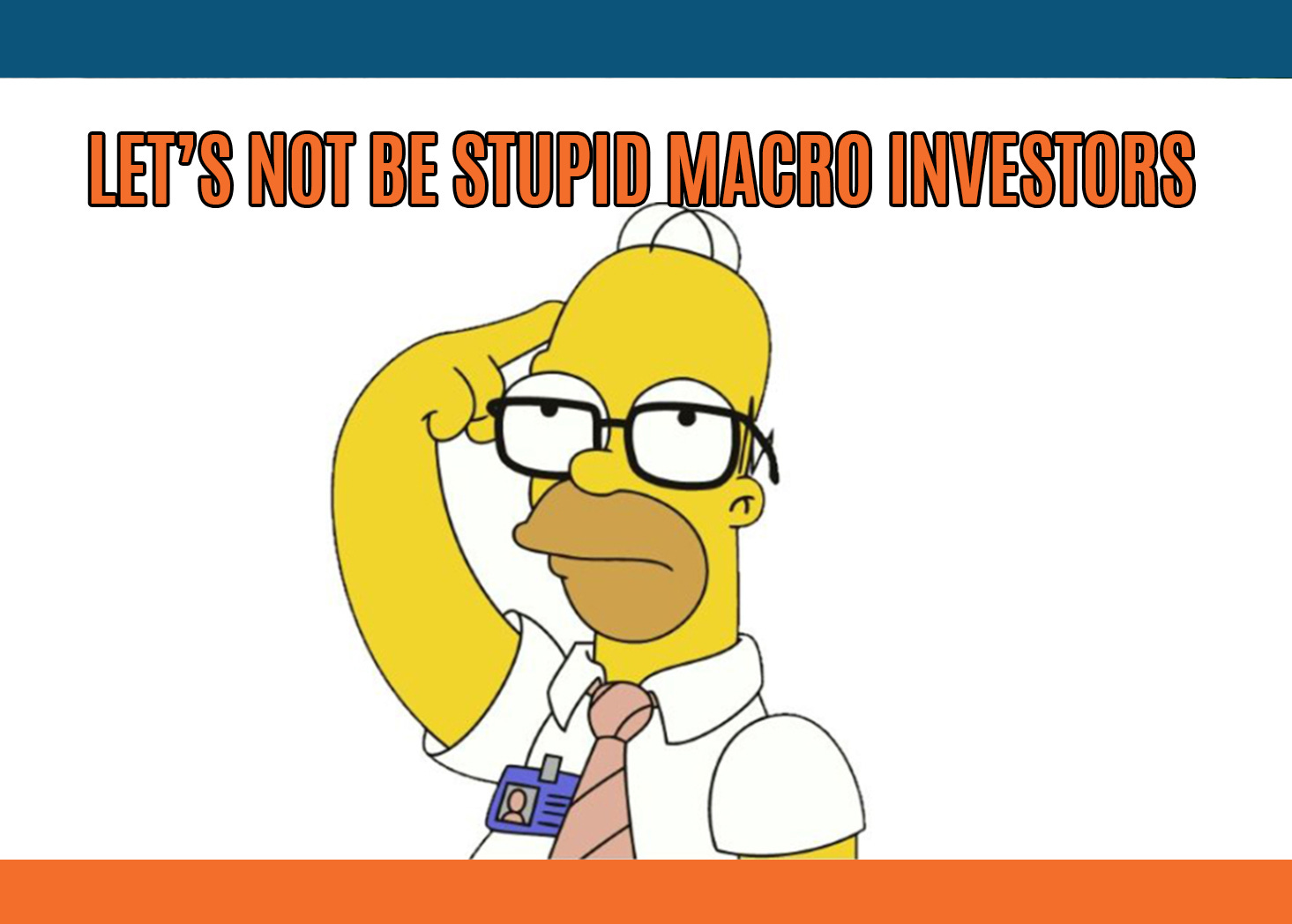
Let's Not Be Stupid Macro Investors
A warm thank you to the 2,000 early birds who took advantage of the exclusive offer and subscribed to The Macro Compass premium services!The ‘‘pay-8-get-12-months’’ offer will not be available anymore.Yet, given the large amount of requests we decided to extend one last time-limited, seats-limited offer to our TMC readers.Until December 10th, the first 1,000 subscribers counting from today will be able to get access to TMC content for the entire 2023 by paying only 9 months instead of 12!From December 11th, no early-bird discounts anymore: full prices will be applicable.Check out which subscription tier suits you the most and grab your last chance to be an early bird subscriber - the discount code is ‘‘TMC2’’!IntroductionAs my mentor always said: Alf, rule #1 as an investor is not to be stupid.And trust me, it’s not an easy rule to respect.As a long-term or tactical macro investor, the emotion-driven biases threatening to kill our performance are countless: recency bias, being in love with a macro narrative even when invalidated by price action, mis-sizing positions and so on.But over time I learnt the hard way that as a macro investor respecting 3 main principles is in most cases enough to avoid stupid mistakes.In this short article, we will go through the most common mistakes and how to avoid them by respecting 3 simple principles. Common Mistakes & How To Avoid ThemNow, picture this.First month running money as a junior PM, and I want to pitch a trade idea to my senior colleagues.I really like it - and they go like ‘‘sure Alf, pitch it’’.Adrenaline running high, I go through every piece of imaginable info and analysis necessary to back the trade. Finally, I have the pitch in writing. I send it over.My to-be-mentor walks to my desk and here is how it goes: Mentor: ‘‘Alf, don’t be stupid.’’Alf: ’’Oh, you don’t like the trade?’’Mentor: ’’That doesn’t matter - you sized it wrong and there is no stop loss. No trade.’’This was my baptism to institutional macro investing, and my first lesson on how to avoid stupid mistakes (spoiler: I made many more in my career).Now, let’s talk about the three most common mistakes in long-term and tactical macro portfolio management and how to avoid them.#1: Don’Put All Eggs In One Macro BasketWe all know about the power of diversification.Many decades ago, Ray Dalio explained how the holy grail for every long-term investor should be to find return-additive, yet not highly correlated assets to add to her portfolio.But in my experience, macro diversification is a nuanced subject.To understand what I mean, let’s have a look at what the TMC Quadrant Asset Allocation model is pointing to today:If you’d take it at face value, you’d be 100% in USD cash.This would classify as a ‘‘stupid macro mistake’’ - why?Because however sophisticated your models might be, you can’t predict the future - macro investors instead have to assess future outcomes in a probabilistic way.Say the Fed really pivots and cuts rates by 300 bps in 2023, and as a result we transition towards Quadrant 1.And to position for that you buy US and EU bonds, US tech and EU growth stocks.That is not a macro-diversified portfolio. At all.You are assigning a 100% probability to a macro-base-case and getting no exposure to other macro factors (e.g. strong growth, persistent inflation) if you are wrong.Don’t put all your eggs in one macro-base-case-scenario basket.Instead, think in probabilistic terms and try to add cheap positions that will deliver convex returns if your base case doesn’t realize.#2: You Sure You’Re Running 5 Positions, Or Is It Just 1?Around March this year, one of my top hedge fund clients reached out to discuss its portfolio ahead of Q2.His book could be summarized by something along these lines:* Long Brazilian Real vs US Dollar* Long a basket of industrial commodities (Copper & Co.)* Long Natural Gas futures* Short 2y Treasuries* Some exotic trade in equity derivativesI told him he was basically running one trade - and that’s dangerous.His macro narrative was that inflation was gonna massively surprise on the upside, that commodities were gonna contribute and benefit from it together with commodity exporters and that the Fed was gonna be forced to raise rates to 5%+ to fight inflation.With hindsight today that was brilliantly prescient, wasn’t it?But the problem was that as he was basically running 4 positions around that very same macro theme, he suffered a material drawdown in June/July and was brutally stopped out despite his main thesis proving to be correct in the end.One way to avoid this mistake is to ask yourself: how much and to what macro risk factors is my aggregate book exposed to?If the answer is ‘‘all my trades make or lose money if xyz happens’’, maybe it’s time to re-assess your exposures.I find Principal Component Analysis (PCA) very useful for that: it decomposes the data into principal components that try to explain as much variance as possible, hence eliminating a lot of noise and

All They Told You About Money Printing Is Really, Really Wrong
Hi all, and welcome back on The Macro Compass!Quick reminder: from January 1st, getting access to this content (and much more!) will require a paid subscription.As a loyal TMC reader, there is an exclusive offer for you: get in now and pay only 8 months instead of 12!The offer is time-limited: it runs for only 3 more days, and out of the 2,000 available spots only 145 are left (~20 for Pro subscribers).Last round: check out which subscription tier suits you the most and take advantage of this exclusive offer before Nov 30!All They Told You About Money Printing Is Really, Really Wrong Without properly understanding money, it’s basically impossible to connect the countless dots of the global macro puzzle.Yet, we assume we know all about money: universities and mainstream economic courses teach us that governments need money to fund their spending, Central Banks have the authority to print money we use, and commercial banks lend and multiply customers’ money in a fractional reserve banking system.That’s literally all wrong.Our monetary and credit system envisages two distinct tiers of money: real-economy money (potentially inflationary) and financial-sector money (potentially asset-price inflationary).Governments and commercial banks have the ability to print real-economy money.Central Banks have the ability to only print financial-sector money.In this article we will:* Discuss the two main forms of money: real-economy and financial-sector money;* Go through the basic mechanics of real-economy and financial-sector money printing, and debunk the most common ‘‘money printing’’ myths;* Summarize the implications for markets ahead.Real-Economy Money & Financial-Sector MoneyLet’s first define the two main tiers of money, and why do we care about them from a global macro asset allocation point-of-view.Real-economy money is the one used by non-financial private sector agents (e.g. households, corporates) to make transactions tha contribute to economic activity.The more real-economy money out there, ceteris paribus the more likely economic growth will be stronger.Also, a rapid increase in real-economy money at a time when the supply of goods and services can’t keep up will most likely generate strong inflationary pressures.In other words, rapid changes in the amount of real-economy money anticipate rapid changes in economic growth and inflation - pretty relevant for asset allocation.Financial-sector money is the one used by financial entities: mostly banks, but also pension funds, asset managers and so on.The more financial-sector money out there, the more likely financial agents will be over time to engage in riskier activities and to chase riskier assets in an attempt to generate better returns.In other words, the level and rate of change of financial-sector money informs us about the attitude that financial institutions are likely to have towards taking risks.Now, who prints what form of money and how does it work?#1: Banks & Governments Print Real-Economy MoneyNowadays, given that in many jurisdictions cash transactions only account for bank deposits held by the non-financial private sector (read: mostly held by us).Every time commercial banks make a loan, new real-economy money is created.Banks don't lend reserves or existing deposits: as the Bank of England itself shows, when making new loans banks expand their balance sheet and literally credit your account out of nowhere. By doing so, they create new deposits for the non-financial private sector (e.g. people).Does this mean banks can just print as much money as they want?Not really: banks are private capitalistic entities which need to maximize RoE for their shareholders and act within the tight boundaries of regulation.This means banks decide about their lending activity looking at these criteria:* The creditworthiness of the borrowers* The attractiveness of loan yields* The required capital and balance sheet costs (i.e. regulatory constraints)If there is a good trade-off amongst these 3 variables, they lend. Otherwise they don't.Did you notice how the amount of reserves they own is basically irrelevant in the decision-making process?QE ≠ real-economy money printing: we will come back to this later.Now, the other real-economy money printer is the government: come again?If the government spends more than it plans to collect taxes for (deficits), in most cases new real-economy money has been created. Government deficit spending increases the net worth of the private sector…without adding a liability to it!Think about it: when the US government sent cheques to its citizens, American people literally saw the amount of their spendable money increase out of nowhere.Deficit spending increases the amount of non-financial private sector deposits (i.e. real-economy money) as long as households don’t need to purchase the Treasuries issued by the government itself - which in most cases are anyway bought by financial institutions or the Central Bank.This means deficit spe

When Recession, Sir?
Hi all, and welcome back on The Macro Compass!A quick reminder that from January 1st, getting access to this content (and much more!) will require a paid subscription.The exclusive offer to get in by paying 8 months instead of 12 runs for only 7 more days, and 86% of the available spots have already been taken.Not much time left: check out which subscription tier suits you the most and take advantage of this exclusive offer!Ok, Recession: But When, and How Hard?Audio note not available due to Substack technical issues.As my mentor used to say, any market practicioner can make headlines by screaming something wildly out-of-consensus but conveniently leaving the details of his forecast out of the equation.How many times have you heard that ‘‘the US Dollar will fall apart’’ or that ‘‘the real estate bubble will burst’’ over the last 10-20 years, yet without a clear time horizon for this call to play out?If only you got 1 USD (pun intended) for every time you heard something like this, you’ll be rich by now.Now, it seems most analysts ‘‘expect a recession’’.Ok, but when will it hit and how hard will it be?The answers to these two questions are very important for asset allocation in 2023.In this article we will:* Refresh 5 forward-leading indicators within our macro framework, and assess their diagnosis for when and how hard the next recession will hit;* Present our conclusions and discuss the principles for asset allocation going into 2023.The DiagnosisFirst of all: shall we agree on what characterizes a recession in the first place?While many refer to 2 consecutive quarters of negative GDP growth as the main signal for a recession, the US National Bureau of Economic Research (NBER) instead looks at a wide array of real economic activity and precisely: real personal income and expenditures, employment, inflation-adjusted retail sales, and industrial production/corporate profits.In other words: it focuses on consumers, the labor market and corporate activity.I agree with this broader assessment of a recession.The labor market, real consumer spending and earnings have materially slowed down in the last few months but we aren’t in a recession yet - no widespread job losses, no materially negative EPS growth yet.Yet, the direction of travel is definitely negative - so, when recession and how hard?Let’s try to answer these two questions by refreshing 5 of the most relevant leading indicators within my macro framework.#1: The Global Credit ImpulseEvery real recession brings negative earnings growth with it.My preliminary results for the October update to my flagship Global Credit Impulse index point to a further deterioration of the pace of real-economy money creation.The global credit impulse (blue) leads S&P500 earnings growth (orange) by roughly 9-10 months, and given its rapid decline in 2022 it’s now pointing to negative YoY EPS by March 2023 already.How bad?Historically, rapid declines in the Global Credit Impulse to negative levels have preceded YoY earnings contraction in the 10-15%+ area.Pretty bad.#2: The Conference Board Leading Indicator IndexThe US Conference Board puts together a leading index which incorporates the top 10 statistically significant forward-leading indicators for the US economy.Its track record in anticipating recessions is very solid: over the last 50+ years, every time the YoY series of this index prints in negative territory for 2+ consecutive months a recession is guaranteed.That trigger was hit in August 2022, and the median lead time is 7 months.Recession starting in March 2023?As this indicator keeps dropping, it’s hard to estimate the magnitude of the recession yet - it first needs to bottom, and then we will be able to quantify that.For the time being: recession to start in March 2023, according to this forward-looking indicator.#3: The Housing MarketIn 2007 Edward Leamer of the University of California stated that the housing market IS the business cycle.I believe he is fundamentally right.Housing-related jobs and economic activity represent anything between 12-15% of US GDP and employment alone, and the interest-rate sensitive nature of the real estate business makes it very prone to rapidly respond to changing economic and financial conditions.The NAHB housing index (orange, inverted) leads trends in US unemployment rate (blue) by roughly 12 months.According to the Sahm Rule, a recession starts when the 3-month moving average of the US unemployment rate (U3) rises by 50+ bps relative to its low during the previous 12 months.In this case: 4.2% unemployment rate would suffice.Looking at the sharp deterioration in housing activity and the usual 12-month lagged effect it has on the labor market, we should get there by Q2-23.How bad?Unemployment rate is set to rise to the 6-7% area by late 2023, which would be roughly double where it stands today.Pretty bad, according to the NAHB housing market indicator.#4: Philly Fed New OrdersThe Philadelphia Fed survey is a very interesting so

The 30,000-Foot View
Hi all, and welcome back on The Macro Compass!From January 1st, getting access to this content (and much more!) will require a paid subscription.As a loyal newsletter reader, you can sign up now and get access to the TMC services for the entire 2023 paying only 8 months instead of 12.This offer is limited in both time and spots available.You have until November 30th (10 days left) to be amongst the only 2,000 subscribers who will exclusively benefit from this offer (~750 spots left).Check out which subscription tier suits you the most and take advantage of the exclusive offer here:IntroIn this business, we are often inundated by countless news headlines telling us all about what’s happening…now. It’s a never-ending process that invites market participants to spend time and energy dissecting how new information affects the investment landscape.For a macro investor though, every now and then taking a step back is crucial: with a 30,000-foot view, the macro big picture becomes increasingly clear.Hence, in this article we will:* Assess the structural trends underpinning our economic and monetary system, and how the 2020-2021 tectonic shifts interplayed with them;* Present our conclusions and discuss how the upcoming macro cycle is likely to play out.The Macro Big PictureLong-term economic growth is a function of the growth in labor supply and total factor productivity.In other words: it’s highly influenced by how many people actively contribute to generate economic output, and how productive the labor force and the use of capital are.Until the mid-80s, the ability to generate organic growth in most Western economies was very solid: a combination of strong working-age population and good productivity trends led to high levels of potential GDP growth.But things rapidly took a turn for the worse in the late ‘80s.By the early ‘90s, the post-WWII demographics boom had exhausted its positive effect.Fertility rates decreased, longevity increased and hence the share of working-age population dropped by several percentage points in a few decades.The number of people actively contributing to GDP growth wasn’t growing fast anymore - but perhaps an upward trend in productivity growth could offset this?It could, but it didn’t.Especially in the 2010s, productivity growth was relatively stagnant: we made some progress, but the marginal productivity gains were rather small and definitely not enough to push structural GDP higher given the demographics headwinds.The permanent scars left by the Great Financial Crisis, and the capital misallocations that partially generated from monetary policy decisions such as the Zero Interest Rate Policies (ZIRP) and QE were amongst the many factors that acted as a drag on productivity growth.Remember: long-term economic growth is a function of the growth in labor supply and total factor productivity.After the ‘90s, as both demographic and productivity trends materially weakened so did the ability to generate structural economic growth amongst advanced economies.Today, advanced economies are looking at potential real GDP growth in the 1.0-1.25% area (left chart) and required equilibrium real rates roughly around 0% for that to happen (right chart).And given the demographics headwinds ahead, these numbers might well look even lower in the next 1-2 decades.Low levels of GDP growth are socially unacceptable in capitalistic societies.So, what’s the fix?Debt.Between 1990 and 2020, all major economies went ahead with an extensive use of credit in an attempt to cyclically boost economic growth way above its poor structural trend - Europe, Japan, US, UK, and even China saw their total economy debt as % of GDP rise from 100-150% to 300-400% in a few decades (left chart).But if the underlying economic activity and wages don’t rapidly rise, how could these economies sustain such a massive build-up in leverage - especially private sector agents, which can’t print money to refinance or service their debt?Easy: real yields were pushed lower and lower every time.After all, if you make 100k/year you can probably afford a 400k mortgage at 4%.At 2%, with the same 100k/year salary you can now take on 600k in debt.The fix was ‘‘straightforward’’: more and more debt, at lower and lower real interest rates (right chart).Can this go on forever?There are three main elements that could disrupt this fragile and leveraged system:A) Excessive levels of (private) debt;B) Higher real rates;C) Recessions and de-leveraging episodes.The policymakers’ reactions to the pandemic led to a sharp increase in debt levels: public debt soared due to unfunded fiscal deficits, and in certain jurisdictions there was also a bump up in private debt due to government-sponsored bank lending to corporates and households - checkmark on A).Gigantic injections of new real-economy money in the private sector (~$5 trillion in the US) coupled with re-openings led to a rapid surge in demand.Bottlenecks in the global supply chain compounded the probl
The Bond Market Is Talking: Are You Listening?
Hi all, and welcome back on The Macro Compass!A warm thank you to the many subscribers who secured their spot to continue this macro learning journey together in 2023 by signing up for our premium products.From January 1st, getting access to this content (and much more!) will require a paid subscription.As a loyal newsletter reader, you can sign up now and get access to the TMC services for the entire 2023 paying only 8 months instead of 12.This offer is limited in both time and spots available.You have until November 30th (13 days left) to be amongst the only 2,000 subscribers who will exclusively benefit from this offer (~950 spots left, 50%+ taken in 5 days).Check out which subscription tier suits you the most and take advantage of the exclusive offer here:IntroThe bond market is often wrong.Yes, you read that right.Many believe fixed income investors have some esotheric power that allows them to always have an edge in anticipating how macro conditions will evolve.The reality is that understanding the signals bond markets send across their many dimensions is not akin to looking into a macro crystal ball, but rather a very useful exercise because bond markets are the biggest and most liquid asset class in the world.And if you want to get a better shot at piecing together the very complex and dynamic global macro puzzle, you’d better make sure your instruction manual is good.The bond market is your instruction manual.Hence, in this article we will:* Assess the current state of the US bond markets, with a particular focus on three interesting dimensions - curve slopes, volatility and implied Central Bank rates;* Discuss portfolio allocations and trade ideas.When The Bond Market Talks, You Better ListenOver the last 30 days, a lot has happened under the surface in bond markets.And no, it’s not as simple as ‘‘bond markets now think the Fed will pivot’’.Let’s instead look into three interesting dimensions that carry a lot of informational value: curve slopes, volatility and implied Central Bank rates.To break them down, I will use the Rates section of my Volatility Adjusted Market Dashboard (VAMD) - an interactive macro tool which will be available to paid subscribers in 2023.In the picture above, I focused on the rolling 30-days move across many segments of the US fixed income market. One of the most important features of the VAMD is its color-coding mechanism.The VAMD color-codes market moves based on their magnitude: the darker the color, the bigger the move in standard deviation terms and hence the more interesting market action to focus on. Let’s cover the 3 areas circled in black.#1: Market-Implied Path for Fed FundsThe bond market is getting around this idea that the Fed won't massively pivot.But instead, it will go for a long, very long pause.As you can see in the VAMD (Forward OIS section), market-implied Fed Funds have rallied significantly over the last 30 days.Yet, putting things in context: bond markets are now expecting Fed Funds to peak at 4.9% in 6 months and then to remain above 4% until Q1 2024!Rather than a sharp pivot, this is fixed income investors assigning a higher and higher probability to a long pause with Fed Funds rate well in restrictive territory for the entire 2023.For comparison, if you are looking for a true pivot have a look at 2001 (a historical parallel The Macro Compass models are strongly pointing to for what’s ahead in 2023).Back then, the Fed cut rates by 475 bps (!) in 12 months as earnings and the labor market were materially weakening, and inflation was slowing down too.In other words: long pause now priced as the base case, while a true pivot only remains a tail risk.This stance is also reflected in implied volatilities - let’s have a look.#2: Implied VolatilityThe option market in fixed income is very large, and it involves a variety of actors: hedge funds, banks, insurances, pension funds and more.Hence, it’s a very important dimension to consider.The Volatility section of the VAMD screenshot shows the implied annualized volatility priced for the next 3 and 12 months in various segments of the curve: a 1y2y swaption ATM vol would reflect the implied volatility priced in for the next year for 2-year rates, and so on.Notice how the 12-month implied volatilities for 2, 5 and 10y rates have recently staged a very significant downward move: why, and what does it imply?If the main theme is a long Fed pause, Powell’s volatility around monetary policy decisions in 2023 will likely be much lower than in 2022.And when there is less uncertainty around such an important market driver, investors can be marginally more aggressive in taking risks as the bond market behaves better and it reduces some of the explosive volatility it brought to their portfolios in 2023.The chart above shows how equity investors (S&P 500, blue) got rattled by a higher and higher bond market implied volatility (orange, inverted) throughout 2022.Recently, the ‘‘long Fed pause’’ narrative and its subseque
Bear Market Rally or Turning Point (Again)?
Hi all, and welcome back to The Macro Compass!Do you remember July?Here we are again: left to assess whether we are looking at a bear market rally or a sustainable turning point for the stock market.Last week’s softer than expected inflation print spurred a massive rally across asset classes: the 60-40 portfolio posted one of its strongest 2-day performances ever, precious metals zoomed higher while the US Dollar took a beating.The magnitude of the market reaction was exacerbated by technical reasons we will discuss, but to assess medium-term implications we need to break down the CPI report and take a broader look at the global macro puzzle.Hence, in this article we will:* Decompose the latest CPI report looking at the drivers behind the surprise, with a particular focus on the inflation features the Fed is the most interested in;* Contextualize the markets’ reaction, taking into account cross-asset signals and keeping an eye on lessons from the past;* Look at Long-Term ETF portfolio implications and tactical trade ideas that could be considered going forward.A Breakdown of The CPI ReportCore CPI came in at a monthly pace of 0.27% for October 2022, the lowest monthly print since summer 2021.When it comes to inflation, growth and other macro drivers here on TMC we prefer looking at momentum rather than one-off prints: this helps smoothen volatility and seasonality, and Powell told us he’s looking at inflation the same way with a particular focus on the 3-month moving average.Here is how it looks like now:Using this momentum metric, we are still far from levels consistent with 2% YoY core inflation (see 2017-2018) but the pace has undeniably slowed down from its peak.As we had two false positives in late 2021 and mid-2022, it’s worth looking into the underlying drivers and the breadth of this inflation surprise - the Fed is also very attentive to how broad inflationary pressures are.The biggest negative contributors of the core CPI print were goods (especially transportation, i.e. used cars) and medical care services, while the most positive topline contributor was shelter inflation.The positive news is that goods disinflation is finally here - and it was about time.The transition from a pandemic, goods-centric world to a post C-19 services driven economy and the decongestion of global supply chains will ensure further weakness in goods prices.The NY Fed Global Supply Chain index is now sitting at only 1 standard deviation away from its long-term mean: we are not totally out of the woods yet, but definitely making progress there.The less positive news is that almost 70% (!) of core CPI components still run at above 4% annualized inflation rates, which makes inflationary pressures still broad.And most importantly, as shelter inflation lags house prices and on-the-ground negotiated rents it’s very unlikely its monthly pace will markedly slow down before ~6 months from today.Ex-energy core services CPI is running at 6.7% YoY, the fastest pace in over 40 years.Going forward, as goods disinflation accelerates and the momentum of core services inflation stabilizes we should expect MoM core CPI prints to range around 0.3-0.4%.That implies YoY core CPI will be slowly trending down towards 4% by June 2023: a welcome development, but still way too high for the Fed to feel at ease.By the end of 2023 though, my models point towards a rapid drop in inflation at or below 2% coupled with a likely earnings recession.The very negative Global Credit Impulse print in July 2022 leads YoY CPI by 5 quarters and it therefore suggests a major downtrend in inflation and nominal growth in Q3-Q4 next year.On the inflation front, we can expect only partial good news going forward followed by a rapid disinflationary trend in the second half of 2023.But that second leg will be also associated with higher unemployment rate and an negative EPS growth.In other words, a recession.How did market react to the CPI print?Let’s take a look.The Celebratory Rally ExplainedThink about this.After the softer than expected CPI print, the GS Unprofitable Tech Index rallied 25% in two days and the 60-40 portfolio had one of its best 2-day streak ever.The market exploded higher across the board.But while the extreme bond market reaction can be somehow rationalized, the equity market rally was also due to technical reasons.The downward surprise in CPI led to a decline of US inflation expectations, with 1-year forward 1y inflation now priced at only 2.65%.Despite the outsized front-end rally, market-implied real Fed Funds rate ahead (e.g. my Powell Credibility Indicator) remain comfortably high.Coupled with terminal Fed Funds still priced in the 4.9% area, this provides context to the bond market move: it was very large, but it leaves fixed income pricing within the realm of acceptable outcomes for the Fed.The equity market rally was instead much more pronounced and mostly driven by technical and institutional reasons.Let me explain.As I’ve run institutiona

It's Showtime!
For years, I was blessed with the opportunity to run a $20 billion multi-asset institutional portfolio.And yet, something didn’t feel right.The amount of information, data, and knowledge available to financial institutions is unparalleled…and yet, strictly reserved only for The Ivory Tower members.I didn’t like that.I grew up in a humble background in the South of Italy - my father is a forklifter, and he taught me the real joy in life is not to be privileged, but to share with others.And that’s why in December 2021 I took a massive, scary leap of faith - I left the industry and started sharing my insights with you on The Macro Compass.It was one of the best decisions of my life.The response was incredible: in only 11 months The Macro Compass has become one of the biggest macro newsletters in the world with over 115,000 subscribers.Which brings me to what comes next.A newsletter is not nearly enough to fill the gap of macro knowledge, portfolio construction, risk management and access to data and tools between financial institutions and regular investors.Today, The Macro Compass graduates from a newsletter to an all-round macro platform whose aim is to send retail investors through a holistic macro learning journey and provide institutional risk-takers with a pro, tailored service.It’s time to step up the game.The Macro Learning Journey Ahead(If you are a pro investor, scroll down below - there is a dedicated section for you).Educational. Interactive. Actionable.These are the three features of the macro learning journey ahead of us.The Macro Compass will cover them all, and provide you with:* Macro ReportsThe idea is to provide unique insights and break down what’s happening in macro and markets around the world.A weekly big picture report for long-term investors, and more frequent and timely updates covering macro events as they happen and also highlighting tactical trade opportunities for all-round investors.* Macro CoursesThere is no Global Macro University out there, and I want to fix that.The aim is to deliver an educational journey that encompasses monetary mechanics, the functioning of all asset classes, principles of portfolio management and much more. * Interactive Macro ToolsProfessional investors have access to incredibly expensive platforms (e.g. Bloomberg) and therefore have an edge in analyzing macro and market data.I want to fill that gap.The Volatility-Adjusted Market Dashboard (VAMD) will allow you to track cross-asset moves and easily connect the macro dots out there, and most importantly to interactively play around with bond market and derivatives data so far only accessible to financial institutions.In the pipeline, we have many more tools: for instance, an interactive Macro Database where to access, analyze and chart all macro and market data out there.And much much more!* Actionable Investment StrategyThe Macro Compass is not only talking the talk, but also walking the walk.There is no proper macro learning journey without getting our hands dirty, and hence The Macro Compass will deliver both a Long-Term ETF Portfolio and Tactical Trade Ideas generated through a data-driven approach and with a keen eye on risk management.In other words, The Macro Compass graduates from a newsletter to a holistic platform that allows you to really step up your macro game.Delivering all the above involves facing significant expenses, including hiring an amazing team of people and paying the hefty subscription fees to many services required for me to close the gap between Wall Street and you.Hence, from January 1st stepping up your macro game will require an investment from your end.But.As you have relentlessly supported me for 11 months, the least I can do is to give the 115,000+ TMC subscribers a highly preferential treatment.Using the code TMC, the first 2,000 subscribers will get a 20% off on all products.This code will be only available to subscribers of The Macro Compass newsletter - only to you, and not to people following me on social media for instance.The offer is anyway valid until November 30th, and after that prices will increase.First come, first served.What tier to choose?The Long-Term Investor subscription gives you access to weekly reports, ETF-only portfolios and 25% discounts on upcoming macro courses - it’s designed for long-term investors and using the TMC code it will cost EUR 319 for the calendar year 2023.The All-Round Investor subscription gives you access to much more on top of that: timely macro reports around big events (e.g. Fed/ECB meetings), tactical trade ideas, access to the interactive macro tools, 50% discounts on macro courses and a monthly Q&A Zoom call - it’s designed for all-round investors and using the TMC code it will cost EUR 999 for the calendar year 2023.If you want to be amongst the first 2,000 subscribers and make use of the exclusive TMC discount code, the link to The Macro Compass website is here.From Risk-Taker to Risk-TakerI have been an institutional in
A Pivot From Hawkish To...More Hawkish
‘‘It is VERY premature to think about a pause in our interest rate hiking cycle’’Jerome Powell - FOMC November press conferenceHi all, and welcome back to The Macro Compass!We finally got a pivot - but it wasn’t the one many investors were hoping for.At the FOMC press conference, Powell pivoted from hawkish to…more hakwish.Through the use of 3 unambiguous punchlines, Chairman Powell made sure to convey one clear message: we will get it done, whatever it takes.As investors entered the meeting with a complacent attitude and the initial press release seemed to back the idea of a ‘‘dovish pause’’, the press conference served as an abrupt awakening to the new/old reality: this is not the time to reload on (risk) assets.In this article, we will:* Go through the Fed meeting and the bond market reaction, step by step;* Discuss how the reiterated Fed hawkish stance will interact with the liquidity backdrop ahead (Treasury buybacks, QT, reverse repo etc), and how this affects portfolio strategies goind forward.Keeping At ItActually, before we jump right in.Dear community: mark your calendars.November 10th, 2022.An email from The Macro Compass you really don’t want to miss.Back to it: the press release seemed to be dovish.But as soon as Powell started speaking, things dramatically changed.Jerome threw 3 major punchlines that inequivocally signalled to investors that yes, there was a pivot. But not the one they were looking for.The pivot was from hawkish to…more hawkish.Let’s go through these 3 key moments.#1: It’s Very Premature‘‘It’s very premature to think about a pause in our interest rate hiking cycle’’.I suspect Powell looked at his screens before entering the press conference room and saw rates rallying, the USD weakening, equities zooming higher.And he must have been very much…p*ssed.Indeed, in the Q&A session he used one of the very first chance he had to completely dispel the idea of a ‘‘dovish pause’’ in the Fed hiking cycle.The Fed is setting policy looking at core inflation and the labor market - those are coincident to lagging indicators, which means the Fed is driving the car looking in the rearview mirror.But as my mentor often said, investors trading based on what Central Banks should do are bound to underperform - as the labor market remains hot and core PCE is trending at 5% annualized rates, there is no evidence at all that would support a data-driven Fed pause, let alone a pivot.It’s not about what the Fed should do, but what they will do.Check for yourself how markets digested Powell’s first punchline: the Fed Funds terminal rate aggressively moved higher and never looked back.A more aggressive Fed in the short-term is likely to cause more long-lasting economic damage in the long-term, and this is reflected in relentlessly flattening yield curves.Here is where we stand in the Overnight Index Swaps (OIS) curve:2s5s: -60 bps (inverted since April)2s10s: -86 (inverted since March)5s30s: -77 (inverted since March)US Treasury curve slopes are also inverted across the board.But to show there is no room for nuances, Powell cherry-picked a very special curve slope: gaslighting at its best, in an attempt to dismiss evident and persistent curve inversions as a reason to slow down.Yet JPow can’t gaslight the TMC community - here is the long term chart of Powell’s preferred curve slope: the 18-month forward 3-month rates minus prevailing 3-month rates (using OIS, as it should be done).It might not be inverted (yet), but it soon will.#2: Higher For Longer: Got It?'‘The incoming data since our last meeting suggest the terminal rate of Fed Funds will be higher than previously expected (4.63%), and we will stay the course until the job is done''.The other ‘‘pivot’’ dimension investors were looking for was a remark of financial stability risks that arise from keeping rates in the 5% area for too long - effectively, a step back from the higher for longer mantra.They got the opposite.Powell reiterated the Fed will ‘‘stay the course’’ and ‘‘keep at it’’ until the job is done - did you know that ‘‘Keeping At It’’ is the name of one of Volcker’s books?!The chart below shows how the bond market digested this message: the Fed was not only repriced to hike rates above 5%, but to keep them at least around that level for 6 more months all the way until the end of 2023.Try to picture this: Fed Funds ≥ 5% for the entirety of 2023.The higher for longer mantra is important to Powell because it reduces the possibility of financial conditions preemptively easing well ahead of time, potentially spurring an uptake in economic activity which is undesirable given the Fed’s willingness to bring inflation down to 2% as soon as possible.When a journalist asked about markets rallying (although they weren’t…) during his press conference, Powell’s reaction was unambiguously along the same lines: strong pushback against easing of financial conditions.Higher for longer: got it?#3: Risk Management = Over-Tightening > Doing Too Little''Prudent
A Sudden Change of Heart?
‘‘We have made substantial progress in removing monetary policy accommodation, and we have to recognize there are clear signs of an economic slowdown in the Eurozone.’’Christine Lagarde - ECB October press conferenceHi all, and welcome back to The Macro Compass!Over the last two weeks, several G10 Central Banks came across as ready-to-pivot.Australia, Canada and now Europe are starting to weigh pros and cons of calibrating monetary policy with a single objective: bringing inflation down to 2%, as soon as possible.Instead, they are beginning to consider a slowdown in the pace of hikes and most likely a complete pause relatively soon.Why such a sudden change of heart?Because all these jurisdictions have something in common: inherent fragilities.Be it private sector debt (Canada), the domestic housing market (Australia), upcoming recession fears or a very suboptimal architecture for a ‘‘monetary/fiscal union’’ (Europe) it’s become increasingly clear that relentless monetary policy tightening will end up breaking something.And hence, all of a sudden pros and cons need to be weighed against each others.Today’s ECB decisions and press conference went exactly into that direction, with a lot of interesting decisions and nuances.In this short article, we will:* Briefly discuss the ECB meeting, and focus on its most interesting nuances;* Summarize the main implications for portfolio allocations & tactical trade ideas.A Ready-To-Pivot ECB?Actually, before we jump right in.Nowadays, time is our scarcest resource and sharing insights in an effective way through charts and visual infographics is a great tool to have in your arsenal.On my social channels, I must have used Chartr visual insights countless times for this very reason - these guys are very skilled at conveying macro, business and market insights in a visual and easy-to-remember fashion.I strongly recommend signing up for their 5-minutes read newsletter which is packed with these very useful and information dense visual insights.It’s free - here is the link.Back to it: let’s unpack this ECB meeting together.#1: We Are Serious About Inflation, But…The ECB hiked by 75 bps hence bringing the Deposit Rate to 1.50%, and acknowledged inflation is likely to stay high and hence that further interest rate increases will be necessary.So, where is the ‘‘ready-to-pivot’’ stance?In the language used to communicate whatever is left of the ECB’s forward guidance.A) The press release indicates the Governing Council doesn’t expect ‘‘to raise interest rates over the next several meetings’’ but only ‘‘to raise interest rates further’’: a much less specific reference to the hike sequencing being prolonged over time;B) The press release now reflects an ECB assessing today’s stance as reasonably tight and moving there quickly: ‘‘With this third major policy rate increase in a row, the Governing Council has made substantial progress in withdrawing monetary policy accommodation.’’C) Lagarde being very vocal in her press conference about recession risks, and the need to weigh pros and cons when moving monetary policy much tighter from here.A quick snapshot of today’s market reaction - we will cover this in much more details later: investors immediately repriced the ECB terminal rate down by 30+ bps!For now, the most important question I want to answer is: with inflation running at around 10% (!) in Europe, why would the ECB deliver such a sudden change of heart?Because of its inherent fragilities.An overleveraged and unproductive private sector, weak potential growth due to poor demographics and a very suboptimal monetary/fiscal union architecture chronically expose Europe to systemic risks.Sum up a brand-new and not necessarily Europe-friendly Italian government and geopolitical risks, and you see where I am going.With such a backdrop, once you tightened by 200 bps in a few months the pros and cons of further aggressive tightening become more ‘‘balanced’’.The Bank of Canada is delivering the exact same message - notice any similarities in the presence of inherent fragilities and the sudden change of heart?In other words, the ECB is ‘‘hoping’’ that markets are right about inflation falling off a cliff (spot European CPI at 10%, and 1y1y inflation swaps are pricing in 2.7%) and most importantly that a mild tightening of their monetary policy stance above neutral rates will be enough to engineer such a sharp drop in inflation.While this ideal outcome might unfold, history suggests baby steps are not enough to slay the inflation dragon.Given my estimate of today’s EUR nominal neutral rate at around 1.5% (exactly where ECB depo is today), the market-implied terminal rate of 2.6% imply an ECB monetary policy stance ~100 bps above neutral.In the 1990s, in order to restore price stability France had to go 300+ bps above neutral for over two years.Will 100 bps be enough?Maybe, but the ECB (& Co) are taking quite the leap of faith here.#2: Dear Banks, The Free-Carry Party Is OverThe ECB also d

A Chat With The Top Macro Hedge Funds
‘‘We want to perceive ourselves as winners, but successful investors are always focusing on their losses.’’Peter Borish - Founding Partner of Tudor Investment CorporationHi all, and welcome back to The Macro Compass!This week felt like the good old days.I was in London for some conferences, but most importantly for the Indian food…kidding: I meant to meet clients and friends working for the top macro hedge funds in the world.These are amongst the most sophisticated macro investors out there - they deploy a great deal of analysis and tools to come up and correctly size macro trade ideas, and yet this is not their top skill.They excel because they are humble about markets - always wondering whether there is really good risk/reward in that trade and where their macro thesis could go wrong.The Macro Compass has always been about sharing my never-ending macro learning journey with you guys.Today, I want to have a peek over the shoulders of the top macro hedge fund managers.Together with you!In this article, we will:* Unpack the main thinking and market musings of three influential macro hedge fund managers;* Summarize the main implications for portfolio allocations & tactical trade ideas.Welcome to the Dark Side of DerivativesActually, before we jump right in.If you are reading The Macro Compass, you’ll probably be interested in other good quality newsletters.The guys at The Daily Upside are doing a great job at sifting through the clickbait-y headlines traditional financial media poses.Instead, their team of investment bankers, scholars, and journalists condense the latest financial stories in a clear, concise, and occasionally witty daily newsletter - it is read by over 750,000 people every day and by the way…it’s free!I definitely recommend checking them out: here is the link.Back to it: I will not reveal the identity or the hedge fund these PMs are CIOs or work for, but I will give you some background color to best contextualize their takes.|Ready? Let’s go.#1: Macro Rates & Credits Hedge Fund CIOThis crispy European gentleman is somebody with a long history in global fixed income strategy and fund management who now runs a rates & credits focused macro hedge fund.‘‘Alf, where is the trade?’’I love this - you can chat macro narratives all you want, but where is that good risk/reward trade we all look for?He sees the world healing from inflationary pressures: the global supply chain is easing, core goods inventories abound while new orders remain weak, a big deleveraging in China is likely to keep that demand engine at bay etc.All very disinflationary, he argues.But I showed him this chart and asked: isn’t this priced in already?The chart below shows how markets expect a 5%+ drop (!) in US CPI over the next few quarters already - to find a similar market-implied CPI drop over a 12 months period you have to go back to 2008.He agrees: his point is indeed that investing isn’t like painting on a white canvas.We must always compare our subjective assessment of scenarios ahead against what markets are discounting - and right now, if your investment thesis solely relies on a sharp slowdown in inflation…well, it’s kinda priced in.But here is where he disagrees with markets: the labor market will take a bigger hit than priced in, and earlier than expected.The ‘‘bull case’’ for the housing market ahead is a total freeze: new marginal buyers are priced out due to the combination of today’s prices and mortgage rates, and sellers will hold on for as long as they can to avoid hitting a lower bid on their planned sales.But this means (plenty of) pain for housing-related job creation.The math is simple: given its demographics and labor force growth, the US needs to add roughly 90k jobs per month to keep unemployment rate stable.Housing related activity (brokers, construction, furniture shops etc) accounts for almost 20% of US GDP and ~12 million jobs.If all the other sectors merely slow towards trend job creation and only 10% of real estate related jobs are lost, US Non-Farm Payrolls could soon carry a negative (!) sign.We agree here - the housing market IS the business cycle.The sharp decline in the NAHB Housing Index (orange line, inverted) suggests US unemployment rate should quickly head towards 7% in 2023: such a vicious and powerful deterioration in the US job market is not market consensus yet.So, what’s the trade?He likes downside in homebuilders, REITS and credits linked to the real estate market.Time to thank him, drink an espresso (oh gosh, the UK version…) and on to the next macro hedge fund!#2: The Family Office Macro PMThis extremely smart lady works for a prominent macro hedge fund that has turned into a family office, allowing her more flexibility to take medium term risks.All she wants to talk about is the US Dollar and monetary plumbing.‘‘Alf: death by a thousand cuts or a sharp systemic risk event?’’She sees the world through the lens of our USD-centric credit and economic system.Despite the US and USD acc

The Pension Funds Drama Explained
‘‘Stability leads to instability. The more stable things become and the longer things are stable, the more unstable they will be when the crisis hits.’’Hyman MinskyHi all, and welcome back to The Macro Compass!Recently, there have been crucial developments in the (global) pension fund industry.And to give you some context, we are talking about a $40+ trillion industry here.Years and years of lower rates and subdued cross-asset volatility led pension funds to make a more aggressive use of derivatives (mostly but not only for hedging purposes).As derivatives require very little cash investment upfront, this freed up additional capacity to invest in higher-yielding and often illiquid assets to generate better returns - after all if volatility is so low, why not?As the perfect storm hits markets, we are now finding out about the ‘‘why not’’ part.In this article, we will:* Break down the dynamics behind the UK pension fund drama;* Discuss whether a similar episode could hit the European or US pension fund industry, and what the implications for markets and portfolios could be.Welcome to the Dark Side of DerivativesActually, before we jump right in.On October 17-18 I will be a speaker at the Digital Asset Summit in London - it’s an excellent conference that combines the worlds of macro and digital assets and it features high-quality speakers and attendees (macro/crypto funds, family offices, banks and many more).If you want to grab a ticket, you can get a 20% discount using the code ‘‘TMC’’ - here is the link.Now, back to it.Let’s start with some context first.The size of the global pension fund industry is estimated to be in the $35-40 trn area. It's a very large and systematically important industry not only because of its size, but also because of its social impact - most of us look forward to retirement after decades of hard work.We recently got some scary headlines coming from the UK: pension funds were about to blow up, and the Bank of England had to backstop them by limiting the relentless rise in 30-year yields.Let’s look into the very dynamics behind such episodes of acute stress.1. How Does It Exactly Work?Pension funds are in the business of accumulating premiums today and investing them (assets) such that they will be able to pay out pensions (liabilities) in the future.Pension funds' liabilities are hence a promise to pay a stream of retirement cash flows in the far future (~20-30y), which organically exposes them to interest rate risks: the discounted value of these liabilities increases if rates go down, and vice versa.To guarantee solvency, these risks need to be hedged at least to a certain extent.But funds must generate returns, too.Here is how a stylized pension fund balance sheet looks like:Let’s talk about the hedging part first.20-30 year government bonds would be an obvious candidate as an asset to buy in order to hedge the interest rate risk of a 20-30 year pension liability, right?Indeed, that’s correct.But as yields kept moving lower for a decade, that also meant pension funds were locking in all their cash in low-yielding products.Hence, a more ‘‘convenient’’ instrument became increasingly popular: swaps.A receiver interest rate swap is nothing else than an agreement to receive cash flows at a fixed rate against the obligation to pay cash flows at the prevailing floating rate over time - ok, but where is the trick?The beauty of a swap is that there is basically no principal investment up front. These derivatives are mostly cleared through a Clearing House, which requires an initial margin (often paid by posting bonds as collateral) and variation margins (mostly settled in cash every day).Most importantly, that means the cash that would have been invested in long dated safe bonds can now been deployed in higher yielding investments - which in a low-return environment were vital for pension funds to be able to deliver the return necessary to service pension payouts in the future.Together with other factors, this led swaps to become so popular as a hedging tool that they now trade at a premium to government bonds (!).Ok, so pension funds are sitting on a very large amount of 30-year receiver swaps to hedge long-dated liabilities.And as this requires very little upfront investments, cash can instead be directed towards higher expected return assets like stocks, EMs, credits etc.Then, this happens.Now, institutional investors’ risk models (trust me: first-hand experience) are mostly based on 5-10 years historical volatility and hence unprepared to deal with such moves.The amount of cash required to meet margin calls when the move in interest rates is 6-8x standard deviations is very large.And remember where this cash has been invested?Mostly in riskier assets that Clearing Houses won’t accept as collateral.Pension funds also don’t have direct access to the Central Bank, which makes it impossible for them to post collateral and receive funds to meet margin calls this way.All of a sudden, the

Wait: Is It 2001 Again?!
‘‘History doesn’t repeat itself, but it often rhymes.’’Mark Twain Hi all, and welcome back to The Macro Compass - we are now 100,000+ strong, wow!Looking at historical parallels to assess prevailing macro conditions can be a useful exercise - also in markets, one can argue that in the end history doesn’t perfectly repeat itself but if often rhymes.In December 2021, carrying a similar analysis I found out that 2022 had a high potential of being ‘‘2018 on steroids’’ and hence delivering negative returns across asset classes: what about today?Refreshing my macro framework and digging into 50+ years of history, the evidence is pretty compelling: the next 6 months might well resemble the Q4 2000 - Q1 2001 period.Leading to that period, we experienced excessive animal spirits and risk-taking activities mostly exemplified by the Dot-Com bubble.In late 2000 and early 2001, as financial conditions became tighter we instead experienced a marked slowdown in earnings and weakness in the labor market but inflation remained stubbornly above 2% hence delaying and limiting the Fed’s ability to accommodate.Sounds familiar, right?In this piece, we will:* Update The Macro Compass framework, exploring the latest development in forward-looking macro indicators and gauges of monetary policy stance;* Discuss the parallels with Q4 2000 - Q1 2001, and have a look at the performance of several asset classes during this period to learn some lessons about how to position our portfolios today.Refreshing The Macro FrameworkActually, before we jump right in.Over the last months, many of you asked for a deep dive into my macro framework - I thought a lot about this, and decided that a (free!) workshop was the way to go!On October 15th, I will join my friends at the global macro prop trading firm Axia in London to deliver a Macro Masterclass that will unpack my entire framework.The event will be live and there will be a long interactive Q&A session, but don’t worry if you can’t make it that day - a recorded version will be sent to your email too.This interactive Masterclass is FREE - you just need to register here.I hope to (virtually) see you on Saturday, October 15th! :)Now, back to it.The Macro Compass framework revolves around forward-looking macro indicators and gauges of the relative monetary policy stance to assess where we stand in the economic cycle and hence what the most appropriate asset allocation could be.While my analysis keeps firmly pointing towards Quadrant 4, quite a lot of things are brewing under the surface.To reflect upon those, let’s refresh some of my main indicators.1. Forward-Looking Macro Indicators Are Pointing DOWNThe x-axis of the TMC Quadrant model informs us on the rate of change in economic growth: will economic activity be accelerating or decelerating?Statistically significant forward-looking macro indicators are very useful to get an idea of what’s ahead for the global economy.Let’s focus on two of these.The chart below shows the YoY changes in US ISM New Orders/Inventories ratio (blue) against YoY changes in S&P500 EPS growth (orange, lagged by 3-4 quarters).If companies are reporting a sluggish pace of new orders and at the same time quickly building up large inventories, a few quarters later earnings growth is likely to start disappointing.Notice how this forward-looking macro indicator does particularly well at predicting turning points in EPS growth, and it’s now pointing towards negative earnings growth in 2023.A robust framework doesn’t rely on a single indicator, so let’s refresh whether my flagship Global Credit Impulse metric suggests a similar slowdown ahead for nominal growth (here proxied with YoY S&P 500 earnings growth).This indicator measures the rate of change of money creation for the real economy (mostly the non-financial private sector = households and corporates).Think about it: the faster your bank deposits (i.e. real-economy money) grow, the more likely you are to increase nominal spending and boost economic activity. And vice versa.In July 2022 (latest available data), the G5 Credit Impulse printed at 20y lows as the result of the combination of a gigantic post C-19 fiscal drag + Chinese de-leveraging + insufficient pickup in global bank lending.While analysts expect earnings to grow by 8% in 2023 (green dot), such a drop in the Global Credit Impulse is instead consistent with an EPS contraction well in the double-digit area.The message seems consistent: going forward earnings are likely to disappoint.And disappoint very hard.In late 2000/early 2001, economic growth and earnings were on the verge of a serious slowdown: check.2. The Relative Monetary Policy Stance Remains VERY TIGHTThe y-axis of the TMC Quadrant model instead captures the relative monetary policy stance - while many investors judge the Fed to be tight or loose based on the absolute level of Fed Funds, my framework suggests the pace of change in monetary policy and the Central Bank’s stance relative to equilibrium (
FX Markets Are On Fire
‘‘Markets are constantly in a state of uncertainty and flux, and money is made by discounting the obvious and betting on the unexpected.’’George Soros - The Man Who Broke The Bank of EnglandHi all, and welcome back to The Macro Compass!The FX vigilantes are back - and that’s an important news.Global FX markets are on fire, with wild moves involving several currencies around the world and mostly having one common denominator: weakness against the US Dollar.Why such dramatic moves?For the last 20+ years, developed markets’ economic models were based on a two-tier system of cheaply available leverage: * Low-cost economic inputs underpinned by just-in-time global supply chains (leverage used to generate non-inflationary growth);* Relentless public and private credit creation at lower and lower borrowing costs (leveraged used to feed the wealth effect).Such an economic model can work wonders…as long as there is no exogenous shock to the system - and right now, there is no shortage of external shocks (e.g. energy inputs, supply chains, inflation, borrowing costs etc).Once you apply stress to a complex system, the resulting pressure will look for a release valve - currencies being one of the obvious candidates.But this scary pickup in FX volatility also brings a lot of potential opportunities, as not all countries sit in the very same boat.All of a sudden, fundamentals matter.In this article, we will:* Provide you with a framework to assess relative FX vulnerabilities around the world, and investigate the moves and potential developments ahead for 3 major currencies (JPY, GBP, CHF);* Assess the implications and provide portfolio allocation guidelines and trade ideas for both long-only and tactical long/short macro portfolios.FX Fundamentals Are Back With A VengeanceActually, before we jump right in.On October 17-18 I will be a speaker at the Digital Asset Summit conference in London - it’s a very well-organized event attended by large investors and companies situated at the crossroads between macro and the digital asset space.You can listen to a large amount of good quality content and meet macro and crypto funds, family offices, banks…or even me :)If you are interested to attend, as a reader of The Macro Compass you can get tickers with a 20% discount using the code ‘‘TMC’’ - the link is here.Now, back to it.An easy way to think about global FX vulnerabilities is to ask yourself: where was the two-tier leverage system applied most extensively, and are policymakers now credibly able to stop the bleeding caused by exogenous shocks?By quantitatively and qualitatively assessing the following variables per each country, we should be able to get a good snapshot of the situation.* Vulnerabilities: debt and deficits.If the value of your goods and services imports exceeds your exports (Current Account deficit), and if the value of your external debt is much higher than the foreign assets you own (net debtor country under the Net International Investment Position) you are not in a great position to handle external shocks - if you also plan to make a large use of Fiscal Deficits, that’s even worse - hello, UK?Additionally, if Private Sector Debt is very high you are likely not well-equipped to sustainably tighten fiscal and monetary policy to offset this shock.* Strengths: Central Bank/policymakers’ credibility = net FX reserves & the ability and willingness to tighten policy.Successfully overcoming exogenous shocks requires a wide array of credible policymaking (higher real rates, FX management, long-term strategic decisions): the amount of Net FX Reserves and the extent of Policymakers’ Credibility in their ability and willingness to tighten are important.Here is a quick visual snapshot of how different currencies are ranking according to this framework:The framework looks at quantitative measurements for each category, focusing not only on spot levels but also on trends and future base case.But it also overlays qualitative assessments - for instance on the willingness and ability of policymakers to deliver ‘‘friendly’’ FX policies (hello, Japan?).Finally, it color-codes variables for each country on an absolute basis: green tonalities for a healthy, FX-supportive element while orange/brown tonalities otherwise.Let’s now cover the 3 interesting currencies in more details.1. Japan: Is The YCC Ever Going To Stop?Japan has been running QE forever, and few years ago the BoJ decided to focus on ‘‘quality’’ rather than quantity by shifting their focus on pinning 10y rates at 0.25% rather than on a certain amount of QE envelope - effectively kickstarting a Yield Curve Control (YCC) policy.Japan’s current account and fiscal balances aren’t particularly healthy, and its private plus public sector leverage is very large. Lately, as interest rate differentials between Japan and the rest of the world widened aggressively markets are loudly asking one question - when will the YCC end?The answer is in this chart.Japanese core inflation
Trust Me: It Will Be Enough
‘‘Within our mandate, the ECB is ready to do whatever it takes to preserve the EUR. And believe me, it will be enough.”Mario Draghi, July 2012''We will keep at it until inflation is down to 2%. And our monetary policy tightening will be enough. It will be enough to restore price stability.''Jerome Powell, September 2022Hi all, and welcome back to The Macro Compass!Yesterday’s Fed meeting was exceptionally important.But not only because the Fed hiked by 75 bps - once again, the devil is in the details.For instance: did you notice the uncanny similarity between Powell’s parting words at the FOMC press conference and Draghi’s famous ‘‘whatever it takes’’ speech in 2012?And did you realize that the yield curve inversion is becoming so relentless and powerful that on a day when the Fed hikes by 75 bps, $TLT actually rallies?!After Jackson Hole, Powell and his colleagues wanted to cement a clear message we have highlighted a month ago already: Fed Pivot My A*S.But this time the nuances in the communication, Summary of Economic Projections (SEP) and the Dot Plot coupled with the impressive cross-asset market reaction really make for an interesting set of macro developments and portfolio implications.So, let’s get to it!In this article, we will:* Provide a deep dive into the Fed meeting, paying particular attention to the nuances in communication, SEP/Dot Plot and cross-asset market reactions;* Assess the implications and provide portfolio/trade ideas for both long-only and tactical macro portfolios.In Case You Didn’t Get It: Don’t Fight The FedActually, before we jump right in.Nowadays I am lucky enough to be often invited as a guest in TV shows, podcast and conferences - but mostly to talk about today’s market environment.This time though the guys at Pepperstone (led by my friend and host Chris Weston, who was absolutely excellent) asked me to deliver something different: a 45 minutes deep dive into my macro framework, trade/portfolio construction process and risk management approach.This unique interview is available here - for free.Now, back to it: one of the most interesting nuances in Powell’s communication actually came very late in the press conference - basically at the very end.With a very similar choice of words vis-à-vis Draghi in 2012, Powell said the Fed tightening ‘‘will be enough; it will be enough to restore price stability’’.If in 2012 Draghi was trying to save the EUR, today Powell is trying to save the Fed’s credibility by winning this inflation fight.The Fed made sure to convey this message further via the Dot Plot, the SEP and during the press conference - and markets reacted in a very interesting way.Let’s go through it.1. The Dot Plot - No Room For Nuances AnymoreThe Dot Plot has a very poor track record in predicting exactly what the Fed will end up doing, and FOMC members themselves have been clear about it too - this is not a prediction of what they will end up doing, but rather a guidance based on today’s set of information.Well, the change in ‘‘guidance’’ since June is very eloquent.Based on today’s set of data and information, 12 out of 19 FOMC members expect Fed Funds to have to set between 4.50% and 5.00% (!) by December 2023.Let me translate: much tighter for much longer - this is the new guidance.Let me stress out something: when it comes to financial conditions, markets first care about the shock - which is best represented by the rate of change in US Dollar, interest rates, credit spreads etc.And while this is widely understood, investors often underappreciate the second dimension: after the shock, markets care about the time persistence of loose/tight financial conditions.A highly leveraged corporate which took opportunity of the historically attractive funding window in 2021 can kick the can down the road and find shelter from the ‘‘shock’’ in financial conditions, but it can hardly escape it if the shock persists over time - and this is what the new Fed Dot Plot tends to signal.The other interesting point was that the neutral nominal Fed Fund rate is still seen in the 2.50% area: the Fed doesn’t think we are in a structural regime change for nominal growth.So: 200+ bps above neutral (tighter) for 15-18 months (for longer).What else did we learn?2. Channeling The Inner Volcker?Another subtle historical reference Powell was very keen in using was the late ‘70s inflation fight Chair Volcker had to go through.No room for ‘‘premature relaxation’’ when restoring price stability: history teaches us that it can be a very expensive exercise - the Fed knows it’s going to cause pain to the private sector (reflected in weaker GDP and higher unemployment forecasts in their updated SEP), but it deems this solution to be preferable to the risk of unanchored inflation expectations as elevated CPI persists over time.This chart straight from the Volcker era is very telling.Soon after Volcker became Chair, month-on-month core inflation was almost 1.5% (!) and the Fed’s response was swift: to dea

Putin vs Europe - The Long War
''The economy of imaginary wealth is being inevitably replaced by the economy of real and hard assets''.Vladimir Putin, September 2022Hi all, and welcome back to The Macro Compass!Last week, Vladimir Putin released a massive speech that clearly outlined his strategy to bring Europe to its knees.For decades, Europe’s business model has been largely structured around cheap energy and input costs used to produce good-quality manufactured goods to export around the world - Germany being a prime example of such business model.Due to globalization, ageing demographics and technological advances real output growth wasn’t necessarily spectacular and most importantly interest rates headed lower and lower over time.This led to another important development: a massive build-up in public and private sector leverage and the hyper-financialization of the West - including Europe.Putin’s strategy is clear: take away the cheap energy inputs from the equation, and a domino of negative consequences will unfold - economic output will materially suffer, but at the same time energy-driven inflation will roar its ugly head too.That means that both the real economy and financial markets get squeezed hard: consumers and corporates suffer from negative real wage growth and much weaker profitability, while the highly leveraged ‘‘imaginary wealth’’ economy gets hit by the ECB being forced to tighten financial conditions.The main question is: will this strategy work, and how will Europe respond?In this article, we will:* Explore Putin’s strategy in more details: how did Europe get here, and how much leverage does Putin really have?* Summarize the likely European policymakers’ response starting from today’s ECB decision, and conclude with portfolio implications.Cheap Energy & Imaginary Wealth''The economy of imaginary wealth is being inevitably replaced by the economy of real and hard assets''.This single sentence summarizes Putin’s entire strategy designed to try and bring Europe to its knees.It consists of 3 main points: let’s walk through them.1. Cheap Energy, Competitive Production, Strong ExportsOnce you can get your hands around cheap input costs, manufacture good quality stuff and export it to countries around the world - well, you are looking good.Germany is the European poster child using this economic model, but many other countries around the world (e.g. Korea) have flourished in the 2000s by relying on it.The key question is: how important is the ‘‘cheap energy’’ component?Or in other words: how big is Russia’s economic leverage were they to drastically change this parameter in the equation?Zoltan Poszar from Credit Suisse calculates that roughly EUR 1.9 trillion of German manufacturing output (red circle in the middle of the chart) relies on only EUR 27 billion equivalent of Russian energy inputs (bottom-left red circle).That’s quite some embedded leverage.And what happens to a highly-leveraged environment when the cost or the availability of this leverage (Russian energy in this case) drastically changes?The system becomes unstable, and because of the embedded leverage the negative reactions are not linear but rather convex.The chart of the momentum in the German current account balance speaks loud.Clearly, this strategy aggressively damages Russia too: energy sales to Europe represent a large portion of Russian income, and the second round effect of effectively cutting ties with one of your biggest trading partners are very negative for your domestic economy.But Putin is planning to go after another important source of leverage, too.2. Leverage Here, Leverage There, Leverage EverywherePutin referred to the ‘‘economy of imaginary wealth’’.He is talking about the enormous wealth generated through the combination of credit creation and low (real) interest rates Europe has experienced over the last 20 years.An example?Extend more mortgages at lower and lower borrowing rates and even if salaries are unchanged, people will be able to ‘‘afford’’ more expensive houses.Think about it this way: the very same EUR 2k monthly mortgage installment only buys you a house worth EUR 350k at 4% mortgage rates, but if you borrow at 1% you can suddenly ‘‘afford’’ a EUR 500k home - you can quickly become ‘‘wealthier’’ even though your salary or ability to generate long-term cash flows hasn’t changed!The most common misconception here is that only certain European countries make excessive use of debt.That’s misleading.Summing private and public debt, all major European jurisdictions easily exceed 200% of GDP and leading the pack you find France and The Netherlands - not Italy.And this doesn’t even account for contingent liabilities: those are government guarantees or liabilities of public corporations which aren’t considered in official debt calculations - Germany’s contingent liabilities exceed 100% of GDP (!).This aggressive credit creation coupled with lower borrowing costs has generated a large amount of financial asset gains - what Putin r
The Moment of Truth for Markets
‘‘If you can’t stand the heat, get out of the kitchen’’US President Harry Truman, 1942Hi all, and welcome back on The Macro Compass!Global markets are at important crossroads.Central Bankers around the world are showing an ever increasing commitment to fight inflation: Powell’s speech at Jackson Hole is being fully digested by bond markets, and the upside surprise in European core inflation has sparked a debate about a 75 bps hike by the ECB (!) and resulted in inverted European yield curves too.At the same time, we are getting more evidence of cooling economic activity and geopolitical developments keep complicating the picture - China has just locked Chengdu (21 million people) down, hence further pressuring supply chains and hitting global demand.The heat in the kitchen is increasing fast: can markets stand it?In this article, we will:* Deep dive into the important European and US fixed income markets reaction to the latest macro developments;* Summarize implications for the bond and the stock market, and reflect on portfolio allocations going forward.Bond Markets at Important CrossroadsUnderstanding what the bond market is pricing across its many dimensions is not useful because it tells us what’s going to happen - actually, its predictive abilities aren’t always great.Exactly one year ago, fixed income markets were expecting the Fed to hike by 25 bps in 2022 - instead, only 8 months in the Fed has already delivered 225 bps worth of hikes and another 100+ bps are highly likely.It’s instead a very useful exercise because the bond market is the biggest and most liquid building block of the ‘‘global markets pyramid’’, and as such fully grasping its multi-dimensional signals is crucial to understand where consensus lies.What matters for portfolio returns is not our absolute macro and market views, but how and why those differ relative to market-implied consensus.So, let’s dive into the European and US fixed income markets: 7 charts in total, and market implications for the bond and stock market after.1. Will The ECB Really Dare To Hammer Inflation Down?The drivers behind the European and US inflationary pressures are not exactly the same - several recent studies (one example here) attribute only 15-20% of the pickup in European inflation to pressures coming from aggregate demand.Energy and supply bottlenecks are responsible for most of the EU CPI increases.So, should the ECB follow the ‘‘hammer inflation down, wherever it comes from’’ strategy and aggressively hike rates?The key word here is should.With the momentum of European core services CPI at the highest level in 25+ years, the time for nuances at the ECB is over - regaining credibility is all that matters.Yes: the drivers behind the strong inflationary pressures have been mostly supply and energy driven so far. But as inflation is broadening towards core services and the momentum isn’t slowing down, it’s not about what the ECB should do.It’s about what the ECB has to do.European fixed income markets are getting the memo, and real yields offer undisputable evidence that’s the case.Before the Great Financial Crisis (orange box), risk-free European real yields consistently traded in positive territory - low levels of debt, decent demographics, no evident signs (yet) of capital misallocation etc.But after the GFC and the European debt crisis (green box), EU real yields found a new equilibrium in negative territory and traded between 0% and -2%.Now, for the first time in almost a decade EU long-term risk-free real yields are back in positive territory: markets understand the ECB has to set tighter monetary policy.That’s a massive change of scenery for over-indebted, low-quality balance sheet European borrowers which have enjoyed very friendly real borrowing costs for years.The party is over.Another striking evidence of bond markets appreciating the forced ECB reaction function lies in the slope of the EUR OIS swap curve.As a reminder, the Overnight Index Swap (OIS) solely reflects market-implied expectations for the future path of the overnight Central Bank rate.Well, the 5s30s EUR OIS swap curve just inverted for the first time since 2008.As the ECB hikes to the priced-in terminal rate of 2%, markets expect this will somehow compound downside pressures on economic growth and hence start reflecting that via an inverted yield curve.I believe this trend will intensify.Finally, a word on Italy.Elections are looming and BTP/Bund spreads are trading in the 230 bps area.As the right-wing coalition could secure the majority in Parliament, a niche corner of the fixed income market (CDS spreads) is getting a bit more concerned about Italian Lira redenomination risks.The chart below shows the delta between the old and new Italy CDS contracts: they both hedge against an Italian government default, but only the 2014 version also protects against redenomination risk while the 2003 doesn’t as that risk wasn’t considered material when the Euro was introduced.A 85 bps de
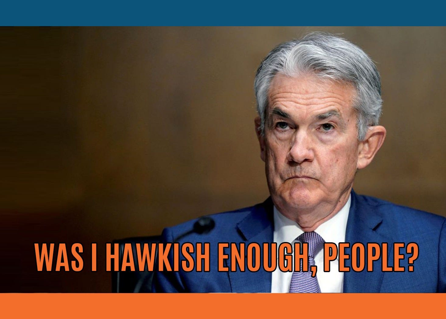
Fed Pivot My A*S
‘‘We will keep at it until we are confident the job (i.e. killing inflation) is done.’’Jerome Powell, Jackson Hole speechHi all, and welcome back on The Macro Compass!Economic data continues to disappoint with some pretty impressive downside surprises in leading, interest-rate sensitive sectors like housing.QT is about to accelerate and the friendly dynamics behind the Fed balance sheet composition which helped risk assets stage a comeback rally in July are likely to fade away in Q4.Nevertheless, we just heard Powell deliver a very decisive speech in Jackson Hole where he stressed out that the Fed won’t be making another mistake: after underestimating inflation in 2021 and delaying the tightening cycle, they will not prematurely stop now.On the other hand, they will keep at it until they are confident the job is done.And getting the job done will come at a great cost for the economy and markets.In this article, we will:* Discuss recent economic data, the impact QT is likely to have from now onwards and how the markets are responding to this very interesting set of macro and monetary policy variables;* Summarize implications for long-term and tactical portfolio allocations.Don’t Fight The FedActually, before we jump right in.As you know I am a supporter of rule-based investing and risk management practices, as they are proven to reduce our innate bias towards emotional decision making.Very often though this approach requires quantitative skills and complicated coding infrastructure which makes popular and successful strategies (e.g. momentum, minimum volatility, risk parity, inflation hedge etc) accessible only to sophisticated investors.The guys at Composer are doing a very good job in democratizing this rule-based investment approach: they empower you to build and backtest your own strategy (at no cost!) and of course to also directly invest in these systematic strategies that minimize emotional decision making.I definitely recommend checking them out - here is the link.Now, back to it: let’s look at the latest set of economic data, the dynamics affecting the Fed balance sheet and how markets are interpreting Powell’s Jackson Hole speech.1. Housing IS The Business Cycle, And It Doesn’t Look GoodHousing activity is slowing down very fast, and it matters.If we also consider the second round spending/activity around the housing market, it accounts for almost 20% of GDP in many countries and its highly leveraged, interest-rate sensitive nature makes it prone to move first when financial conditions and economic cycles are changing - this is why housing is so crucial to the business cycle.The chart below shows the US NAHB Housing Index (orange, inverted on the LHS) against the Unemployment Rate (blue, on the RHS).Big changes in the National Association of Home Builders Index lead turns in unemployment rate by roughly 12 months - with the notable exception being the 2020 pandemic where the global economy was shut down so fast that the housing market couldn't lead the process.With the momentum of US home sales slowing faster than in 2007 (!) due to the terrible affordability of real estate at the moment, the NAHB index just lost 30+ points.Historically, such a drop precedes a 3% jump in Unemployment Rate.If the correlation would hold, that implies US Unemployment Rate above 6% in 2023.Soft landing, you said? :)Aside from housing, also other leading economic indicators keep deteriorating.The US Conference Board ranks the top 10 economic leading indicators and wraps them in a very convenient diffusion index depicted in the chart below.Every time the index prints two or more times below 0, we are already in a full recession - you know, not only a technical one but one that also leads to protracted weakness in the labor market.Once this criteria was met, the index correctly forecasted 5/5 recessions since the ‘80s.The recent trend is clear and the last print was 0: let’s monitor what happens next.In short: tighter monetary and financial conditions take a few months to be fully reflect in leading indicators, and a few quarters to affect hard coincident indicators like the labor market and real consumer spending.It seems we are getting there, and the path after that doesn’t look great either.2. Central Banks’ Balance Sheets DO Matter For MarketsHave we forgotten about QT?As I explained in this primer, QT matters for markets as it generally reduces the amount of interbank liquidity (bank reserves) while adding net collateral (bonds) the private sector needs to absorb at the same time - this has major implication for repo rates and risk taking, more in the article above.But over the past few weeks a very interesting phenomenon occurred: despite ongoing QT, bank reserves actually grew (!).What the heck?When the asset side of the Fed balance sheet shrinks (QT), liabilities must shrink too: but bank reserves aren’t the only liability there - the Treasury General Account (TGA) and Reverse Repos (RRP) are also Fed liabilities.

On The Art Of Macro Portfolio Construction
Global macro and markets are a gigantic puzzle that will always fascinate investors and lure most to believe that in the end we can put all the pieces in the right place and find the Holy Grail of Investing.The reality is different: we will always miss some pieces, and we will often be wrong.The common trait of the best investors and hedge fund managers I can call friends is not having a macro crystal ball, but embracing and living by this simple principle: maximizing the odds (and not the ephemeral feeling of infallibility) of achieving good returns while taking predictable amounts of risk.This is generally achieved via a combination of solid macro skills and by mastering the art of portfolio/trade construction.In this article, we will:Discuss the foundations of how to maximize your odds of success in both strategic asset allocation and tactical trade construction;Look at how some trades sitting in my long-term and tactical portfolios try to reflect these principles given the current macro and market backdrop.How To Maximize The OddsAs we know we will be wrong plenty of times: so how do we structure portfolios to be able to manage risks around these inevitable bumps?There are at least 3 things we need to care about during portfolio/trade construction to maximize our odds of success in this highly unpredictable game called investing.1. Build unbiased & data-driven macro models (and don’t blindly trust them…)Let’s start by postulating that global macro and markets are not a 0-1 binary environment but rather resemble a probabilistic setup with multiple potential outcomes whose odds of materializing vary across time.Every investor has its own subjective probabilistic macro setup that must be weighted against market consensus.My approach to generate one is to craft unbiased, data-driven macro models…and after all the hard work, to not blindly rely on them for investment decisions.For instance, The Macro Compass models use forward-looking macro indicators (e.g. G5 Credit Impulse, and many more) and a prop gauge of the monetary policy stance against neutral (e.g. real rates vs r*, liquidity proxies and others) to grasp the subjective base case macro environment we currently sit in.This is how it looks like today.My model-driven assessment is that the current base case macro environment is a Quadrant 4 setup: economic growth is poised to decelerate further while Central Banks are likely to keep monetary policy and liquidity tighter than equilibrium levels.This has historically been a very poor setup for risk-adjusted real returns across asset classes.And yet, I am overweight long-end bonds in my structural long-term portfolio and I am not indiscriminately max short everything in my tactical book: why?Because to maximize our odds we can’t build portfolios solely relying on our own subjective assessment - we need to consider at least 2 more things.2. Find your opponent’s (i.e. the market’s) weak spotsMany investors forget this is a relative, not an absolute exercise.Your aim should be to find the best risk/reward setups in the relative discrepancies in cross-asset valuations between what your assessment suggests and what markets are discounting.For instance: if your subjective assessment suggests there is a high probability the Fed will have to cut rates to 0% and the market is already discounting the very same probabilistic setup, you wouldn’t be maximizing your odds by adding that trade to your book.For a strategic, long-term investor this relative assessment can be performed by looking at valuations and probability distributions.On June 23rd, I bought 10y+ European and US Treasury bonds (see here) for my structural portfolio even though The Macro Compass model would not suggest the best possible setup for this investment yet: why?Because as the chart above shows, markets were pricing the ECB to remain in restrictive territory (above my estimate of neutral rate) for more than a decade to come although the economy is already weakening very hard: even accounting for an error band in my estimate of EUR neutral rate, this very large discrepancy was hard to ignore.Another way to think about this is to look at probability distributions: if you are able to identify an overly distorted one and anticipate how/when markets are going to normalize it, you have an edge.The picture above shows the premium and payoff of a CADJPY 1-year digital option.Don’t worry, it’s really simple - bear with me.The option requires you to pay CAD 80k upfront to get a final payoff worth CAD 1 million if CADJPY drops 20% or more and hence trades at or below 80.526 (spot = 104.77) in 1 year from now or otherwise you’ll lose your premium.The strike has been chosen to be 20% out of the money as this roughly compares with a 2 standard deviation move in one year - a theoretical 5% probability.Given that you pay CAD 80k upfront and your final potential payoff is worth CAD 1 million, this means markets are pricing in a 8% probability instead.Using d