
Data Stories
170 episodes — Page 2 of 4

Ep 120120 | Data Science and Visualization with David Robinson
We have David Robinson on the show to talk about the role of data visualization in data science.
Ep 119119 | Color with Karen Schloss
Karen Schloss, Assistant Professor at the University of Wisconsin Madison, joins us on the show to talk about color.
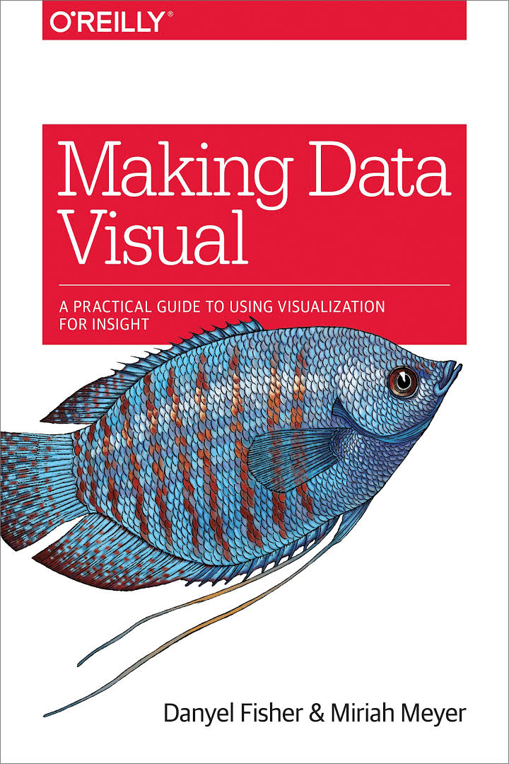
Ep 118118 | Making Data Visual with Miriah Meyer and Danyel Fisher
We have Miriah Meyer (University of Utah) and Danyel Fisher (Microsoft Research) on the show to talk about their new book "Making Data Visual".
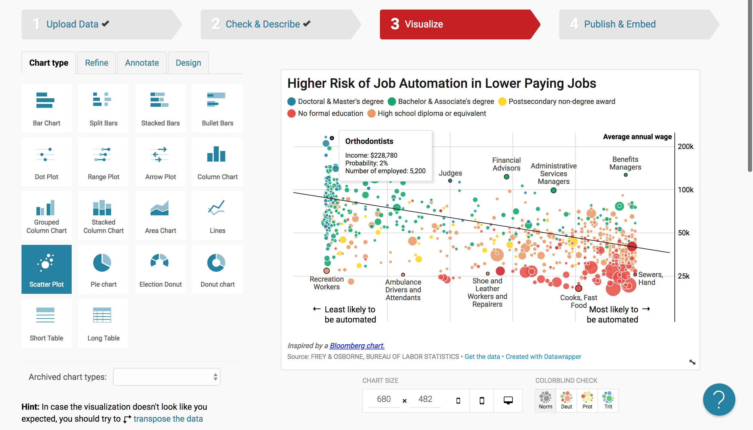
Ep 117117 | Datawrapper with Lisa C. Rost and Gregor Aisch
We have Lisa C. Rost and Gregor Aisch on the show to talk about the exciting work they are doing at Datawrapper.

Ep 116116 | Cognitive Bias and Visualization with Evanthia Dimara
We talk with Evanthia Dimara about cognitive bias and the role it plays in visualization.

Ep 115115 | Human-Driven Machine Learning with Saleema Amershi
Saleema Amershi, Researcher at Microsoft Research AI, joins us on the show to discuss Interactive Machine Learning and how it connects to data visualization.

Ep 114114 | Machine Learning for Artists with Gene Kogan
We have Gene Kogan on the show to talk about the use of machine learning in art and visualization.

Ep 113113 | What Makes A Visualization Memorable? with Michelle Borkin
We have Michelle Borkin from Northeastern University on the show to talk about her research on data viz memorability.

Ep 112112 | Data Pottery with Alice Thudt
Alice Thudt makes pottery — such as cups, plates, or teapots — that show data! Her project Life in Clay started off as a twist on a hobby, and has since become part of her PhD research on personal data visualization.
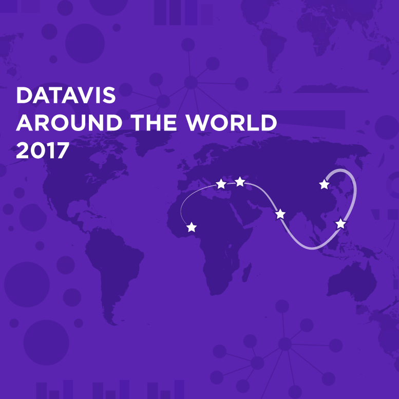
Ep 111111 | Data Vis Around The World in 2017
We go around the world to discover what has happened in vis in 2017.

Ep 110110 | What's Going On In This Graph? with Michael Gonchar and Sharon Hessney
We have Sharon Hessney (American Statistical Association) and Michael Gonchar (New York Times Learning Network) on the show to talk about the New York Times project called "What's Going On In This Graph?".

Ep 109109 | Feminist Data Visualization with Catherine D’Ignazio
We have Catherine D'Ignazio on the show this week to talk about feminist data visualization.

Ep 108108 | Review of IEEE VIS’17 with Jessica Hullman and Robert Kosara
We have Jessica Hullman from UW and Robert Kosara from Tableau Software on the show to share highlights from the IEEE VIS 2017 conference.
Ep 107107 | Visualizing Bitcoin with Dan McGinn
We talk with Dan McGinn about a bitcoin visualization project developed at Imperial College in London.

Ep 106106 | Data Sculptures with Adrien Segal
We have sculptural artist Adrien Segal on the show to talk about her data sculptures.

Ep 105105 | Data Visualization at Twitter with Krist Wongsuphasawat
We have data visualization scientist Krist Wongsuphasawat on the show to talk about data visualization at Twitter.
Ep 104104 | Visualization Literacy in Elementary School with Basak Alper and Nathalie Riche
We have Basak Alper and Nathalie Riche on the show to talk about "C'est La Vis," their project dedicated to teaching visualization to elementary school kids.

Ep 103103 | Explorable Explanations with Nicky Case
We have Nicky Case on the show to talk about "explorable explanations," interactive simulations that help people understand complex issues.

Ep 102102 | Understanding Comics and Visual Storytelling with Scott McCloud
We have famous cartoonist and comics theorist Scott McCloud on the show to talk about making comics, storytelling, virtual reality and what vis people can learn from comics.
Ep 101101 | Surprise Maps with Michael Correll and Jeff Heer
We talk with Michael Correll and Jeff Heer about their new Surprise Maps: maps that display surprise about a dataset rather than the raw data itself.

Ep 100100 | Data Stories 100!!!
Data Stories celebrates its 100th episode! We review some of the most successful episodes, talk about the major categories of episodes, and recollect some funny moments from recording the show. We also have a surprise segment where we reveal the "behind the scenes" of Data Stories.

Ep 9999 | Data Visualization at Capital One with Kim Rees and Steph Hay
We have Kim Rees and Steph Hay on the show to talk about Kim's new position as Head of Data Visualization at Capital One.

Ep 9898 | Data Sketches with Nadieh Bremer and Shirley Wu
We meet Nadieh Bremer and Shirley Wu to talk about their 12-months collaboration Data Sketches.

Ep 97097 | Calling Bullshit with Carl Bergstrom and Jevin West
Carl Bergstrom and Jevin West, two professors at the University of Washington, talk about their new course on "Calling Bullshit".

Ep 9696 | Innovation from Research with Jarke Van Wijk
We have Jarke Van Wijk from Eindhoven University of Technology on the show to talk about the many innovative visualizations developed in his lab.

Ep 9595 | Challenges of Being a Vis Professional in Industry with Elijah Meeks
This week, we have Elijah Meeks on the show to talk about the state of data visualization jobs in the industry.

Ep 94094 | Uncertainty and Trumpery with Alberto Cairo
We have Alberto Cairo from the University of Miami on the show to talk about partisanship and rhetoric, visualizing uncertainty and risk, cognitive biases, and much more.
Ep 9393 | OddityViz with Valentina D’Efilippo and Miriam Quick
We have designer Valentina D’Efilippo and researcher Miriam Quick on the show to talk about their recent project OddityViz, a series of data visualizations of "Space Oddity," the famous song of David Bowie.

Ep 9292 | A Tribute to Hans Rosling
We asked 5 visualization experts to record an audio snippet to talk about how Hans Rosling influenced and impacted their work.

Ep 9191 | Visualizing Data with RAW
We have on the show three funders of RAW, the open-source interactive data visualization tool, to talk about their experience developing and promoting a data visualization application.

Ep 90090 | Beyond the Chart with Brendan Dawes
We have Brendan Dawes on the show to talk about his amazing data art installations.

Ep 89089 | Data Vis Around the World in 2016
In this 2016 year review episode, we interview 6 visualization experts from 6 different countries. There is a lot to learn about data visualization around the world! Wishing a Happy Holidays and a Happy New Year to all our listeners!

Ep 8888 | Re-designing Visualizations on #MakeoverMonday with Andy Kriebel and Andy Cotgreave
We have Andy Kriebel, Head Coach at The Information Lab, and Andy Cotgreave, Technical Evangelist at Tableau, on the show to talk about their social web series, #MakeoverMonday, in which people redesign an existing visualization every week.

Ep 8787 | VizKidz: Books on Data Visualization for Kids
We have Abigail Ricarte and Liv Buli on the show to talk about their Kickstarter project, VizKidz, an illustrated book series to teach kids about data visualization.

Ep 8686 | Highlights from IEEE VIS'16 with Jessica Hullman and Robert Kosara
Enrico meets Jessica Hullman and Robert Kosara at IEEE VIS'16 conference to talk about the main highlights.

Ep 8585 | Machine Bias with Jeff Larson
Jeff Larson from ProPublica joins us to talk about his work on bias found in automated algorithms that compute the recidivism scores of convicted criminals.

Ep 8484 | Statistical Numbing with Paul Slovic
We talk with Prof. Slovic about "Statistical Numbing," the inability of numbers and statistics to convey a sense of scale of human tragedies and to elicit compassion.

Ep 8383 | Olympic Feathers with Nadieh Bremer
We have Nadieh Bremer (a.k.a Visual Cinnamon) on the show to talk about her latest project "Olympic Feathers," an interactive data visualization to show the history of olympic medals.

Ep 82082 | Information+ Conference Review
Moritz and Enrico review three selected talks from the Information Plus Conference.

Ep 81081 | The Hustle with Mahir Yavuz and Jan Willem Tulp
How do you make a living out of data viz? We have Mahir Yavuz and Jan Willem Tulp on the show to talk about navigating the business side of data visualization.

Ep 8080 | Indexical Visualization with Dietmar Offenhuber
We have Dietmar Offenhuber, Assistant Professor at Northeastern University, on the show again to talk about “Indexical Visualizations”: visualizations that reduce the gap between the recorded phenomenon and its representation. On the show we talk about strategies to define and build indexical visualizations. Dietmar provides numerous examples, including thermometers, tree rings, petri dishes, and the blinking lights in your router. He also offers tips on experimenting with this kind of visualization and connecting to the indexical vis community.

Ep 7979 | Information Design with Isabel Meirelles
We talk with Isabel Meirelles, Professor in the Faculty of Design at OCAD University in Toronto, about her book "Design for Information" and Information Plus, the data visualization conference she organized in June.

Ep 78078 | Mimi Onuoha on Visualizing People's Lives through Mobile Data
This week Mimi Onuoha joins Moritz on the show for a project episode from the Eyeo Festival. Mimi is a Brooklyn-based artist and researcher, and currently a Fellow at the Data & Society Research Institute. Mimi is fascinated by the moment when data get collected -- by what can be captured in that moment, and what goes unseen. As a Fulbright-National Geographic Fellow, Mimi developed Pathways, a data storytelling project on a month's worth of mobile data from a small group of Londoners. Using a quasi-ethnographic approach, the project reflects not only the individuals' mobile metadata, but also their experiences becoming data subjects. On the show, we discuss Mimi's process recruiting both friends and strangers to become her data subjects, her experience developing personal relationships with each of them, and their reaction to the final product. LINKS Fulbright-National Geographic Fellowship Data and Society Research Institute Open Paths app Moves app owned by Facebook Reveal.js slideshow software

Ep 7777 | Polygraph and The Journalist Engineer Matt Daniels
We have Matt Daniels on the show, the "journalist engineer" behind Polygraph, a blog featuring beautiful journalistic pieces based on data. If you are not familiar with the site, stop now and take a look. Matt starts with a simple question -- for example, what songs from the '90s are still popular? -- and tries to answer it through data analysis and visualization. The result is always a well-crafted web page and applications, with a mix of data analysis, interactive graphics, and explanations. On the show we talk specifically about two projects: "The most timeless songs of all-time," in which Matt analyzes song popularity from Spotify data, and "Film Dialogue from 2,000 screenplays, Broken Down by Gender and Age," in which he examines movie dialogues as a way to dig deeper into gender biases in the film industry. LINKS Matt Daniels Matt’s Medium article “The Journalist Engineer” Project: "The largest vocabulary in Hip Hop" Project: "How music taste evolved" Project: "The most timeless songs of all-time" Project: "Film Dialogue from 2,000 screenplays, Broken Down by Gender and Age"

Ep 7676 | Bocoup and OpenVis Conference
We talk with the data visualization team from Bocoup about how they work with groups to create open-source data visualization software. We also discuss the OpenVis Conference that they organize each year.

Ep 7575 | Listening to Data From Space with Scott Hughes
Astrophysicist Scott Hughes from MIT plays the sounds of colliding black holes and explains what they mean.

Ep 74074 | Data Ethics and Privacy with Eleanor Saitta
Eleanor is Etsy’s new Security Architect and "a hacker, designer, artist, writer, and barbarian." We talk with Eleanor about how to deal with data ethics and privacy.

Ep 73073 | Kim Albrecht on Untangling Tennis and the Cosmic Web
Kim is a visualization researcher and information designer. He currently works at the Center for Complex Network Research, the lab led by famous network physicist László Barabási. Kim works in a team of scientists to create effective and beautiful visualizations that explain complex scientific phenomena. In the show we focus on Untangling Tennis, a data visualization project aimed at explaining the relationship between popularity and athletic performance. We also talk about his more recent project, the Cosmic Web, which visualizes 24,000 galaxies and their network of gravitational relationships. Enjoy the show! This episode of Data Stories is sponsored by Qlik, which allows you to explore the hidden relationships within your data that lead to meaningful insights. Make sure to check out the blog post listing Visualization Advocate Patrik Lundblad’s favorite data visualization pioneers. You can try out Qlik Sense for free at qlik.de/datastories. LINKS Kim Albrecht: http://kimalbrecht.com/ Untangling Tennis: http://untangling-tennis.net/ The Cosmic Web: http://cosmicweb.barabasilab.com/ D3.js: https://d3js.org/ three.js, a javascript library for 3D vis: http://threejs.org/ Ben Shneiderman’s The New ABC of Research: http://www.cs.umd.edu/hcil/newabcs/ Peter Galison's Image and Logic: http://www.amazon.com/Image-Logic-Material-Culture-Microphysics/dp/0226279170 Peter Galison’s “Images Scatter Into Data, Data Gathers Into Images”: http://www.ann-sophielehmann.nl/content/docs/grgalison.pdf

Ep 72072 | Jeff Heer on Merging Industry and Research with the Interactive Data Lab
Jeff Heer is Associate Professor at the University of Washington, co-creator D3.js and co-funder of Trifacta. We talk about software infrastructure, Trifacta, and the interplay between research and industry.

Ep 7171 | Tapestry Conference Review with Robert Kosara
This is a special edition from Tapestry, the conference on Data Storytelling that gathers visualization experts, journalists, designers, NGOs, academics, etc. Enrico sits together with Robert Kosara to talk about the conference, the keynotes, some of the short stories talk, and how to participate to future editions of Tapestry.