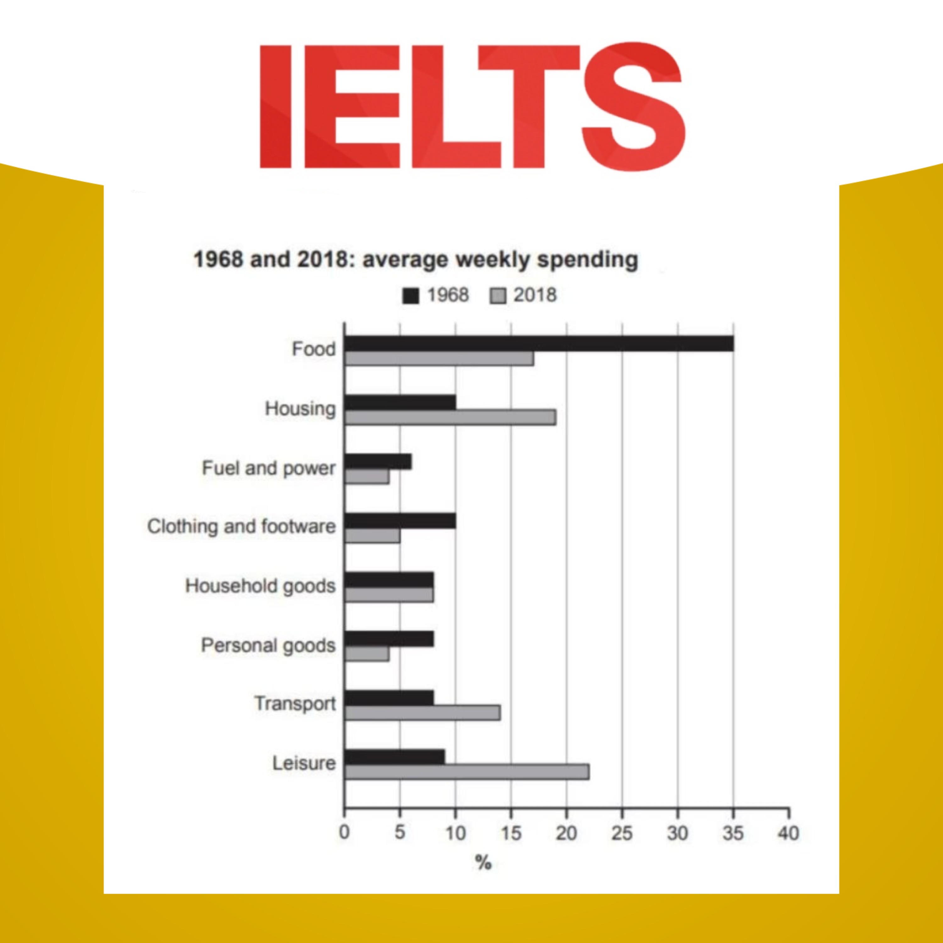
📊 Bar chart: Comparing the average percentages of income spending in two years which are fifty years apart
Prepare for IELTS and have fun along the way!
IELTS Writing for Success · Success with IELTS
Audio is streamed directly from the publisher (sphinx.acast.com) as published in their RSS feed. Play Podcasts does not host this file. Rights-holders can request removal through the copyright & takedown page.
Show Notes
The bar chart provides information about how families in a country spent weekly income in both 1968 and 2018.
Summaries the information by selecting and reporting the main features, and make comparisons where relevant.
Write at least 150 words.
-
Get full episodes of our IELTS Writing Task 1 and 2 episodes: https://linktr.ee/ieltswfs
Maria's IELTS writing course: https://course.yourielts.net/ielts-writing-course
Listen to our IELTS Speaking podcast: https://linktr.ee/ieltssfs
Our social media: https://linktr.ee/successwithielts
© 2021 Success with IELTS
Hosted on Acast. See acast.com/privacy for more information.