Boagworld: UX, Design Leadership, Marketing & Conversion Optimization
Paul Boag, Marcus Lillington · Paul Boag
Show overview
Boagworld: UX, Design Leadership, Marketing & Conversion Optimization has been publishing since 2005, and across the 21 years since has built a catalogue of 578 episodes, alongside 7 trailers or bonus episodes. That works out to roughly 540 hours of audio in total. Releases follow a fortnightly cadence, with the show now in its 27th season.
Episodes typically run thirty-five to sixty minutes — most land between 50 min and 1h 3m — and the run-time is fairly consistent across the catalogue. None of the episodes are flagged explicit by the publisher. It is catalogued as a EN-language Business show.
The show is actively publishing — the most recent episode landed 1 months ago, with 8 episodes already out so far this year. The busiest year was 2009, with 48 episodes published. Published by Paul Boag.
From the publisher
Boagworld: The podcast where digital best practices meets a terrible sense of humor! Join us for a relaxed chat about all things digital design. We dish out practical advice and industry insights, all wrapped up in friendly conversation. Whether you're looking to improve your user experience, boost your conversion or be a better design lead, we've got something for you. With over 400 episodes, we're like the cool grandads of web design podcasts – experienced, slightly inappropriate, but always entertaining. So grab a drink, get comfy, and join us for an entertaining journey through the life of a digital professional.
Latest Episodes
View all 578 episodesFrom Doer to Director, Getting Value From AI
AI Can Fix Your Broken Research Repository
From Doer to Director: The AI Mindset Shift
Why UX Teams Need a Maturity Audit Right Now
AI Is Showing UI Designers the Door
S27 Ep 32Website Rebuilds, AI Tools, and UX in 2026
This month, Paul and Marcus get into a tool that has made Paul cancel his Figma subscription, walk through how Paul has completely changed the way he approaches website rebuilds thanks to AI, and round things off with the latest thinking from Nielsen Norman Group on where UX is heading in 2026. App of the Week: figr.design Paul has been road-testing AI design tools as part of a workshop he ran on AI and UI, and after going through dozens of them, one stood out: figr.design. What makes it work where others fall short? A few things. It lets you feed in a significant amount of context upfront, things like style guides, design systems, and personas, which means the output is far more tailored than the generic average you often get from AI design tools. Iteration is also genuinely fast. You can queue up a whole list of changes and it processes them all in one go, rather than making you wait between each tweak. The prototypes it produces are more realistic than what you would typically get out of Figma. Text fields you can actually type in, accordion states that open and close, button states, fully responsive layouts. Not exactly revolutionary in theory, but refreshingly functional in practice. Export to Figma is available when you need it. The main limitation is that you cannot manually adjust elements yourself. Everything goes through the conversational interface. Paul has also been looking at a tool called Inspector, which runs locally and connects to the Claude API so you pay as you go rather than a flat monthly token allocation. It has been a bit fiddly to set up but worth keeping an eye on. For anyone regularly using Figma for wireframing and prototyping, it is worth giving figr.design a proper look. The shift Paul describes, from hunching over Figma to leaning back and having a conversation with the tool, is a fairly good summary of where this kind of work is heading. Rebuilding a Website in 2026 Paul has fundamentally changed how he approaches website rebuilds, and the shift is largely down to AI making a genuinely hard problem, getting good content onto a website, a lot easier. The old problem Website rebuilds have traditionally meant migrating existing content into a new design. Which sounds fine until you remember that most of that content was written by subject matter experts who know their field but have never thought about writing for the web. The result is pages that lecture rather than help, that bury the things users actually want to know, and that rarely arrive on time, because the content phase is almost always where projects stall. Why things are different now AI has changed three things meaningfully. First, generating content is no longer the enormous manual effort it used to be. Second, doing the research that informs good content, finding out what users actually ask, worry about, and need, is much simpler with tools like Perplexity. Third, AI-powered search engines are pushing toward a more question-oriented approach to content anyway, which makes getting this right more important than it used to be. How Paul works now Here is the process Paul walks through for a rebuild project. 1. Online research Using Perplexity, Paul researches the audience. For a well-known client, he'll ask specifically about them. For a smaller or niche client, he looks at the sector. He is looking for the questions people are asking, the tasks they are trying to complete, their objections, goals, and pain points. This takes about 10 minutes. 2. Personas The research output goes into AI, which identifies patterns and segments it into a set of personas. A couple of hours of back and forth to get these right. 3. Company overview Paul records his kickoff meeting with the client and points AI at the transcript. Out comes a clean summary of what the company does, its products and services, and how it talks about itself. An hour for the meeting, plus 10 minutes for the summary creation. 4. Top task analysis and information architecture If time and budget allow, Paul runs a formal top task analysis, collecting and prioritizing the questions users most want answered. For card sorting, he uses UX Metrics. If there is no time for that, AI brainstorms the top tasks from the personas and company overview. Either way, those tasks get fed into an AI-generated information architecture. 5. Building out the IA Paul builds the IA in the CMS or in Notion, assigning the relevant tasks and questions to each page. Stakeholders can see the structure and understand what each page is there to do before a word of copy is written. 6. Getting stakeholders to contribute Rather than asking stakeholders to write content (a recipe for delays), Paul asks them to do two simpler things for each page: bullet-point answers to the questions assigned to that page, and any other talking points they want included. Bullets only. No pressure to write. 7. Writing the content with AI This is where it all comes together. Paul sets up an AI project with four inpu
S27 Ep 31From Agency Work to Product Success
This episode we're joined by Stu Green, a product designer, agency founder, and serial app builder who's sold not one but two successful SaaS products.We dig into the realities of building your own product versus running an agency, the role AI plays in modern product development, and whether the flood of AI-built apps is a threat or an opportunity for professionals.Plus, we check out Bleet, an app that turns your meeting transcripts into social media content, and Paul shares how AI-powered personas are changing the way he approaches user research.App of the Week: BleetYou know you should be posting on LinkedIn. You've told yourself that every week for the past 6 months. But then you sit down, stare at the blank post box, and realize you have absolutely no idea what to write about. So you close the tab and promise yourself you'll do it tomorrow. You won't.Bleet is an app built by Stu Green (and collaborator Nick) that solves this by mining the conversations you're already having. It takes your meeting recordings and transcripts, extracts the key topics using AI, and helps you turn them into social media posts. And the thing that sets it apart from just asking ChatGPT to write something for you is that it pulls your actual words and phrases from the conversation, piecing them together into posts that genuinely sound like you rather than generic AI slop.How It WorksYou connect your meeting recordings or transcripts (or even just speak a thought into the app), and Bleet will surface a list of topics you covered. From there, you pick the ones you want to post about and hit "create." You can dial in how much creative liberty the AI takes, from near-verbatim to lightly polished.So you sit down for 10 minutes once a week, pick a handful of topics, schedule them up, and you're done. A single meeting can generate enough content for almost a week of daily posts.What About Client Confidentiality?The number one concern people raise is about sharing sensitive client information. Bleet strips out client names, specific people, and identifiable details. It focuses on the general topic and the ideas discussed, not the specifics of who said what in which meeting. And of course, you review everything before it goes anywhere, so if something feels too close to the bone, you just skip it or edit it.Topic of the Week: Building Products vs. Running AgenciesStu Green has lived both lives. He's run agencies, built products from scratch, and sold 2 SaaS businesses. So what's the difference between building for clients and building for yourself? Quite a lot, as it turns out.Start by Solving Your Own ProblemBoth of Stu's successful apps, a project management tool and HourStack (a time management app), started the same way: he needed something that didn't exist. The project management tool grew out of running his own consultancy. HourStack came from juggling small children and fragmented work hours, and wanting a way to visualize and stack little blocks of productive time.If you're genuinely your own best customer, there's a good chance others like you exist. And if even 2 or 5 or 10 of them show up, you've got the start of something real.The Myth of "I One-Shotted This"AI has made it dramatically easier to build apps, but Stu is refreshingly honest about the gap between a demo and a product. Sure, he cloned entire apps in a single prompt and it looked great. But behind that impressive facade? Hours of iteration, hosting setup, video infrastructure, S3 servers, and a stack of decisions that require real product-building experience.The people posting "I built this in one shot" on X are technically telling the truth, but they're showing you the Hollywood set, not the house behind the door. Getting from prototype to something you can actually charge money for still takes professional knowledge. You need to know what questions to ask, which answers are good, and when you're being led down a rabbit hole.Two Tiers of AI ToolsPaul and Stu landed on a useful mental model: there are essentially 2 categories of AI building tools.Tools for everyone: Platforms like Lovable or Figma Make that let anyone create a basic app or prototype. Great for personal use, proof of concepts, and quick experiments.Tools for professionals: Things like Cursor and Claude Code that enhance a developer's ability to build production-quality software faster and better, but still require real expertise to use well.Think of it like desktop publishing in the '90s. When it arrived, everyone panicked that graphic designers were finished. Instead, regular people made terrible flyers with Comic Sans, and the professionals used the same tools to produce better work, faster. AI-built apps are following the same pattern.The 3-Stage Development ModelPaul offered a framework for thinking about where AI fits in the build process:Prototype and proof of concept: Anyone can do this with AI tools. Great for validating ideas quickly and cheaply.The production build: This still needs a pr
S27 Ep 30The UX Reckoning: What 2026 Holds for Our Industry
In this episode, we kick off 2026 with a candid look at where the UX industry stands and where it's heading. We dig into a thought-provoking article from Nielsen Norman Group, share our hopes (and fears) for the year ahead, and explore a fantastic design pattern catalog focused on building user trust. Plus, we discuss why generalists might just be the unicorns the industry needs right now.Topic of the Week: Preparing for 2026 and the UX ReckoningWe spent a good chunk of this episode discussing an article from the Nielsen Norman Group that, while technically published in early 2025, remains just as relevant today. Written by Kate Morin, Sarah Gibbons, and others at NNGroup, it tackles the challenges facing our industry head-on.UX Is Back on the Chopping BlockLet's not sugarcoat it. It's been a tough time for UX professionals. Layoffs have hit hard, particularly in the US, and there's a palpable sense of doom and gloom floating around LinkedIn and other professional spaces. We've seen this before, though. We set up Headscape right in the middle of the dot-com bust, after being laid off ourselves. It wasn't fun, but times like these have a way of separating the wheat from the chaff.Economic downturns tend to clear out people who jumped into UX because they saw easy opportunities, leaving behind those with genuine understanding and passion for the work. And despite all the negativity online, the World Economic Forum actually ranked UX design as one of the 8th fastest-growing industries. So the discipline itself isn't dying. There's just been a mismatch between the number of people entering the field and the reality of what the market can absorb.The Rebranding Debate Is a Red HerringSome people are suggesting we rebrand UX to "product design" or "experience design" to solve our problems. We don't think that's the answer. The word "design" does carry some baggage. In many business minds, it's seen as a luxury rather than a business-critical function. So when budgets get tight, "design" gets cut while "conversion optimization" and "customer retention" survive. That's a perception problem, not a naming problem.The real issue is that there are too many low-quality UX practitioners who've been churned out through bootcamps. They've been taught a process to follow, and they follow it come what may. That's not their fault; they were taught that way. But six months of bootcamp doesn't prepare you for the messy, contextual reality of actual UX work.The AI ReckoningThe negativity around AI on LinkedIn has been phenomenal lately. There's anger about "AI slop" and a general feeling that it's no good for anything. Paul posted about using AI to help create personas and do online research, and got absolutely slated for it.AI is just a tool. Like any tool, if you use it badly, you get bad results. If you use it well, it can be genuinely helpful. The good news is that we're finally moving past the "AI for AI's sake" phase. We're starting to see thoughtful integration of AI into products and services, AI that actually solves real user needs.Every technology goes through the same cycle. Remember video recorders? First, we were just amazed the technology worked at all. Big analog buttons, you started recording and stopped recording, and that was it. Then manufacturers added more and more features until the things became unusable with their tiny buttons and complicated preset systems. Then someone invented a code you could enter from the Radio Times to set recording times automatically. And finally, Sky came along with "press a button and it records." AI is going through that exact same evolution right now.Shallow UX Is Suffering (and That's Okay)Templates, processes, production-line UX: that stuff is really struggling, and it will continue to struggle. AI can do that now. You're not going to make money or build a career by blindly following the double diamond and churning out deliverables.What you need going forward are distinctly human skills: critical thinking, taste, knowing whether something is heading in the right direction, and navigating messy organizational dynamics. Those are the skills that matter. Soft skills like relationship building, facilitation, and empathy are going to be far more valuable than whether you can use Figma.Stop Worshipping Templates and ProcessesUX is messy. You can't box it up the same way on every project. Templates and checklists are great starting points, but they're not a substitute for thinking. Context is everything.There's no such thing as best practice. When someone from Google or Facebook says you need a 6-week discovery phase with facilitated usability testing of at least 6 people, and sure, that probably worked great for their situation, with their team, their product, and their stakeholders. But it doesn't mean it's right for your startup or your client with a third of the budget and massive internal politics.If you've been taught a linear process, shift your mindset. Don't have a process

S27 Ep 29Surviving Crisis: Lessons from Higher Ed's Financial Storm
In this episode, we welcome back Andrew Millar from the University of Dundee to discuss the current state of higher education, vibe coding platforms for non-developers, and the importance of community-driven conferences like Scottish Web Folk.App of the Week: Bolt.newThis week we're looking at Bolt.new, a vibe coding platform designed specifically for non-developers. Unlike tools like Cursor that are built for developers to pair program with AI, Bolt is aimed at people like marketers, designers, and small business owners who want to create functional applications without ever touching code.Paul has been using Bolt to build practical tools for his own business, including a custom top task analysis app, WordPress plugins, JavaScript extensions, and CSS animations. The platform handles everything from the database to publishing and hosting, making it genuinely accessible for non-technical users.However, we'd caution against treating these tools as production-ready for enterprise use. They're excellent for prototyping, internal tools, and small-scale applications, but they likely won't pass rigorous quality control in larger organizations. Think of them like desktop publishing was in the early days. They democratize creation but don't eliminate the need for professional expertise.For production-ready code, the real value comes when developers use AI pair programming tools where they can review, understand, and quality-check the output. The future likely involves professionals using these tools to increase productivity rather than replacing expertise entirely.Topic of the Week: The State of Higher Education and Digital TransformationAndrew Millar, who runs the digital team at Dundee University, joins us to paint an honest picture of the current higher education landscape. It's not pretty, but his candid insights offer valuable lessons for anyone navigating organizational crisis, whether in universities or elsewhere.The Perfect Storm Facing UniversitiesHigher education has always claimed poverty, but the structural problems have become impossible to ignore. Universities face two fundamental financial challenges: funding per student hasn't kept pace with inflation over the past decade, and research grants typically only cover around 80% of actual costs, leaving institutions to make up the difference.International students became the solution to plug this gap. They could be charged higher fees and effectively cross-subsidized teaching for domestic students and research activities. This worked until a perfect storm hit: COVID disruptions, international conflicts, hostile government rhetoric toward international students, and for Dundee specifically, the Nigerian economy's collapse, which dramatically reduced one of their key international markets.Dundee found themselves with a 30 million pound deficit. Within a year, the principal resigned, the entire executive changed, the Scottish government stepped in with emergency funding, and 500 staff members have left from a workforce of around 3,000.The Three Phases of Crisis ManagementAndrew outlined three distinct phases organizations go through during financial crisis, and his framework offers practical guidance for anyone facing similar situations.Phase 1: Cut, Cut, CutWhen crisis hits, budgets get slashed, often multiple times. Andrew recommends categorizing everything into three buckets: what's absolutely critical to keep the lights on, what will hurt but won't cause lasting harm, and what's easy to eliminate. This is actually an opportunity to clear out legacy systems and processes that nobody uses but somehow persist.The challenge is that during this phase, people aren't open to change or new ways of working. They just want to see the existing stuff cut. Don't waste energy trying to introduce innovations here. Focus on strategic pruning.Phase 2: The Great Spaghetti Flying ContestThis is where everyone becomes an expert on how to solve the crisis. Phrases like "we should at least try it" and "isn't it good to test ideas?" fly around constantly. The problem is that these are the exact phrases digital teams have been using for years to encourage experimentation, now thrown back at them by people with competing priorities.Governance structures become critical here. You can clarify requests (ensuring they're truly worth pursuing), compromise on scope, or clog them up in committees until priorities become clearer. When your escalation paths have collapsed, as they did at Dundee when leadership departed, you're left justifying decisions without backup.The key insight: never say "computer says no" via email. Have conversations. Explain your reasoning. When people understand the constraints, they typically accept them. Email refusals just get escalated to whoever shouts loudest.Phase 3: The Big SqueezeWith less money, fewer people, less institutional knowledge, and no clear strategy, this phase is when things get really difficult. But paradoxically, it's also when people bec

S27 Ep 28E-commerce UX Secrets: What 200,000 Hours of Research Reveals About Conversion
If you run an e-commerce site or work on digital products, this conversation is packed with research-backed insights that could transform your conversion rates.Apps of the WeekBefore we get into our main discussion, we want to highlight a couple of tools that caught our attention recently.UX-Ray 2.0We talked about this last week, but it deserves another mention. UX-Ray from Baymard Institute is an extraordinary tool built on 150,000 hours (soon to be 200,000 hours) of e-commerce research. You can scan your site or a competitor's URL, and it analyzes it against Baymard's research database, providing specific recommendations for improvement.What makes UX-Ray remarkable is its accuracy. Baymard spent almost $100,000 just setting up a test structure with manually conducted UX audits of 50 different e-commerce sites across nearly 500 UX parameters. They then compared these line by line to how UX-Ray performed, achieving a 95% accuracy rate when compared to human experts. That accuracy is crucial because if a third of your recommendations are actually harmful to conversions, you end up wasting more time weeding those out than you saved.Currently, UX-Ray assesses 40 different UX characteristics. They could assess 80 parameters if they dropped the accuracy to 70%, but they chose quality over quantity. Each recommendation links back to detailed guides explaining the research behind the suggestion.For anyone working in e-commerce, particularly if you're trying to compete with larger players, this tool is worth exploring. There's also a free Baymard Figma plugin that lets you annotate your designs with research-backed insights, which is brilliant for justifying design decisions to stakeholders.SnapWe also came across Snap this week, which offers AI-driven nonfacilitated testing. The tool claims to use AI personas that go around your site completing tasks and speaking out loud, mimicking user behavior.These kinds of tools do our heads in a bit. On one hand, we're incredibly nervous about them because they could just be making things up. There's also the concern that they remove us from interacting with real users, and you don't build empathy with an AI persona the way you do with real people. But on the other hand, the pragmatic part of us recognizes that many organizations never get to do testing because management always says there's no time or money. Tools like this might enable people who would otherwise never test at all.At the end of the day, it comes down to accuracy and methodology. Before using any such tool, you should ask them to document their accuracy rate and show you that documentation. That will tell you how much salt to take their output with.E-commerce UX Best Practices with Christian HolstOur main conversation this month is with Christian Holst, Research Director and Co-Founder of Baymard Institute. We've been following Baymard's work for years, and having Christian on the show gave us a chance to dig into what nearly 200,000 hours of e-commerce research has taught them about conversion optimization.The Birth of Baymard InstituteChristian shared the story of how Baymard started about 15 years ago. His co-founder Jamie was working as a lead front-end developer at a medium-sized agency, and he noticed something frustrating about design decision meetings. When the agency prepared three different design variations, the decision often came down to who could argue most passionately (usually the designer who created that version), the boss getting impatient and just picking one, or the client simply choosing their favorite.Rarely did anyone say they had large-scale user experience data to prove which design would actually work better. They realized they could solve this problem by testing general user behavior across sites and looking for patterns that transcend individual websites. If they threw out the site-specific data and only looked for patterns across sites, they could uncover what are general user behaviors for specific UI components and patterns.It started with just checkout flows. It wasn't even clear they would ever move beyond that. But now, 15 years later, Baymard has a team of around 60 people, with 35 working full-time on conducting new research or maintaining existing research.The Role of Research-Backed GuidelinesOne important point Christian emphasized is that Baymard's research isn't meant to replace your own internal testing. You should always do your own data collection and usability testing. The point of having a large database of user behavior and test-based best practices is that when you're redesigning something, you have maybe 100 micro decisions to make. You can't run internal tests for every single one of those decisions.Even Fortune 500 companies that have the budget don't have the time to wait for results on every micro decision. So what happens is you collect research on the two or three big things that are site-specific or unique to your brand or customer demographic. But all

S27 Ep 27Freelancing for Small Businesses: Real World Budget Constraints and High Stakes
Welcome to Episode 27 of the Boagworld Show, where we dive into a side of web work that doesn't get nearly enough attention. This month, we're exploring life as a freelancer working with small businesses. We're joined by Paul Edwards, a fellow member of the Agency Academy who has spent two decades serving clients that don't have massive budgets or sprawling marketing teams. If you've ever wondered how best practice advice translates to the real world of limited resources and high stakes, this conversation is for you.App of the Week: Baymard UX-RayBefore we get into our main conversation, we need to talk about an extraordinary tool that just launched. Baymard UX-Ray is built on the Baymard Institute's 150,000 hours of ecommerce research. If you're not familiar with Baymard, they've been conducting rigorous usability research for years, building an enormous repository of what actually works in ecommerce design.What makes UX-Ray remarkable is how it applies all that research. You can input your own site or a competitor's URL, and the tool scans it against Baymard's research database. It then provides specific recommendations for improvement, each one linked back to detailed guides explaining the research behind the suggestion.Now, we'll be honest. Tools like this can feel a bit depressing when you first encounter them. Another thing that AI can do that used to be our job, right? But the reality is more nuanced. You still need expertise to ask the right questions, to know when to ignore advice that doesn't fit your situation, and to implement recommendations effectively. What UX-Ray really does is democratize access to quality research, allowing smaller teams and solo practitioners to benefit from insights that would otherwise require a massive research budget.For anyone working in ecommerce, particularly if you're trying to compete with larger players, this tool is worth exploring.Life as a Freelancer Serving Small BusinessesOur main conversation this month centers on something we don't discuss enough in the UX and web design community. Most of the advice you read online, most of the case studies and best practice articles, come from people working with large organizations. We're guilty of this too. Between the two of us, we've worked with clients like Doctors Without Borders, GlaxoSmithKline, and major universities. That shapes our perspective in ways we don't always recognize.Paul Edwards brings a different lens. He's spent 20 years as a freelancer, and while he's worked with organizations of varying sizes, the common thread through his client list isn't scale. It's circumstance. His clients typically have small or nonexistent marketing teams. They're often time-poor and lack technical expertise. Most importantly, they have skin in the game in a way that corporate clients rarely do.The Origin StoryPaul's freelance journey started dramatically. On November 5, 2005, he had a tantrum at his job as a commercial manager for a civil engineering company and quit on the spot. No savings, no business plan, no real idea what he was doing. He just knew he'd been teaching himself web design with Dreamweaver and Fireworks, and he thought maybe he could make a go of it.What followed was the classic freelancer trajectory. He worked his friends and family network, which led him into academia and international development work. He found himself building sites for projects funded by the Bill and Melinda Gates Foundation, DFID, and the World Bank. These weren't necessarily well-funded projects despite the prestigious funders, but they gave him experience working with agencies across Europe and projects in Africa focused on critical issues like hygiene and sanitation.What Makes Small Business Work DifferentWhen you're working with a small business owner, the stakes are fundamentally different. As Paul put it, the number of clicks their campaign generates directly affects how much money they take home at the end of the month and the security of their family. That changes everything about the relationship.This isn't to say working with large organizations is easy or that the work doesn't matter. But in a corporation, success and failure are distributed across many people and many factors. When you're working with someone who owns their business, your work has an immediate, visible impact on their livelihood. The opportunity cost of failure is enormous. The credit for success is also more direct, which can be incredibly motivating.Paul's business has evolved toward more retainer and time bank arrangements over project work. This shift happened gradually but has been transformative. For clients, it guarantees access to his expertise when they need it. For Paul, it provides income stability. But there's another benefit that often gets overlooked. When you have long-term retainer clients, especially small ones with staff turnover, you become a point of continuity in their organization.One of Paul's retainer clients had a marketing de

S27 Ep 26Dark Patterns, Bright Ideas: Why Deceptive Design Belongs in Accessibility
You know, those sneaky little tricks sites use to funnel you into doing things you never intended, like paying for insurance you didn’t want or scrolling until your thumb falls off.We talked about why this stuff isn’t just bad manners, but also an accessibility issue, and how to push back when your boss is shouting about conversion rates. We also wandered off into personas, because what’s a Boagworld Show without a tangent or two?App of the WeekThis week app is Be My Eyes. It’s designed to support blind and low-vision users by letting them connect with volunteers (or increasingly, AI) who can describe what’s in front of them. It’s practical, humane, and a great reminder that sometimes technology really does make life easier. Unlike my dishwasher, which still beeps at me like I’m trying to launch a nuclear missile.Topic of the Week: Deceptive Design, Accessibility, And The Real Cost Of ManipulationThis is where we rolled up our sleeves and got into the meat of it. What actually counts as deceptive design, why it’s more than just “bad UX,” and why the accessibility crowd are getting involved.What Do We Mean By Deceptive?There’s no single definition everyone agrees on, but the gist is: if you’re deliberately steering or trapping users into something they didn’t intend or need (and especially if it lines your company’s pockets) it’s deceptive. That’s different from an anti-pattern, which is just poor design born of ignorance.Why It’s An Accessibility IssueDeceptive patterns catch everyone out eventually, but they’re especially cruel to people with cognitive disabilities, attention difficulties, or those relying on assistive tech.If you’ve ever been stuck doomscrolling until you realized it’s not lunchtime but bedtime, you’ll know the feeling. The difference is, for some users, the consequences can be more than just a lost afternoon. That’s why accessibility guidelines are starting to take these patterns seriously.If you’re keen to see where this work is going, have a poke at these:WCAG 3 Working DraftW3C User StoriesProposed Personas DraftWhere It Gets MessyOf course, it’s rarely moustache-twirling villains plotting this stuff. Most of the time it’s teams chasing KPIs (sales, clicks, engagement) and nudging too far. That’s how you get:The big shiny green “Buy with insurance” button, while the “Buy without” option is hiding in grey.Cheaper plans buried three clicks down, so the expensive ones look like the only choice.The friendly phone call that turns into a hard sell for extended warranties.On paper the numbers look great. Meanwhile, refunds, complaints, and customer churn quietly tick upward. But hey, at least the dashboard looks good, right?The Role Of AIAI has the potential to make things better (look at how Be My Eyes uses it) but it also risks making things worse. More chatbots standing between you and an actual human being, for instance.At the moment we haven’t seen a tidal wave of AI-driven trickery, but the ingredients are all there. Somewhere in Silicon Valley, there’s probably a twenty-something rubbing his hands and plotting.Pushing Back Without Becoming UnemployedTelling your boss “this is unethical” might get you a polite nod. Showing them how deceptive patterns increase refunds, tank repeat purchases, and hike up customer support costs? That’s when people start listening. Always lead with the business case, because sadly “doing the right thing” isn’t enough in most boardrooms.Offer alternatives that still meet goals but don’t annoy users. Equal-weight buttons. Clear language. Confirmations before adding sneaky extras. And if management still insists, put your concerns in an email so there’s a record. Nobody likes receiving an email that basically says, “I warned you.”Personas With A Bit More RealityWhile we’re at it, let’s talk personas. Most marketing personas are about as useful as a chocolate teapot. They’re built around demographics and stereotypes. King Charles and Ozzy Osbourne would end up in the same persona (same age, same country, both live in castles). Clearly useless.Instead, think functional personas. Base them on needs, tasks, objections, and accessibility requirements.You don’t need a “disabled persona.” Just make sure some of your personas have traits like dyslexia, ADHD, low vision, or anxiety about being conned. That way, you’ve got a ready-made reason to say, “This won’t work for Priya, who relies on a screen reader.”The Big PictureDeception feels like a shortcut. It isn’t. It costs you in trust, support overhead, and long-term loyalty. Treat deceptive design as an accessibility barrier, argue with data, and keep users in your personas. That way you’ll serve both your customers and your company—and maybe sleep better at night.Read of the WeekIn this week’s show we also highlighted two cracking resources:Deceptive DesignA collection of manipulative patterns with real examples. Perfect for calling out “that thing the boss wants us to try.”Deceptive Patterns and FAST by Todd Libby
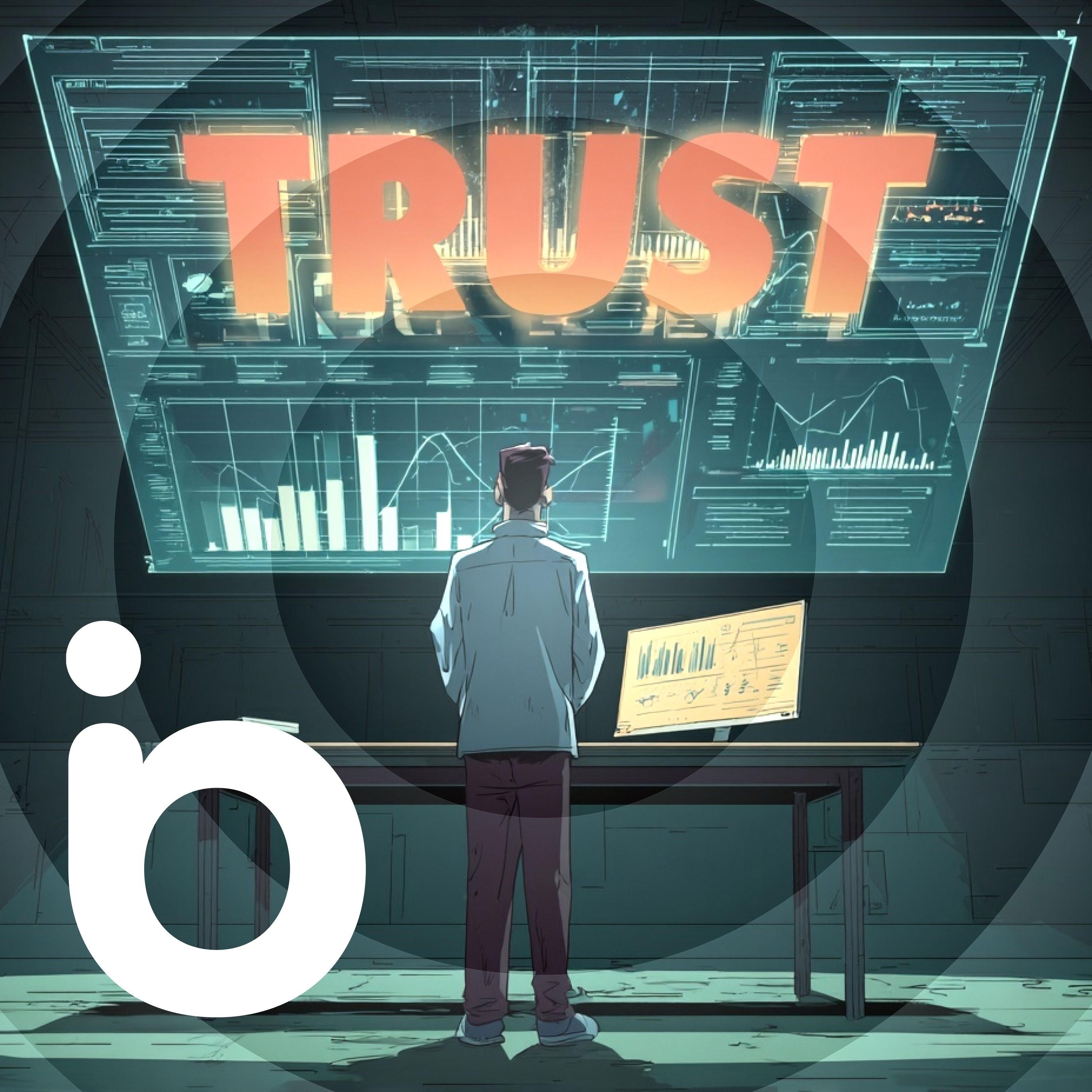
S27 Ep 23Why Your UX Needs a Trust Audit
In this episode, we look at why trust is key to good UX, especially with scams, deepfakes, and AI blurring the line between helpful and deceptive. We also ask if emotion-reading apps are helpful or just unsettling, and explore the tricky process of turning services into products. Plus, we discuss a framework from Nielsen Norman Group, tackle a listener's question on productization, and end with Marcus's joke.App of the WeekCheck out Emotion Sense Pro—a Chrome extension that analyzes micro‑expressions and emotional tone in real time during Google Meet calls, while keeping all data safely on your device. It's privacy-first, insightful, and a bit unsettling. But if you're moderating user tests, hosting webinars, or running interviews, it gives a useful look into unseen emotional cues.Topic of the Week: Trust as Your UX SuperpowerThis week's topic dives into why trust is absolutely essential in today's digital landscape. Here's a summary of what was discussed, but we encourage you to listen to the whole show for more detailed insights.We're convinced trust isn't optional, it's foundational. Amid a haze of misinformation, broken customer promises, slick AI-generated content, and user fatigue, building trust isn't just ethical, it's strategic.Why Trust Is Harder to Earn (But More Rewarding)Trust isn't automatic anymore. Big brands used to get the benefit of the doubt. Now users are skeptical. Scams and data breaches have made people cautious. Small problems like unfamiliar checkout pages, strange wording, or awkward user flows make people suspicious.UX Choices That Build (or Break) TrustKeep your visuals and interface consistent so users don't have to work hard. When people get confused, they put their guard up. Think about clicking through to a payment page with no familiar branding. That tiny moment can kill trust. Messages like "Only 3 left in stock" can seem manipulative if users don't trust you yet.Speak Like a HumanTalking about "the company" instead of "we" creates distance. Use normal conversation with "you" and "we" instead of "students" or "customers." Skip the marketing language. And remember that if your photos don't show people like your users, they might leave without saying why.Trust-Building in ActionHere are concrete steps that showcase trust-building in real-world scenarios. Implementing these practices can transform how users perceive and interact with your digital experiences:Audit for trust breakpoints. Look for spots where your UI might confuse users.Loop in legal early. This stops compliance from ruining your tone with last-minute jargon.Test trust directly. Ask "Would you feel comfortable sharing your data here?" during testing.Use authentic social proof. Link testimonials to sources, use third-party reviews. Even better? Simple, unpolished video testimonials.Prioritize clarity over cleverness. Skip the buzzwords.Make human support obvious. This is one of the strongest trust signals you can offer.Trust runs through every part of your experience. Get it right and it becomes your biggest advantage.Read of the WeekThis week's read is "Hierarchy of Trust: The 5 Experiential Levels of Commitment" by Nielsen Norman Group. They outline a trust pyramid:Baseline trust. Can the site meet my needs?Interest & preference. Is this better than alternatives?Trust with personal info. Worth registering?Trust with sensitive data. Can I trust you with payments?Long-term commitment. Will I come back?Main point? Don't ask for level-3 or level-4 commitments before earning levels 1 and 2. Users leave when you push for sign-ups or newsletter pop-ups too early. Build trust in stages.Listener Question of the Week"Is productizing my services a good idea, and if so, how should I approach it?It depends. Productisation can add clarity but might limit your value by putting your service in a rigid box. We find it works better to focus on outcomes rather than fixed processes.If you do want to productise:Focus on the outcome, not the deliverable. Example: "Conversion rate strategy" not "5 interviews and wireframes."Stay flexible. Your process should change as the project develops.Don't use fixed pricing that punishes change.Think about your service's value, not just features.Most of us will get further with a custom toolkit and clear outcomes than a one-size-fits-all "product."Marcus’s Joke“I removed the shell from my racing snail. I thought it would make it faster, but if anything, it’s more sluggish.” Find The Latest Show Notes
S27 Ep 22Scaling UX in a Decentralized World: Inside Oxford
In this episode, we chat with Sarah Zama from the University of Oxford about how she's helping to influence UX across one of the most complex and decentralized organizations in the world.We explore how she built a UX center of excellence almost from scratch, how the team is transforming culture through coaching and community, and what it takes to push UX forward in a challenging environment. There's also a digression into Apple's questionable design choices, a fantastic app recommendation, and of course, Marcus' joke.App Of The WeekThis week’s app recommendation is Zuko Form Analytics. It’s an incredibly helpful tool for anyone involved in conversion rate optimization or form design.Zuko tracks detailed interactions with every field in a form—like how long someone spends in a field, where they drop off, and what fields trigger abandonment.You get session-level insights, and it all works via a simple JavaScript snippet. There's a free tier to get started (up to 1,000 sessions), and pricing starts around £40/month for 5,000 tracked sessions. It’s the kind of tool we wish we’d known about sooner.Topic Of The Week: Building UX Capability at Oxford UniversityWe were thrilled to be joined by Sarah Zama, UX Lead at the University of Oxford, to discuss a journey we’ve had the privilege of being part of: building a UX center of excellence in one of the most decentralized institutions in the world.Getting Started With Limited ResourcesPaul originally worked with a small team at Oxford to create the business case for a UX team, ultimately recommending a center of excellence model rather than a centralized tactical team.Why? Because hiring enough UXers to match developer headcount across such a massive organization was never going to be viable. Instead, a small, strategic team could focus on enabling others.Sarah took that vision and ran with it. She started with a written plan—not just a strategy that collects dust but a living, practical document with measurable outcomes. She quickly assembled a lean team, brought in an existing accessibility lead, and even secured a six-month secondee to help with projects and spread good UX practice further into the organization.A Consultative, Empowering ApproachThe Oxford UX team doesn’t do UX for people. Instead, they help others do UX better. Through consulting, coaching, training, and providing reusable assets (like a design system), the team makes itself useful across a broad landscape without getting dragged into execution.This consultative model includes:Workshops to support high-profile projectsGuest training sessions with external speakersCustom-built resources tailored to Oxford’s contextSupportive relationships with departments already doing good UXThey’ve also cleverly leveraged accessibility requirements as a wedge to introduce better UX thinking, combining compliance with best practices to gain traction.Growing a UX CulturePerhaps most impressively, Sarah and her team have focused on growing a UX culture through grassroots advocacy. They’ve built a UX Champions network that now includes over 150 people from across the university. This community shares knowledge, resources, and a passion for improving user experience, even when UX isn’t in their job title.It’s a smart way to scale. By empowering individuals and embedding UX thinking across departments, Sarah's team extends its reach far beyond what any centralized team could manage.The Frustrations and the WinsSarah admits the biggest challenge is visibility. Getting buy-in across such a large institution takes time and constant communication. There’s also the frustration that people still perceive UX as a cost or blocker rather than an enabler of success.But the wins are meaningful. A growing, skilled team. A network of passionate advocates. And projects where UX clearly moved the needle. Sarah credits much of the team’s progress to strong collaboration, openness to learning, and sheer persistence. It’s a long game, but one that’s already paying off.You can follow Sarah’s team and explore their resources at staff.admin.ox.ac.uk/ux. They welcome feedback, iteration, and anyone who wants to borrow from their growing UX playbook.Read Of The WeekThis episode’s recommended read is The Leadership Dilemma, an article Paul wrote for Smashing Magazine. It reflects on the exact challenges Oxford faced: how do you scale UX influence when your team is too small to do all the work? The article walks through a strategic approach to UX leadership that empowers others, shifts the organizational mindset, and creates lasting change.If you’re trying to build UX maturity in a large or slow-moving organization, this is worth your time.Question Of The WeekThis week’s question wasn’t submitted via email but came up naturally during the show: "What does a typical week look like for a small UX team in a large organization?"Sarah’s answer? There’s no such thing as a typical week. Her team works on everything from:Running UX trainingProviding

S27 Ep 20The Future Of UX With Jared Spool
Joining me, Paul, are Marcus Lillington and Jared Spool, and together we explore how UX needs to reposition itself, what AI really means for designers, and how to navigate the current UX job landscape without losing hope. We also touch on some interesting new tools from Figma and an exciting AI-assisted prototyping app that could change how we work.App of the WeekThis episode highlights two key apps making waves in the design space:Figma SitesAnnounced recently at the Figma conference, this new tool aims to let you publish websites directly from Figma, competing with players like Webflow and Framer. However, we share a healthy dose of skepticism about its current capabilities—especially its accessibility issues and lack of data entry support, which limits its usefulness beyond very simple sites.ReaddyThis AI-powered assisted coding tool stands out as a promising alternative. Unlike traditional prototyping in Figma, Ready lets you describe your UI in natural language, and it generates real HTML and CSS code that’s responsive and supports data entry. This means you can create interactive prototypes faster, test them in real-world conditions, and iterate with ease. It’s not about replacing designers but augmenting their productivity, and it offers a glimpse into how AI can support design workflows in practical ways.The Future of UX, AI, and the Job MarketWe begin by reflecting on the state of UX and where it’s headed, especially with AI’s rapid development changing the landscape. Jared shares his ongoing work guiding UX professionals to unlock their full potential within organizations, emphasizing the gap between what UX can deliver and what’s often realized. This disconnect often results from a lack of awareness or understanding within teams, and Jared’s leadership sessions aim to close that gap.AI’s Impact on UX DesignWe delve into AI tools emerging in design, focusing particularly on generative AI and assisted coding. While AI is often hyped as a threat to designers, we agree it’s more of a productivity booster than a replacement. AI lets us do more with less effort, but it doesn’t eliminate the need for thoughtful, skilled UX design. The analogy Jared uses — comparing AI’s rise to previous tech shifts like blacksmiths transitioning to new materials — reminds us that professions evolve rather than vanish overnight.We discuss the limitations of current AI design tools, such as Figma Sites, which lack the sophistication needed for anything beyond very basic websites. On the other hand, Readdy offers a more practical approach by generating actual working code through conversational commands. It’s a step forward but still not a magic bullet. The process requires human input, iteration, and adjustment, which is where UX professionals continue to add value.An interesting angle comes from the critique of AI as reinventing the command line — a somewhat clunky, text-based interface for describing complex UIs. This makes it tricky to fully express the nuances of design and iterate quickly, especially in production environments where prototyping demands fast, precise changes.The UX Job Market RealityTurning to the job market, Jared offers a clear-eyed analysis: although there are more UX jobs available now than ever before, there are also far more UX professionals competing for them. The result? Overcrowded job listings and intense competition, especially for junior roles. The industry isn’t shrinking; rather, it’s saturated.He points out that the issue isn’t job scarcity but a mismatch between experience levels and job requirements. Many bootcamp graduates enter the market with limited experience, and companies often prefer hiring senior candidates to junior ones due to cost efficiency and immediate impact. For those struggling to find work, Jared advises gaining real-world experience by volunteering on meaningful projects with tangible outcomes, like improving a local charity’s website to boost adoption rates.For senior professionals, the key is precision: tailoring applications meticulously to each job posting and clearly demonstrating how your skills match the role. Generic resumes won’t cut it when hiring managers sift through hundreds of applicants. This targeted approach greatly improves the chances of landing interviews and offers.Looking Ahead: Will AI Replace UX?We debate an intriguing prediction by Jakob Nielsen that many UX battles are “won” and that AI might replace human interaction with websites entirely, as AI agents fetch and personalize content for users. While fascinating, we question the commercial and practical realities. Advertisers still rely on website visits for revenue, and user experience involves more than information retrieval; it’s about connection, context, and trust.We emphasize the enduring importance of educating organizations about real UX issues, including accessibility and ethical design topics that remain under appreciated despite technological advances.Final ThoughtsThe conversat
S27 Ep 19Creating Personality-Driven Design Experiences
Creating Personality-Driven Design ExperiencesIn this week’s episode of the Boagworld Show, we’re joined by none other than Andy “The Pioneer” Clarke. We dig deep into the role of aesthetics in UX, explore how AI can conduct user interviews, and debate how to approach pricing conversations with clients. Alongside our usual banter, you’ll find insights into why design needs personality and how creative direction can add real value, whether you’re designing marketing sites or B2B dashboards.We also introduce a new AI-powered user research tool, share some standout reading recommendations, and end with the usual Marcus groaner (you’ve been warned).App of the Week: WhyserThis week we took a look at Whyser, an AI tool designed to conduct user interviews on your behalf. You simply set up your interview goals and questions, and the AI takes care of the rest; scheduling, conducting, and even analyzing interviews.What impressed us most was how well the AI adapted its questions based on our answers. It felt remarkably natural and even asked follow-up questions relevant to what we’d said earlier. That’s a big deal for those of us who struggle to find time to do interviews at scale.Whyser isn’t without its drawbacks; it does put a layer between you and your users, which can dilute the empathy you build through real human conversation. But if time or access is limited, this could be a game changer. Especially helpful for teams that rarely get to talk to users directly.Topic of the Week: Why Aesthetics Still Matter in UXWe hear it all the time: “Design is about solving problems.” That’s true, but it’s not the whole picture. In this episode, we explore the undervalued role of aesthetics in UX and why visual design, art direction, and brand personality still matter.From Usable to MemorableWe kicked off with a discussion about how too many websites today feel like “colored-in wireframes.” They’re functional but lack soul. The shift toward product-thinking has stripped personality from digital experiences. As Andy put it, “Everything looks like Bootstrap.”Yet, personality plays a critical role in how users connect with your brand. Whether it’s a SaaS dashboard or a marketing homepage, how a product feels impacts engagement, trust, and even long-term retention. People stick around when something makes them feel something—even if they can’t quite explain why.The Cognitive Load LinkThere’s a practical side to aesthetics too. Good design improves usability not just through layout but also by boosting mood. A more pleasant experience reduces cognitive load, making interfaces feel easier to use.That means aesthetics aren’t just about making things pretty; they’re a lever for user performance and satisfaction. It’s not fluff; it’s function wrapped in emotion.Art Direction in Unlikely PlacesAndy gave a great example from his time working on a cybersecurity app. Hardly a glamorous field, yet he found space to inject moments of brand personality through microinteractions, onboarding flows, and visual consistency. Even in utilitarian tools, design can reflect a brand’s values and improve the user experience.As he put it: “You don’t need to delight, but you do need to differentiate.”Reframing CreativityThe problem, we all agreed, starts in education. Many young designers are trained to focus on flows, not feelings. They're brilliant at getting users from A to B but haven’t been taught how to make that journey enjoyable or memorable.Andy argued that curiosity is the missing ingredient. Design isn’t just about function, it’s about communication. And communication thrives on references, storytelling, and creativity. He showed us how keeping a library of visual influences, whether it’s old magazine layouts, album covers, or supermarket packaging, can help inject new life into projects.Selling the Value of Aesthetic ThinkingWebsites are easy to build these days. What clients are really paying for is the ability to tell their story well. That’s where we, as designers, add value.Andy’s take? Spend 95% of your budget on creativity and 5% on implementation. Tools like Squarespace can handle the build, what matters is how it looks, feels, and communicates. That’s where your edge lies.And when clients say, “But we already have a brand,” the job becomes about interpreting that brand, stretching it into a full visual language, not just slapping a logo onto a template.So if you’ve felt the creative spark dimming lately, maybe it’s time to step away from your Figma files and pick up an old design annual, flick through a vintage magazine, or just take a walk with curiosity as your guide.Read of the WeekThis week we didn’t highlight specific articles, so no recommended reading to share. That said, the conversation itself was rich with references; from Blue Note album covers to 'Smash Hits' magazine layouts—and might inspire you to go digging through your own design bookshelf.Listener Question of the WeekWe didn’t have a listener question either, but the

S27 Ep 18The Job Title Train Wreck
This week, we catch up on Paul’s latest adventures—from a memorable dinner with Todd “the accessibility guru” where we talked WCAG 3, to a deep dive into the shifting landscape of design job titles. We’ll share an app that brings real form fields into your Figma prototypes, unpack why “product designer” is suddenly on everyone’s profile, and wrap up with a classic Marcus joke to send you on your way.App of the WeekWe’ve been wrestling with Figma’s built‑in prototyping limitations—particularly the lack of real form fields—and this week we discovered Bolt. Bolt lets you import a Figma frame URL and instantly spin up an interactive prototype complete with working inputs and text fields. That means you can run realistic usability tests without hand‑coding forms or cobbling together workarounds.Topic of the Week: Bringing Clarity to the Chaos of Design Job TitlesIn an era when “UX designer,” “UI designer,” “product designer,” and “service designer” all coexist, you might feel like you need an advanced diploma just to understand your own role. We certainly do. Let’s unpack what each title really implies, why the trend toward “product design” worries us, and how you can bring crystal‑clear definitions into your next job posting or team conversation.Why Job Titles MatterEven if you’re happy wearing multiple hats, inconsistent naming can cause real headaches:Employer confusion: Hiring managers may post for a “product designer” but expect the traditional UX responsibilities you’ve mastered.Scope creep: Without clear boundaries, you’ll end up doing support tickets one week and sales decks the next—often without the title or compensation to match.Perception gaps: Outside the design bubble, “designer” still conjures images of pretty pictures, not strategic problem‑solvers.Getting titles straight not only sets expectations for you, it helps stakeholders understand the value you bring.The Rise of Product DesignLately, many companies are retiring “UX designer” in favor of “product designer.” On the surface, this feels like career progression: a broader focus that spans UI, analytics, and even marketing. Yet we see two risks here:Internal focus: “Product designer” can imply you’re optimizing existing features and metrics, rather than uncovering latent user needs.Ambiguous boundaries: When design expands outward, it often steps on the toes of customer success, support, and even engineering roles.If your title leans toward “product,” make sure you and your team agree on whether that includes user research, email flows, or post‑launch monitoring.Breaking Down the RolesHere’s how we interpret the four most common titles—and how they overlap:UI DesignerUI designers focus on the look and feel of your screens. Their goal is to reduce friction and make interactions intuitive. Think pixel perfection, animation timing, and responsive layouts. They might not set research objectives, but they’ll ensure that every button state feels just right.UX DesignerUX designers own the end‑to‑end experience. From SEO‑driven landing pages to post‑purchase emails, they obsess over every touchpoint. If you care about conversion funnels, user flows, or cross‑channel consistency, you’re in the UX camp.Product DesignerProduct designers straddle the middle: they build interfaces and track success metrics, but they’re also tasked with aligning features to business goals. In healthy organizations, they champion user advocacy and roadmap prioritization, but that balance can tip too far toward internal KPIs.Service DesignerService designers operate backstage. They optimize the processes and systems—think support scripts, training materials, or fulfillment pipelines—that empower on‑stage teams to deliver seamless experiences. Their scoreboard? Operational efficiency and scalability.How to Bring Clarity to Your TeamLabels alone won’t solve confusion. Here’s how we recommend making roles crystal clear:Define scopes explicitlyIn every job description or team charter, list the deliverables you own—and those you don’t. For example, “Responsible for wireframes and prototypes, not email automation.”Align on success metricsAgree on the KPIs or user outcomes tied to each role. If you’re a UX designer, maybe it’s task completion rates; if you’re a service designer, it might be first‑response times.Foster cross‑role collaborationSchedule regular syncs between UI, UX, product, and service designers so everyone sees the handoffs and dependencies. That shared visibility prevents silos.Revisit titles periodicallyAs your organization evolves, carve out time every six months to discuss whether roles—and their titles—still reflect who does what.By naming responsibilities clearly and encouraging open dialogue, you’ll reduce friction, align expectations, and help everyone—from junior hires to C‑suite—understand what “designer” really means in your organization.Resources of the WeekHere are two go‑to resources for leveling up your UX practice:Leaders of AwesomenessA free communit
S27 Ep 17Beyond Usability: Why Emotion and Delight Matter in UX
This week’s episode takes a deeper look at how we define good user experience—and argues it’s time we move beyond the narrow focus of usability. We explore how friction can sometimes enhance an experience, and why emotional design is essential if we want to create interfaces that stick in users’ minds.We also review a new batch of AI-powered design tools and uncover where they currently fall short. Plus, we look at how AI can still be incredibly useful for user research—when used the right way.Finally, we answer a question from our Agency Academy about giving feedback in a way that doesn't crush your colleagues, and Marcus closes out with one of his typically pun-tastic jokes.App Of The WeekWe explored two sides of AI in this episode—one disappointing, one surprisingly powerful.AI Website Builders: Not Quite There YetWhile on the road (and supposedly on holiday), Paul trialed four AI-powered tools that promise to design and code entire websites based on your prompts. The tools included:UXPilotV0PolymetLoveableAll four are generating excitement among many, but from a UX perspective, we found them underwhelming. Results were inconsistent at best—white text on white backgrounds, bland copy, missing CSS, and difficult-to-edit layouts. Even with carefully crafted prompts, they failed to deliver production-ready (or even prototype-ready) experiences.If you’re curious, they’re cheap enough to try—but don’t expect them to replace designers or developers anytime soon.A New Way to Use AI: Deep Research for User InsightsOn the flip side, we’ve found AI incredibly useful for online user research, especially when time or resources make traditional methods tough.Paul used Perplexity to perform sentiment analysis across:Social media mentionsReview sites like TrustpilotOnline forums like MoneySavingExpertHe asked it to uncover what users liked, disliked, questioned, or hesitated over when it came to purchasing insurance. The results? Incredibly insightful—and backed up with linked sources to verify accuracy.You can also ask it to find testimonials that support key selling points, making it great for conversion optimization.If you're short on research time, tools like Perplexity offer a fast and surprisingly effective way to better understand your audience.Topic Of The Week: Why Usability Alone Isn’t EnoughIt all started in a casino. Well, sort of.While walking through a bank of overly-themed slot machines in Vegas, Paul had a realization: if a UX designer created a slot machine, it would probably be terrible. We’d remove all the friction. Strip away the flashing lights. Replace the reels with a simple “Win or Lose” button. It would be technically better, but emotionally dead.And that’s the problem.Too often in UX, we treat usability as the holy grail. We remove friction, optimize flows, and tidy up interfaces. But we sometimes forget the _emotional layer_—the personality, surprise, or joy that makes a product memorable.The Risk of Sterile DesignWhen we fixate only on usability, we risk creating something that is forgettable. Efficient, yes. Effective, perhaps. But emotionally flat. That’s not what builds brand loyalty. That’s not what users remember.It’s like eating a plain rice cake. Technically food. But not something you'd write home about.We need to learn from other industries. Slot machine designers understand user psychology on a visceral level. They’ve mastered the art of creating anticipation, excitement, even obsession. Not that we should copy their manipulative tactics—but we can learn from how they invoke emotion.Same goes for print designers, who often embrace bold creative expression. Or the restaurant industry, where service, ambiance, and delight matter as much as the food.Emotional States Affect UsabilityIt’s not just about delight for delight’s sake. Emotional state directly affects cognitive load. When someone is stressed, even the simplest interaction feels hard. When they’re relaxed or entertained, they glide through even complex tasks.We need to design for these emotional states. A well-designed interface doesn’t just help users complete a task. It shapes how they feel about doing it.Consider the Mailchimp example. Back in the day, their UI was full of little delightful moments—from their chimp mascot Freddy to playful animations. None of it was strictly necessary. But it made the product feel human, friendly, and approachable. And it mattered.What Can We Do?We should be testing and measuring more than just usability.Some suggestions:Use semantic differential surveys. Give users a list of emotional adjectives and ask which ones best describe the experience.Monitor sentiment through social listening. Tools like Perplexity can help uncover how people feel about your product online.Track qualitative feedback. Those smiley-face buttons at airport security? They can work for digital experiences too.Use metrics beyond task completion. Net Promoter Score (NPS), emotion mapping, and post-task satisfaction rati
S27 Ep 16Redefine Your Role
On this week's Boagworld Show, we're exploring how UX design leaders can take control of their roles within organizations, why UX agencies might feel doomed (but probably aren't), and how AI is reshaping the way we code and collaborate. We'll dig into practical strategies for UX leaders, share insights on the changing landscape for UX agencies, and provide guidance for navigating AI in your workflows.App of the WeekThis week's recommendation is UXPressia, a powerful yet easy-to-use visualization tool. UXPressia helps teams collaboratively create customer journey maps, personas, and impact maps. Although the visual output isn't necessarily designer-quality, it excels at engaging stakeholders and team members in user research activities. It's particularly useful for empowering non-designers to contribute meaningfully to UX strategies.Topic of the Week: Defining Your Role as a UX Design LeaderAs UX professionals, many of us often find ourselves caught in cycles of endless implementation, working on tasks dictated by others rather than strategically influencing user experience. If you're feeling overworked, understaffed, and under-appreciated, it's time to redefine your role. Here’s how you can proactively take control and transform your position from pixel-pusher to strategic UX leader.Clarify Your GoalsSenior management frequently sets high-level organizational objectives that, while seemingly vague, offer essential clues to aligning your UX efforts strategically. Start by identifying those broader goals—whether increasing efficiency, targeting new demographics, or enhancing sustainability—and ask yourself how UX can meaningfully contribute. Present these alignment opportunities to your manager, framing your UX role around supporting company-wide goals. This shifts your focus from reactive tasks to proactive strategic initiatives.Leverage Your Resources WiselyRather than dwelling on resource limitations, carefully evaluate what’s already at your disposal:Budgets and Software: Identify any discretionary funds or tools available.Internal Staff and External Support: Consider tapping into colleagues from other departments or engaging reliable external agencies. Establishing preferred supplier lists helps manage quality and ensures that external agencies align with your UX standards.Autonomy and Training: Use your authority to delegate smaller UX tasks, freeing yourself to focus on strategic planning and education.This perspective allows you to create impactful strategies within existing constraints. For instance, shifting your role to training internal teams on basic UX practices like user research and testing can extend your influence without increasing headcount.Expand Your InfluenceTrue UX leadership isn’t just about completing projects; it’s about cultivating a user-centered culture throughout your organization. Here's how:Education and Empowerment: Provide training materials and workshops to build UX capabilities within other departments.Policies and Standards: Establish clear UX standards and guidelines, creating a framework everyone in your organization can follow.Metrics and Accountability: Introduce meaningful UX metrics that encourage internal competition and drive continuous improvement. For instance, turning analytics into league tables among departments can spark healthy competition and motivate better user experiences.Transforming your role into that of an internal UX consultant positions you to make a broader impact, aligning user-centric design with the overarching organizational strategy.By following these steps—clarifying your objectives, leveraging your resources, and expanding your influence—you can redefine your role as a UX design leader, shifting from mere execution to strategic empowerment.Read of the WeekJacob Nielsen recently wrote an intriguing article titled "Future is Lean, Mean and Scary for UX Agencies". Nielsen predicts challenging times ahead for UX agencies, primarily driven by a shift towards more robust internal UX teams and the rapid rise of AI. However, we believe the narrative is somewhat skewed toward Nielsen's experience with larger organizations. While internal teams are expanding, they often remain overstretched, and the role of specialized UX agencies is still crucial. AI will indeed reshape the industry but likely as an enhancement rather than a replacement, empowering both in-house and external UX teams to deliver more sophisticated solutions rather than merely cutting costs.Listener Question of the WeekQuestion: How should agencies handle clients who approach them with projects partially completed using AI-generated code, expecting it to be quick and cheap to finalize?This is a growing challenge as clients become increasingly confident in AI capabilities, sometimes overestimating what AI can deliver without professional oversight. Here's our approach to handling this:Clients may assume AI-generated code is nearly complete, but the reality is often different. AI-gener

S27 Ep 15The Art of Stealth Research
On this week's Boagworld Show, we delve into the powerful concept of invisible user research - tackling how to conduct essential UX work even when stakeholders resist investing in formal research. We explore the often-overlooked impact of UX debt, crown a new champion among user-testing apps, and surprisingly, find ourselves nodding along with McKinsey on the strategic role of design leaders.App of the WeekThis week, we're excited about Useberry, a versatile user-testing platform that covers a wide range of UX research tasks like card sorting, tree testing, five-second tests, preference tests, and single-task usability studies. It's particularly appealing due to its comprehensive features, straightforward user interface, scalability, and affordable pricing model. With a free tier for small tests and scalable packages allowing incremental purchases up to 2000 responses per month, Useberry makes rigorous user research accessible without heavy upfront costs.Topic of the Week: Invisible User ResearchOne of the biggest hurdles in UX is convincing stakeholders of the importance of investing in user research. Often, organizations resist due to perceived cost, time constraints, or simply misunderstanding its value. However, this doesn't mean UX practitioners should abandon research altogether. Instead, we're advocating the concept of "invisible user research," embedding research seamlessly into the workflow without explicitly seeking permission or additional budgets.Embedding Research into Your WorkflowInvisible user research is all about reframing how you incorporate research activities. Instead of flagging them as separate tasks, integrate research directly into your design activities. For example, avoid creating separate budget line items for user research; instead, simply extend your design phase slightly to accommodate quick, effective tests and validation steps.Practical ApproachesLeverage everyday moments in your project timeline to slip in valuable research:Stakeholder meetings: If stakeholders question the design or argue over choices, propose a quick user test as a neutral way to resolve debates. For instance, if a stakeholder believes users might miss an essential CTA, perform a quick five-second test. You'll have concrete data within hours.Feedback delays: When awaiting feedback on your designs, use that downtime productively. Conduct small, targeted surveys or quick polls to fill knowledge gaps.Routine presentations: When stakeholders request updates or progress presentations, add a quick round of user research to validate your work and strengthen your position.Addressing Common ObjectionsStakeholders often push back against research for several common reasons, but here's how you can respond effectively:"It's too costly or time-consuming": Highlight how small-scale tests (like quick surveys or five-second tests) take minimal time and cost very little."Our users are too busy or inaccessible": Utilize surrogate groups, such as customer support teams or sales representatives who interact daily with users."Your research is biased or insufficient": Emphasize that even limited testing is more reliable than subjective opinions. Additionally, use tools like ChatGPT to ensure questions are unbiased and clearly phrased, or offer to conduct further rounds of testing to reassure stakeholders.Reframing Research as Efficiency and Risk ManagementPositioning invisible user research as efficiency gains or risk management can be particularly persuasive. Explain that catching design issues early prevents costly revisions later. Frame user research as a routine activity that ensures project success, rather than as an optional extra.Pragmatism Over ProcessFinally, remain pragmatic. Rather than adhering rigidly to a formalized research process (extensive discovery phases, multiple rounds of card sorts, or lengthy reports), opt for quick, targeted interventions tailored to immediate needs. This responsive approach ensures research stays relevant, actionable, and minimally disruptive to the workflow.By adopting invisible user research, you embed essential UX validation into everyday project activities, ensuring user-centered outcomes without needing formal approval at every turn.Read of the WeekWe have three great articles recommended for strategic UX leaders:Are You Asking Enough of Your Design Leaders? from McKinsey emphasizes treating design leaders as strategic partners at the executive level, advocating for a more impactful role beyond implementation tasks.How to Bring Value as a Design Leader Without Getting Hands-On outlines practical ways to effectively lead UX teams by stepping back from hands-on design tasks and focusing on team support and organizational communication.UX Debt by Nielsen Norman Group introduces the concept of UX debt, akin to tech debt, highlighting how design shortcuts during development can accrue and negatively impact user experiences, providing strategies for managing and mitigating this debt ef